Willkommen bei den Top‑Schriften – hier treffen Beliebtheit und Qualität aufeinander. Das sind die in diesem Jahr am häufigsten heruntergeladenen und genutzten Fonts. Wenn Sie sichere Optionen für Logo, Web oder Social suchen, starten Sie hier.
Jeder Top‑Font überzeugt durch Balance, Lesbarkeit und Vielseitigkeit. Sie finden moderne Sans‑Serifs, elegante Scripts, Vintage‑Serifs und minimalistische Displays.
-
 Herunterladen 648 Downloads@WebFont
 -
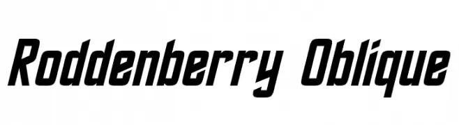
( Fonts by Neale Davidson - www.pixelsagas.com )
A bold, oblique font with a futuristic and dynamic style.
![Roddenberry Oblique Frei Schriftart Herunterladen]() Herunterladen 648 Downloads@WebFont
Herunterladen 648 Downloads@WebFont -
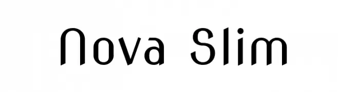
( Copyright (c) 2011, wmk69 (wmk69@o2.pl) )
A sleek, modern font with rounded edges and uniform stroke width.
![Nova Slim Frei Schriftart Herunterladen]() Herunterladen 648 Downloads@WebFont
Herunterladen 648 Downloads@WebFont -
![Quantifier NBP Frei Schriftart Herunterladen]() Herunterladen 648 Downloads@WebFont
Herunterladen 648 Downloads@WebFont -
( Fonts by Jeri Ingalls - littlehouse.homestead.com )
A playful, decorative font with characters enclosed in picket fence shapes.
![JI Picket Fence Frei Schriftart Herunterladen]() Herunterladen 647 Downloads@WebFont
Herunterladen 647 Downloads@WebFont -
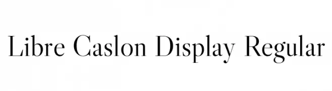
( Copyright 2012 The Libre Caslon Display Authors (https://github.com/impallari/Libre-Caslon-Display) )
A classic serif typeface with elegant detailing and balanced proportions.
![Libre Caslon Display Regular Frei Schriftart Herunterladen]() Herunterladen 647 Downloads@WebFont
Herunterladen 647 Downloads@WebFont -
![LushUs Medium Frei Schriftart Herunterladen]() Herunterladen 647 Downloads
Herunterladen 647 Downloads -
![Vineyard Frei Schriftart Herunterladen]() Herunterladen 647 Downloads@WebFont
Herunterladen 647 Downloads@WebFont -
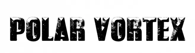
( Fonts by Castcraft Software - opti.netii.net - check the website before use )
A bold, distressed font with a rugged, vintage texture.
![POLAR VORTEX Frei Schriftart Herunterladen]() Herunterladen 647 Downloads@WebFont
Herunterladen 647 Downloads@WebFont -
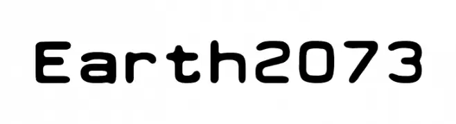
( Lukas Krakora - www.typewriterfonts.net/ )
A modern, rounded font with a bold and slightly condensed style.
![Earth 2073 Frei Schriftart Herunterladen]() Herunterladen 647 Downloads@WebFont
Herunterladen 647 Downloads@WebFont -
![Kruti Dev 100 Bold Italic Frei Schriftart Herunterladen]() Herunterladen 647 Downloads@WebFont
Herunterladen 647 Downloads@WebFont -
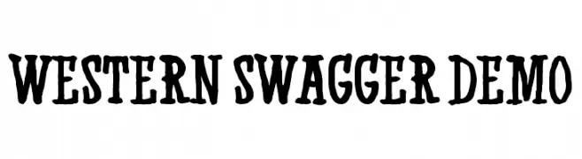
( Fonts by Kevin Christopher - www.kcfonts.com )
A bold, decorative font with a rugged, Western-inspired style.
![Western Swagger DEMO Frei Schriftart Herunterladen]() Herunterladen 647 Downloads@WebFont
Herunterladen 647 Downloads@WebFont -
![puzzleface Frei Schriftart Herunterladen]() Herunterladen 647 Downloads@WebFont
Herunterladen 647 Downloads@WebFont -
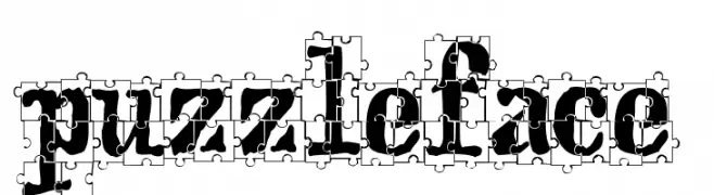
( Fonts by Manfred Klein. Free for private and charity use. Free for commercial with donation to organizations )
A dynamic serif font with calligraphic influences and sharp serifs.
![MWaKomia Frei Schriftart Herunterladen]() Herunterladen 647 Downloads@WebFont
Herunterladen 647 Downloads@WebFont -
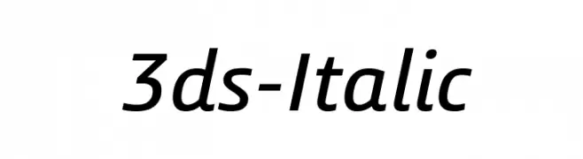
![3ds-Italic Frei Schriftart Herunterladen]() Herunterladen 647 Downloads@WebFont
Herunterladen 647 Downloads@WebFont -
( Fonts by Chris Vile - fontmonger.com - Personal-use only. For commercial use please contact owner. )
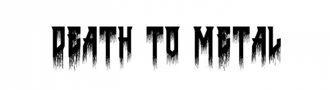
A bold, jagged font with a dripping effect, perfect for dramatic and intense designs.
![Death to Metal Frei Schriftart Herunterladen]() Herunterladen 647 Downloads@WebFont
Herunterladen 647 Downloads@WebFont -
( Darrell Flood )
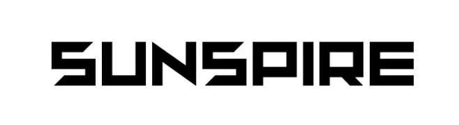
A bold, geometric font with a futuristic, angular design.
![sunspire Frei Schriftart Herunterladen]() Herunterladen 647 Downloads@WebFont
Herunterladen 647 Downloads@WebFont -
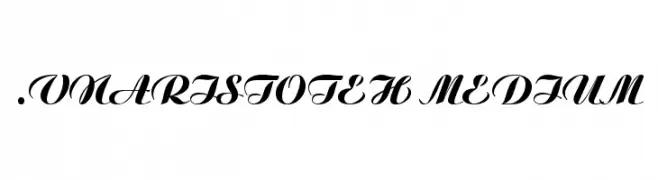
![.VnAristoteH Medium Frei Schriftart Herunterladen]() Herunterladen 647 Downloads
Herunterladen 647 Downloads -
( Fonts by Graham Meade - GemFonts )
A bold, distressed sans-serif font with a rugged, torn appearance.
![Tearoff Frei Schriftart Herunterladen]() Herunterladen 647 Downloads@WebFont
Herunterladen 647 Downloads@WebFont -
( Fonts by Luke Owens - Personal-use only. For commercial use please contact owner. )
A bold, modern font with clean lines and a balanced structure, perfect for impactful designs.
![Oregon LDO ExtraBold Frei Schriftart Herunterladen]() Herunterladen 647 Downloads@WebFont
Herunterladen 647 Downloads@WebFont -
![Army Hollow Expanded Frei Schriftart Herunterladen]() Herunterladen 647 Downloads
Herunterladen 647 Downloads -
( Fonts by Pinisiart )
A bold, geometric font with dynamic, playful characters and unique cutouts.
![Rhune-Explorer Frei Schriftart Herunterladen]() Herunterladen 647 Downloads@WebFont
Herunterladen 647 Downloads@WebFont -
( www.woodcutter.es )
A bold, tech-inspired font with characters inside smartphone frames.
![[smartphone] Frei Schriftart Herunterladen]() Herunterladen 647 Downloads@WebFont
Herunterladen 647 Downloads@WebFont -
( Fonts by DeNada Industries )
A classic serif font with elegant curves and bold presence.
![Romeodn Frei Schriftart Herunterladen]() Herunterladen 647 Downloads@WebFont
Herunterladen 647 Downloads@WebFont -
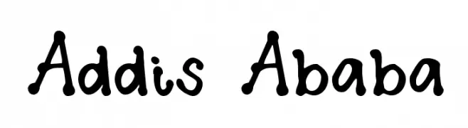
( Fonts by Kimberly Geswein - kimberlygeswein.com )
A playful, handwritten font with irregular strokes and whimsical curves.
![Addis Ababa Frei Schriftart Herunterladen]() Herunterladen 647 Downloads@WebFont
Herunterladen 647 Downloads@WebFont -
![Sliver Frei Schriftart Herunterladen]() Herunterladen 647 Downloads@WebFont
Herunterladen 647 Downloads@WebFont -
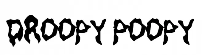
( Fonts by Rob Dobi - Toxic Type - www.dobi.nu )
A bold, decorative font with a dripping, playful style.
![Droopy Poopy Frei Schriftart Herunterladen]() Herunterladen 647 Downloads@WebFont
Herunterladen 647 Downloads@WebFont -
( Fonts by Andrew McCluskey - nalgames.com. Personal-use only. For commercial use please contact owner. )
A tall, narrow, and geometric font with a modern aesthetic.
![A Dash of Salt Frei Schriftart Herunterladen]() Herunterladen 647 Downloads@WebFont
Herunterladen 647 Downloads@WebFont -
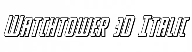
( Fonts by Daniel Zadorozny - www.iconian.com - Free for personal use )
A bold, italic, 3D font with a modern and dynamic style.
![Watchtower 3D Italic Frei Schriftart Herunterladen]() Herunterladen 647 Downloads@WebFont
Herunterladen 647 Downloads@WebFont -
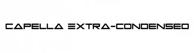
( Fonts by Daniel Zadorozny - www.iconian.com )
A futuristic, angular, and extra-condensed font ideal for striking headlines.
![Capella Extra-condensed Frei Schriftart Herunterladen]() Herunterladen 647 Downloads@WebFont
Herunterladen 647 Downloads@WebFont -
( Fonts by Aji Waluyo )
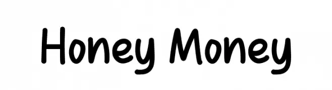
A playful, rounded font with a hand-drawn, friendly appearance.
![Honey Money Frei Schriftart Herunterladen]() Herunterladen 647 Downloads@WebFont
Herunterladen 647 Downloads@WebFont -
( Fonts by a Typeface Leone - www.tipografialeone.net. Personal-use only. For commercial use please contact owner. )
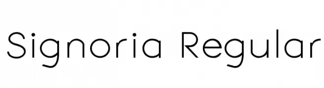
A modern, geometric sans-serif font with clean lines and balanced spacing.
![Signoria Regular Frei Schriftart Herunterladen]() Herunterladen 647 Downloads@WebFont
Herunterladen 647 Downloads@WebFont -
![Barcade No Bar Bold Frei Schriftart Herunterladen]() Herunterladen 647 Downloads@WebFont
Herunterladen 647 Downloads@WebFont -
( Fonts by Abstract Type Design - Patrick Durr )
A bold, distressed font with irregular edges and a gritty aesthetic.
![Grudge Frei Schriftart Herunterladen]() Herunterladen 647 Downloads@WebFont
Herunterladen 647 Downloads@WebFont -
( Fonts by Iconian Fonts )
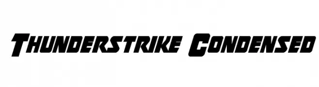
A bold, condensed font with sharp, angular edges and a dynamic slant.
![Thunderstrike Condensed Frei Schriftart Herunterladen]() Herunterladen 647 Downloads@WebFont
Herunterladen 647 Downloads@WebFont


![[smartphone] Frei Schriftart Herunterladen](https://d144mzi0q5mijx.cloudfront.net/img/0/S/smartphone.webp)


Welche Schriften sind gerade am populärsten?
Poppins, Roboto, Montserrat, Open Sans und Lato sind wegen ihrer klaren Formen und breiten Einsetzbarkeit sehr gefragt – von Markenauftritt über Landingpages bis hin zu Postern.
Welche Fonts eignen sich für Logos?
Geometrische Sans‑Serifs (z. B. Poppins, Familien im Gotham‑Stil) sind ein häufiger Griff für sauberes, skalierbares Branding. Für eine persönlichere Note bleiben Scripts und Handschrift‑Stile beliebt. Kombinieren Sie einen prägnanten Headline‑Font mit einer neutralen Brotschrift für Wiedererkennung und Harmonie.
Wie oft wird die Top‑Liste aktualisiert?
Regelmäßig – basierend auf realen Downloads und Interaktionen. Schauen Sie öfter vorbei, um aufstrebende Favoriten früh zu entdecken.
💡 Tipp: Seite bookmarken – Trends wechseln schnell, und heutige Top‑Schriften inspirieren morgen vielleicht das Rebranding.