Willkommen bei den Top‑Schriften – hier treffen Beliebtheit und Qualität aufeinander. Das sind die in diesem Jahr am häufigsten heruntergeladenen und genutzten Fonts. Wenn Sie sichere Optionen für Logo, Web oder Social suchen, starten Sie hier.
Jeder Top‑Font überzeugt durch Balance, Lesbarkeit und Vielseitigkeit. Sie finden moderne Sans‑Serifs, elegante Scripts, Vintage‑Serifs und minimalistische Displays.
-
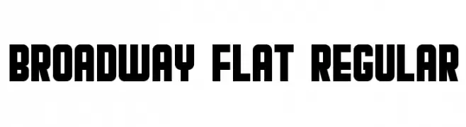
( Vladimir Nikolic - www.coroflot.com/vladimirnikolic )
A bold, decorative typeface with geometric shapes and a theatrical style.
 Herunterladen 6378 Downloads@WebFont
 -
( Fonts by a www.fontfabric.com. Personal-use only. For commercial use please contact owner. )
A modern, rounded sans-serif font with uniform strokes and geometric influences.
![BloggerSans Frei Schriftart Herunterladen]() Herunterladen 6372 Downloads@WebFont
Herunterladen 6372 Downloads@WebFont -
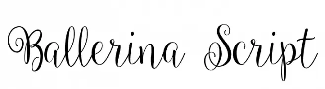
( Fonts by a Emily Spadoni - http://creativemarket.com/emilyspadoni/. Personal-use only. For commercial use please contact owner. )
A graceful script font with elegant swirls and loops, perfect for sophisticated designs.
![Ballerina Script Frei Schriftart Herunterladen]() Herunterladen 6371 Downloads@WebFont
Herunterladen 6371 Downloads@WebFont -
Schriftart von paolocad. For commercial use please contact the owner.
![highaltodecor Frei Schriftart Herunterladen]() Herunterladen 6371 Downloads@WebFont
Herunterladen 6371 Downloads@WebFont -
![NBA Pacers Frei Schriftart Herunterladen]() Herunterladen 6371 Downloads@WebFont
Herunterladen 6371 Downloads@WebFont -
( Fonts by vladimirnikolic - Personal-use only. For commercial use please contact owner. )
A classic serif font with elegant curves and medium contrast, ideal for formal and traditional designs.
![International Regular Frei Schriftart Herunterladen]() Herunterladen 6368 Downloads@WebFont
Herunterladen 6368 Downloads@WebFont -
( Fonts by or from www.graffitifonts.net )
A playful, handwritten font with a childlike charm and bold strokes.
![Kids Frei Schriftart Herunterladen]() Herunterladen 6365 Downloads@WebFont
Herunterladen 6365 Downloads@WebFont -
![Pasajero Frei Schriftart Herunterladen]() Herunterladen 6364 Downloads@WebFont
Herunterladen 6364 Downloads@WebFont -
( Fonts by Castcraft Software - OPTI Fonts Archive - opti.netii.net - Personal-use only. For commercial use please contact owner. )
A modern, clean font with a balanced structure and strong presence.
![OPTIOptionMedium Frei Schriftart Herunterladen]() Herunterladen 6362 Downloads@WebFont
Herunterladen 6362 Downloads@WebFont -
![Dracula Frei Schriftart Herunterladen]() Herunterladen 6362 Downloads@WebFont
Herunterladen 6362 Downloads@WebFont -
( Fonts by Ariq Sya - marsnev.com )
A bold slab serif font with a vintage, industrial feel.
![Mars&Twist Frei Schriftart Herunterladen]() Herunterladen 6360 Downloads@WebFont
Herunterladen 6360 Downloads@WebFont -
![1454 Gutenberg Bibel Frei Schriftart Herunterladen]() Herunterladen 6360 Downloads@WebFont
Herunterladen 6360 Downloads@WebFont -
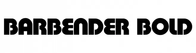
( Fonts by Mickey Rossi - www.subflux.com )
A bold, geometric sans-serif font with a modern, industrial style.
![BarBender Bold Frei Schriftart Herunterladen]() Herunterladen 6358 Downloads@WebFont
Herunterladen 6358 Downloads@WebFont -
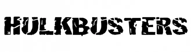
( Fonts by Daniel Zadorozny - www.iconian.com - Free for personal use )
A bold, distressed font with a rugged and industrial appearance.
![Hulkbusters Frei Schriftart Herunterladen]() Herunterladen 6356 Downloads@WebFont
Herunterladen 6356 Downloads@WebFont -
( Fonts by Rajesh Rajput - gumroad.com/rajputrajesh_448 - Personal-use only. For commercial use please contact owner. )
A bold, modern sans-serif font with a tall, condensed style.
![Morganite SemiBold Frei Schriftart Herunterladen]() Herunterladen 6354 Downloads@WebFont
Herunterladen 6354 Downloads@WebFont -
![NBA Pistons Frei Schriftart Herunterladen]() Herunterladen 6354 Downloads@WebFont
Herunterladen 6354 Downloads@WebFont -
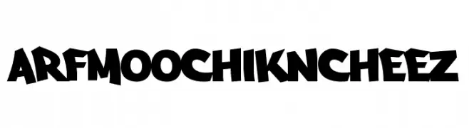
( Fonts by a Kosal Sen - www.philatype.com . Personal-use only. For commercial use please contact owner. )
A bold, playful font with exaggerated strokes and a cartoonish style.
![Arfmoochikncheez Frei Schriftart Herunterladen]() Herunterladen 6354 Downloads@WebFont
Herunterladen 6354 Downloads@WebFont -
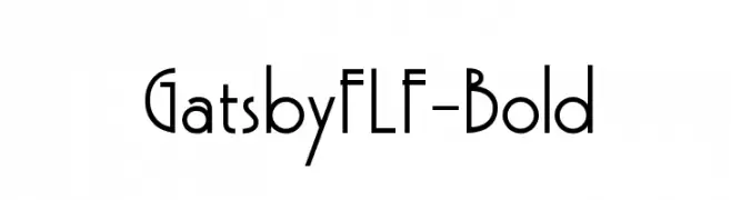
( Fonts by Casady & Greene )
A bold, Art Deco-inspired font with geometric shapes and clean lines.
![GatsbyFLF-Bold Frei Schriftart Herunterladen]() Herunterladen 6352 Downloads@WebFont
Herunterladen 6352 Downloads@WebFont -
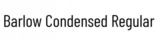
( Copyright 2017 The Barlow Project Authors (https://github.com/jpt/barlow) )
A modern, condensed sans-serif font with uniform stroke width and excellent readability.
![Barlow Condensed Regular Frei Schriftart Herunterladen]() Herunterladen 6348 Downloads@WebFont
Herunterladen 6348 Downloads@WebFont -
![surrounding__ regular Frei Schriftart Herunterladen]() Herunterladen 6345 Downloads@WebFont
Herunterladen 6345 Downloads@WebFont -
![tara Frei Schriftart Herunterladen]() Herunterladen 6343 Downloads@WebFont
Herunterladen 6343 Downloads@WebFont -
( Fonts by Nick Curtis - www.nicksfonts.com )
A bold, geometric font with a strong visual impact.
![AerojonesNF Frei Schriftart Herunterladen]() Herunterladen 6339 Downloads@WebFont
Herunterladen 6339 Downloads@WebFont -
![NCAA Wisconsin Badger Bold Frei Schriftart Herunterladen]() Herunterladen 6335 Downloads@WebFont
Herunterladen 6335 Downloads@WebFont -
( These fonts are free to use in any private, recreational manner.For commercial go to www.flopdesign.com/fordesign/font.html )
A modern, geometric font with a sleek and futuristic style.
![popstarregular Frei Schriftart Herunterladen]() Herunterladen 6335 Downloads@WebFont
Herunterladen 6335 Downloads@WebFont -
![Telefonica Regular Frei Schriftart Herunterladen]() Herunterladen 6335 Downloads@WebFont
Herunterladen 6335 Downloads@WebFont -
( Fonts by paperstreet )
A modern, clean sans-serif font with rounded edges and uniform strokes.
![Congratulations DEMO Frei Schriftart Herunterladen]() Herunterladen 6334 Downloads@WebFont
Herunterladen 6334 Downloads@WebFont -
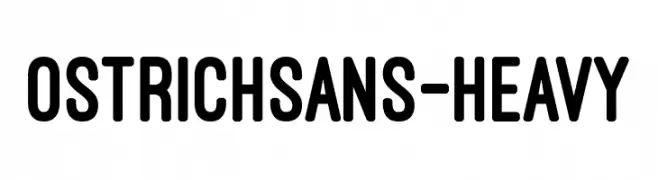
( Fonts by Tyler Finck. Personal-use only. For commercial use please contact owner. )
A bold, modern sans-serif font with a geometric and uniform structure.
![OstrichSans-Heavy Frei Schriftart Herunterladen]() Herunterladen 6331 Downloads@WebFont
Herunterladen 6331 Downloads@WebFont -
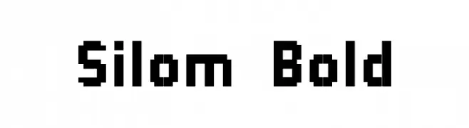
![Silom Bold Frei Schriftart Herunterladen]() Herunterladen 6331 Downloads@WebFont
Herunterladen 6331 Downloads@WebFont -
![HeadlineNEWS Frei Schriftart Herunterladen]() Herunterladen 6327 Downloads@WebFont
Herunterladen 6327 Downloads@WebFont -
( Fonts by Mike Lecky - www.superfunk.com )
A bold, geometric font with a strong, blocky design.
![Font Frei Schriftart Herunterladen]() Herunterladen 6326 Downloads@WebFont
Herunterladen 6326 Downloads@WebFont -
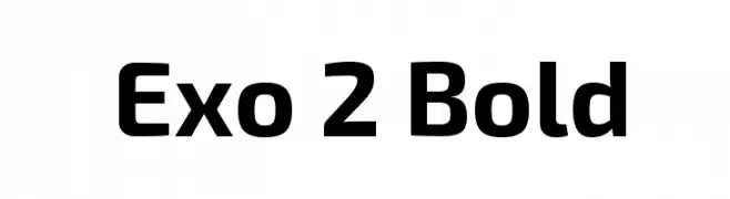
( Copyright (c) 2013, Natanael Gama (www.ndiscovered.com . info(at)ndiscovered.com), with Reserved Font Name 'Exo' )
A modern, bold font with a geometric and sleek design.
![Exo 2 Bold Frei Schriftart Herunterladen]() Herunterladen 6323 Downloads@WebFont
Herunterladen 6323 Downloads@WebFont -
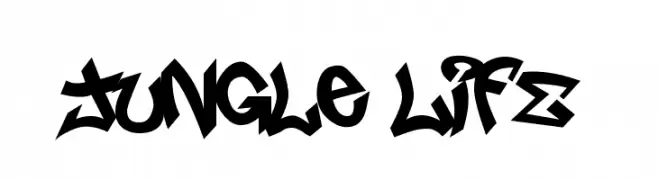
( Fonts by or from www.graffitifonts.net )
A bold, graffiti-inspired font with sharp angles and dynamic movement.
![Jungle LIFE Frei Schriftart Herunterladen]() Herunterladen 6320 Downloads@WebFont
Herunterladen 6320 Downloads@WebFont -
( Fonts by Darcy Baldwin {fontography} )
A digital, segmented font with a modern, tech-inspired style.
![DJB Get Digital Frei Schriftart Herunterladen]() Herunterladen 6319 Downloads@WebFont
Herunterladen 6319 Downloads@WebFont -
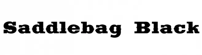
( Fonts by Dieter Steffmann )
A bold, vintage-style serif font with strong, block-like serifs.
![Saddlebag Black Frei Schriftart Herunterladen]() Herunterladen 6318 Downloads@WebFont
Herunterladen 6318 Downloads@WebFont -
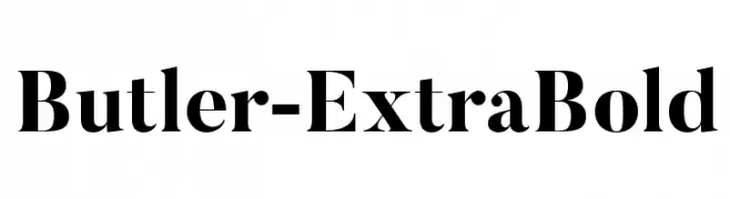
( Fonts by fabiandesmet.com )
A bold, modern serif font with a classic touch, perfect for elegant designs.
![Butler-ExtraBold Frei Schriftart Herunterladen]() Herunterladen 6317 Downloads@WebFont
Herunterladen 6317 Downloads@WebFont


Welche Schriften sind gerade am populärsten?
Poppins, Roboto, Montserrat, Open Sans und Lato sind wegen ihrer klaren Formen und breiten Einsetzbarkeit sehr gefragt – von Markenauftritt über Landingpages bis hin zu Postern.
Welche Fonts eignen sich für Logos?
Geometrische Sans‑Serifs (z. B. Poppins, Familien im Gotham‑Stil) sind ein häufiger Griff für sauberes, skalierbares Branding. Für eine persönlichere Note bleiben Scripts und Handschrift‑Stile beliebt. Kombinieren Sie einen prägnanten Headline‑Font mit einer neutralen Brotschrift für Wiedererkennung und Harmonie.
Wie oft wird die Top‑Liste aktualisiert?
Regelmäßig – basierend auf realen Downloads und Interaktionen. Schauen Sie öfter vorbei, um aufstrebende Favoriten früh zu entdecken.
💡 Tipp: Seite bookmarken – Trends wechseln schnell, und heutige Top‑Schriften inspirieren morgen vielleicht das Rebranding.