Willkommen bei den Top‑Schriften – hier treffen Beliebtheit und Qualität aufeinander. Das sind die in diesem Jahr am häufigsten heruntergeladenen und genutzten Fonts. Wenn Sie sichere Optionen für Logo, Web oder Social suchen, starten Sie hier.
Jeder Top‑Font überzeugt durch Balance, Lesbarkeit und Vielseitigkeit. Sie finden moderne Sans‑Serifs, elegante Scripts, Vintage‑Serifs und minimalistische Displays.
-
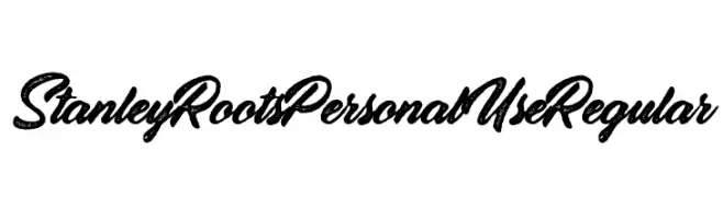
( Fonts by Billy Argel - Personal-use only. For commercial use please contact owner. )
A textured, cursive script font with a rustic and vintage appeal.
 Herunterladen 133 Downloads@WebFont
 -
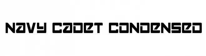
![Navy Cadet Condensed Frei Schriftart Herunterladen]() Herunterladen 133 Downloads@WebFont
Herunterladen 133 Downloads@WebFont -
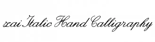
( Fonts by Tomasz Skowronski - Personal-use only. For commercial use please contact owner. )
A graceful, cursive script font with elegant, flowing lines.
![zai Italic Hand Calligraphy Frei Schriftart Herunterladen]() Herunterladen 133 Downloads@WebFont
Herunterladen 133 Downloads@WebFont -
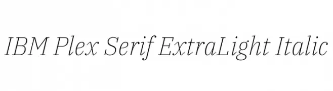
( Copyright © 2017 IBM Corp. with Reserved Font Name "Plex" )
An elegant, extra light italic serif font with a refined and sophisticated style.
![IBM Plex Serif ExtraLight Italic Frei Schriftart Herunterladen]() Herunterladen 133 Downloads@WebFont
Herunterladen 133 Downloads@WebFont -
( Rahmat Hidayat )
A decorative cursive font with elegant loops and flourishes.
![Magdalen Free Frei Schriftart Herunterladen]() Herunterladen 133 Downloads@WebFont
Herunterladen 133 Downloads@WebFont -
-
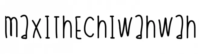
( Fonts by a Des Gomez. Personal-use only. For commercial use please contact owner. )
A playful, handwritten font with a casual and friendly style.
![MaxiTheChiwahwah Frei Schriftart Herunterladen]() Herunterladen 133 Downloads@WebFont
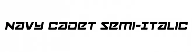
Herunterladen 133 Downloads@WebFont -
![Navy Cadet Semi-Italic Frei Schriftart Herunterladen]() Herunterladen 133 Downloads@WebFont
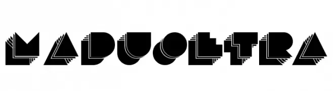
Herunterladen 133 Downloads@WebFont -
![maduoETRA Frei Schriftart Herunterladen]() Herunterladen 133 Downloads@WebFont
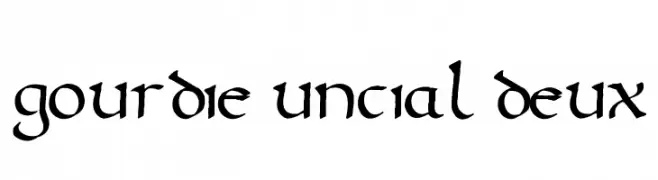
Herunterladen 133 Downloads@WebFont -
( Mouser Fonts - www.mouserfonts.com/ )
A medieval-inspired font with rounded, flowing letterforms and a calligraphic style.
![Gourdie Uncial Deux Frei Schriftart Herunterladen]() Herunterladen 133 Downloads@WebFont
Herunterladen 133 Downloads@WebFont -
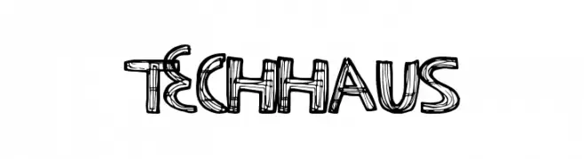
( Fonts by a Max Infeld - XEROGRAPHER FONTS - xerographer.blogspot.com . Personal-use only. For commercial use please contact owner. )
A sketch-like, hand-drawn font with bold outlines and a playful style.
![TechHaus Frei Schriftart Herunterladen]() Herunterladen 133 Downloads@WebFont
Herunterladen 133 Downloads@WebFont

Welche Schriften sind gerade am populärsten?
Poppins, Roboto, Montserrat, Open Sans und Lato sind wegen ihrer klaren Formen und breiten Einsetzbarkeit sehr gefragt – von Markenauftritt über Landingpages bis hin zu Postern.
Welche Fonts eignen sich für Logos?
Geometrische Sans‑Serifs (z. B. Poppins, Familien im Gotham‑Stil) sind ein häufiger Griff für sauberes, skalierbares Branding. Für eine persönlichere Note bleiben Scripts und Handschrift‑Stile beliebt. Kombinieren Sie einen prägnanten Headline‑Font mit einer neutralen Brotschrift für Wiedererkennung und Harmonie.
Wie oft wird die Top‑Liste aktualisiert?
Regelmäßig – basierend auf realen Downloads und Interaktionen. Schauen Sie öfter vorbei, um aufstrebende Favoriten früh zu entdecken.
💡 Tipp: Seite bookmarken – Trends wechseln schnell, und heutige Top‑Schriften inspirieren morgen vielleicht das Rebranding.