Willkommen bei den Top‑Schriften – hier treffen Beliebtheit und Qualität aufeinander. Das sind die in diesem Jahr am häufigsten heruntergeladenen und genutzten Fonts. Wenn Sie sichere Optionen für Logo, Web oder Social suchen, starten Sie hier.
Jeder Top‑Font überzeugt durch Balance, Lesbarkeit und Vielseitigkeit. Sie finden moderne Sans‑Serifs, elegante Scripts, Vintage‑Serifs und minimalistische Displays.
-
( Fonts by a Neale Davidson - www.pixelsagas.com. Personal-use only. For commercial use please contact owner. )
A bold, futuristic font with geometric shapes and a sci-fi aesthetic.
 Herunterladen 610 Downloads@WebFont
 -
( Fonts by Daniel Zadorozny - www.iconian.com )
A bold, expanded italic font with a modern, dynamic style.
![Ghost Clan Expanded Italic Frei Schriftart Herunterladen]() Herunterladen 610 Downloads@WebFont
Herunterladen 610 Downloads@WebFont -
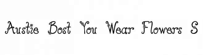
( Free for personal use - austiebost.net )
A whimsical, flower-embellished decorative font with a playful, hand-drawn style.
![Austie Bost You Wear Flowers S Frei Schriftart Herunterladen]() Herunterladen 609 Downloads@WebFont
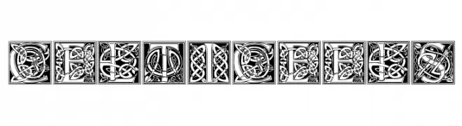
Herunterladen 609 Downloads@WebFont -
![CelticEels Frei Schriftart Herunterladen]() Herunterladen 609 Downloads@WebFont
Herunterladen 609 Downloads@WebFont -
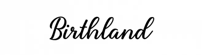
( Fonts by Hendra Pratama - HPTypework - https://hptypework.com - Personal-use only. For commercial use please contact owner. )
A graceful cursive font with elegant, sweeping strokes and decorative flourishes.
![Birthland Frei Schriftart Herunterladen]() Herunterladen 609 Downloads@WebFont
Herunterladen 609 Downloads@WebFont -
-
( Fonts by www.gliphmaker.com. Personal-use only. For commercial use please contact owner. )
A bold, decorative font with playful curves and sharp edges.
![Cordeballet Frei Schriftart Herunterladen]() Herunterladen 609 Downloads@WebFont
Herunterladen 609 Downloads@WebFont -
![CgZeppelin Frei Schriftart Herunterladen]() Herunterladen 609 Downloads@WebFont
Herunterladen 609 Downloads@WebFont -
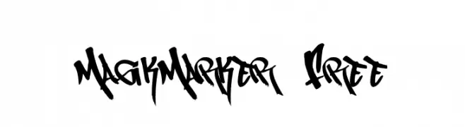
( Fonts by or from www.graffitifonts.net )
A bold, graffiti-inspired font with dynamic strokes and sharp angles.
![MagikMarker_Free Frei Schriftart Herunterladen]() Herunterladen 609 Downloads@WebFont
Herunterladen 609 Downloads@WebFont -
( Fonts by Rochadi Sudarma [Rochart Studio] - Personal-use only. For commercial use please contact owner. )
A bold, dynamic script font with flowing cursive letterforms.
![Lattetude Frei Schriftart Herunterladen]() Herunterladen 609 Downloads@WebFont
Herunterladen 609 Downloads@WebFont -
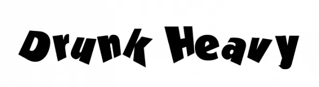
( Lollibomb - www.lollibomb.com/ )
A playful and whimsical font with bold, irregular letterforms.
![Drunk Heavy Frei Schriftart Herunterladen]() Herunterladen 609 Downloads@WebFont
Herunterladen 609 Downloads@WebFont -
( Fonts by KLoNk - Philippe Dallaire )
A bold, textured font with a playful, distressed design.
![Happy Customer Frei Schriftart Herunterladen]() Herunterladen 609 Downloads@WebFont
Herunterladen 609 Downloads@WebFont -
![KR Cuori Divertenti 2 Frei Schriftart Herunterladen]() Herunterladen 609 Downloads@WebFont
Herunterladen 609 Downloads@WebFont -
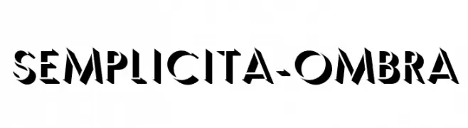
( Fonts by Flanker - Personal-use only. For commercial use please contact owner. )
A bold, geometric font with a unique shadow effect for a three-dimensional look.
![Semplicita-Ombra Frei Schriftart Herunterladen]() Herunterladen 609 Downloads@WebFont
Herunterladen 609 Downloads@WebFont -
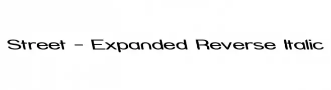
( Fonts by Apostrophic Lab )
A modern, expanded font with a reverse italic slant and bold, rounded characters.
![Street - Expanded Reverse Italic Frei Schriftart Herunterladen]() Herunterladen 609 Downloads@WebFont
Herunterladen 609 Downloads@WebFont -
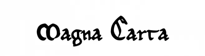
![Magna Carta Frei Schriftart Herunterladen]() Herunterladen 609 Downloads@WebFont
Herunterladen 609 Downloads@WebFont -
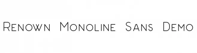
( Fonts by Dan Steinbok - Out Of Step Font Company - outofstepfontco.com - Personal-use only. For commercial use please contact owner. )
A clean, monolinear sans-serif font with a modern, geometric style.
![Renown Monoline Sans Demo Frei Schriftart Herunterladen]() Herunterladen 609 Downloads@WebFont
Herunterladen 609 Downloads@WebFont -
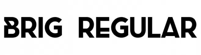
( Fonts by Filipe Rolim - Personal-use only. For commercial use please contact owner. )
A bold, geometric font with modern, assertive letterforms.
![Brig Regular Frei Schriftart Herunterladen]() Herunterladen 609 Downloads@WebFont
Herunterladen 609 Downloads@WebFont -
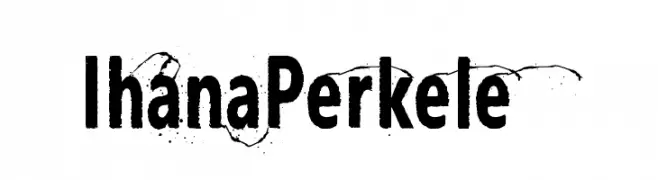
( Fonts by junkohanhero )
A bold, textured font with a vintage, rugged appearance.
![Ihana Perkele Frei Schriftart Herunterladen]() Herunterladen 609 Downloads@WebFont
Herunterladen 609 Downloads@WebFont -
( Fonts by Skyhaven Fonts - Personal-use only. For commercial use please contact owner. )
A bold, wide sans-serif font with a modern and clean design.
![WhirlyBirdie-WideBold Frei Schriftart Herunterladen]() Herunterladen 609 Downloads@WebFont
Herunterladen 609 Downloads@WebFont -
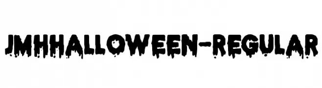
( Joorgemoron@gmail.com )
A spooky, dripping font perfect for Halloween themes.
![JMHHALLOWEEN-Regular Frei Schriftart Herunterladen]() Herunterladen 609 Downloads@WebFont
Herunterladen 609 Downloads@WebFont -
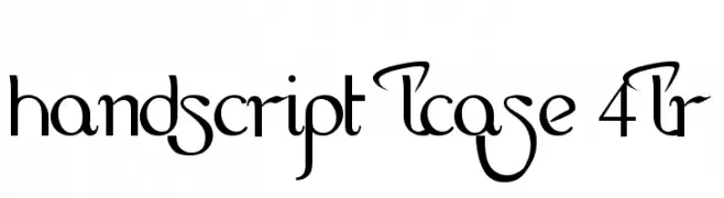
![HandScript LCase 4LR Frei Schriftart Herunterladen]() Herunterladen 609 Downloads@WebFont
Herunterladen 609 Downloads@WebFont -
( Fonts by Jonathan S. Harris - www.tattoowoo.com. Personal-use only. For commercial use please contact owner. )
An ornate and flowing script font with intricate flourishes.
![Always Beside You Frei Schriftart Herunterladen]() Herunterladen 609 Downloads@WebFont
Herunterladen 609 Downloads@WebFont -
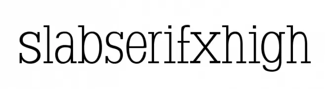
( Fonts by Manfred Klein. Free for private and charity use. Free for commercial with donation to organizations )
A classic slab serif font with strong, rectangular serifs and consistent stroke width.
![SlabserifXhigh Frei Schriftart Herunterladen]() Herunterladen 609 Downloads@WebFont
Herunterladen 609 Downloads@WebFont -
![Evolved Frei Schriftart Herunterladen]() Herunterladen 609 Downloads@WebFont
Herunterladen 609 Downloads@WebFont -
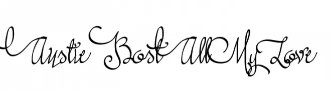
( austiebost.net )
A whimsical and elegant script font with flowing, interconnected letterforms.
![Austie Bost All My Love Frei Schriftart Herunterladen]() Herunterladen 609 Downloads@WebFont
Herunterladen 609 Downloads@WebFont -
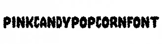
( Fonts by Daniel Gauthier )
A playful, bold font with a bubbly, cloud-like appearance.
![PinkCandyPopcornFont Frei Schriftart Herunterladen]() Herunterladen 609 Downloads@WebFont
Herunterladen 609 Downloads@WebFont -
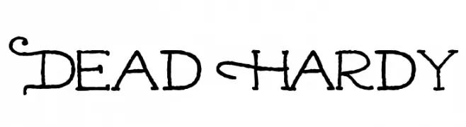
( Fonts by Andrew Hart - dirt2.com )
A playful and decorative font with quirky, spooky elements.
![Dead Hardy Frei Schriftart Herunterladen]() Herunterladen 609 Downloads@WebFont
Herunterladen 609 Downloads@WebFont -
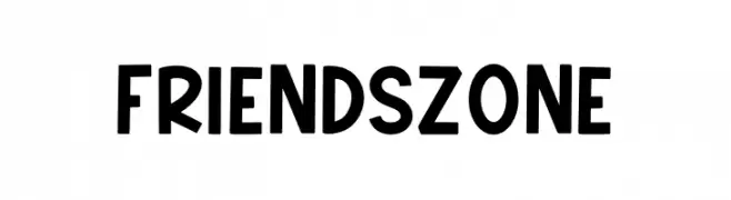
( Fonts by Mozatype )
A playful and bold font with thick, uniform strokes and rounded edges.
![Friendszone Frei Schriftart Herunterladen]() Herunterladen 609 Downloads@WebFont
Herunterladen 609 Downloads@WebFont -
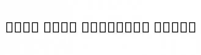
( Noto is a trademark of Google Inc. Noto fonts are open source. All Noto fonts are published under the SIL Open Font License, Version 1.1 )
A clean, modern font with consistent stroke widths and balanced spacing.
![Noto Sans Ethiopic Light Frei Schriftart Herunterladen]() Herunterladen 609 Downloads@WebFont
Herunterladen 609 Downloads@WebFont -
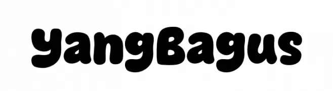
( Fonts by Khurasan )
A playful, bold font with rounded, bubbly characters.
![Yang Bagus Frei Schriftart Herunterladen]() Herunterladen 609 Downloads@WebFont
Herunterladen 609 Downloads@WebFont -
( Fonts by www.houseoflime.com Sponsoren Schriftart )
A whimsical serif font with playful illustrations on each uppercase letter.
![Kids Alphabet Frei Schriftart Herunterladen]() Herunterladen 609 Downloads
Herunterladen 609 Downloads -
![Keetano Gaijin Frei Schriftart Herunterladen]() Herunterladen 609 Downloads@WebFont
Herunterladen 609 Downloads@WebFont -
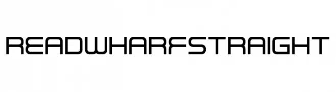
( Fonts by www.chequered.ink - Chequered Ink - Personal-use only. For commercial use please contact owner. )
A modern, geometric font with clean lines and rounded edges.
![Read Wharf Straight Frei Schriftart Herunterladen]() Herunterladen 609 Downloads@WebFont
Herunterladen 609 Downloads@WebFont -
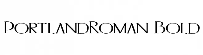
( Paul Lloyd Fonts )
A bold, elegant serif font with a modern twist and sharp, clean lines.
![PortlandRoman Bold Frei Schriftart Herunterladen]() Herunterladen 609 Downloads@WebFont
Herunterladen 609 Downloads@WebFont -
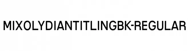
( Typodermic Fonts - Ray Larabie - www.typodermicfonts.com/ )
A bold, modern sans-serif typeface with uniform strokes and excellent readability.
![MixolydianTitlingBk-Regular Frei Schriftart Herunterladen]() Herunterladen 609 Downloads@WebFont
Herunterladen 609 Downloads@WebFont


Welche Schriften sind gerade am populärsten?
Poppins, Roboto, Montserrat, Open Sans und Lato sind wegen ihrer klaren Formen und breiten Einsetzbarkeit sehr gefragt – von Markenauftritt über Landingpages bis hin zu Postern.
Welche Fonts eignen sich für Logos?
Geometrische Sans‑Serifs (z. B. Poppins, Familien im Gotham‑Stil) sind ein häufiger Griff für sauberes, skalierbares Branding. Für eine persönlichere Note bleiben Scripts und Handschrift‑Stile beliebt. Kombinieren Sie einen prägnanten Headline‑Font mit einer neutralen Brotschrift für Wiedererkennung und Harmonie.
Wie oft wird die Top‑Liste aktualisiert?
Regelmäßig – basierend auf realen Downloads und Interaktionen. Schauen Sie öfter vorbei, um aufstrebende Favoriten früh zu entdecken.
💡 Tipp: Seite bookmarken – Trends wechseln schnell, und heutige Top‑Schriften inspirieren morgen vielleicht das Rebranding.