Willkommen bei den Top‑Schriften – hier treffen Beliebtheit und Qualität aufeinander. Das sind die in diesem Jahr am häufigsten heruntergeladenen und genutzten Fonts. Wenn Sie sichere Optionen für Logo, Web oder Social suchen, starten Sie hier.
Jeder Top‑Font überzeugt durch Balance, Lesbarkeit und Vielseitigkeit. Sie finden moderne Sans‑Serifs, elegante Scripts, Vintage‑Serifs und minimalistische Displays.
-
 Herunterladen 623 Downloads@WebFont
 -
![ER Bukinist 1251 Bold Italic Frei Schriftart Herunterladen]() Herunterladen 622 Downloads@WebFont
Herunterladen 622 Downloads@WebFont -
![I have been waiting for youRegular Frei Schriftart Herunterladen]() Herunterladen 622 Downloads@WebFont
Herunterladen 622 Downloads@WebFont -
( Robin Campistron - www.rcgraphics.fr )
A modern, geometric sans-serif font with a clean and minimalist design.
![StandarisRegular Frei Schriftart Herunterladen]() Herunterladen 622 Downloads@WebFont
Herunterladen 622 Downloads@WebFont -
![Dome Circle Frei Schriftart Herunterladen]() Herunterladen 622 Downloads@WebFont
Herunterladen 622 Downloads@WebFont -
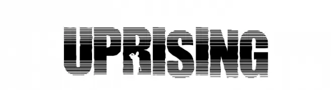
![Uprising Frei Schriftart Herunterladen]() Herunterladen 622 Downloads@WebFont
Herunterladen 622 Downloads@WebFont -
( Fonts by Situjuh Nazara - 7ntypes.com - Personal-use only. For commercial use please contact owner. )
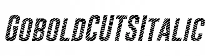
A bold, italicized font with diagonal cuts for a dynamic, edgy look.
![Gobold CUTS Italic Frei Schriftart Herunterladen]() Herunterladen 622 Downloads@WebFont
Herunterladen 622 Downloads@WebFont -
![Braeside Lumberboy Frei Schriftart Herunterladen]() Herunterladen 622 Downloads@WebFont
Herunterladen 622 Downloads@WebFont -
( Fonts by Type Design - Muhammad Zaini - Personal-use only. For commercial use please contact owner. )
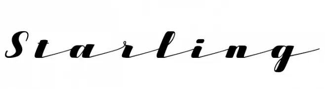
A stylish and elegant script font with flowing, cursive letterforms.
![Starling Frei Schriftart Herunterladen]() Herunterladen 622 Downloads@WebFont
Herunterladen 622 Downloads@WebFont -
( Fonts by MadeType - Personal-use only. For commercial use please contact owner. )
A bold, outlined sans-serif font with a modern and geometric style.
![MADEOuterSansOutline-Bold Frei Schriftart Herunterladen]() Herunterladen 622 Downloads@WebFont
Herunterladen 622 Downloads@WebFont -
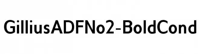
( Fonts by Arkandis Digital Foundry )
A bold, condensed sans-serif font with a modern and clean appearance.
![GilliusADFNo2-BoldCond Frei Schriftart Herunterladen]() Herunterladen 622 Downloads@WebFont
Herunterladen 622 Downloads@WebFont -
( Fonts by Blue Vinyl - Jess Latham - www.bvfonts.com )
A playful dashed cursive font ideal for handwriting education.
![LearningCurveDashedPro Frei Schriftart Herunterladen]() Herunterladen 622 Downloads@WebFont
Herunterladen 622 Downloads@WebFont -
![ChalkMarks-Bold Frei Schriftart Herunterladen]() Herunterladen 622 Downloads@WebFont
Herunterladen 622 Downloads@WebFont -
![Bruesh Frei Schriftart Herunterladen]() Herunterladen 622 Downloads@WebFont
Herunterladen 622 Downloads@WebFont -
( Fonts by Mooniak - Personal-use only. For commercial use please contact owner. )
A bold, clean sans-serif font with strong geometric shapes and uniform strokes.
![YaldeviJaffna Bold Frei Schriftart Herunterladen]() Herunterladen 622 Downloads@WebFont
Herunterladen 622 Downloads@WebFont -
( Fonts by Andre Berg. Personal-use only. For commercial use please contact owner. )
A clean, modern monospaced font ideal for coding and technical documentation.
![Meslo LG S DZ Regular Frei Schriftart Herunterladen]() Herunterladen 622 Downloads@WebFont
Herunterladen 622 Downloads@WebFont -
( Fonts by Nomo Studio - bybu.es - Personal-use only. For commercial use please contact owner. )
A tall, narrow, and modern geometric font with a sleek design.
![FacundaAlternate Frei Schriftart Herunterladen]() Herunterladen 622 Downloads@WebFont
Herunterladen 622 Downloads@WebFont -
![Chi Frei Schriftart Herunterladen]() Herunterladen 622 Downloads@WebFont
Herunterladen 622 Downloads@WebFont -
( Fonts by Kreative Korporation - www.kreativekorp.com )
A bold, modern typeface with clean lines and strong presence.
![Pfennig Bold Frei Schriftart Herunterladen]() Herunterladen 622 Downloads@WebFont
Herunterladen 622 Downloads@WebFont -
( Fonts by www.kimberlygeswein.com - Kimberly Geswein )
A whimsical, swirly font with playful and ornate characters.
![Janda Swirlygirl Frei Schriftart Herunterladen]() Herunterladen 622 Downloads@WebFont
Herunterladen 622 Downloads@WebFont -
![Epsy Sans Italic Frei Schriftart Herunterladen]() Herunterladen 622 Downloads@WebFont
Herunterladen 622 Downloads@WebFont -
( Fonts by Graham Meade - GemFonts )
A playful, bold outline font with a three-dimensional appearance.
![Zapped Sticks Frei Schriftart Herunterladen]() Herunterladen 622 Downloads@WebFont
Herunterladen 622 Downloads@WebFont -
![UmberSSK Frei Schriftart Herunterladen]() Herunterladen 622 Downloads@WebFont
Herunterladen 622 Downloads@WebFont -
![Double Strike Frei Schriftart Herunterladen]() Herunterladen 622 Downloads@WebFont
Herunterladen 622 Downloads@WebFont -
( Copyright 2018 The Solway Project Authors (https://github.com/googlefonts/solway) )
A modern serif font with balanced proportions and subtle elegance.
![Solway Regular Frei Schriftart Herunterladen]() Herunterladen 622 Downloads@WebFont
Herunterladen 622 Downloads@WebFont -
( Fonts by Andrew McCluskey - nalgames.com )
A tall, narrow, and modern geometric font with a sleek design.
![See You At The Movies Regular Frei Schriftart Herunterladen]() Herunterladen 622 Downloads@WebFont
Herunterladen 622 Downloads@WebFont -
![Antilles Expanded Italic Frei Schriftart Herunterladen]() Herunterladen 622 Downloads@WebFont
Herunterladen 622 Downloads@WebFont -
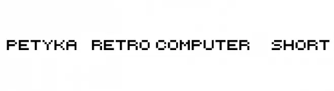
![Petyka - Retro Computer___SHORT Frei Schriftart Herunterladen]() Herunterladen 622 Downloads@WebFont
Herunterladen 622 Downloads@WebFont -
( Fonts by weknow - Wino S Kadir )
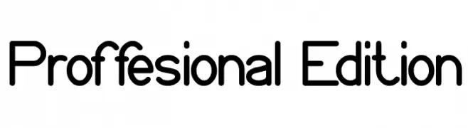
A modern sans-serif font with rounded edges and balanced spacing.
![Proffesional Edition Frei Schriftart Herunterladen]() Herunterladen 622 Downloads@WebFont
Herunterladen 622 Downloads@WebFont -
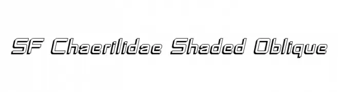
![SF Chaerilidae Shaded Oblique Frei Schriftart Herunterladen]() Herunterladen 622 Downloads@WebFont
Herunterladen 622 Downloads@WebFont -
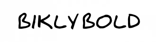
![Bikly Bold Frei Schriftart Herunterladen]() Herunterladen 622 Downloads@WebFont
Herunterladen 622 Downloads@WebFont -
( Fonts by Pria Ravichandran )
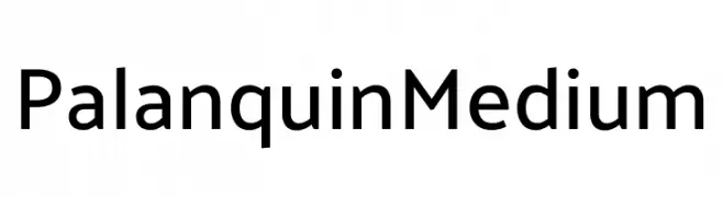
A clean, modern sans-serif font with consistent stroke width and excellent readability.
![Palanquin Medium Frei Schriftart Herunterladen]() Herunterladen 622 Downloads@WebFont
Herunterladen 622 Downloads@WebFont -
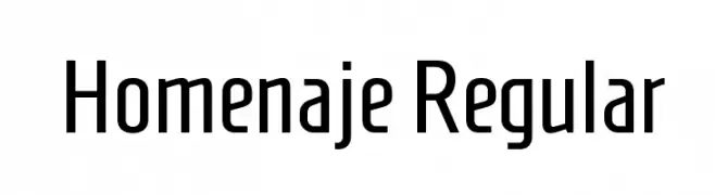
( Copyright 2016 The Homenaje Project Authors (https://github.com/googlefonts/Homenaje), with Reserved Font Name 'Homenaje’. )
A modern, geometric sans-serif font with clean lines and balanced proportions.
![Homenaje Regular Frei Schriftart Herunterladen]() Herunterladen 622 Downloads@WebFont
Herunterladen 622 Downloads@WebFont -
![Dwarves Frei Schriftart Herunterladen]() Herunterladen 622 Downloads@WebFont
Herunterladen 622 Downloads@WebFont -
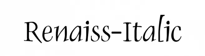
( Fonts by Manfred Klein - manfred-klein.ina-mar.com )
An elegant italic font with medium contrast and classic styling.
![Renaiss-Italic Frei Schriftart Herunterladen]() Herunterladen 622 Downloads@WebFont
Herunterladen 622 Downloads@WebFont


Welche Schriften sind gerade am populärsten?
Poppins, Roboto, Montserrat, Open Sans und Lato sind wegen ihrer klaren Formen und breiten Einsetzbarkeit sehr gefragt – von Markenauftritt über Landingpages bis hin zu Postern.
Welche Fonts eignen sich für Logos?
Geometrische Sans‑Serifs (z. B. Poppins, Familien im Gotham‑Stil) sind ein häufiger Griff für sauberes, skalierbares Branding. Für eine persönlichere Note bleiben Scripts und Handschrift‑Stile beliebt. Kombinieren Sie einen prägnanten Headline‑Font mit einer neutralen Brotschrift für Wiedererkennung und Harmonie.
Wie oft wird die Top‑Liste aktualisiert?
Regelmäßig – basierend auf realen Downloads und Interaktionen. Schauen Sie öfter vorbei, um aufstrebende Favoriten früh zu entdecken.
💡 Tipp: Seite bookmarken – Trends wechseln schnell, und heutige Top‑Schriften inspirieren morgen vielleicht das Rebranding.