Willkommen bei den Top‑Schriften – hier treffen Beliebtheit und Qualität aufeinander. Das sind die in diesem Jahr am häufigsten heruntergeladenen und genutzten Fonts. Wenn Sie sichere Optionen für Logo, Web oder Social suchen, starten Sie hier.
Jeder Top‑Font überzeugt durch Balance, Lesbarkeit und Vielseitigkeit. Sie finden moderne Sans‑Serifs, elegante Scripts, Vintage‑Serifs und minimalistische Displays.
-
( Fonts by www.peter-wiegel.de - Personal-use only. For commercial use please contact owner. )
A bold, hand-drawn font with a textured, sketch-like appearance.
 Herunterladen 617 Downloads@WebFont
 -
( Fonts by Kong Font )
A bold, playful handwritten font with rounded strokes and a lively appearance.
![Milkids Frei Schriftart Herunterladen]() Herunterladen 617 Downloads@WebFont
Herunterladen 617 Downloads@WebFont -
( Fonts by www.houseoflime.com )
A bold, decorative font with a starry texture, perfect for creative projects.
![Stars Frei Schriftart Herunterladen]() Herunterladen 617 Downloads@WebFont
Herunterladen 617 Downloads@WebFont -
![Antilles Frei Schriftart Herunterladen]() Herunterladen 617 Downloads@WebFont
Herunterladen 617 Downloads@WebFont -
( Fonts by Calligraphy Fonts )
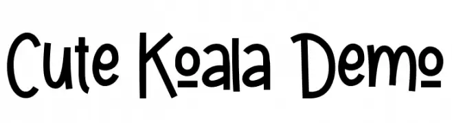
A playful, hand-drawn font with bold strokes and a whimsical style.
![Cute Koala Demo Frei Schriftart Herunterladen]() Herunterladen 617 Downloads@WebFont
Herunterladen 617 Downloads@WebFont -
( Fonts by onne - Personal-use only. For commercial use please contact owner. )
A flowing, cursive font with elegant, connected letters and consistent stroke width.
![Scripterialism Frei Schriftart Herunterladen]() Herunterladen 617 Downloads@WebFont
Herunterladen 617 Downloads@WebFont -
( Fonts by Galdino Otten - galdinootten.com )
A playful, hand-drawn font with a 3D sketch effect.
![False 3D Frei Schriftart Herunterladen]() Herunterladen 617 Downloads@WebFont
Herunterladen 617 Downloads@WebFont -
( Fonts by Iconian Fonts )
A playful, 3D cartoon-style font with bold outlines and rounded characters.
![98 Bottles of Beer 3D Frei Schriftart Herunterladen]() Herunterladen 617 Downloads@WebFont
Herunterladen 617 Downloads@WebFont -
( Fonts by Ana )
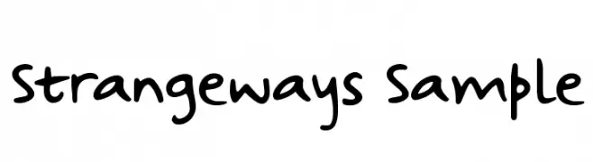
A playful, handwritten font with rounded, irregular letterforms.
![Strangeways Sample Frei Schriftart Herunterladen]() Herunterladen 617 Downloads@WebFont
Herunterladen 617 Downloads@WebFont -
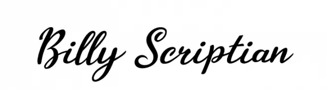
![Billy Scriptian Frei Schriftart Herunterladen]() Herunterladen 617 Downloads@WebFont
Herunterladen 617 Downloads@WebFont -
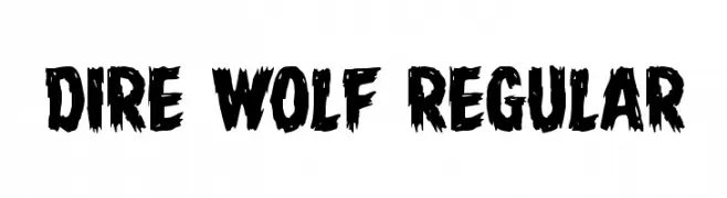
( Fonts by Daniel Zadorozny - www.iconian.com )
A bold, distressed font with jagged, claw-like edges.
![Dire Wolf Regular Frei Schriftart Herunterladen]() Herunterladen 617 Downloads@WebFont
Herunterladen 617 Downloads@WebFont -
( Fonts by Julieta Ulanovsky (font) & Cristiano Sobral (main changes) - Personal-use only. For commercial use please contact owner. )
A bold and italic font with a modern, dynamic style.
![Argentum Novus Bold Italic Frei Schriftart Herunterladen]() Herunterladen 617 Downloads@WebFont
Herunterladen 617 Downloads@WebFont -
![DKInsomniac Frei Schriftart Herunterladen]() Herunterladen 617 Downloads@WebFont
Herunterladen 617 Downloads@WebFont -
( Fonts by Docallisme HAS )
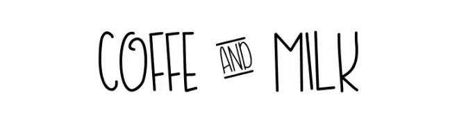
A playful, hand-drawn font with tall, narrow letters and a whimsical style.
![COFFE & MILK Frei Schriftart Herunterladen]() Herunterladen 617 Downloads@WebFont
Herunterladen 617 Downloads@WebFont -
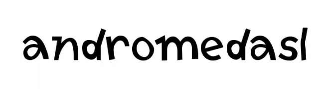
![AndromedaSL Frei Schriftart Herunterladen]() Herunterladen 617 Downloads@WebFont
Herunterladen 617 Downloads@WebFont -
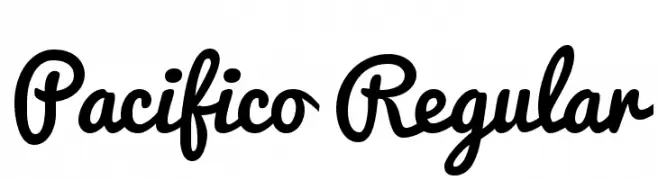
( Fonts by New Typography - Vernon Adams. Personal-use only. For commercial use please contact owner. )
A playful, handwritten script font with smooth, interconnected characters.
![Pacifico Regular Frei Schriftart Herunterladen]() Herunterladen 617 Downloads@WebFont
Herunterladen 617 Downloads@WebFont -
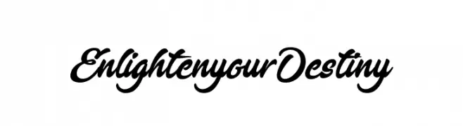
( Fonts by Octotype - www.foundmyfont.com - Personal-use only. For commercial use please contact owner. )
A bold, elegant script font with flowing curves and ornate flourishes.
![EnlightenyourDestiny Frei Schriftart Herunterladen]() Herunterladen 617 Downloads@WebFont
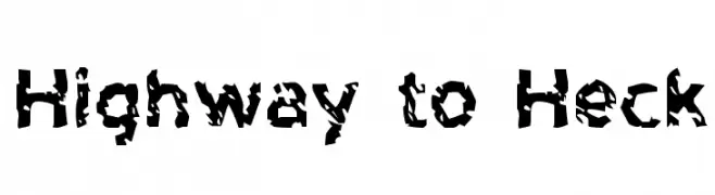
Herunterladen 617 Downloads@WebFont -
![Highway to Heck Frei Schriftart Herunterladen]() Herunterladen 616 Downloads@WebFont
Herunterladen 616 Downloads@WebFont -
( Billy Argel - billyargel.com/ )
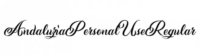
An elegant and flowing script font with intricate, decorative letterforms.
![Andaluzia Personal Use Regular Frei Schriftart Herunterladen]() Herunterladen 616 Downloads@WebFont
Herunterladen 616 Downloads@WebFont -
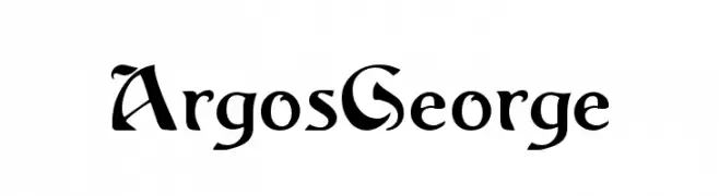
( Fonts by Dieter Steffmann )
A bold, Gothic-inspired font with sharp serifs and dramatic flair.
![ArgosGeorge Frei Schriftart Herunterladen]() Herunterladen 616 Downloads@WebFont
Herunterladen 616 Downloads@WebFont -
( Linux Libertine - www.linuxlibertine.org )
A classic serif font with a slight slant, offering elegance and readability.
![Linux Libertine Slanted Frei Schriftart Herunterladen]() Herunterladen 616 Downloads@WebFont
Herunterladen 616 Downloads@WebFont -
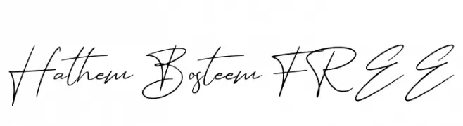
( Fonts by Abas Creative - Farhan Ramadhika - Personal-use only. For commercial use please contact owner. )
A fluid and elegant cursive script font with a handwritten style.
![Hathem Bosteem FREE Frei Schriftart Herunterladen]() Herunterladen 616 Downloads@WebFont
Herunterladen 616 Downloads@WebFont -
![Forty-SecondStreet Frei Schriftart Herunterladen]() Herunterladen 616 Downloads
Herunterladen 616 Downloads -
( Fonts by Supersemar Letter )
A playful, handwritten font with a lively and informal style.
![Kiddos Planet Frei Schriftart Herunterladen]() Herunterladen 616 Downloads@WebFont
Herunterladen 616 Downloads@WebFont -
( www.woodcutter.es )
A bold, festive font displayed on triangular pennants, ideal for celebrations.
![[Viva La Fiesta] Frei Schriftart Herunterladen]() Herunterladen 616 Downloads@WebFont
Herunterladen 616 Downloads@WebFont -
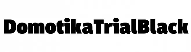
( Zetafonts - www.zetafonts.com )
A bold, modern font with thick, uniform strokes and a geometric influence.
![Domotika Trial Black Frei Schriftart Herunterladen]() Herunterladen 616 Downloads@WebFont
Herunterladen 616 Downloads@WebFont -
![MaqueenSans Frei Schriftart Herunterladen]() Herunterladen 616 Downloads@WebFont
Herunterladen 616 Downloads@WebFont -
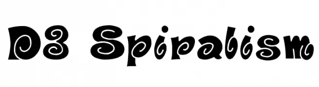
( Fonts by www.DigitalDreamDesign.net )
A bold, playful font with spiral motifs and a whimsical style.
![D3 Spiralism Frei Schriftart Herunterladen]() Herunterladen 616 Downloads@WebFont
Herunterladen 616 Downloads@WebFont -
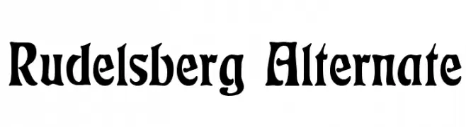
( Fonts by Dieter Steffmann )
A bold, distinctive font with a blend of traditional and modern elements.
![Rudelsberg Alternate Frei Schriftart Herunterladen]() Herunterladen 616 Downloads@WebFont
Herunterladen 616 Downloads@WebFont -
( Copyright (c) 2014-2015, Sorkin Type Co (sorkintype.com | sorkintype@gmail.com). )
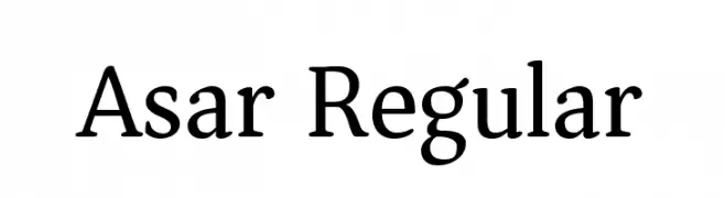
A classic serif typeface with elegant strokes and balanced proportions.
![Asar Regular Frei Schriftart Herunterladen]() Herunterladen 616 Downloads@WebFont
Herunterladen 616 Downloads@WebFont -
( graphicriver.net/user/joiaco )
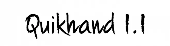
A casual, handwritten font with a dynamic and energetic style.
![Quikhand 1.1 Frei Schriftart Herunterladen]() Herunterladen 616 Downloads@WebFont
Herunterladen 616 Downloads@WebFont -
( Demo font. To purchase the full version, you can order it online at www.schoolhousefonts.com )
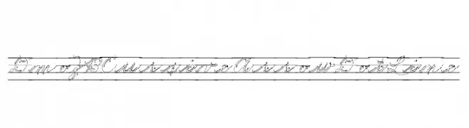
Cursive educational font with dotted lines and directional guides.
![DmoZBCursiveArrowDotLine Frei Schriftart Herunterladen]() Herunterladen 616 Downloads@WebFont
Herunterladen 616 Downloads@WebFont -
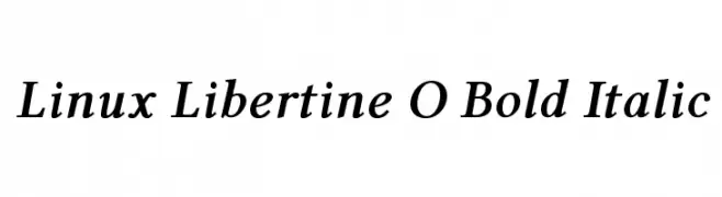
![Linux Libertine O Bold Italic Frei Schriftart Herunterladen]() Herunterladen 616 Downloads@WebFont
Herunterladen 616 Downloads@WebFont -
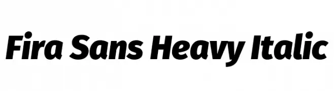
( Fonts by Mozilla Foundation - Personal-use only. For commercial use please contact owner. )
A bold, italic sans-serif font with a dynamic and modern style.
![Fira Sans Heavy Italic Frei Schriftart Herunterladen]() Herunterladen 616 Downloads@WebFont
Herunterladen 616 Downloads@WebFont -
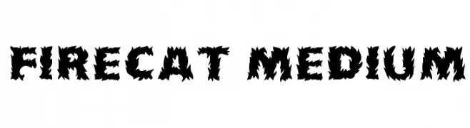
( Fonts by David Rakowski )
A bold, flame-inspired font with jagged edges and strong visual impact.
![Firecat Medium Frei Schriftart Herunterladen]() Herunterladen 616 Downloads
Herunterladen 616 Downloads


![[Viva La Fiesta] Frei Schriftart Herunterladen](https://d144mzi0q5mijx.cloudfront.net/img/0/V/Viva-La-Fiesta.webp)

Welche Schriften sind gerade am populärsten?
Poppins, Roboto, Montserrat, Open Sans und Lato sind wegen ihrer klaren Formen und breiten Einsetzbarkeit sehr gefragt – von Markenauftritt über Landingpages bis hin zu Postern.
Welche Fonts eignen sich für Logos?
Geometrische Sans‑Serifs (z. B. Poppins, Familien im Gotham‑Stil) sind ein häufiger Griff für sauberes, skalierbares Branding. Für eine persönlichere Note bleiben Scripts und Handschrift‑Stile beliebt. Kombinieren Sie einen prägnanten Headline‑Font mit einer neutralen Brotschrift für Wiedererkennung und Harmonie.
Wie oft wird die Top‑Liste aktualisiert?
Regelmäßig – basierend auf realen Downloads und Interaktionen. Schauen Sie öfter vorbei, um aufstrebende Favoriten früh zu entdecken.
💡 Tipp: Seite bookmarken – Trends wechseln schnell, und heutige Top‑Schriften inspirieren morgen vielleicht das Rebranding.