Willkommen bei den Top‑Schriften – hier treffen Beliebtheit und Qualität aufeinander. Das sind die in diesem Jahr am häufigsten heruntergeladenen und genutzten Fonts. Wenn Sie sichere Optionen für Logo, Web oder Social suchen, starten Sie hier.
Jeder Top‑Font überzeugt durch Balance, Lesbarkeit und Vielseitigkeit. Sie finden moderne Sans‑Serifs, elegante Scripts, Vintage‑Serifs und minimalistische Displays.
-
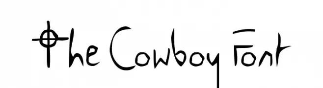
( Fonts by Jacob Fisher - www.pizzadude.dk )
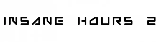
A futuristic, geometric font with bold, angular characters.
 Herunterladen 585 Downloads@WebFont
 -
![The Cowboy Font Frei Schriftart Herunterladen]() Herunterladen 585 Downloads@WebFont
Herunterladen 585 Downloads@WebFont -
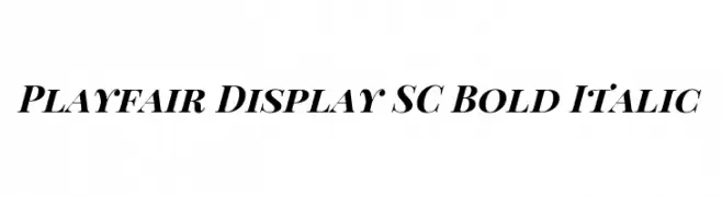
( Copyright 2017 The Playfair Display Project Authors (https://github.com/clauseggers/Playfair-Display), with Reserved Font Name "Playfair Display". )
A bold, italic serif font with high contrast and elegant styling.
![Playfair Display SC Bold Italic Frei Schriftart Herunterladen]() Herunterladen 585 Downloads@WebFont
Herunterladen 585 Downloads@WebFont -
( Fonts by Kong Font - https://fontkong.com/ - Personal-use only. For commercial use please contact owner. )
A bold, playful script font with dynamic cursive letterforms.
![The Blester Frei Schriftart Herunterladen]() Herunterladen 585 Downloads@WebFont
Herunterladen 585 Downloads@WebFont -
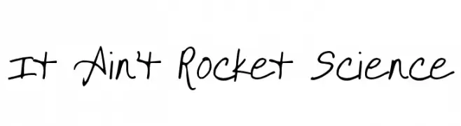
( Fonts by Kimberly Geswein - kimberlygeswein.com )
A casual, handwritten font with a playful and informal style.
![It Ain't Rocket Science Frei Schriftart Herunterladen]() Herunterladen 585 Downloads@WebFont
Herunterladen 585 Downloads@WebFont -
-
![OCTOBER Frei Schriftart Herunterladen]() Herunterladen 584 Downloads@WebFont
Herunterladen 584 Downloads@WebFont -
![Varicelle Frei Schriftart Herunterladen]() Herunterladen 584 Downloads@WebFont
Herunterladen 584 Downloads@WebFont -
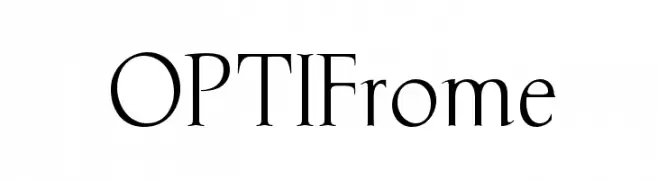
( Fonts by Castcraft Software - OPTI Fonts Archive - opti.netii.net - Personal-use only. For commercial use please contact owner. )
A classic serif font with elegant, elongated strokes and a refined appearance.
![OPTIFrome Frei Schriftart Herunterladen]() Herunterladen 584 Downloads@WebFont
Herunterladen 584 Downloads@WebFont -
( Fonts by Daniel Zadorozny - www.iconian.com - Free for personal use )
A bold, italicized font with a brush-like, dynamic style.
![Yellowjacket Italic Frei Schriftart Herunterladen]() Herunterladen 584 Downloads@WebFont
Herunterladen 584 Downloads@WebFont -
( Fonts by Elephant Shape Productions )
A bold, geometric font with a futuristic and modern design.
![Cosmos0 Frei Schriftart Herunterladen]() Herunterladen 584 Downloads@WebFont
Herunterladen 584 Downloads@WebFont -
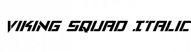
( Fonts by Daniel Zadorozny - www.iconian.com )
A bold, italic, and angular font with a futuristic style.
![Viking Squad Italic Frei Schriftart Herunterladen]() Herunterladen 584 Downloads@WebFont
Herunterladen 584 Downloads@WebFont -
( Fonts by Yasir Ekinci - Personal-use only. For commercial use please contact owner. )
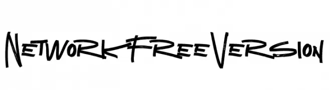
A bold, energetic font with dynamic brush strokes and irregular letterforms.
![Network Free Version Frei Schriftart Herunterladen]() Herunterladen 584 Downloads@WebFont
Herunterladen 584 Downloads@WebFont -
( Fonts by Arterfak Project )
A bold, playful font with rounded, whimsical characters.
![Bestoom-Bold Frei Schriftart Herunterladen]() Herunterladen 584 Downloads@WebFont
Herunterladen 584 Downloads@WebFont -
( Copyright (c) 2011 Silicon Andhra (fonts.siliconandhra.org). )
A playful, hand-drawn font with dynamic strokes and a whimsical style.
![Ravi Prakash Frei Schriftart Herunterladen]() Herunterladen 584 Downloads@WebFont
Herunterladen 584 Downloads@WebFont -
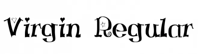
![Virgin Regular Frei Schriftart Herunterladen]() Herunterladen 584 Downloads@WebFont
Herunterladen 584 Downloads@WebFont -
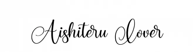
( Fonts by Abas Creative - Farhan Ramadhika - Personal-use only. For commercial use please contact owner. )
An elegant script font with flowing, cursive style and intricate flourishes.
![Aishiteru Lover Frei Schriftart Herunterladen]() Herunterladen 584 Downloads@WebFont
Herunterladen 584 Downloads@WebFont -
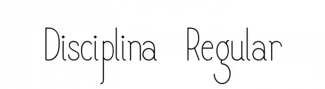
Schriftart von Samiya. For commercial use please contact the owner.
![Disciplina-Regular Frei Schriftart Herunterladen]() Herunterladen 584 Downloads@WebFont
Herunterladen 584 Downloads@WebFont -
![EvelynsHand Regular Frei Schriftart Herunterladen]() Herunterladen 584 Downloads@WebFont
Herunterladen 584 Downloads@WebFont -
( Fonts by Andrew O Connor - Personal-use only. For commercial use please contact owner. )
A bold, edgy font with sharp, angular lines and a hand-drawn appearance.
![BattleMage Frei Schriftart Herunterladen]() Herunterladen 584 Downloads@WebFont
Herunterladen 584 Downloads@WebFont -
( Fonts by Jay Batchelor )
A modern, artistic font with sharp angles and smooth curves.
![RebelRedux Frei Schriftart Herunterladen]() Herunterladen 584 Downloads@WebFont
Herunterladen 584 Downloads@WebFont -
( Andrew Paglinawan - www.andrewpaglinawan.com )
A modern, geometric font with rounded edges and consistent stroke width.
![QuicksandBook-Regular Frei Schriftart Herunterladen]() Herunterladen 584 Downloads@WebFont
Herunterladen 584 Downloads@WebFont -
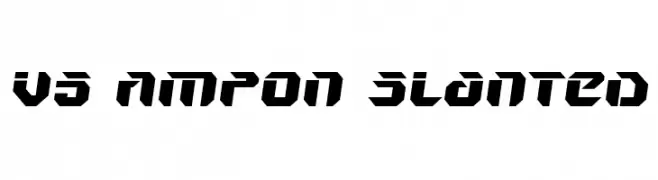
![V5 Ampon Slanted Frei Schriftart Herunterladen]() Herunterladen 584 Downloads@WebFont
Herunterladen 584 Downloads@WebFont -
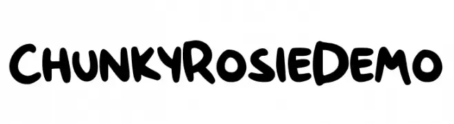
( Fonts by Gartype Studio )
A bold, playful font with rounded, hand-drawn characters.
![Chunky Rosie Demo Frei Schriftart Herunterladen]() Herunterladen 584 Downloads@WebFont
Herunterladen 584 Downloads@WebFont -
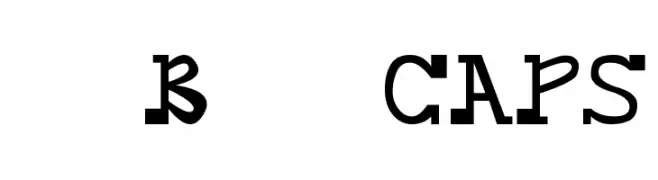
( Fonts by Dibujado )
A bold, playful font with unique twists and exaggerated serifs.
![daBossCAPS Frei Schriftart Herunterladen]() Herunterladen 584 Downloads@WebFont
Herunterladen 584 Downloads@WebFont -
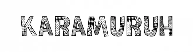
( Fonts by Galdino Otten - galdinootten.com )
A playful, artistic font with unique patterns and textures in each character.
![Karamuruh Frei Schriftart Herunterladen]() Herunterladen 584 Downloads@WebFont
Herunterladen 584 Downloads@WebFont -
( Julius Woodard - jwoodstudios.com )
A bold, geometric font with a modern and assertive style.
![Moshka Frei Schriftart Herunterladen]() Herunterladen 584 Downloads@WebFont
Herunterladen 584 Downloads@WebFont -
( Daymarius - www.creativefabrica.com/designer/Daymarius )
A bold, modern font with geometric lines and a monospaced appearance.
![Munistic Frei Schriftart Herunterladen]() Herunterladen 584 Downloads@WebFont
Herunterladen 584 Downloads@WebFont -
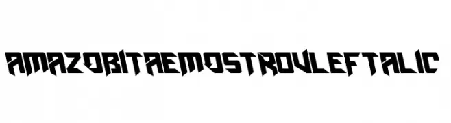
( Fonts by Amazingmax - Maxim Avdeev )
A bold, angular font with a futuristic and dynamic design.
![AmazObitaemOstrovLeftalic Frei Schriftart Herunterladen]() Herunterladen 584 Downloads@WebFont
Herunterladen 584 Downloads@WebFont -
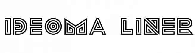
![ideoma LINER Frei Schriftart Herunterladen]() Herunterladen 584 Downloads@WebFont
Herunterladen 584 Downloads@WebFont -
( Fonts by Nirmal Biswas - www.be.net/nirmalbiswas/ - Usage demands USD 25 or more via PayPal to nirmalbiswas@gmail.com )
A modern, dotted font with a geometric, pixelated style.
![Charlie Dotted Regular Frei Schriftart Herunterladen]() Herunterladen 584 Downloads@WebFont
Herunterladen 584 Downloads@WebFont -
![Rails Frei Schriftart Herunterladen]() Herunterladen 584 Downloads@WebFont
Herunterladen 584 Downloads@WebFont -
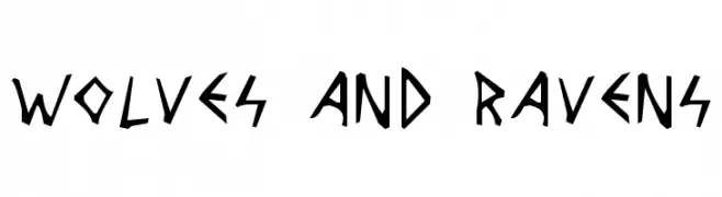
( Fonts by Cumberland Fontworks - http://www222.pair.com/sjohn/fonts.htm - S. John Ross )
A rugged, angular font with a hand-carved, tribal aesthetic.
![Wolves and Ravens Frei Schriftart Herunterladen]() Herunterladen 584 Downloads@WebFont
Herunterladen 584 Downloads@WebFont -
![Plakatbau Frei Schriftart Herunterladen]() Herunterladen 584 Downloads@WebFont
Herunterladen 584 Downloads@WebFont -
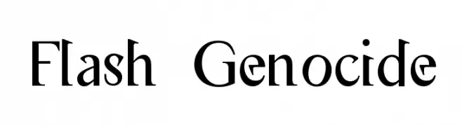
![Flash Genocide Frei Schriftart Herunterladen]() Herunterladen 584 Downloads@WebFont
Herunterladen 584 Downloads@WebFont -
![POE Unicase Condensed Frei Schriftart Herunterladen]() Herunterladen 584 Downloads@WebFont
Herunterladen 584 Downloads@WebFont


Welche Schriften sind gerade am populärsten?
Poppins, Roboto, Montserrat, Open Sans und Lato sind wegen ihrer klaren Formen und breiten Einsetzbarkeit sehr gefragt – von Markenauftritt über Landingpages bis hin zu Postern.
Welche Fonts eignen sich für Logos?
Geometrische Sans‑Serifs (z. B. Poppins, Familien im Gotham‑Stil) sind ein häufiger Griff für sauberes, skalierbares Branding. Für eine persönlichere Note bleiben Scripts und Handschrift‑Stile beliebt. Kombinieren Sie einen prägnanten Headline‑Font mit einer neutralen Brotschrift für Wiedererkennung und Harmonie.
Wie oft wird die Top‑Liste aktualisiert?
Regelmäßig – basierend auf realen Downloads und Interaktionen. Schauen Sie öfter vorbei, um aufstrebende Favoriten früh zu entdecken.
💡 Tipp: Seite bookmarken – Trends wechseln schnell, und heutige Top‑Schriften inspirieren morgen vielleicht das Rebranding.