Willkommen bei den Top‑Schriften – hier treffen Beliebtheit und Qualität aufeinander. Das sind die in diesem Jahr am häufigsten heruntergeladenen und genutzten Fonts. Wenn Sie sichere Optionen für Logo, Web oder Social suchen, starten Sie hier.
Jeder Top‑Font überzeugt durch Balance, Lesbarkeit und Vielseitigkeit. Sie finden moderne Sans‑Serifs, elegante Scripts, Vintage‑Serifs und minimalistische Displays.
-
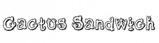
( Fonts by www.fontmesa.com )
A playful, cactus-themed font with spiny, decorative characters.
 Herunterladen 597 Downloads@WebFont
 -
( Fonts by Maulana Creative )
A bold, rounded, and playful font with a friendly, informal style.
![Polers Free Frei Schriftart Herunterladen]() Herunterladen 597 Downloads@WebFont
Herunterladen 597 Downloads@WebFont -
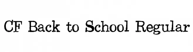
( Fonts by Steve Cloutier - www.cloutierfontes.ca )
A playful, distressed font with a hand-drawn, chalkboard style.
![CF Back to School Regular Frei Schriftart Herunterladen]() Herunterladen 597 Downloads@WebFont
Herunterladen 597 Downloads@WebFont -
( Copyright 2016 Aoife Mooney (aoifemooney@gmail.com www.aoifemooney.org) )
A bold slab serif font with expanded letterforms and moderate stroke contrast.
![BioRhyme Expanded Regular Frei Schriftart Herunterladen]() Herunterladen 597 Downloads@WebFont
Herunterladen 597 Downloads@WebFont -
( Fonts by Manfred Klein - manfred-klein.ina-mar.com )
A bold, angular font with a modern yet classic style.
![SteinAntik-Bold Frei Schriftart Herunterladen]() Herunterladen 597 Downloads@WebFont
Herunterladen 597 Downloads@WebFont -
( Fonts by Almarkhatype - Abdul Malik Wisnu - Personal-use only. For commercial use please contact owner. )
A modern, geometric sans-serif font with clean lines and balanced proportions.
![LORENZA Frei Schriftart Herunterladen]() Herunterladen 597 Downloads@WebFont
Herunterladen 597 Downloads@WebFont -
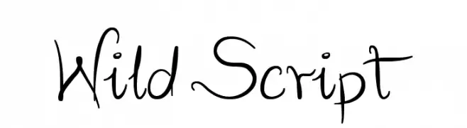
( Fonts by Marcin Leskow - www.martinleskow.pl )
A lively and expressive script font with dynamic, fluid strokes.
![Wild Script Frei Schriftart Herunterladen]() Herunterladen 597 Downloads@WebFont
Herunterladen 597 Downloads@WebFont -
( Micronus )
A modern, geometric sans-serif font with clean lines and uniform stroke widths.
![Y14.5M Frei Schriftart Herunterladen]() Herunterladen 597 Downloads@WebFont
Herunterladen 597 Downloads@WebFont -
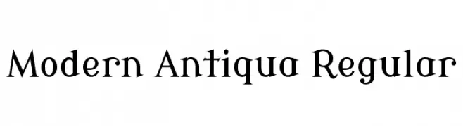
( Copyright (c) 2011, wmk69 (wmk69@o2.pl) )
A modern serif font with elegant, angular serifs and balanced proportions.
![Modern Antiqua Regular Frei Schriftart Herunterladen]() Herunterladen 597 Downloads@WebFont
Herunterladen 597 Downloads@WebFont -
( Fonts by Syaf Rizal - Khurasan - Personal-use only. For commercial use please contact owner. )
A bold, brush-style font with dynamic, hand-drawn strokes.
![Wellfont Frei Schriftart Herunterladen]() Herunterladen 597 Downloads@WebFont
Herunterladen 597 Downloads@WebFont -
( Fonts by bridgeco.jp )
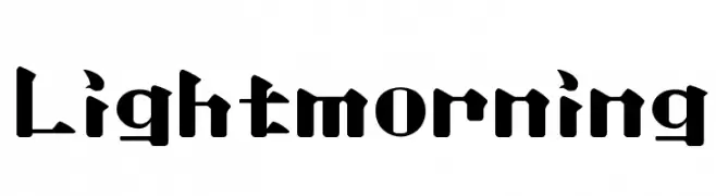
A bold, geometric font with sharp edges and a modern style.
![Lightmorning Frei Schriftart Herunterladen]() Herunterladen 597 Downloads@WebFont
Herunterladen 597 Downloads@WebFont -
( Fonts by www.tepidmonkey.net )
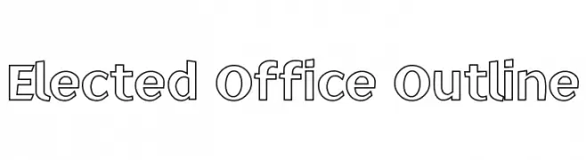
A modern, outlined font with geometric and clean letterforms.
![Elected Office Outline Frei Schriftart Herunterladen]() Herunterladen 597 Downloads@WebFont
Herunterladen 597 Downloads@WebFont -
( George Williams - web.archive.org/web/20051223080638/bibliofile.mc.duke.edu/gww/fonts/fonts.html )
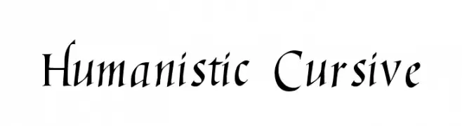
An elegant humanistic cursive font with dynamic serifs and flowing letterforms.
![Humanistic Cursive Frei Schriftart Herunterladen]() Herunterladen 597 Downloads@WebFont
Herunterladen 597 Downloads@WebFont -
( Fonts by Liam Butler )
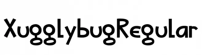
A playful, hand-drawn font with quirky, irregular letterforms.
![Xugglybug Regular Frei Schriftart Herunterladen]() Herunterladen 597 Downloads@WebFont
Herunterladen 597 Downloads@WebFont -
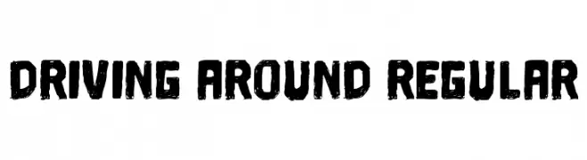
( Vladimir Nikolic - www.coroflot.com/vladimirnikolic )
A bold, textured font with a hand-drawn, distressed style.
![Driving Around Regular Frei Schriftart Herunterladen]() Herunterladen 597 Downloads@WebFont
Herunterladen 597 Downloads@WebFont -
( Fonts by Fajar Abdul Fattah - https://fontbundles.net/sibelumpagi-studio - Personal-use only. For commercial use please contact owner. )
A playful and elegant handwritten script font with graceful curves.
![Sweetrough Frei Schriftart Herunterladen]() Herunterladen 597 Downloads@WebFont
Herunterladen 597 Downloads@WebFont -
( Fonts by Colorful Typhoon - http://orange.s56.xrea.com/blog/ )
A bold, angular font with a rough, edgy design.
![Square rough Frei Schriftart Herunterladen]() Herunterladen 597 Downloads@WebFont
Herunterladen 597 Downloads@WebFont -
( Fonts by www.26plus-zeichen.de )
A modern, geometric sans-serif font with clean lines and balanced proportions.
![superficialmedium Frei Schriftart Herunterladen]() Herunterladen 597 Downloads@WebFont
Herunterladen 597 Downloads@WebFont -
( Fonts by CloutierFontes )
A decorative font with intricate, Mayan-inspired patterns.
![CF Civilisation Maya Regular Frei Schriftart Herunterladen]() Herunterladen 596 Downloads@WebFont
Herunterladen 596 Downloads@WebFont -
![Leicht Frei Schriftart Herunterladen]() Herunterladen 596 Downloads@WebFont
Herunterladen 596 Downloads@WebFont -
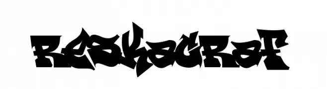
( Fonts by or from www.graffitifonts.net )
A bold, graffiti-inspired font with sharp, angular lines and dynamic shapes.
![ReskaGraf Frei Schriftart Herunterladen]() Herunterladen 596 Downloads@WebFont
Herunterladen 596 Downloads@WebFont -
Schriftart von thessalos. For commercial use please contact the owner.
![Retro Stereo Thin Frei Schriftart Herunterladen]() Herunterladen 596 Downloads@WebFont
Herunterladen 596 Downloads@WebFont -
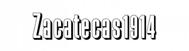
Schriftart von defharo. For commercial use please contact the owner.
![Zacatecas1914 Frei Schriftart Herunterladen]() Herunterladen 596 Downloads@WebFont
Herunterladen 596 Downloads@WebFont -
![Dylan Regular Frei Schriftart Herunterladen]() Herunterladen 596 Downloads@WebFont
Herunterladen 596 Downloads@WebFont -
( Fonts by Letterhend Studio - Hendry Juanda - Personal-use only. For commercial use please contact owner. )
A bold, modern sans-serif font with clean lines and uniform strokes.
![GrandWilsonSansDEMO Frei Schriftart Herunterladen]() Herunterladen 596 Downloads@WebFont
Herunterladen 596 Downloads@WebFont -
( Fonts by Arkandis Digital Foundry )
A modern, geometric font with a clean and sleek design.
![NeoGothisADFStd-Medium Frei Schriftart Herunterladen]() Herunterladen 596 Downloads@WebFont
Herunterladen 596 Downloads@WebFont -
( Fonts by Font People - Personal-use only. For commercial use please contact owner. )
A bold, modern font with strong, consistent strokes.
![Billie DEMO Bold Frei Schriftart Herunterladen]() Herunterladen 596 Downloads@WebFont
Herunterladen 596 Downloads@WebFont -
![Rise & Shine Frei Schriftart Herunterladen]() Herunterladen 596 Downloads@WebFont
Herunterladen 596 Downloads@WebFont -
( Fonts by www.typodermicfonts.com - Ray Larabie )
A modern, elegant font with tall, slender letterforms and subtle curves.
![Echelon-Regular Frei Schriftart Herunterladen]() Herunterladen 596 Downloads@WebFont
Herunterladen 596 Downloads@WebFont -
![Lexust Demo Frei Schriftart Herunterladen]() Herunterladen 596 Downloads
Herunterladen 596 Downloads -
( Fonts by Hamsah )
A playful, rounded font with smooth curves and consistent stroke width.
![Magic Hour Frei Schriftart Herunterladen]() Herunterladen 596 Downloads@WebFont
Herunterladen 596 Downloads@WebFont -
( Fonts by www.woodcutter.es - woodcutter Manero - Personal-use only. For commercial use please contact owner. )
A bold, Western-style font with pronounced serifs and a shadow effect.
![Hard Western Frei Schriftart Herunterladen]() Herunterladen 596 Downloads@WebFont
Herunterladen 596 Downloads@WebFont -
( Andrew Paglinawan - www.andrewpaglinawan.com )
A modern, geometric font with rounded edges and consistent stroke width.
![QuicksandBook-Regular Frei Schriftart Herunterladen]() Herunterladen 596 Downloads@WebFont
Herunterladen 596 Downloads@WebFont -
![Paradox Italic Frei Schriftart Herunterladen]() Herunterladen 596 Downloads@WebFont
Herunterladen 596 Downloads@WebFont -
( Fonts by Misti's Fonts )
A playful, handwritten font with heart motifs and a whimsical style.
![LoveandSunshine Frei Schriftart Herunterladen]() Herunterladen 596 Downloads@WebFont
Herunterladen 596 Downloads@WebFont


Welche Schriften sind gerade am populärsten?
Poppins, Roboto, Montserrat, Open Sans und Lato sind wegen ihrer klaren Formen und breiten Einsetzbarkeit sehr gefragt – von Markenauftritt über Landingpages bis hin zu Postern.
Welche Fonts eignen sich für Logos?
Geometrische Sans‑Serifs (z. B. Poppins, Familien im Gotham‑Stil) sind ein häufiger Griff für sauberes, skalierbares Branding. Für eine persönlichere Note bleiben Scripts und Handschrift‑Stile beliebt. Kombinieren Sie einen prägnanten Headline‑Font mit einer neutralen Brotschrift für Wiedererkennung und Harmonie.
Wie oft wird die Top‑Liste aktualisiert?
Regelmäßig – basierend auf realen Downloads und Interaktionen. Schauen Sie öfter vorbei, um aufstrebende Favoriten früh zu entdecken.
💡 Tipp: Seite bookmarken – Trends wechseln schnell, und heutige Top‑Schriften inspirieren morgen vielleicht das Rebranding.