Willkommen bei den Top‑Schriften – hier treffen Beliebtheit und Qualität aufeinander. Das sind die in diesem Jahr am häufigsten heruntergeladenen und genutzten Fonts. Wenn Sie sichere Optionen für Logo, Web oder Social suchen, starten Sie hier.
Jeder Top‑Font überzeugt durch Balance, Lesbarkeit und Vielseitigkeit. Sie finden moderne Sans‑Serifs, elegante Scripts, Vintage‑Serifs und minimalistische Displays.
-
( Zess Type - zesstype.com/ )
A bold, modern font with rounded edges and geometric influences.
 Herunterladen 595 Downloads@WebFont
 -
( Fonts by a AlterDeco Type Foundry - Adit Saputra. Personal-use only. For commercial use please contact owner. )
A bold, decorative font with a three-dimensional effect and intricate detailing.
![JackRunnerFree Frei Schriftart Herunterladen]() Herunterladen 595 Downloads@WebFont
Herunterladen 595 Downloads@WebFont -
![Plakatbau Frei Schriftart Herunterladen]() Herunterladen 595 Downloads@WebFont
Herunterladen 595 Downloads@WebFont -
![BluelminKisaburo Frei Schriftart Herunterladen]() Herunterladen 595 Downloads@WebFont
Herunterladen 595 Downloads@WebFont -
( Fonts by Apostrophic Lab )
A bold, italicized font with a modern and dynamic style.
![Youthanasia Italic Frei Schriftart Herunterladen]() Herunterladen 595 Downloads@WebFont
Herunterladen 595 Downloads@WebFont -
![First Aid Frei Schriftart Herunterladen]() Herunterladen 595 Downloads@WebFont
Herunterladen 595 Downloads@WebFont -
( Fonts by Arkandis Digital Foundry )
A bold, italic serif font with elegant, flowing lines and a classic style.
![AccanthisADFStd-BoldItalic Frei Schriftart Herunterladen]() Herunterladen 595 Downloads@WebFont
Herunterladen 595 Downloads@WebFont -
![Janmeja2920a Frei Schriftart Herunterladen]() Herunterladen 595 Downloads@WebFont
Herunterladen 595 Downloads@WebFont -
( Fonts by Vít Čondák )
A playful, whimsical font with tall, narrow letterforms and irregular strokes.
![Gomez Strikes Again! Frei Schriftart Herunterladen]() Herunterladen 595 Downloads@WebFont
Herunterladen 595 Downloads@WebFont -
![ROCKSTEADY Frei Schriftart Herunterladen]() Herunterladen 595 Downloads@WebFont
Herunterladen 595 Downloads@WebFont -
( Fonts by Anthem Type - Joey Nelson )
A bold, distressed font with a grunge texture, perfect for vintage designs.
![Silver Sideshow Frei Schriftart Herunterladen]() Herunterladen 595 Downloads@WebFont
Herunterladen 595 Downloads@WebFont -
![Hemawathy Regular Frei Schriftart Herunterladen]() Herunterladen 595 Downloads@WebFont
Herunterladen 595 Downloads@WebFont -
( Fonts by Graham Meade - GemFonts )
A bold, decorative font with a unique striped pattern.
![Labtop Candy Extra Frei Schriftart Herunterladen]() Herunterladen 595 Downloads@WebFont
Herunterladen 595 Downloads@WebFont -
( Fonts by Apostrophic Lab )
A bold, geometric font with a modern, industrial style.
![Karnivore Lite Frei Schriftart Herunterladen]() Herunterladen 595 Downloads@WebFont
Herunterladen 595 Downloads@WebFont -
![RareBlair-Regular Frei Schriftart Herunterladen]() Herunterladen 595 Downloads@WebFont
Herunterladen 595 Downloads@WebFont -
( Fonts by Utopiafonts )
A whimsical and playful font with exaggerated curves and dynamic strokes.
![Luxo Frei Schriftart Herunterladen]() Herunterladen 595 Downloads@WebFont
Herunterladen 595 Downloads@WebFont -
( Fonts by Daniel Zadorozny - www.iconian.com )
A bold, condensed, and italicized font with sharp angles and dynamic energy.
![Oceanic Drift Condensed Italic Frei Schriftart Herunterladen]() Herunterladen 594 Downloads@WebFont
Herunterladen 594 Downloads@WebFont -
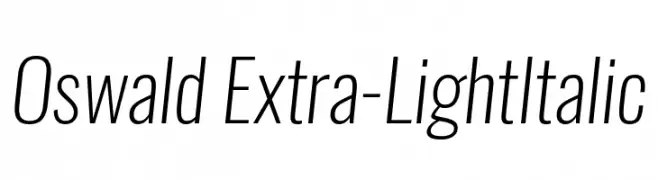
( Fonts by Vernon Adams - Personal-use only. For commercial use please contact owner. )
A sleek, modern, extra-light italic font with a narrow, streamlined design.
![Oswald Extra-LightItalic Frei Schriftart Herunterladen]() Herunterladen 594 Downloads@WebFont
Herunterladen 594 Downloads@WebFont -
( JLH Fonts - jlhfonts.blogspot.com/ )
A bold, slanted font with horizontal lines, evoking speed and motion.
![Speedway Frei Schriftart Herunterladen]() Herunterladen 594 Downloads@WebFont
Herunterladen 594 Downloads@WebFont -
![Rammstein Frei Schriftart Herunterladen]() Herunterladen 594 Downloads@WebFont
Herunterladen 594 Downloads@WebFont -
( Fonts by Roman Paslavskiy )
A playful, hand-drawn font with tall, narrow characters and a whimsical style.
![Zokhan Regular Frei Schriftart Herunterladen]() Herunterladen 594 Downloads@WebFont
Herunterladen 594 Downloads@WebFont -
( Fonts by a Neale Davidson - www.pixelsagas.com. Personal-use only. For commercial use please contact owner. )
A bold, angular font with a futuristic and industrial design.
![Convoy Frei Schriftart Herunterladen]() Herunterladen 594 Downloads@WebFont
Herunterladen 594 Downloads@WebFont -
( truefonts.blogspot.com )
Ornate and vintage-inspired decorative frames and flourishes.
![ornaments labels and frames Frei Schriftart Herunterladen]() Herunterladen 594 Downloads@WebFont
Herunterladen 594 Downloads@WebFont -
![GurmukhiLys 040 Wide Frei Schriftart Herunterladen]() Herunterladen 594 Downloads@WebFont
Herunterladen 594 Downloads@WebFont -
( Fonts by benoitsjoholm.blogspot.com - Benoit Sjoholm - Personal-use only. For commercial use please contact owner. )
A modern, clean font with smooth curves and rounded elements.
![Charlotte Frei Schriftart Herunterladen]() Herunterladen 594 Downloads@WebFont
Herunterladen 594 Downloads@WebFont -
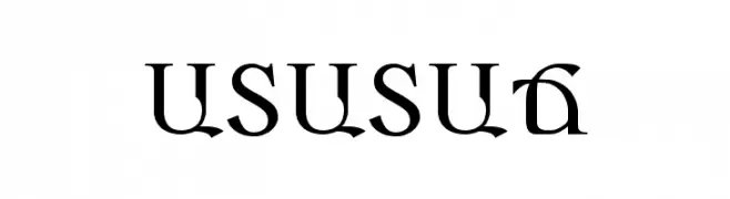
![ARARAT Frei Schriftart Herunterladen]() Herunterladen 594 Downloads
Herunterladen 594 Downloads -
( Fonts by ibeydesign - Personal-use only. For commercial use please contact owner. )
A fluid, handwritten-style font with elegant, connected characters.
![Amanda Signature Frei Schriftart Herunterladen]() Herunterladen 594 Downloads@WebFont
Herunterladen 594 Downloads@WebFont -
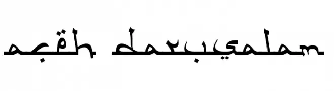
( Fonts by Adien Gunarta - fontasticindonesia.blogspot.com )
An elegant Arabic script font with flowing, connected letters and ornamental details.
![Aceh Darusalam Frei Schriftart Herunterladen]() Herunterladen 594 Downloads@WebFont
Herunterladen 594 Downloads@WebFont -
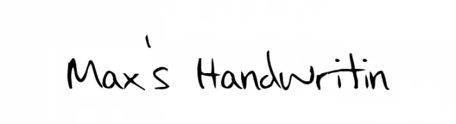
![Max's Handwritin Frei Schriftart Herunterladen]() Herunterladen 594 Downloads@WebFont
Herunterladen 594 Downloads@WebFont -
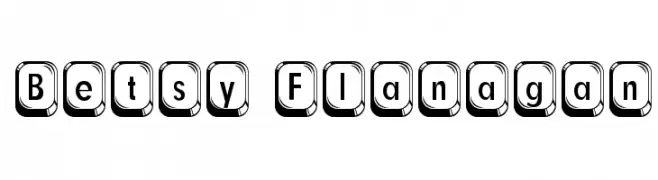
![Betsy Flanagan Frei Schriftart Herunterladen]() Herunterladen 594 Downloads@WebFont
Herunterladen 594 Downloads@WebFont -
( Fonts by www.DigitalDreamDesign.net )
A pixelated, bitmap-style font inspired by retro digital displays.
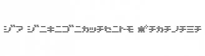
![D3 DigiBitMapism Katakana Frei Schriftart Herunterladen]() Herunterladen 594 Downloads@WebFont
Herunterladen 594 Downloads@WebFont -
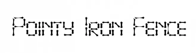
![Pointy Iron Fence Frei Schriftart Herunterladen]() Herunterladen 594 Downloads@WebFont
Herunterladen 594 Downloads@WebFont -
( Chequered Ink - chequered.ink/ )
A playful, rounded font with bold, smooth curves and consistent stroke width.
![Tintenfische Frei Schriftart Herunterladen]() Herunterladen 594 Downloads@WebFont
Herunterladen 594 Downloads@WebFont -
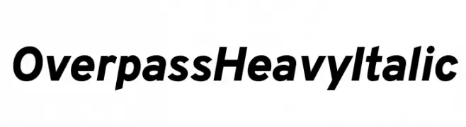
( Fonts by Red Hat )
A bold, italic sans-serif font with a modern and dynamic style.
![Overpass Heavy Italic Frei Schriftart Herunterladen]() Herunterladen 594 Downloads@WebFont
Herunterladen 594 Downloads@WebFont -
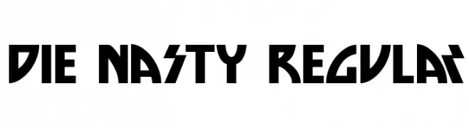
![Die Nasty Regular Frei Schriftart Herunterladen]() Herunterladen 594 Downloads@WebFont
Herunterladen 594 Downloads@WebFont


Welche Schriften sind gerade am populärsten?
Poppins, Roboto, Montserrat, Open Sans und Lato sind wegen ihrer klaren Formen und breiten Einsetzbarkeit sehr gefragt – von Markenauftritt über Landingpages bis hin zu Postern.
Welche Fonts eignen sich für Logos?
Geometrische Sans‑Serifs (z. B. Poppins, Familien im Gotham‑Stil) sind ein häufiger Griff für sauberes, skalierbares Branding. Für eine persönlichere Note bleiben Scripts und Handschrift‑Stile beliebt. Kombinieren Sie einen prägnanten Headline‑Font mit einer neutralen Brotschrift für Wiedererkennung und Harmonie.
Wie oft wird die Top‑Liste aktualisiert?
Regelmäßig – basierend auf realen Downloads und Interaktionen. Schauen Sie öfter vorbei, um aufstrebende Favoriten früh zu entdecken.
💡 Tipp: Seite bookmarken – Trends wechseln schnell, und heutige Top‑Schriften inspirieren morgen vielleicht das Rebranding.