Willkommen bei den Top‑Schriften – hier treffen Beliebtheit und Qualität aufeinander. Das sind die in diesem Jahr am häufigsten heruntergeladenen und genutzten Fonts. Wenn Sie sichere Optionen für Logo, Web oder Social suchen, starten Sie hier.
Jeder Top‑Font überzeugt durch Balance, Lesbarkeit und Vielseitigkeit. Sie finden moderne Sans‑Serifs, elegante Scripts, Vintage‑Serifs und minimalistische Displays.
-
( Max Kuivenhoven - www.lovelybird.co )
A playful, hand-drawn font with a sketch-like, artistic appearance.
 Herunterladen 121 Downloads@WebFont
 -
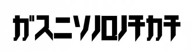
( www.chiba-design.com )
A bold, geometric font with a modern, tech-inspired aesthetic.
![Trick_kata Frei Schriftart Herunterladen]() Herunterladen 121 Downloads@WebFont
Herunterladen 121 Downloads@WebFont -
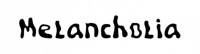
( Dapeeb )
A playful, hand-drawn font with irregular, blob-like shapes and a whimsical style.
![Melancholia Frei Schriftart Herunterladen]() Herunterladen 121 Downloads@WebFont
Herunterladen 121 Downloads@WebFont -
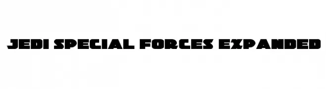
( Fonts by Daniel Zadorozny - www.iconian.com - Free for personal use )
A bold, angular font with a futuristic, military-inspired design.
![Jedi Special Forces Expanded Frei Schriftart Herunterladen]() Herunterladen 121 Downloads@WebFont
Herunterladen 121 Downloads@WebFont -
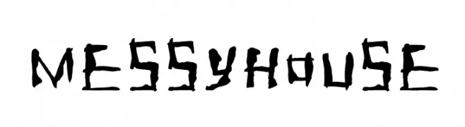
Schriftart von NicholasJudy456. For commercial use please contact the owner.
![Messyhouse Frei Schriftart Herunterladen]() Herunterladen 121 Downloads@WebFont
Herunterladen 121 Downloads@WebFont -
-
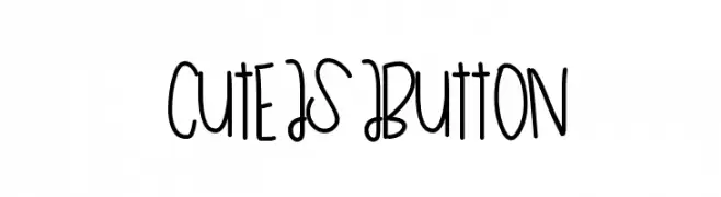
( Fonts by a Des Gomez. Personal-use only. For commercial use please contact owner. )
A playful, handwritten font with a whimsical and casual style.
![CuteAsAButton Frei Schriftart Herunterladen]() Herunterladen 121 Downloads@WebFont
Herunterladen 121 Downloads@WebFont -
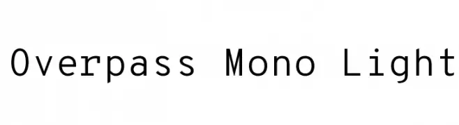
( Copyright (c) 2016 by Red Hat, Inc. All rights reserved. )
A modern, monospaced font with clean lines and excellent readability.
![Overpass Mono Light Frei Schriftart Herunterladen]() Herunterladen 121 Downloads@WebFont
Herunterladen 121 Downloads@WebFont -
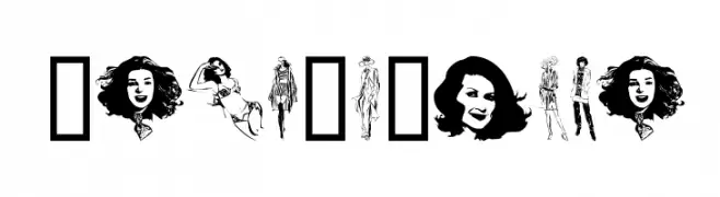
( Fonts by www.houseoflime.com )
Illustrative, fashion-themed decorative display font featuring women in various poses.
![Unca'sWomen Frei Schriftart Herunterladen]() Herunterladen 121 Downloads@WebFont
Herunterladen 121 Downloads@WebFont -
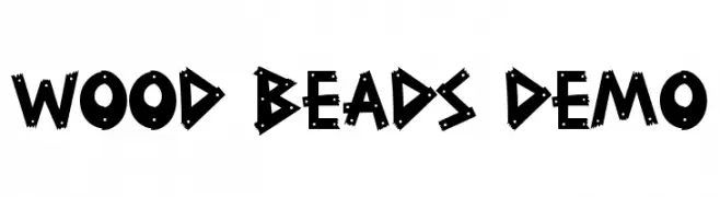
( Fonts by RaisProject )
A bold, playful font with a woodcut, handcrafted appearance.
![Wood Beads Demo Frei Schriftart Herunterladen]() Herunterladen 121 Downloads@WebFont
Herunterladen 121 Downloads@WebFont -
![Typis-Shadow-Demo Frei Schriftart Herunterladen]() Herunterladen 121 Downloads@WebFont
Herunterladen 121 Downloads@WebFont

Welche Schriften sind gerade am populärsten?
Poppins, Roboto, Montserrat, Open Sans und Lato sind wegen ihrer klaren Formen und breiten Einsetzbarkeit sehr gefragt – von Markenauftritt über Landingpages bis hin zu Postern.
Welche Fonts eignen sich für Logos?
Geometrische Sans‑Serifs (z. B. Poppins, Familien im Gotham‑Stil) sind ein häufiger Griff für sauberes, skalierbares Branding. Für eine persönlichere Note bleiben Scripts und Handschrift‑Stile beliebt. Kombinieren Sie einen prägnanten Headline‑Font mit einer neutralen Brotschrift für Wiedererkennung und Harmonie.
Wie oft wird die Top‑Liste aktualisiert?
Regelmäßig – basierend auf realen Downloads und Interaktionen. Schauen Sie öfter vorbei, um aufstrebende Favoriten früh zu entdecken.
💡 Tipp: Seite bookmarken – Trends wechseln schnell, und heutige Top‑Schriften inspirieren morgen vielleicht das Rebranding.