Willkommen bei den Top‑Schriften – hier treffen Beliebtheit und Qualität aufeinander. Das sind die in diesem Jahr am häufigsten heruntergeladenen und genutzten Fonts. Wenn Sie sichere Optionen für Logo, Web oder Social suchen, starten Sie hier.
Jeder Top‑Font überzeugt durch Balance, Lesbarkeit und Vielseitigkeit. Sie finden moderne Sans‑Serifs, elegante Scripts, Vintage‑Serifs und minimalistische Displays.
-
( Fonts by Khurasan )
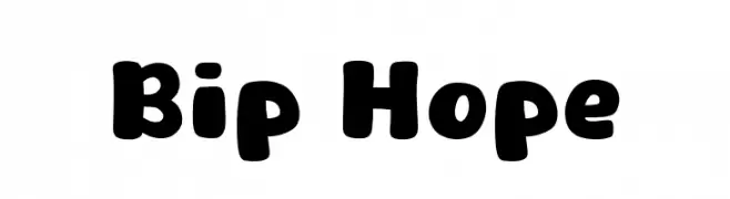
A playful, bold font with rounded edges and a friendly appearance.
 Herunterladen 587 Downloads@WebFont
 -
( Fonts by Dicky Syafaat )
A bold, dynamic font with a playful, comic book style.
![KAPOW Frei Schriftart Herunterladen]() Herunterladen 587 Downloads@WebFont
Herunterladen 587 Downloads@WebFont -
![Vidas Secas Frei Schriftart Herunterladen]() Herunterladen 587 Downloads@WebFont
Herunterladen 587 Downloads@WebFont -
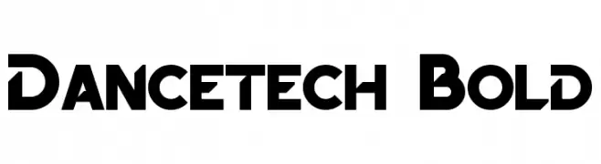
![Dancetech Bold Frei Schriftart Herunterladen]() Herunterladen 587 Downloads@WebFont
Herunterladen 587 Downloads@WebFont -
( koeiekat - koeiekat.com )
A modern, geometric font with a clean, condensed style.
![Monotoon KK Frei Schriftart Herunterladen]() Herunterladen 587 Downloads@WebFont
Herunterladen 587 Downloads@WebFont -
( Fonts by Phillip Cavette )
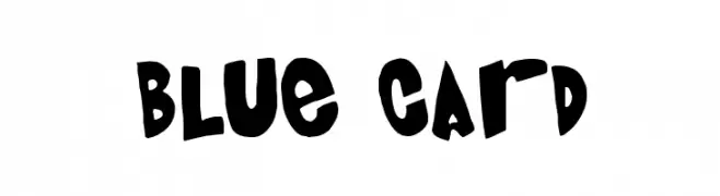
A playful, bold font with a hand-drawn, whimsical style.
![Blue Card Frei Schriftart Herunterladen]() Herunterladen 587 Downloads@WebFont
Herunterladen 587 Downloads@WebFont -
( Fonts by Peax Webdesign - www.peax-webdesign.com. Personal-use only. For commercial use please contact owner. )
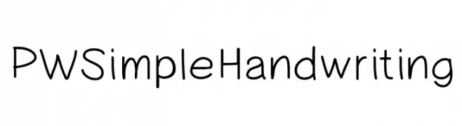
A casual, friendly handwritten font with smooth, rounded strokes.
![PWSimpleHandwriting Frei Schriftart Herunterladen]() Herunterladen 587 Downloads@WebFont
Herunterladen 587 Downloads@WebFont -
( Noto is a trademark of Google Inc. Noto fonts are open source. All Noto fonts are published under the SIL Open Font License, Version 1.1 )
A classic serif font with elegant and legible numerals and special characters.
![Noto Serif Sinhala Regular Frei Schriftart Herunterladen]() Herunterladen 587 Downloads@WebFont
Herunterladen 587 Downloads@WebFont -
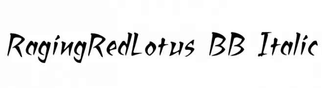
( Fonts by www.blambot.com )
A dynamic, italicized font with sharp, angular strokes and a hand-drawn feel.
![RagingRedLotus BB Italic Frei Schriftart Herunterladen]() Herunterladen 587 Downloads@WebFont
Herunterladen 587 Downloads@WebFont -
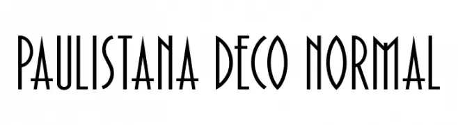
( www.megaart.com.br )
A tall, narrow Art Deco font with geometric, elegant letterforms.
![Paulistana Deco Normal Frei Schriftart Herunterladen]() Herunterladen 587 Downloads@WebFont
Herunterladen 587 Downloads@WebFont -
![Minecraft Italic Frei Schriftart Herunterladen]() Herunterladen 587 Downloads@WebFont
Herunterladen 587 Downloads@WebFont -
![Noto Sans Khmer UI Frei Schriftart Herunterladen]() Herunterladen 587 Downloads@WebFont
Herunterladen 587 Downloads@WebFont -
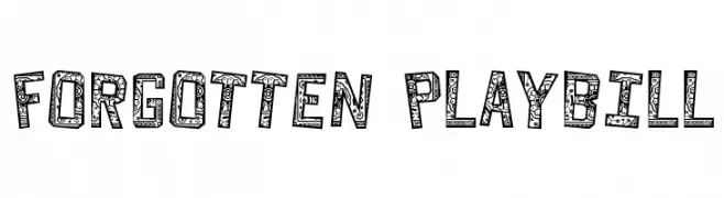
![Forgotten Playbill Frei Schriftart Herunterladen]() Herunterladen 587 Downloads@WebFont
Herunterladen 587 Downloads@WebFont -
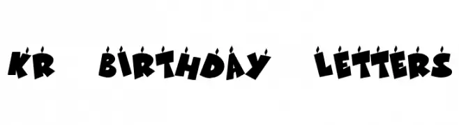
( Fonts by Kat`s Fun Fonts - Personal-use only. For commercial use please contact owner. )
A bold, festive font with candle-like accents, perfect for celebrations.
![KR Birthday Letters Frei Schriftart Herunterladen]() Herunterladen 587 Downloads@WebFont
Herunterladen 587 Downloads@WebFont -
( Fonts by Graphix Line Studio )
A playful, bold font with rounded, hand-drawn strokes.
![Moonchild Frei Schriftart Herunterladen]() Herunterladen 587 Downloads@WebFont
Herunterladen 587 Downloads@WebFont -
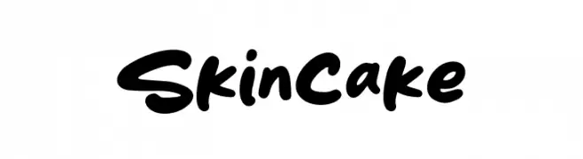
( Fonts by Khurasan )
A bold, playful handwritten font with thick strokes and rounded edges.
![Skincake Frei Schriftart Herunterladen]() Herunterladen 587 Downloads@WebFont
Herunterladen 587 Downloads@WebFont -
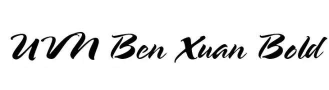
![UVN Ben Xuan Bold Frei Schriftart Herunterladen]() Herunterladen 587 Downloads@WebFont
Herunterladen 587 Downloads@WebFont -
( Mr Ginanto )
A playful, handwritten font with rounded edges and a casual style.
![Didno Frei Schriftart Herunterladen]() Herunterladen 587 Downloads@WebFont
Herunterladen 587 Downloads@WebFont -
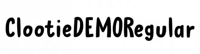
( Fonts by Hanoded )
A playful, bold font with a hand-drawn, whimsical style.
![Clootie DEMO Regular Frei Schriftart Herunterladen]() Herunterladen 587 Downloads@WebFont
Herunterladen 587 Downloads@WebFont -
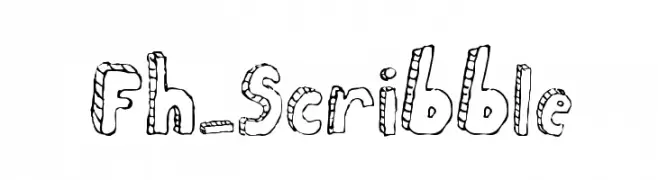
![Fh_Scribble Frei Schriftart Herunterladen]() Herunterladen 587 Downloads@WebFont
Herunterladen 587 Downloads@WebFont -
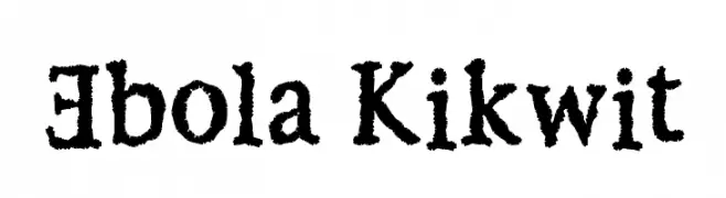
![Ebola Kikwit Frei Schriftart Herunterladen]() Herunterladen 587 Downloads@WebFont
Herunterladen 587 Downloads@WebFont -
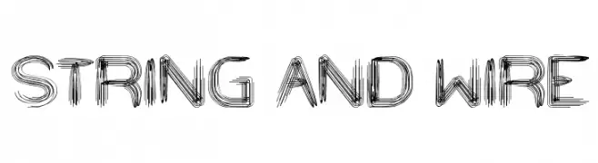
( Fonts by weknow - Wino S Kadir )
A hand-drawn, wire-like font with a textured and artistic appearance.
![STRING AND WIRE Frei Schriftart Herunterladen]() Herunterladen 587 Downloads@WebFont
Herunterladen 587 Downloads@WebFont -
( Fonts by imagex )
A playful, bold font with a comic-like, hand-drawn style.
![Comics Tricks Frei Schriftart Herunterladen]() Herunterladen 587 Downloads@WebFont
Herunterladen 587 Downloads@WebFont -
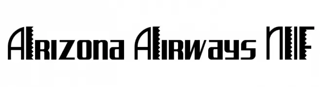
( Fonts by Nick Curtis - www.nicksfonts.com )
A bold, decorative font with unique zigzag patterns in uppercase letters.
![Arizona Airways NF Frei Schriftart Herunterladen]() Herunterladen 587 Downloads@WebFont
Herunterladen 587 Downloads@WebFont -
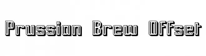
( Fonts by Apostrophic Lab )
A bold, geometric font with a 3D offset shadow effect.
![Prussian Brew Offset Frei Schriftart Herunterladen]() Herunterladen 587 Downloads@WebFont
Herunterladen 587 Downloads@WebFont -
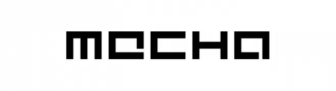
( Fonts by dustBUST - Andreas Nylin )
A futuristic, geometric font with a blocky, pixelated design.
![Mecha Frei Schriftart Herunterladen]() Herunterladen 587 Downloads@WebFont
Herunterladen 587 Downloads@WebFont -
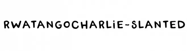
( Fonts by Rachel White )
A playful, hand-drawn font with a slanted, whimsical style.
![RWATangoCharlie-Slanted Frei Schriftart Herunterladen]() Herunterladen 587 Downloads@WebFont
Herunterladen 587 Downloads@WebFont -
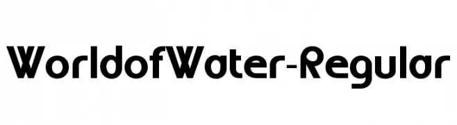
( Fonts by www.typodermicfonts.com - Ray Larabie )
A bold, geometric font with a modern and structured design.
![WorldofWater-Regular Frei Schriftart Herunterladen]() Herunterladen 587 Downloads@WebFont
Herunterladen 587 Downloads@WebFont -
![Gender Frei Schriftart Herunterladen]() Herunterladen 587 Downloads@WebFont
Herunterladen 587 Downloads@WebFont -
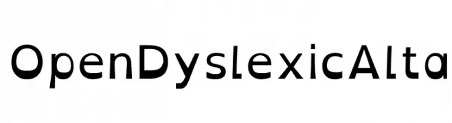
( Abelardo Gonzalez - abbiecod.es )
A dyslexia-friendly font with distinct, weighted letterforms for improved readability.
![OpenDyslexicAlta Frei Schriftart Herunterladen]() Herunterladen 587 Downloads@WebFont
Herunterladen 587 Downloads@WebFont -
( aldedesign - Alde Saputro - creativemarket.com/aldedesign?u=aldedesign )
An elegant, flowing script font with graceful curves and fluid strokes.
![Asgard Frei Schriftart Herunterladen]() Herunterladen 587 Downloads@WebFont
Herunterladen 587 Downloads@WebFont -
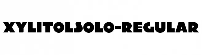
( Typodermic Fonts - Ray Larabie - www.typodermicfonts.com/ )
A bold, geometric font with a modern and impactful style.
![XylitolSolo-Regular Frei Schriftart Herunterladen]() Herunterladen 586 Downloads@WebFont
Herunterladen 586 Downloads@WebFont -
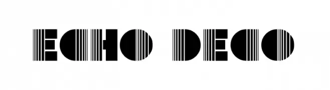
( Fonts by GreyWolf Webworks - www.greywolfwebworks.com - Personal-use only. For commercial use please contact owner. )
A bold, geometric font with a mix of solid and striped elements.
![Echo Deco Frei Schriftart Herunterladen]() Herunterladen 586 Downloads@WebFont
Herunterladen 586 Downloads@WebFont -
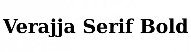
( Fonts by softerviews.org )
A bold serif typeface with a classic and authoritative style.
![Verajja Serif Bold Frei Schriftart Herunterladen]() Herunterladen 586 Downloads@WebFont
Herunterladen 586 Downloads@WebFont -
( Fonts by Adien Gunarta - fontasticindonesia.blogspot.com )
A playful, hand-drawn style font with rounded, bold characters.
![Si Kancil Frei Schriftart Herunterladen]() Herunterladen 586 Downloads@WebFont
Herunterladen 586 Downloads@WebFont


Welche Schriften sind gerade am populärsten?
Poppins, Roboto, Montserrat, Open Sans und Lato sind wegen ihrer klaren Formen und breiten Einsetzbarkeit sehr gefragt – von Markenauftritt über Landingpages bis hin zu Postern.
Welche Fonts eignen sich für Logos?
Geometrische Sans‑Serifs (z. B. Poppins, Familien im Gotham‑Stil) sind ein häufiger Griff für sauberes, skalierbares Branding. Für eine persönlichere Note bleiben Scripts und Handschrift‑Stile beliebt. Kombinieren Sie einen prägnanten Headline‑Font mit einer neutralen Brotschrift für Wiedererkennung und Harmonie.
Wie oft wird die Top‑Liste aktualisiert?
Regelmäßig – basierend auf realen Downloads und Interaktionen. Schauen Sie öfter vorbei, um aufstrebende Favoriten früh zu entdecken.
💡 Tipp: Seite bookmarken – Trends wechseln schnell, und heutige Top‑Schriften inspirieren morgen vielleicht das Rebranding.