Willkommen bei den Top‑Schriften – hier treffen Beliebtheit und Qualität aufeinander. Das sind die in diesem Jahr am häufigsten heruntergeladenen und genutzten Fonts. Wenn Sie sichere Optionen für Logo, Web oder Social suchen, starten Sie hier.
Jeder Top‑Font überzeugt durch Balance, Lesbarkeit und Vielseitigkeit. Sie finden moderne Sans‑Serifs, elegante Scripts, Vintage‑Serifs und minimalistische Displays.
-
( Fonts by Darrell Flood )
A bold, rugged font with an organic, ink-blot appearance.
 Herunterladen 119 Downloads@WebFont
 -
![True 2D Frei Schriftart Herunterladen]() Herunterladen 119 Downloads@WebFont
Herunterladen 119 Downloads@WebFont -
( Fonts by K_IN Studio )
A bold, playful handwritten font with dynamic curves and thick strokes.
![MINIMUM DEDLOCK Frei Schriftart Herunterladen]() Herunterladen 119 Downloads@WebFont
Herunterladen 119 Downloads@WebFont -
![Tammy Italic Frei Schriftart Herunterladen]() Herunterladen 119 Downloads@WebFont
Herunterladen 119 Downloads@WebFont -
( Fonts by ijemrockart - Personal-use only. For commercial use please contact owner. )
A bold, expressive script font with a hand-drawn, fluid style.
![Love Moment Frei Schriftart Herunterladen]() Herunterladen 119 Downloads@WebFont
Herunterladen 119 Downloads@WebFont -
-
( Fonts by Mozatype )
An elegant serif font with intricate floral embellishments, perfect for decorative use.
![Farmhouse Monogram Frei Schriftart Herunterladen]() Herunterladen 119 Downloads@WebFont
Herunterladen 119 Downloads@WebFont -
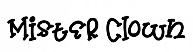
( Fonts by Daddi Daryawan )
A playful, hand-drawn font with bold, rounded characters and a whimsical style.
![Mister Clown Frei Schriftart Herunterladen]() Herunterladen 119 Downloads@WebFont
Herunterladen 119 Downloads@WebFont -
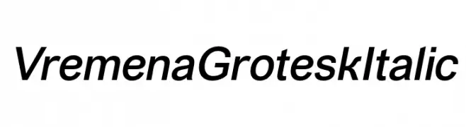
( Fonts by Roman Gornitsky - Personal-use only. For commercial use please contact owner. )
A modern, italicized font with clean lines and a professional appearance.
![VremenaGroteskItalic Frei Schriftart Herunterladen]() Herunterladen 119 Downloads@WebFont
Herunterladen 119 Downloads@WebFont -
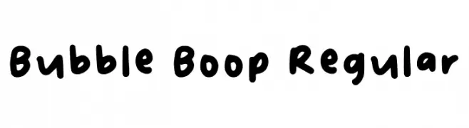
( Fonts by Betina Patricia Belardo - Personal-use only. For commercial use please contact owner. )
A playful, bubbly font with rounded characters and a whimsical style.
![Bubble Boop Regular Frei Schriftart Herunterladen]() Herunterladen 119 Downloads@WebFont
Herunterladen 119 Downloads@WebFont -
![baby_csp Frei Schriftart Herunterladen]() Herunterladen 119 Downloads@WebFont
Herunterladen 119 Downloads@WebFont


Welche Schriften sind gerade am populärsten?
Poppins, Roboto, Montserrat, Open Sans und Lato sind wegen ihrer klaren Formen und breiten Einsetzbarkeit sehr gefragt – von Markenauftritt über Landingpages bis hin zu Postern.
Welche Fonts eignen sich für Logos?
Geometrische Sans‑Serifs (z. B. Poppins, Familien im Gotham‑Stil) sind ein häufiger Griff für sauberes, skalierbares Branding. Für eine persönlichere Note bleiben Scripts und Handschrift‑Stile beliebt. Kombinieren Sie einen prägnanten Headline‑Font mit einer neutralen Brotschrift für Wiedererkennung und Harmonie.
Wie oft wird die Top‑Liste aktualisiert?
Regelmäßig – basierend auf realen Downloads und Interaktionen. Schauen Sie öfter vorbei, um aufstrebende Favoriten früh zu entdecken.
💡 Tipp: Seite bookmarken – Trends wechseln schnell, und heutige Top‑Schriften inspirieren morgen vielleicht das Rebranding.