Willkommen bei den Top‑Schriften – hier treffen Beliebtheit und Qualität aufeinander. Das sind die in diesem Jahr am häufigsten heruntergeladenen und genutzten Fonts. Wenn Sie sichere Optionen für Logo, Web oder Social suchen, starten Sie hier.
Jeder Top‑Font überzeugt durch Balance, Lesbarkeit und Vielseitigkeit. Sie finden moderne Sans‑Serifs, elegante Scripts, Vintage‑Serifs und minimalistische Displays.
-
 Herunterladen 116 Downloads@WebFont
 -
( Noto is a trademark of Google Inc. Noto fonts are open source. All Noto fonts are published under the SIL Open Font License, Version 1.1 )
Modern sans-serif font for Khmer script.
![Noto Sans Khmer UI Regular Frei Schriftart Herunterladen]() Herunterladen 116 Downloads@WebFont
Herunterladen 116 Downloads@WebFont -
( Fonts by YOFonts - Yasuhiro Yamaoka - yoworks.com - Personal-use only. For commercial use please contact owner. )
A bold, italicized sans-serif font with a modern and dynamic style.
![Midiet Sans Italic Bold Frei Schriftart Herunterladen]() Herunterladen 116 Downloads@WebFont
Herunterladen 116 Downloads@WebFont -
![Vtks Zamioyn4 Frei Schriftart Herunterladen]() Herunterladen 116 Downloads@WebFont
Herunterladen 116 Downloads@WebFont -
( Fonts by Daniel Zadorozny - www.iconian.com - Free for personal use )
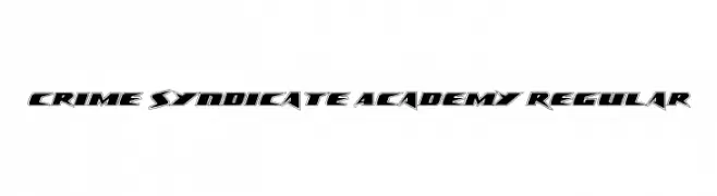
A bold, angular font with a futuristic and dynamic style.
![Crime Syndicate Academy Regular Frei Schriftart Herunterladen]() Herunterladen 116 Downloads@WebFont
Herunterladen 116 Downloads@WebFont -
-
( Fonts by headfirst - Morice Kastoun - Personal-use only. For commercial use please contact owner. )
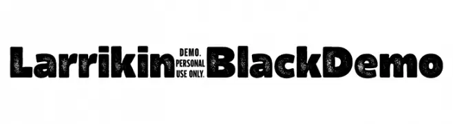
A bold, textured font with a rugged, vintage appearance.
![Larrikin-BlackDemo Frei Schriftart Herunterladen]() Herunterladen 116 Downloads@WebFont
Herunterladen 116 Downloads@WebFont -
( Fonts by Minim - Personal-use only. For commercial use please contact owner. )
A geometric, angular font with a futuristic and technical style.
![minim Frei Schriftart Herunterladen]() Herunterladen 116 Downloads@WebFont
Herunterladen 116 Downloads@WebFont -
( Fonts by backpacker.gr )
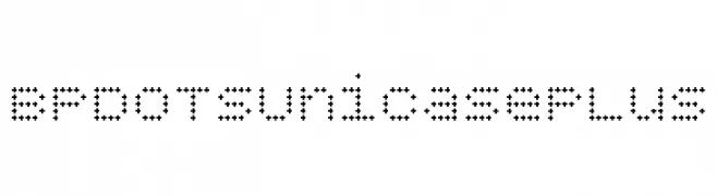
A modern, dotted font with a geometric and playful style.
![BPdotsUnicasePlus Frei Schriftart Herunterladen]() Herunterladen 116 Downloads@WebFont
Herunterladen 116 Downloads@WebFont -
( Fonts by Endri Sulistyawan - Personal-use only. For commercial use please contact owner. )
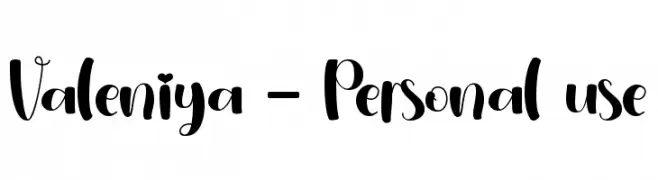
A playful, handwritten-style font with dynamic strokes and whimsical charm.
![Valeniya - Personal use Frei Schriftart Herunterladen]() Herunterladen 116 Downloads@WebFont
Herunterladen 116 Downloads@WebFont -
( Fonts by Google )
A modern, extra bold, extra condensed sans-serif font with excellent legibility.
![Noto Sans ExtraCondensed ExtraBold Frei Schriftart Herunterladen]() Herunterladen 116 Downloads@WebFont
Herunterladen 116 Downloads@WebFont

Welche Schriften sind gerade am populärsten?
Poppins, Roboto, Montserrat, Open Sans und Lato sind wegen ihrer klaren Formen und breiten Einsetzbarkeit sehr gefragt – von Markenauftritt über Landingpages bis hin zu Postern.
Welche Fonts eignen sich für Logos?
Geometrische Sans‑Serifs (z. B. Poppins, Familien im Gotham‑Stil) sind ein häufiger Griff für sauberes, skalierbares Branding. Für eine persönlichere Note bleiben Scripts und Handschrift‑Stile beliebt. Kombinieren Sie einen prägnanten Headline‑Font mit einer neutralen Brotschrift für Wiedererkennung und Harmonie.
Wie oft wird die Top‑Liste aktualisiert?
Regelmäßig – basierend auf realen Downloads und Interaktionen. Schauen Sie öfter vorbei, um aufstrebende Favoriten früh zu entdecken.
💡 Tipp: Seite bookmarken – Trends wechseln schnell, und heutige Top‑Schriften inspirieren morgen vielleicht das Rebranding.