Willkommen bei den Top‑Schriften – hier treffen Beliebtheit und Qualität aufeinander. Das sind die in diesem Jahr am häufigsten heruntergeladenen und genutzten Fonts. Wenn Sie sichere Optionen für Logo, Web oder Social suchen, starten Sie hier.
Jeder Top‑Font überzeugt durch Balance, Lesbarkeit und Vielseitigkeit. Sie finden moderne Sans‑Serifs, elegante Scripts, Vintage‑Serifs und minimalistische Displays.
-
( Fonts by ingoFonts - Ingo Zimmermann - Personal-use only. For commercial use please contact owner. )
A rounded, modern font with smooth curves and consistent stroke width.
 Herunterladen 111 Downloads@WebFont
 -
( Fonts by Ditya Ananto )
An angular, tribal-inspired font with sharp, jagged lines and geometric shapes.
![XENDER Frei Schriftart Herunterladen]() Herunterladen 111 Downloads@WebFont
Herunterladen 111 Downloads@WebFont -
![MewTooHand ExtraItalic Frei Schriftart Herunterladen]() Herunterladen 111 Downloads@WebFont
Herunterladen 111 Downloads@WebFont -
![Game Battles 2 Regular Frei Schriftart Herunterladen]() Herunterladen 110 Downloads@WebFont
Herunterladen 110 Downloads@WebFont -
( Fonts by Letterena Studios )
A whimsical, nature-inspired italic font with leaf-like details.
![NATURE green Italic Frei Schriftart Herunterladen]() Herunterladen 110 Downloads@WebFont
Herunterladen 110 Downloads@WebFont -
-
( Fonts by Wino S Kadir - weknow - www.revolge.com/shop/weknow/ - Personal-use only. For commercial use please contact owner. )
A futuristic, bold font with rounded edges and geometric design.
![Gabriele Frei Schriftart Herunterladen]() Herunterladen 110 Downloads@WebFont
Herunterladen 110 Downloads@WebFont -
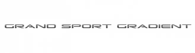
( Fonts by Daniel Zadorozny - www.iconian.com )
A modern, gradient-effect font with a sporty and dynamic design.
![Grand Sport Gradient Frei Schriftart Herunterladen]() Herunterladen 110 Downloads@WebFont
Herunterladen 110 Downloads@WebFont -
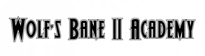
( Donationware )
A bold, angular font with a vintage gothic flair.
![Wolf's Bane II Academy Frei Schriftart Herunterladen]() Herunterladen 110 Downloads@WebFont
Herunterladen 110 Downloads@WebFont -
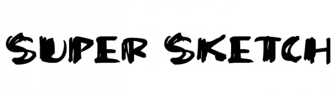
( Fonts by Darrell Flood - Personal-use only. For commercial use please contact owner. )
A bold, hand-drawn font with a sketchy, expressive style.
![Super Sketch Frei Schriftart Herunterladen]() Herunterladen 110 Downloads@WebFont
Herunterladen 110 Downloads@WebFont -
( Fonts by www.legacyofdefeat.com )
A modern, geometric font with elongated, narrow letterforms and consistent stroke width.
![HFraternal-Normal Frei Schriftart Herunterladen]() Herunterladen 110 Downloads@WebFont
Herunterladen 110 Downloads@WebFont


Welche Schriften sind gerade am populärsten?
Poppins, Roboto, Montserrat, Open Sans und Lato sind wegen ihrer klaren Formen und breiten Einsetzbarkeit sehr gefragt – von Markenauftritt über Landingpages bis hin zu Postern.
Welche Fonts eignen sich für Logos?
Geometrische Sans‑Serifs (z. B. Poppins, Familien im Gotham‑Stil) sind ein häufiger Griff für sauberes, skalierbares Branding. Für eine persönlichere Note bleiben Scripts und Handschrift‑Stile beliebt. Kombinieren Sie einen prägnanten Headline‑Font mit einer neutralen Brotschrift für Wiedererkennung und Harmonie.
Wie oft wird die Top‑Liste aktualisiert?
Regelmäßig – basierend auf realen Downloads und Interaktionen. Schauen Sie öfter vorbei, um aufstrebende Favoriten früh zu entdecken.
💡 Tipp: Seite bookmarken – Trends wechseln schnell, und heutige Top‑Schriften inspirieren morgen vielleicht das Rebranding.