Willkommen bei den Top‑Schriften – hier treffen Beliebtheit und Qualität aufeinander. Das sind die in diesem Jahr am häufigsten heruntergeladenen und genutzten Fonts. Wenn Sie sichere Optionen für Logo, Web oder Social suchen, starten Sie hier.
Jeder Top‑Font überzeugt durch Balance, Lesbarkeit und Vielseitigkeit. Sie finden moderne Sans‑Serifs, elegante Scripts, Vintage‑Serifs und minimalistische Displays.
-
 Herunterladen 552 Downloads@WebFont
 -
( Fonts by Nick Curtis - www.nicksfonts.com )
A bold slab serif font with strong, block-like serifs and a robust appearance.
![BluePlateSpecialSW Frei Schriftart Herunterladen]() Herunterladen 552 Downloads@WebFont
Herunterladen 552 Downloads@WebFont -
![LCDMono Normal Frei Schriftart Herunterladen]() Herunterladen 552 Downloads@WebFont
Herunterladen 552 Downloads@WebFont -
( Fonts by Woodcutter )
A bold, decorative Blackletter-style font with intricate, gothic elements.
![Old Deutschland Frei Schriftart Herunterladen]() Herunterladen 552 Downloads@WebFont
Herunterladen 552 Downloads@WebFont -
![Beneath the Surface Frei Schriftart Herunterladen]() Herunterladen 552 Downloads@WebFont
Herunterladen 552 Downloads@WebFont -
( Fonts by Balpirick Studio - https://www.creativefabrica.com/designer/balpirick/ref/308299/ - Personal-use only. For commercial use please contact owner. )
A playful, handwritten font with a lively and bouncy style.
![BOUNCY Frei Schriftart Herunterladen]() Herunterladen 552 Downloads@WebFont
Herunterladen 552 Downloads@WebFont -
( Fonts by weknow - Wino S Kadir - Personal-use only. For commercial use please contact owner. )
A bold, playful font with rounded, dynamic characters.
![abc Bold Frei Schriftart Herunterladen]() Herunterladen 552 Downloads@WebFont
Herunterladen 552 Downloads@WebFont -
( Fonts by Paul Lloyd )
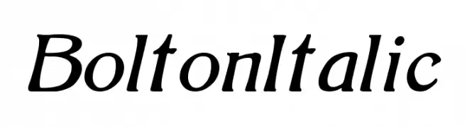
An elegant italic serif font with smooth curves and a classic style.
![BoltonItalic Frei Schriftart Herunterladen]() Herunterladen 552 Downloads@WebFont
Herunterladen 552 Downloads@WebFont -
( Fonts by Alex Slobzheninov - Personal-use only. For commercial use please contact owner. )
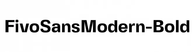
A bold, modern sans-serif font with clean lines and strong presence.
![FivoSansModern-Bold Frei Schriftart Herunterladen]() Herunterladen 552 Downloads@WebFont
Herunterladen 552 Downloads@WebFont -
![Vestite y Andate! Frei Schriftart Herunterladen]() Herunterladen 552 Downloads@WebFont
Herunterladen 552 Downloads@WebFont -
( Juan Pablo De Gregorio - www.letritas.info )
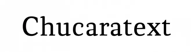
A classic serif font with strong strokes and a traditional, timeless appeal.
![Chucaratext Frei Schriftart Herunterladen]() Herunterladen 552 Downloads@WebFont
Herunterladen 552 Downloads@WebFont -
( Fonts by www.kimberlygeswein.com - Kimberly Geswein )
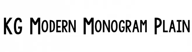
A clean, modern font with a geometric structure and strong readability.
![KG Modern Monogram Plain Frei Schriftart Herunterladen]() Herunterladen 552 Downloads@WebFont
Herunterladen 552 Downloads@WebFont -
Schriftart von wisnu. For commercial use please contact the owner.
![WOLF GANG Frei Schriftart Herunterladen]() Herunterladen 552 Downloads@WebFont
Herunterladen 552 Downloads@WebFont -
( Vladimir Nikolic - www.coroflot.com/vladimirnikolic )
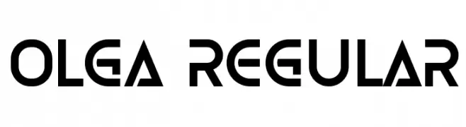
A bold, geometric font with a futuristic and dynamic style.
![Olga Regular Frei Schriftart Herunterladen]() Herunterladen 552 Downloads@WebFont
Herunterladen 552 Downloads@WebFont -
![Oakland Frei Schriftart Herunterladen]() Herunterladen 552 Downloads@WebFont
Herunterladen 552 Downloads@WebFont -
( Chequered Ink - chequered.ink/ )
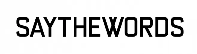
A bold, modern sans-serif font with geometric lines and uniform width.
![Say the Words Frei Schriftart Herunterladen]() Herunterladen 552 Downloads@WebFont
Herunterladen 552 Downloads@WebFont -
( Free for personal use - www.junkohanhero.com )
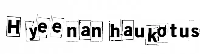
A bold, grunge-inspired font with a ransom-note aesthetic.
![Hyeenan haukotus Frei Schriftart Herunterladen]() Herunterladen 552 Downloads@WebFont
Herunterladen 552 Downloads@WebFont -
( Fonts by ingoFonts. http://www.ingofonts.de )
A modern, geometric sans-serif font with clean lines and uniform strokes.
![CountriesofEurope Frei Schriftart Herunterladen]() Herunterladen 552 Downloads@WebFont
Herunterladen 552 Downloads@WebFont -
( Fonts by Masato Shimojima - Personal-use only. For commercial use please contact owner. )
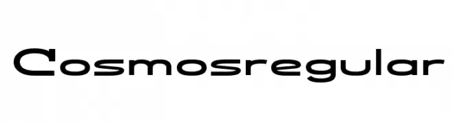
A modern, geometric font with a sleek and futuristic design.
![Cosmosregular Frei Schriftart Herunterladen]() Herunterladen 552 Downloads@WebFont
Herunterladen 552 Downloads@WebFont -
( Fonts by Dieter Schumacher )
A bold, decorative font with a mosaic-like pattern, ideal for striking visual designs.
![Dar Skin Frei Schriftart Herunterladen]() Herunterladen 552 Downloads@WebFont
Herunterladen 552 Downloads@WebFont -
( Fonts by www.kimberlygeswein.com - Kimberly Geswein )
A playful, casual handwritten font with smooth, rounded edges and a whimsical touch.
![Blessings through Raindrops Frei Schriftart Herunterladen]() Herunterladen 552 Downloads@WebFont
Herunterladen 552 Downloads@WebFont -
( Fonts by or from www.graffitifonts.net )
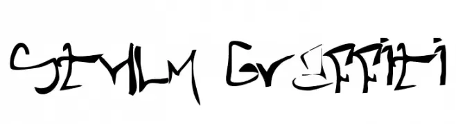
A bold, graffiti-inspired font with dynamic, freeform strokes.
![STHLM Graffiti Frei Schriftart Herunterladen]() Herunterladen 552 Downloads@WebFont
Herunterladen 552 Downloads@WebFont -
( Fonts by Inermedia Studio )
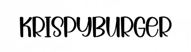
A playful, bold font with rounded edges and a whimsical style.
![Krispy Burger Frei Schriftart Herunterladen]() Herunterladen 552 Downloads@WebFont
Herunterladen 552 Downloads@WebFont -
( Fonts by Subectype & Orenari )
A bold, rugged font with thick strokes and a hand-crafted appearance.
![Rockies Frei Schriftart Herunterladen]() Herunterladen 552 Downloads@WebFont
Herunterladen 552 Downloads@WebFont -
![Black Oval Frei Schriftart Herunterladen]() Herunterladen 552 Downloads@WebFont
Herunterladen 552 Downloads@WebFont -
( Ariel Alvares )
A bold, modern sans-serif font with a clean and approachable design.
![Polt bold Frei Schriftart Herunterladen]() Herunterladen 552 Downloads@WebFont
Herunterladen 552 Downloads@WebFont -
( Fonts by www.aka-acid.com )
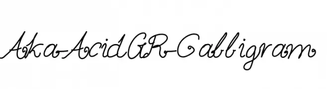
An elegant, flowing script font with cursive and calligraphic elements.
![Aka-AcidGR-Calligram Frei Schriftart Herunterladen]() Herunterladen 552 Downloads@WebFont
Herunterladen 552 Downloads@WebFont -
( Fonts by Nick Curtis - www.nicksfonts.com )
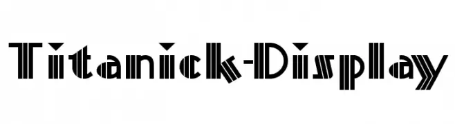
A bold, geometric font with strong vertical lines and sharp angles.
![Titanick-Display Frei Schriftart Herunterladen]() Herunterladen 552 Downloads
Herunterladen 552 Downloads -
( Fonts by Emanes Dsign )
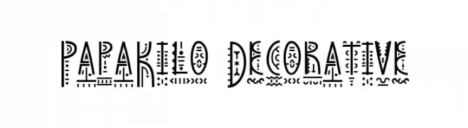
A decorative font with intricate geometric and abstract patterns.
![PapaKilo Decorative Frei Schriftart Herunterladen]() Herunterladen 552 Downloads@WebFont
Herunterladen 552 Downloads@WebFont -
( Fonts by www.marcelomagalhaes.net )
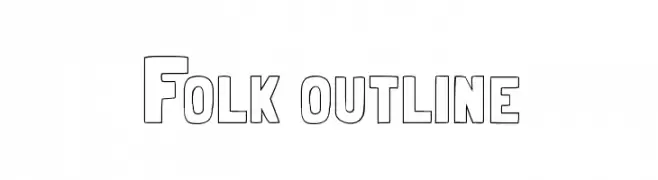
A bold, outlined font with a geometric and eye-catching style.
![Folk outline Frei Schriftart Herunterladen]() Herunterladen 552 Downloads@WebFont
Herunterladen 552 Downloads@WebFont -
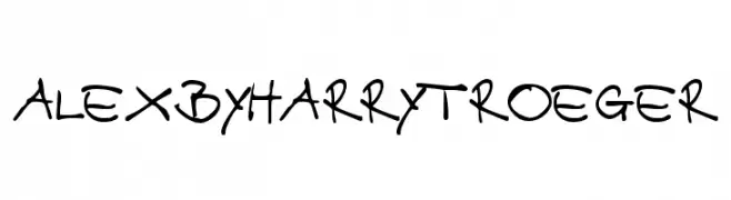
![AlexbyHarryTroeger Frei Schriftart Herunterladen]() Herunterladen 552 Downloads@WebFont
Herunterladen 552 Downloads@WebFont -
( Fonts by Rich Gast - www.greywolfwebworks.com Sponsoren Schriftart )
A bold, pierced font with a modern, industrial aesthetic.
![Angie Pierced Frei Schriftart Herunterladen]() Herunterladen 552 Downloads
Herunterladen 552 Downloads -
( Fonts by Marty Bee - www.martybee.com )
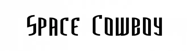
A futuristic, bold font with tall, narrow letterforms and sharp angles.
![Space Cowboy Frei Schriftart Herunterladen]() Herunterladen 552 Downloads@WebFont
Herunterladen 552 Downloads@WebFont -
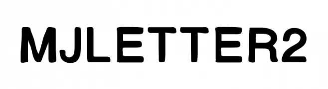
![MJletter2 Frei Schriftart Herunterladen]() Herunterladen 552 Downloads@WebFont
Herunterladen 552 Downloads@WebFont -
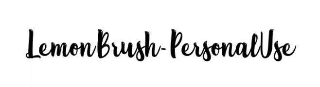
( Fonts by Typhoon Type - Suthi Srisopha - www.typhoontype.net - Personal-use only. For commercial use please contact owner. )
A playful, brush-style font with dynamic strokes and a hand-drawn aesthetic.
![Lemon Brush - Personal Use Frei Schriftart Herunterladen]() Herunterladen 552 Downloads@WebFont
Herunterladen 552 Downloads@WebFont


Welche Schriften sind gerade am populärsten?
Poppins, Roboto, Montserrat, Open Sans und Lato sind wegen ihrer klaren Formen und breiten Einsetzbarkeit sehr gefragt – von Markenauftritt über Landingpages bis hin zu Postern.
Welche Fonts eignen sich für Logos?
Geometrische Sans‑Serifs (z. B. Poppins, Familien im Gotham‑Stil) sind ein häufiger Griff für sauberes, skalierbares Branding. Für eine persönlichere Note bleiben Scripts und Handschrift‑Stile beliebt. Kombinieren Sie einen prägnanten Headline‑Font mit einer neutralen Brotschrift für Wiedererkennung und Harmonie.
Wie oft wird die Top‑Liste aktualisiert?
Regelmäßig – basierend auf realen Downloads und Interaktionen. Schauen Sie öfter vorbei, um aufstrebende Favoriten früh zu entdecken.
💡 Tipp: Seite bookmarken – Trends wechseln schnell, und heutige Top‑Schriften inspirieren morgen vielleicht das Rebranding.