Willkommen bei den Top‑Schriften – hier treffen Beliebtheit und Qualität aufeinander. Das sind die in diesem Jahr am häufigsten heruntergeladenen und genutzten Fonts. Wenn Sie sichere Optionen für Logo, Web oder Social suchen, starten Sie hier.
Jeder Top‑Font überzeugt durch Balance, Lesbarkeit und Vielseitigkeit. Sie finden moderne Sans‑Serifs, elegante Scripts, Vintage‑Serifs und minimalistische Displays.
-
( Fonts by Kong Font - https://fontkong.com/ - Personal-use only. For commercial use please contact owner. )
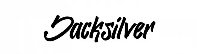
A bold, dynamic script font with fluid, interconnected strokes and a modern, expressive style.
 Herunterladen 112 Downloads@WebFont
 -
( kimberlygeswein.com )
A whimsical and decorative font with playful swirls and curls.
![Janda Swirlygirl Frei Schriftart Herunterladen]() Herunterladen 112 Downloads@WebFont
Herunterladen 112 Downloads@WebFont -
( Fonts by Jamie Place [FontBlast Design] - Personal-use only. For commercial use please contact owner. )
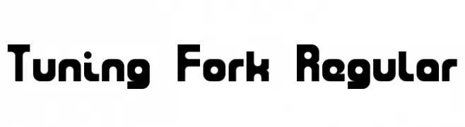
A bold, rounded, and geometric font with a modern style.
![Tuning Fork Regular Frei Schriftart Herunterladen]() Herunterladen 112 Downloads@WebFont
Herunterladen 112 Downloads@WebFont -
( Zetafonts - www.zetafonts.com )
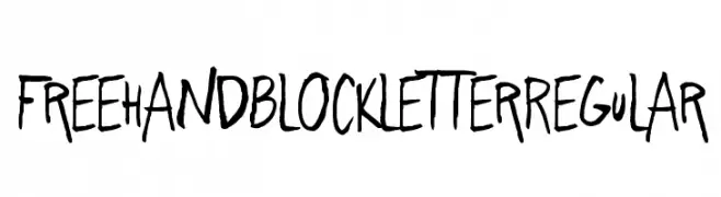
A playful, hand-drawn font with bold, expressive strokes and a casual style.
![Freehand Blockletter Regular Frei Schriftart Herunterladen]() Herunterladen 112 Downloads@WebFont
Herunterladen 112 Downloads@WebFont -
( Fonts by RantautypeStudio )
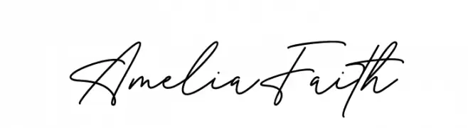
A sophisticated and elegant handwritten script with fluid, continuous strokes.
![Amelia Faith Frei Schriftart Herunterladen]() Herunterladen 112 Downloads@WebFont
Herunterladen 112 Downloads@WebFont -
-
( Fonts by Ikrar Bey Khubaib )
A bold, cursive script font with dynamic and fluid strokes.
![Firegoods Frei Schriftart Herunterladen]() Herunterladen 112 Downloads@WebFont
Herunterladen 112 Downloads@WebFont -
![MaiLinh Frei Schriftart Herunterladen]() Herunterladen 112 Downloads@WebFont
Herunterladen 112 Downloads@WebFont -
( Fonts by Situjuh Nazara - 7ntypes.com - Personal-use only. For commercial use please contact owner. )
A bold, playful handwritten font with rounded edges and a casual style.
![Sotis Frei Schriftart Herunterladen]() Herunterladen 112 Downloads@WebFont
Herunterladen 112 Downloads@WebFont -
( Noto is a trademark of Google Inc. Noto fonts are open source. All Noto fonts are published under the SIL Open Font License, Version 1.1 )
Invalid font rendering with empty boxes.
![Noto Serif Ethiopic SemiCondensed Bold Frei Schriftart Herunterladen]() Herunterladen 112 Downloads@WebFont
Herunterladen 112 Downloads@WebFont -
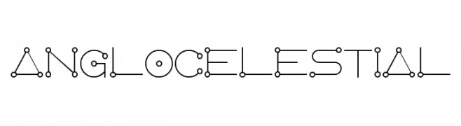
( Fonts by a Neale Davidson - www.pixelsagas.com. Personal-use only. For commercial use please contact owner. )
A futuristic, geometric font with circular nodes and connecting lines.
![AngloCelestial Frei Schriftart Herunterladen]() Herunterladen 112 Downloads@WebFont
Herunterladen 112 Downloads@WebFont


Welche Schriften sind gerade am populärsten?
Poppins, Roboto, Montserrat, Open Sans und Lato sind wegen ihrer klaren Formen und breiten Einsetzbarkeit sehr gefragt – von Markenauftritt über Landingpages bis hin zu Postern.
Welche Fonts eignen sich für Logos?
Geometrische Sans‑Serifs (z. B. Poppins, Familien im Gotham‑Stil) sind ein häufiger Griff für sauberes, skalierbares Branding. Für eine persönlichere Note bleiben Scripts und Handschrift‑Stile beliebt. Kombinieren Sie einen prägnanten Headline‑Font mit einer neutralen Brotschrift für Wiedererkennung und Harmonie.
Wie oft wird die Top‑Liste aktualisiert?
Regelmäßig – basierend auf realen Downloads und Interaktionen. Schauen Sie öfter vorbei, um aufstrebende Favoriten früh zu entdecken.
💡 Tipp: Seite bookmarken – Trends wechseln schnell, und heutige Top‑Schriften inspirieren morgen vielleicht das Rebranding.