Willkommen bei den Top‑Schriften – hier treffen Beliebtheit und Qualität aufeinander. Das sind die in diesem Jahr am häufigsten heruntergeladenen und genutzten Fonts. Wenn Sie sichere Optionen für Logo, Web oder Social suchen, starten Sie hier.
Jeder Top‑Font überzeugt durch Balance, Lesbarkeit und Vielseitigkeit. Sie finden moderne Sans‑Serifs, elegante Scripts, Vintage‑Serifs und minimalistische Displays.
-
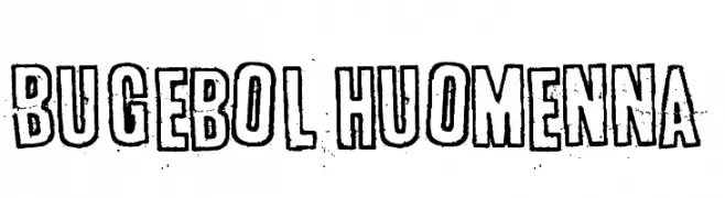
( Fonts by www.junkohanhero.com )
A bold, distressed font with a hand-drawn, vintage style.
 Herunterladen 552 Downloads@WebFont
 -
( Ariel Alvares )
A bold, modern sans-serif font with a clean and approachable design.
![Polt bold Frei Schriftart Herunterladen]() Herunterladen 552 Downloads@WebFont
Herunterladen 552 Downloads@WebFont -
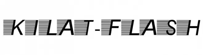
![Kilat-Flash Frei Schriftart Herunterladen]() Herunterladen 552 Downloads@WebFont
Herunterladen 552 Downloads@WebFont -
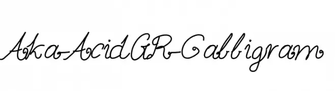
( Fonts by www.aka-acid.com )
An elegant, flowing script font with cursive and calligraphic elements.
![Aka-AcidGR-Calligram Frei Schriftart Herunterladen]() Herunterladen 552 Downloads@WebFont
Herunterladen 552 Downloads@WebFont -
( Fonts by Chequered Ink - chequered.ink - Personal-use only. For commercial use please contact owner. )
A bold, modern font with geometric lines and a cohesive, balanced design.
![Bathrind Frei Schriftart Herunterladen]() Herunterladen 552 Downloads@WebFont
Herunterladen 552 Downloads@WebFont -
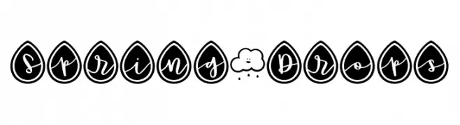
( Fonts by Brittney Murphy Design )
A playful script font with letters in teardrop shapes, offering a whimsical and decorative style.
![Spring*Drops Frei Schriftart Herunterladen]() Herunterladen 552 Downloads@WebFont
Herunterladen 552 Downloads@WebFont -
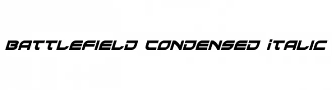
( Fonts by Daniel Zadorozny - www.iconian.com - Free for personal use )
A bold, condensed italic font with a modern, dynamic style.
![Battlefield Condensed Italic Frei Schriftart Herunterladen]() Herunterladen 552 Downloads@WebFont
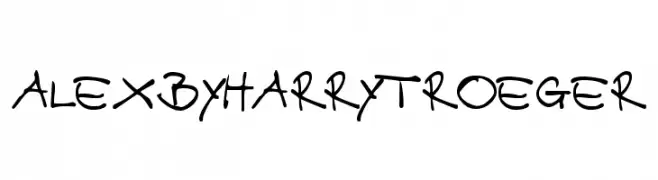
Herunterladen 552 Downloads@WebFont -
![AlexbyHarryTroeger Frei Schriftart Herunterladen]() Herunterladen 552 Downloads@WebFont
Herunterladen 552 Downloads@WebFont -
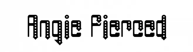
( Fonts by Rich Gast - www.greywolfwebworks.com Sponsoren Schriftart )
A bold, pierced font with a modern, industrial aesthetic.
![Angie Pierced Frei Schriftart Herunterladen]() Herunterladen 552 Downloads
Herunterladen 552 Downloads -
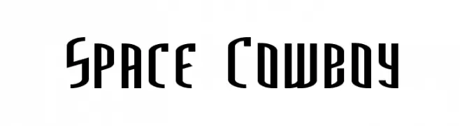
( Fonts by Marty Bee - www.martybee.com )
A futuristic, bold font with tall, narrow letterforms and sharp angles.
![Space Cowboy Frei Schriftart Herunterladen]() Herunterladen 552 Downloads@WebFont
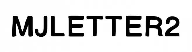
Herunterladen 552 Downloads@WebFont -
![MJletter2 Frei Schriftart Herunterladen]() Herunterladen 552 Downloads@WebFont
Herunterladen 552 Downloads@WebFont -
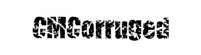
( Fonts by Charly Masci - www.mvdgdesign.com )
A bold, distressed font with a rugged, textured appearance.
![CMCorruged Frei Schriftart Herunterladen]() Herunterladen 552 Downloads@WebFont
Herunterladen 552 Downloads@WebFont -
( Fonts by Steve Cloutier - www.cloutierfontes.ca )
A bold, decorative font with intricate patterns and a playful, adventurous style.
![CF Peru Adventure Regular Frei Schriftart Herunterladen]() Herunterladen 552 Downloads@WebFont
Herunterladen 552 Downloads@WebFont -
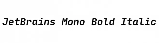
( Fonts by Philipp Nurullin )
A bold, italic monospaced font ideal for coding and technical use.
![JetBrains Mono Bold Italic Frei Schriftart Herunterladen]() Herunterladen 552 Downloads@WebFont
Herunterladen 552 Downloads@WebFont -
( Fonts by Manfred Klein. Free for private and charity use. Free for commercial with donation to organizations )
A bold, modern font with mirrored shadow effects for a 3D look.
![MirrorKlein Shadows Frei Schriftart Herunterladen]() Herunterladen 551 Downloads@WebFont
Herunterladen 551 Downloads@WebFont -
( Fonts by Tokopress )
A playful, bold font with rounded, thick strokes and a friendly appearance.
![Dolpino Frei Schriftart Herunterladen]() Herunterladen 551 Downloads@WebFont
Herunterladen 551 Downloads@WebFont -
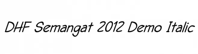
![DHF Semangat 2012 Demo Italic Frei Schriftart Herunterladen]() Herunterladen 551 Downloads@WebFont
Herunterladen 551 Downloads@WebFont -
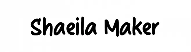
( Fonts by Kong Font )
A playful, bold handwritten font with smooth curves and rounded edges.
![Shaeila Maker Frei Schriftart Herunterladen]() Herunterladen 551 Downloads@WebFont
Herunterladen 551 Downloads@WebFont -
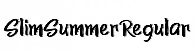
( Fonts by K_IN Studio )
A bold, handwritten-style font with dynamic, slanted characters and high contrast.
![SlimSummerRegular Frei Schriftart Herunterladen]() Herunterladen 551 Downloads@WebFont
Herunterladen 551 Downloads@WebFont -
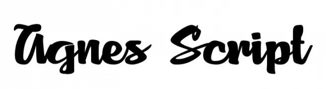
![Agnes Script Frei Schriftart Herunterladen]() Herunterladen 551 Downloads@WebFont
Herunterladen 551 Downloads@WebFont -
( Aldus )
An ornate and regal font with intricate details and decorative flourishes.
![Royal2 Frei Schriftart Herunterladen]() Herunterladen 551 Downloads@WebFont
Herunterladen 551 Downloads@WebFont -
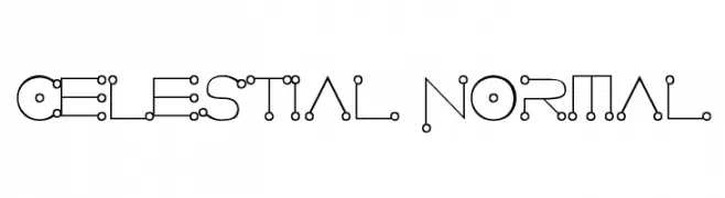
![Celestial Normal Frei Schriftart Herunterladen]() Herunterladen 551 Downloads@WebFont
Herunterladen 551 Downloads@WebFont -
( Fonts by Dustin Norlander - www.cheapskatefonts.com )
A bold, italic serif font with a classic and elegant style.
![Dustismo Roman Bold Italic Frei Schriftart Herunterladen]() Herunterladen 551 Downloads@WebFont
Herunterladen 551 Downloads@WebFont -
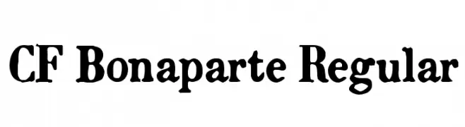
( Fonts by CloutierFontes )
A bold, high-contrast font with dramatic strokes and elegant curves.
![CF Bonaparte Regular Frei Schriftart Herunterladen]() Herunterladen 551 Downloads@WebFont
Herunterladen 551 Downloads@WebFont -
( Fonts by Agathe M.Joyce - www.foundmyfont.com - Personal-use only. For commercial use please contact owner. )
A dynamic and elegant script font with bold, flowing curves.
![Matador de Nimes Frei Schriftart Herunterladen]() Herunterladen 551 Downloads@WebFont
Herunterladen 551 Downloads@WebFont -
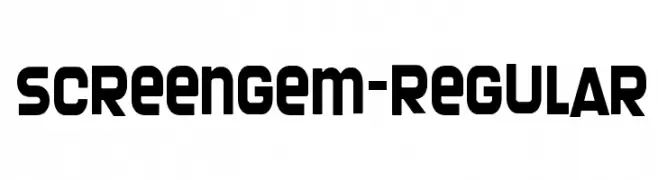
( Fonts by www.typodermicfonts.com - Ray Larabie )
A bold, geometric font with a modern and robust design.
![Screengem-Regular Frei Schriftart Herunterladen]() Herunterladen 551 Downloads@WebFont
Herunterladen 551 Downloads@WebFont -
![Assimilation Frei Schriftart Herunterladen]() Herunterladen 551 Downloads@WebFont
Herunterladen 551 Downloads@WebFont -
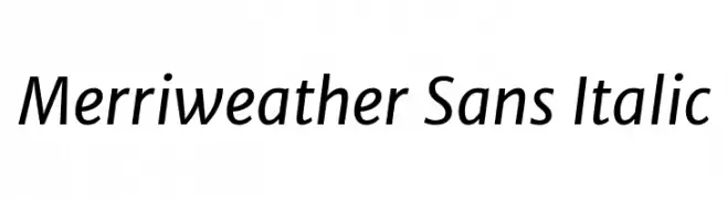
( Copyright (c) 2013-2016, Sorkin Type Co (www.sorkintype.com) with Reserved Font Name 'Merriweather'. Merriweather is a trademark of Sorkin Type Co. )
A modern sans-serif font with a subtle italic slant, offering elegance and readability.
![Merriweather Sans Italic Frei Schriftart Herunterladen]() Herunterladen 551 Downloads@WebFont
Herunterladen 551 Downloads@WebFont -
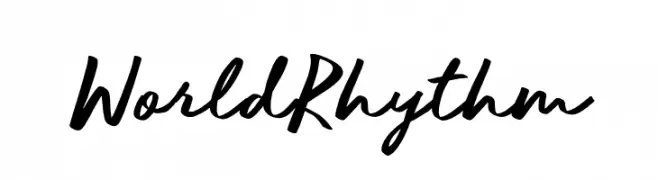
( Fonts by BLKBK - https://blkbk.ink - Personal-use only. For commercial use please contact owner. Sponsoren Schriftart )
A dynamic script font with fluid, connected letterforms and a casual, sophisticated vibe.
![World Rhythm Frei Schriftart Herunterladen]() Herunterladen 551 Downloads
Herunterladen 551 Downloads -
( Fonts by www.paintblackeditions.org - Free for personal use only )
A bold, distressed font with a rugged, textured appearance.
![out of tune Frei Schriftart Herunterladen]() Herunterladen 551 Downloads@WebFont
Herunterladen 551 Downloads@WebFont -
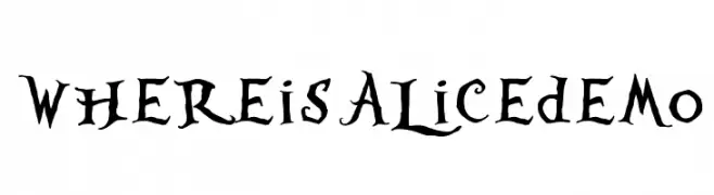
( JoannaVu - ioannaladopoulou.com )
A whimsical, gothic-style font with playful serifs and a hand-drawn appearance.
![WhereisAlicedemo Frei Schriftart Herunterladen]() Herunterladen 551 Downloads@WebFont
Herunterladen 551 Downloads@WebFont -
( Fonts by Dieter Steffmann )
A bold, dotted decorative font with a shadow effect, ideal for eye-catching designs.
![Tonight Frei Schriftart Herunterladen]() Herunterladen 551 Downloads@WebFont
Herunterladen 551 Downloads@WebFont -
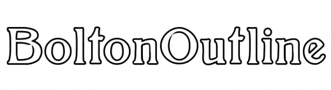
( Fonts by Paul Lloyd )
A bold, outlined font with a modern and playful style.
![BoltonOutline Frei Schriftart Herunterladen]() Herunterladen 551 Downloads@WebFont
Herunterladen 551 Downloads@WebFont -
( Fonts by Cathy Davies - cathydavies.com )
A bold, modern font with geometric structure and high contrast, ideal for impactful headlines.
![Soft Hits Frei Schriftart Herunterladen]() Herunterladen 551 Downloads@WebFont
Herunterladen 551 Downloads@WebFont -
![tlj Frei Schriftart Herunterladen]() Herunterladen 551 Downloads@WebFont
Herunterladen 551 Downloads@WebFont


Welche Schriften sind gerade am populärsten?
Poppins, Roboto, Montserrat, Open Sans und Lato sind wegen ihrer klaren Formen und breiten Einsetzbarkeit sehr gefragt – von Markenauftritt über Landingpages bis hin zu Postern.
Welche Fonts eignen sich für Logos?
Geometrische Sans‑Serifs (z. B. Poppins, Familien im Gotham‑Stil) sind ein häufiger Griff für sauberes, skalierbares Branding. Für eine persönlichere Note bleiben Scripts und Handschrift‑Stile beliebt. Kombinieren Sie einen prägnanten Headline‑Font mit einer neutralen Brotschrift für Wiedererkennung und Harmonie.
Wie oft wird die Top‑Liste aktualisiert?
Regelmäßig – basierend auf realen Downloads und Interaktionen. Schauen Sie öfter vorbei, um aufstrebende Favoriten früh zu entdecken.
💡 Tipp: Seite bookmarken – Trends wechseln schnell, und heutige Top‑Schriften inspirieren morgen vielleicht das Rebranding.