Willkommen bei den Top‑Schriften – hier treffen Beliebtheit und Qualität aufeinander. Das sind die in diesem Jahr am häufigsten heruntergeladenen und genutzten Fonts. Wenn Sie sichere Optionen für Logo, Web oder Social suchen, starten Sie hier.
Jeder Top‑Font überzeugt durch Balance, Lesbarkeit und Vielseitigkeit. Sie finden moderne Sans‑Serifs, elegante Scripts, Vintage‑Serifs und minimalistische Displays.
-
( Hazel Abbiati - diamondidiocy.tumblr.com )
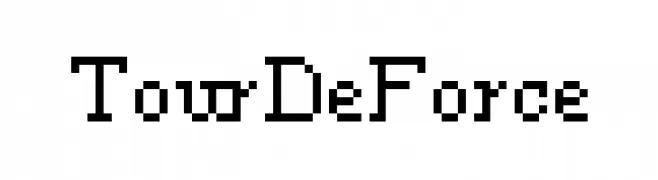
A pixelated, blocky font with a retro digital aesthetic.
 Herunterladen 109 Downloads@WebFont
 -
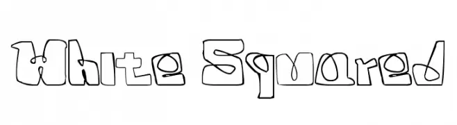
![White Squared Frei Schriftart Herunterladen]() Herunterladen 109 Downloads@WebFont
Herunterladen 109 Downloads@WebFont -
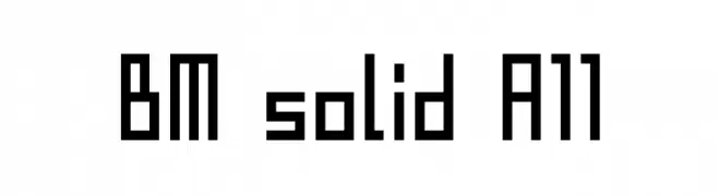
( BitmapMania - bitmapmania.m78.com/ )
A bold, geometric font with uniform strokes and a modern, digital aesthetic.
![BM solid A11 Frei Schriftart Herunterladen]() Herunterladen 109 Downloads@WebFont
Herunterladen 109 Downloads@WebFont -
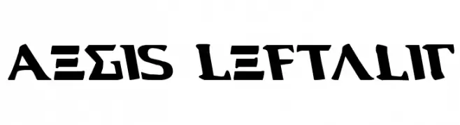
( Fonts by Daniel Zadorozny - www.iconian.com - Free for personal use )
A bold, left-leaning font with sharp, angular edges and a geometric style.
![Aegis Leftalic Frei Schriftart Herunterladen]() Herunterladen 109 Downloads@WebFont
Herunterladen 109 Downloads@WebFont -
( Fonts by Daniel Zadorozny - www.iconian.com - Personal-use only. For commercial use please contact owner. )
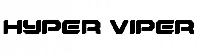
A bold, futuristic font with angular, geometric shapes.
![Hyper Viper Frei Schriftart Herunterladen]() Herunterladen 109 Downloads@WebFont
Herunterladen 109 Downloads@WebFont -
-
( Fonts by Iconian Fonts )
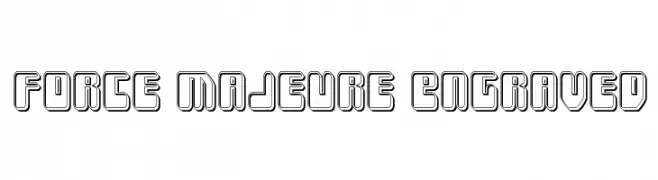
A bold, engraved font with a three-dimensional, futuristic style.
![Force Majeure Engraved Frei Schriftart Herunterladen]() Herunterladen 109 Downloads@WebFont
Herunterladen 109 Downloads@WebFont -
( Fonts by Stefie Justprince - https://shoppy.gg/@stefiejustprince- Personal-use only. For commercial use please contact owner. )
A playful handwritten font with fluid, energetic strokes.
![Chillhop Frei Schriftart Herunterladen]() Herunterladen 109 Downloads@WebFont
Herunterladen 109 Downloads@WebFont -
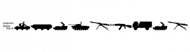
![Soviet-Kit Frei Schriftart Herunterladen]() Herunterladen 109 Downloads@WebFont
Herunterladen 109 Downloads@WebFont -
( Fonts by Mike Evans )
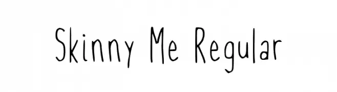
A playful, handwritten font with tall, narrow letterforms and a casual style.
![Skinny Me Regular Frei Schriftart Herunterladen]() Herunterladen 109 Downloads@WebFont
Herunterladen 109 Downloads@WebFont -
![Digital Internet Black Frei Schriftart Herunterladen]() Herunterladen 109 Downloads@WebFont
Herunterladen 109 Downloads@WebFont

Welche Schriften sind gerade am populärsten?
Poppins, Roboto, Montserrat, Open Sans und Lato sind wegen ihrer klaren Formen und breiten Einsetzbarkeit sehr gefragt – von Markenauftritt über Landingpages bis hin zu Postern.
Welche Fonts eignen sich für Logos?
Geometrische Sans‑Serifs (z. B. Poppins, Familien im Gotham‑Stil) sind ein häufiger Griff für sauberes, skalierbares Branding. Für eine persönlichere Note bleiben Scripts und Handschrift‑Stile beliebt. Kombinieren Sie einen prägnanten Headline‑Font mit einer neutralen Brotschrift für Wiedererkennung und Harmonie.
Wie oft wird die Top‑Liste aktualisiert?
Regelmäßig – basierend auf realen Downloads und Interaktionen. Schauen Sie öfter vorbei, um aufstrebende Favoriten früh zu entdecken.
💡 Tipp: Seite bookmarken – Trends wechseln schnell, und heutige Top‑Schriften inspirieren morgen vielleicht das Rebranding.