Willkommen bei den Top‑Schriften – hier treffen Beliebtheit und Qualität aufeinander. Das sind die in diesem Jahr am häufigsten heruntergeladenen und genutzten Fonts. Wenn Sie sichere Optionen für Logo, Web oder Social suchen, starten Sie hier.
Jeder Top‑Font überzeugt durch Balance, Lesbarkeit und Vielseitigkeit. Sie finden moderne Sans‑Serifs, elegante Scripts, Vintage‑Serifs und minimalistische Displays.
-
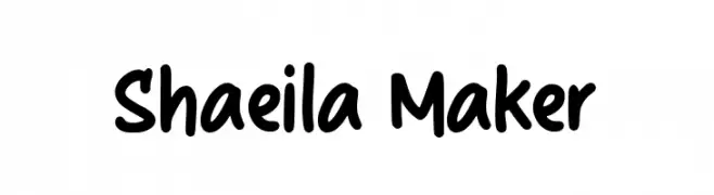
( Fonts by Kong Font )
A playful, bold handwritten font with smooth curves and rounded edges.
 Herunterladen 550 Downloads@WebFont
 -
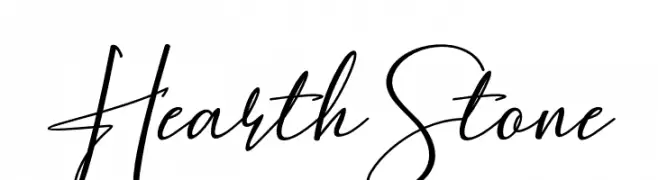
( Fonts by mightype - Personal-use only. For commercial use please contact owner. )
A modern, elegant script font with flowing, cursive characters.
![HearthStone Frei Schriftart Herunterladen]() Herunterladen 550 Downloads@WebFont
Herunterladen 550 Downloads@WebFont -
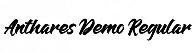
( Wacaksara Co - www.wacaksara.co )
A bold, expressive script font with flowing, cursive letterforms.
![Anthares Demo Regular Frei Schriftart Herunterladen]() Herunterladen 550 Downloads@WebFont
Herunterladen 550 Downloads@WebFont -
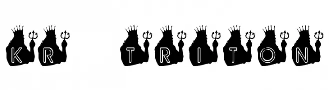
![KR Triton Frei Schriftart Herunterladen]() Herunterladen 550 Downloads@WebFont
Herunterladen 550 Downloads@WebFont -
( Fonts by Dustin Norlander - www.cheapskatefonts.com )
A bold, italic serif font with a classic and elegant style.
![Dustismo Roman Bold Italic Frei Schriftart Herunterladen]() Herunterladen 550 Downloads@WebFont
Herunterladen 550 Downloads@WebFont -
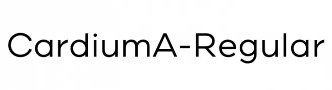
( Fonts by Yellow Design Studio - Ryan Martinson - Personal-use only. For commercial use please contact owner. )
A modern, geometric sans-serif font with clean lines and uniform strokes.
![CardiumA-Regular Frei Schriftart Herunterladen]() Herunterladen 550 Downloads@WebFont
Herunterladen 550 Downloads@WebFont -
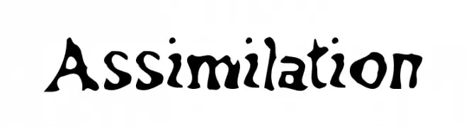
![Assimilation Frei Schriftart Herunterladen]() Herunterladen 550 Downloads@WebFont
Herunterladen 550 Downloads@WebFont -
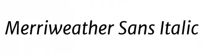
( Copyright (c) 2013-2016, Sorkin Type Co (www.sorkintype.com) with Reserved Font Name 'Merriweather'. Merriweather is a trademark of Sorkin Type Co. )
A modern sans-serif font with a subtle italic slant, offering elegance and readability.
![Merriweather Sans Italic Frei Schriftart Herunterladen]() Herunterladen 550 Downloads@WebFont
Herunterladen 550 Downloads@WebFont -
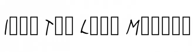
![It's Too Late Medium Frei Schriftart Herunterladen]() Herunterladen 550 Downloads@WebFont
Herunterladen 550 Downloads@WebFont -
( Fonts by Andrew McCluskey - nalgames.com )
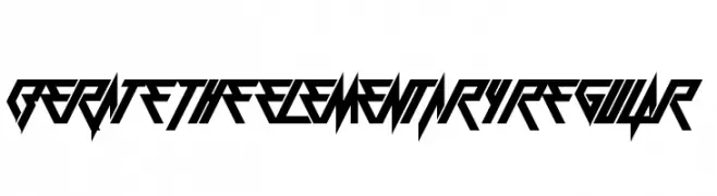
A bold, angular font with a futuristic and geometric design.
![Berate The Elementary Regular Frei Schriftart Herunterladen]() Herunterladen 550 Downloads@WebFont
Herunterladen 550 Downloads@WebFont -
( JoannaVu - ioannaladopoulou.com )
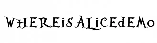
A whimsical, gothic-style font with playful serifs and a hand-drawn appearance.
![WhereisAlicedemo Frei Schriftart Herunterladen]() Herunterladen 550 Downloads@WebFont
Herunterladen 550 Downloads@WebFont -
( Fonts by Dieter Steffmann )
A bold, dotted decorative font with a shadow effect, ideal for eye-catching designs.
![Tonight Frei Schriftart Herunterladen]() Herunterladen 550 Downloads@WebFont
Herunterladen 550 Downloads@WebFont -
( Fonts by LyonsType - Daniel Lyons - Personal-use only. For commercial use please contact owner. )
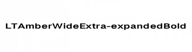
A bold, extra-expanded sans-serif font ideal for impactful headlines.
![LT Amber Wide Extra-expanded Bold Frei Schriftart Herunterladen]() Herunterladen 550 Downloads@WebFont
Herunterladen 550 Downloads@WebFont -
( Fonts by Cathy Davies - cathydavies.com )
A bold, modern font with geometric structure and high contrast, ideal for impactful headlines.
![Soft Hits Frei Schriftart Herunterladen]() Herunterladen 550 Downloads@WebFont
Herunterladen 550 Downloads@WebFont -
![European SansSerif Frei Schriftart Herunterladen]() Herunterladen 550 Downloads@WebFont
Herunterladen 550 Downloads@WebFont -
( Fonts by Balpirick Studio - https://www.creativefabrica.com/designer/balpirick/ref/308299/ - Personal-use only. For commercial use please contact owner. )
A playful and elegant script font with a flowing, handwritten style.
![Milcandy Frei Schriftart Herunterladen]() Herunterladen 550 Downloads@WebFont
Herunterladen 550 Downloads@WebFont -
![tlj Frei Schriftart Herunterladen]() Herunterladen 550 Downloads@WebFont
Herunterladen 550 Downloads@WebFont -
( Fonts by Mohammad Azmil Bahar )
A playful, rounded font with smooth curves and a friendly vibe.
![Holaholo Frei Schriftart Herunterladen]() Herunterladen 550 Downloads@WebFont
Herunterladen 550 Downloads@WebFont -
![EdenDisplay Frei Schriftart Herunterladen]() Herunterladen 550 Downloads@WebFont
Herunterladen 550 Downloads@WebFont -
( Fonts by Craft Supply Co. )
A playful, outlined font with rounded, bold characters and a whimsical style.
![KiddosyFree-Outline Frei Schriftart Herunterladen]() Herunterladen 550 Downloads@WebFont
Herunterladen 550 Downloads@WebFont -
( Fonts by Subectype & Orenari )
A bold, playful handwritten font with thick, rounded strokes.
![Urban Ranger Frei Schriftart Herunterladen]() Herunterladen 550 Downloads@WebFont
Herunterladen 550 Downloads@WebFont -
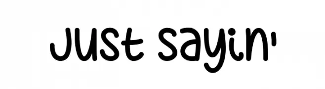
![Just Sayin' Frei Schriftart Herunterladen]() Herunterladen 550 Downloads@WebFont
Herunterladen 550 Downloads@WebFont -
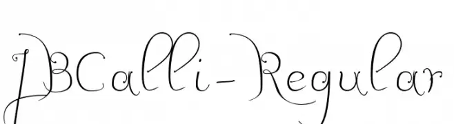
![JBCalli-Regular Frei Schriftart Herunterladen]() Herunterladen 550 Downloads@WebFont
Herunterladen 550 Downloads@WebFont -
( Fonts by a Max Infeld - XEROGRAPHER FONTS - xerographer.blogspot.com . Personal-use only. For commercial use please contact owner. )
A decorative font with intricate, nature-inspired bamboo-like patterns.
![bambu Frei Schriftart Herunterladen]() Herunterladen 550 Downloads@WebFont
Herunterladen 550 Downloads@WebFont -
![Thirteen Pixel Fonts Regular Frei Schriftart Herunterladen]() Herunterladen 550 Downloads@WebFont
Herunterladen 550 Downloads@WebFont -
( Fonts by Stefan Peev, Context Ltd - Personal-use only. For commercial use please contact owner. )
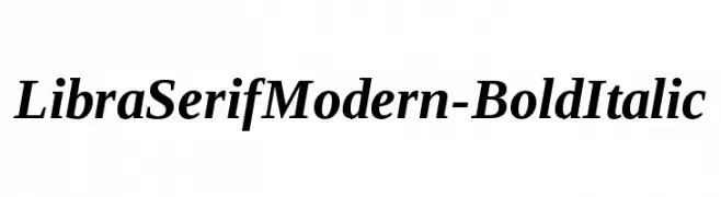
A bold, italic serif font with a modern and elegant style.
![LibraSerifModern-BoldItalic Frei Schriftart Herunterladen]() Herunterladen 550 Downloads@WebFont
Herunterladen 550 Downloads@WebFont -
( Fonts by Erlina Graphic )
A bold, hand-drawn font with rounded, playful characters.
![Lasting Sketch Frei Schriftart Herunterladen]() Herunterladen 550 Downloads@WebFont
Herunterladen 550 Downloads@WebFont -
( Fonts by ShyFonts )
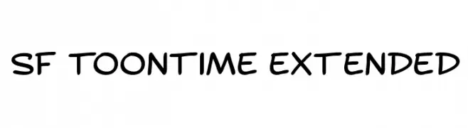
A playful, cartoon-like font with rounded, hand-drawn characters.
![SF Toontime Extended Frei Schriftart Herunterladen]() Herunterladen 550 Downloads@WebFont
Herunterladen 550 Downloads@WebFont -
( Fonts by Arkandis Digital Foundry )
A bold, modern sans-serif font with clean lines and geometric structure.
![Mintysis Bold Frei Schriftart Herunterladen]() Herunterladen 550 Downloads@WebFont
Herunterladen 550 Downloads@WebFont -
( Fonts by Zetafonts - Personal-use only. For commercial use please contact owner. )
A bold, italic font with a dynamic and impactful style.
![HeadingNow Trial 37 Extrabold Italic Frei Schriftart Herunterladen]() Herunterladen 550 Downloads@WebFont
Herunterladen 550 Downloads@WebFont -
( Fonts by David Rakowski )
Bold, three-dimensional serif font with shadow effects.
![Tejaratchi Ex Lefti Frei Schriftart Herunterladen]() Herunterladen 550 Downloads@WebFont
Herunterladen 550 Downloads@WebFont -
![Vingy Normal Frei Schriftart Herunterladen]() Herunterladen 550 Downloads
Herunterladen 550 Downloads -
![Chain Crank Frei Schriftart Herunterladen]() Herunterladen 550 Downloads@WebFont
Herunterladen 550 Downloads@WebFont -
( Copyright (c) 2015 Indian Type Foundry (info@indiantypefoundry.com) )
A bold, geometric font with sharp angles and consistent stroke width.
![Kumar One Regular Frei Schriftart Herunterladen]() Herunterladen 550 Downloads@WebFont
Herunterladen 550 Downloads@WebFont -
![The Classy Dots Frei Schriftart Herunterladen]() Herunterladen 550 Downloads@WebFont
Herunterladen 550 Downloads@WebFont


Welche Schriften sind gerade am populärsten?
Poppins, Roboto, Montserrat, Open Sans und Lato sind wegen ihrer klaren Formen und breiten Einsetzbarkeit sehr gefragt – von Markenauftritt über Landingpages bis hin zu Postern.
Welche Fonts eignen sich für Logos?
Geometrische Sans‑Serifs (z. B. Poppins, Familien im Gotham‑Stil) sind ein häufiger Griff für sauberes, skalierbares Branding. Für eine persönlichere Note bleiben Scripts und Handschrift‑Stile beliebt. Kombinieren Sie einen prägnanten Headline‑Font mit einer neutralen Brotschrift für Wiedererkennung und Harmonie.
Wie oft wird die Top‑Liste aktualisiert?
Regelmäßig – basierend auf realen Downloads und Interaktionen. Schauen Sie öfter vorbei, um aufstrebende Favoriten früh zu entdecken.
💡 Tipp: Seite bookmarken – Trends wechseln schnell, und heutige Top‑Schriften inspirieren morgen vielleicht das Rebranding.