Willkommen bei den Top‑Schriften – hier treffen Beliebtheit und Qualität aufeinander. Das sind die in diesem Jahr am häufigsten heruntergeladenen und genutzten Fonts. Wenn Sie sichere Optionen für Logo, Web oder Social suchen, starten Sie hier.
Jeder Top‑Font überzeugt durch Balance, Lesbarkeit und Vielseitigkeit. Sie finden moderne Sans‑Serifs, elegante Scripts, Vintage‑Serifs und minimalistische Displays.
-
( Fonts by Peter Wiegel - www.peter-wiegel.de - Personal-use only. For commercial use please contact owner. )
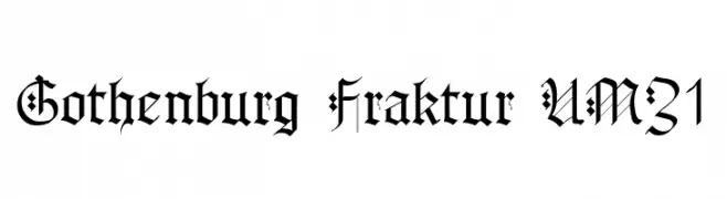
A bold and ornate Blackletter font with intricate details and a medieval aesthetic.
 Herunterladen 106 Downloads@WebFont
 -
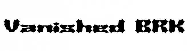
![Vanished BRK Frei Schriftart Herunterladen]() Herunterladen 106 Downloads@WebFont
Herunterladen 106 Downloads@WebFont -
( Fonts by StringLabs )
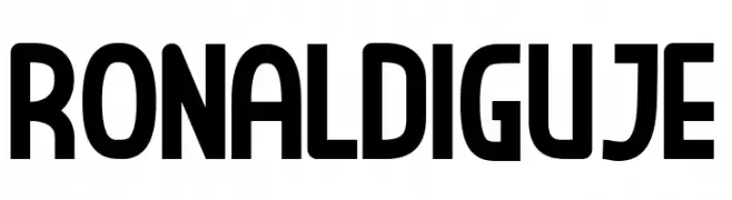
A bold, modern font with geometric structure and minimal contrast.
![RONALDI GUJE Frei Schriftart Herunterladen]() Herunterladen 106 Downloads@WebFont
Herunterladen 106 Downloads@WebFont -
( Copyright © 2017 IBM Corp. with Reserved Font Name "Plex" )
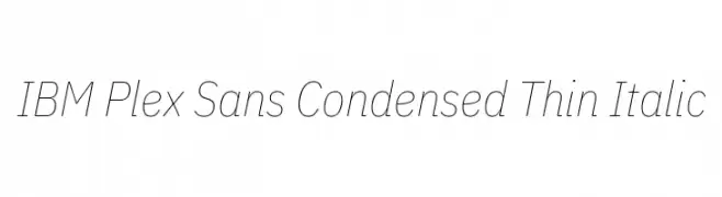
A sleek, modern, condensed, and thin italic font with a clean and elegant style.
![IBM Plex Sans Condensed Thin Italic Frei Schriftart Herunterladen]() Herunterladen 106 Downloads@WebFont
Herunterladen 106 Downloads@WebFont -
( Frogii`s Fonts )
Bold, geometric font with strong rectangular shapes and high contrast.
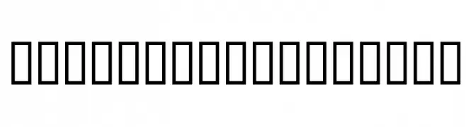
![Frogii's Froggers Frei Schriftart Herunterladen]() Herunterladen 106 Downloads@WebFont
Herunterladen 106 Downloads@WebFont -
-
( Fonts by GGBotNet )
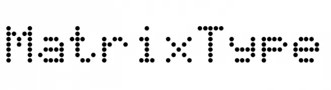
A dot matrix style font with a modern, digital appearance.
![MatrixType Frei Schriftart Herunterladen]() Herunterladen 106 Downloads@WebFont
Herunterladen 106 Downloads@WebFont -
( Free for personal use - truefonts.blogspot.com )
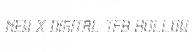
A futuristic, hollow, segmented font inspired by digital displays.
![New X Digital tfb Hollow Frei Schriftart Herunterladen]() Herunterladen 106 Downloads@WebFont
Herunterladen 106 Downloads@WebFont -
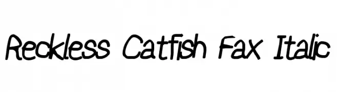
![Reckless Catfish Fax Italic Frei Schriftart Herunterladen]() Herunterladen 106 Downloads@WebFont
Herunterladen 106 Downloads@WebFont -
( Morgan - ritamorgan.wix.com/bhsmorgan#! )
A playful, casual handwritten font with irregular strokes and organic flow.
![Lauren Frei Schriftart Herunterladen]() Herunterladen 106 Downloads@WebFont
Herunterladen 106 Downloads@WebFont -
![Negative_Frequences_Regular Frei Schriftart Herunterladen]() Herunterladen 106 Downloads@WebFont
Herunterladen 106 Downloads@WebFont

Welche Schriften sind gerade am populärsten?
Poppins, Roboto, Montserrat, Open Sans und Lato sind wegen ihrer klaren Formen und breiten Einsetzbarkeit sehr gefragt – von Markenauftritt über Landingpages bis hin zu Postern.
Welche Fonts eignen sich für Logos?
Geometrische Sans‑Serifs (z. B. Poppins, Familien im Gotham‑Stil) sind ein häufiger Griff für sauberes, skalierbares Branding. Für eine persönlichere Note bleiben Scripts und Handschrift‑Stile beliebt. Kombinieren Sie einen prägnanten Headline‑Font mit einer neutralen Brotschrift für Wiedererkennung und Harmonie.
Wie oft wird die Top‑Liste aktualisiert?
Regelmäßig – basierend auf realen Downloads und Interaktionen. Schauen Sie öfter vorbei, um aufstrebende Favoriten früh zu entdecken.
💡 Tipp: Seite bookmarken – Trends wechseln schnell, und heutige Top‑Schriften inspirieren morgen vielleicht das Rebranding.