Willkommen bei den Top‑Schriften – hier treffen Beliebtheit und Qualität aufeinander. Das sind die in diesem Jahr am häufigsten heruntergeladenen und genutzten Fonts. Wenn Sie sichere Optionen für Logo, Web oder Social suchen, starten Sie hier.
Jeder Top‑Font überzeugt durch Balance, Lesbarkeit und Vielseitigkeit. Sie finden moderne Sans‑Serifs, elegante Scripts, Vintage‑Serifs und minimalistische Displays.
-
( Fonts by Arlub )
A bold, playful font with whimsical, decorative elements.
 Herunterladen 517 Downloads@WebFont
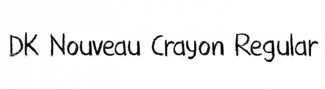
 -
![DK Nouveau Crayon Regular Frei Schriftart Herunterladen]() Herunterladen 517 Downloads@WebFont
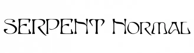
Herunterladen 517 Downloads@WebFont -
![SERPENT Normal Frei Schriftart Herunterladen]() Herunterladen 517 Downloads
Herunterladen 517 Downloads -
( Fonts by www.fontalicious.com )
A futuristic, geometric font with bold, blocky letterforms.
![Digit Frei Schriftart Herunterladen]() Herunterladen 517 Downloads@WebFont
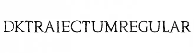
Herunterladen 517 Downloads@WebFont -
![DK Traiectum Regular Frei Schriftart Herunterladen]() Herunterladen 517 Downloads@WebFont
Herunterladen 517 Downloads@WebFont -
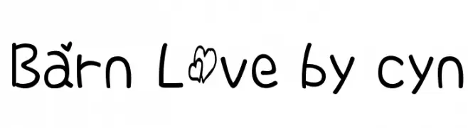
-
![Barn Love by cyn Frei Schriftart Herunterladen]() Herunterladen 517 Downloads@WebFont
Herunterladen 517 Downloads@WebFont -
( Fonts by Kreative Korporation - www.kreativekorp.com )
A clean, modern sans-serif font with a geometric influence.
![Pfennig Frei Schriftart Herunterladen]() Herunterladen 517 Downloads@WebFont
Herunterladen 517 Downloads@WebFont -
( Fonts by Riyadh Rahman - Personal-use only. For commercial use please contact owner. )
An elegant and flowing script font with intricate letterforms and graceful curves.
![PeachCuties Frei Schriftart Herunterladen]() Herunterladen 517 Downloads@WebFont
Herunterladen 517 Downloads@WebFont -
( Fonts by Daniel Zadorozny - www.iconian.com )
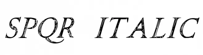
A decorative italic font with a hand-drawn, textured style reminiscent of Roman inscriptions.
![SPQR Italic Frei Schriftart Herunterladen]() Herunterladen 517 Downloads@WebFont
Herunterladen 517 Downloads@WebFont -
( Vladimir Nikolic - www.coroflot.com/vladimirnikolic )
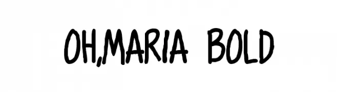
A bold, playful handwritten font with rounded, consistent strokes.
![Oh,Maria Bold Frei Schriftart Herunterladen]() Herunterladen 517 Downloads@WebFont
Herunterladen 517 Downloads@WebFont -
( Noto is a trademark of Google Inc. Noto fonts are open source. All Noto fonts are published under the SIL Open Font License, Version 1.1 )
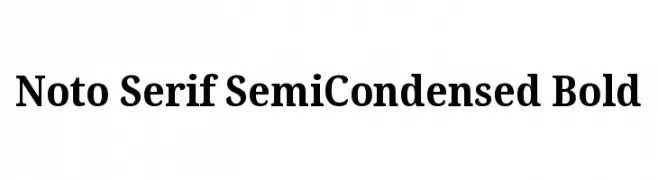
A bold, semi-condensed serif font with moderate contrast and classic styling.
![Noto Serif SemiCondensed Bold Frei Schriftart Herunterladen]() Herunterladen 517 Downloads@WebFont
Herunterladen 517 Downloads@WebFont -
( Free for personal use - www.junkohanhero.com )
A bold, distressed font with a rugged, textured appearance.
![Terra Frei Schriftart Herunterladen]() Herunterladen 517 Downloads@WebFont
Herunterladen 517 Downloads@WebFont -
![Peon Frei Schriftart Herunterladen]() Herunterladen 517 Downloads@WebFont
Herunterladen 517 Downloads@WebFont -
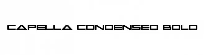
( Fonts by Daniel Zadorozny - www.iconian.com )
A bold, condensed font with a futuristic, geometric design.
![Capella Condensed Bold Frei Schriftart Herunterladen]() Herunterladen 517 Downloads@WebFont
Herunterladen 517 Downloads@WebFont -
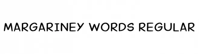
( Fonts by shark_of_the_tale )
A playful, handwritten font with rounded, smooth letterforms.
![Margariney Words Regular Frei Schriftart Herunterladen]() Herunterladen 517 Downloads@WebFont
Herunterladen 517 Downloads@WebFont -
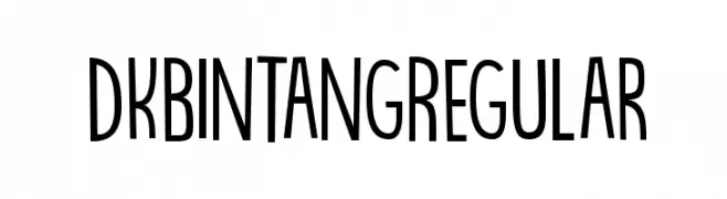
( Hanoded - David Kerkhoff - www.hanodedfonts.com )
A playful, decorative font with tall, narrow characters and unique starburst symbols.
![DK Bintang Regular Frei Schriftart Herunterladen]() Herunterladen 517 Downloads@WebFont
Herunterladen 517 Downloads@WebFont -
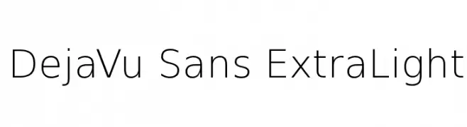
( Fonts by Bitstream - Personal-use only. For commercial use please contact owner. )
A clean, minimalist sans-serif font with an extra-light weight and modern appeal.
![DejaVu Sans ExtraLight Frei Schriftart Herunterladen]() Herunterladen 517 Downloads@WebFont
Herunterladen 517 Downloads@WebFont -
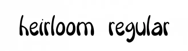
( Kelsey Punch )
A playful, hand-drawn font with rounded, irregular letterforms and a whimsical style.
![Heirloom Regular Frei Schriftart Herunterladen]() Herunterladen 517 Downloads@WebFont
Herunterladen 517 Downloads@WebFont -
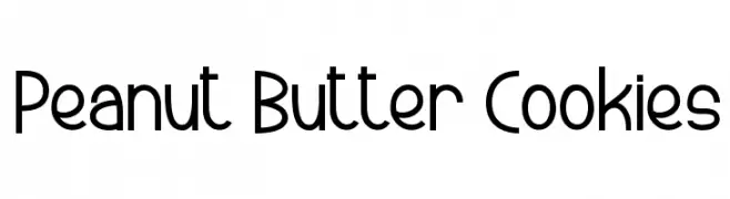
( Fonts by www.dcoxy.com )
A modern, geometric sans-serif font with consistent stroke width and balanced spacing.
![Peanut Butter Cookies Frei Schriftart Herunterladen]() Herunterladen 517 Downloads@WebFont
Herunterladen 517 Downloads@WebFont -
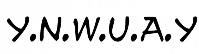
( Fonts by Jacob Fisher - www.pizzadude.dk )
A bold, handwritten font with a playful and dynamic style.
![y.n.w.u.a.y Frei Schriftart Herunterladen]() Herunterladen 517 Downloads@WebFont
Herunterladen 517 Downloads@WebFont -
![Promotion Script Frei Schriftart Herunterladen]() Herunterladen 517 Downloads@WebFont
Herunterladen 517 Downloads@WebFont -
( Fonts by Daniel Gauthier )
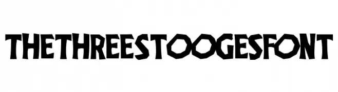
A bold, playful font with jagged, hand-drawn edges and a cartoonish style.
![TheThreeStoogesFont Frei Schriftart Herunterladen]() Herunterladen 517 Downloads@WebFont
Herunterladen 517 Downloads@WebFont -
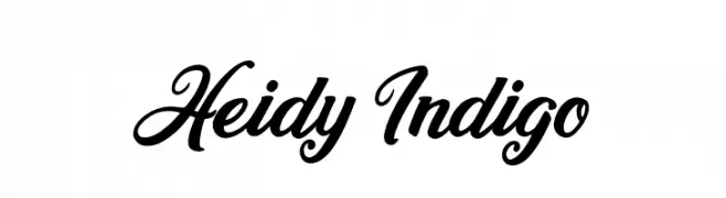
![Heidy Indigo Frei Schriftart Herunterladen]() Herunterladen 517 Downloads@WebFont
Herunterladen 517 Downloads@WebFont -
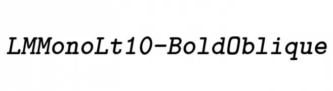
( Fonts by www.gust.org.pl )
A bold, oblique monospaced font with uniform character width and modern appeal.
![LMMonoLt10-BoldOblique Frei Schriftart Herunterladen]() Herunterladen 517 Downloads@WebFont
Herunterladen 517 Downloads@WebFont -
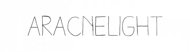
Schriftart von antipixel. For commercial use please contact the owner.
![AracneLight Frei Schriftart Herunterladen]() Herunterladen 517 Downloads@WebFont
Herunterladen 517 Downloads@WebFont -
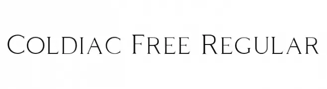
( Fonts by Craft Supply Co - Personal-use only. For commercial use please contact owner. )
A clean and elegant serif font with thin, elongated strokes and subtle curves.
![Coldiac Free Regular Frei Schriftart Herunterladen]() Herunterladen 517 Downloads@WebFont
Herunterladen 517 Downloads@WebFont -
( Fonts by Huerta Tipográfica - Personal-use only. For commercial use please contact owner. )
A bold, italic serif font with a modern yet classic appeal.
![Andada Bold Italic Frei Schriftart Herunterladen]() Herunterladen 517 Downloads@WebFont
Herunterladen 517 Downloads@WebFont -
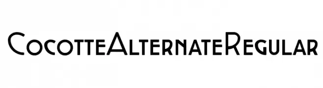
( Fonts by Zetafonts )
A modern, geometric font with bold uppercase and smooth lowercase letters.
![Cocotte Alternate Regular Frei Schriftart Herunterladen]() Herunterladen 517 Downloads@WebFont
Herunterladen 517 Downloads@WebFont -
![RamRod Frei Schriftart Herunterladen]() Herunterladen 517 Downloads@WebFont
Herunterladen 517 Downloads@WebFont -
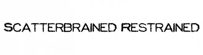
( Fonts by www.stimuleyefonts.com )
A bold, distressed font with a grunge, hand-drawn style.
![Scatterbrained Restrained Frei Schriftart Herunterladen]() Herunterladen 517 Downloads@WebFont
Herunterladen 517 Downloads@WebFont -
![Palisoc Italic Frei Schriftart Herunterladen]() Herunterladen 517 Downloads@WebFont
Herunterladen 517 Downloads@WebFont -
( Pizzadude - Jakob Fischer - www.pizzadude.dk/ )
A tall, narrow font with a hand-drawn, artistic style.
![PorceleinaDEMO Frei Schriftart Herunterladen]() Herunterladen 517 Downloads@WebFont
Herunterladen 517 Downloads@WebFont -
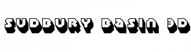
![Sudbury Basin 3D Frei Schriftart Herunterladen]() Herunterladen 517 Downloads@WebFont
Herunterladen 517 Downloads@WebFont -
( Copyright (c) 2012, Impallari Type (www.impallari.com), with Reserved Font Name Encode Sans. )
A modern, narrow sans-serif font with a clean and professional look.
![Encode Sans Narrow Frei Schriftart Herunterladen]() Herunterladen 517 Downloads@WebFont
Herunterladen 517 Downloads@WebFont -
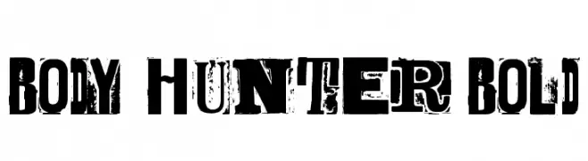
( Fonts by billyargel.blogspot.com - Billy Argel )
A bold, distressed font with a grunge aesthetic and strong visual impact.
![BODY HUNTER Bold Frei Schriftart Herunterladen]() Herunterladen 517 Downloads@WebFont
Herunterladen 517 Downloads@WebFont


Welche Schriften sind gerade am populärsten?
Poppins, Roboto, Montserrat, Open Sans und Lato sind wegen ihrer klaren Formen und breiten Einsetzbarkeit sehr gefragt – von Markenauftritt über Landingpages bis hin zu Postern.
Welche Fonts eignen sich für Logos?
Geometrische Sans‑Serifs (z. B. Poppins, Familien im Gotham‑Stil) sind ein häufiger Griff für sauberes, skalierbares Branding. Für eine persönlichere Note bleiben Scripts und Handschrift‑Stile beliebt. Kombinieren Sie einen prägnanten Headline‑Font mit einer neutralen Brotschrift für Wiedererkennung und Harmonie.
Wie oft wird die Top‑Liste aktualisiert?
Regelmäßig – basierend auf realen Downloads und Interaktionen. Schauen Sie öfter vorbei, um aufstrebende Favoriten früh zu entdecken.
💡 Tipp: Seite bookmarken – Trends wechseln schnell, und heutige Top‑Schriften inspirieren morgen vielleicht das Rebranding.