Willkommen bei den Top‑Schriften – hier treffen Beliebtheit und Qualität aufeinander. Das sind die in diesem Jahr am häufigsten heruntergeladenen und genutzten Fonts. Wenn Sie sichere Optionen für Logo, Web oder Social suchen, starten Sie hier.
Jeder Top‑Font überzeugt durch Balance, Lesbarkeit und Vielseitigkeit. Sie finden moderne Sans‑Serifs, elegante Scripts, Vintage‑Serifs und minimalistische Displays.
-
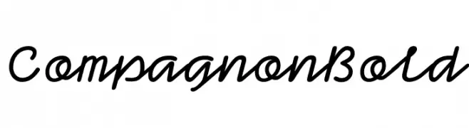
( Fonts by Velvetyne )
A bold, elegant script font with interconnected characters and a cohesive flow.
 Herunterladen 513 Downloads@WebFont
 -
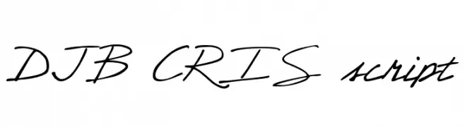
( Fonts by Darcy Baldwin - darcybaldwin.com. Free for personal use only )
A casual script font with fluid, handwritten strokes and a natural, elegant style.
![DJB CRIS script Frei Schriftart Herunterladen]() Herunterladen 513 Downloads@WebFont
Herunterladen 513 Downloads@WebFont -
( Fonts by Arkandis Digital Foundry )
An elegant serif font with a classic italic style and refined appearance.
![VenturisADFStyle-Italic Frei Schriftart Herunterladen]() Herunterladen 513 Downloads@WebFont
Herunterladen 513 Downloads@WebFont -
( Fonts by ShyFonts )
A bold, modern, and geometric font with an extended width, perfect for headlines.
![SF Proverbial Gothic Extended Frei Schriftart Herunterladen]() Herunterladen 513 Downloads@WebFont
Herunterladen 513 Downloads@WebFont -
( Fonts by StereoType - Clément Nicolle - Personal-use only. For commercial use please contact owner. )
A lively and expressive handwritten font with dynamic strokes.
![Yellowstone Frei Schriftart Herunterladen]() Herunterladen 513 Downloads@WebFont
Herunterladen 513 Downloads@WebFont -
-
( Fonts by Etik Fatimah )
A playful and energetic script font with smooth, connected letterforms.
![Sometime Frei Schriftart Herunterladen]() Herunterladen 513 Downloads@WebFont
Herunterladen 513 Downloads@WebFont -
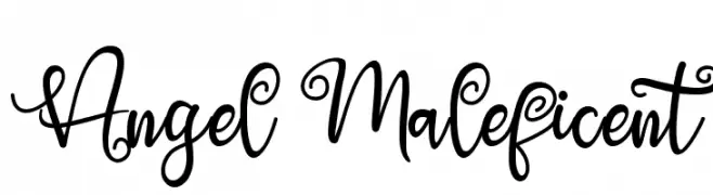
( Fonts by Thomas Aradea )
An elegant and whimsical script font with ornate curls and loops.
![Angel Maleficent Frei Schriftart Herunterladen]() Herunterladen 513 Downloads@WebFont
Herunterladen 513 Downloads@WebFont -
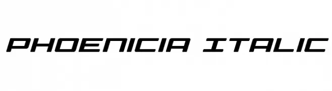
( Fonts by Daniel Zadorozny - www.iconian.com - Free for personal use )
A modern, italicized font with a sleek, geometric design.
![Phoenicia Italic Frei Schriftart Herunterladen]() Herunterladen 513 Downloads@WebFont
Herunterladen 513 Downloads@WebFont -
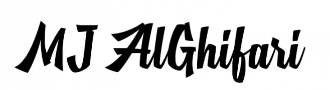
( Fonts by Mikrojihad Inc - www.behance.net/mikrojihad - Personal-use only. For commercial use please contact owner. )
A bold, dynamic script font with angular uppercase and fluid lowercase letters.
![MJ AlGhifari Frei Schriftart Herunterladen]() Herunterladen 513 Downloads@WebFont
Herunterladen 513 Downloads@WebFont -
( Fonts by MJType )
A bold, playful handwritten font with rounded edges and a dynamic style.
![TIKTAK Frei Schriftart Herunterladen]() Herunterladen 513 Downloads@WebFont
Herunterladen 513 Downloads@WebFont -
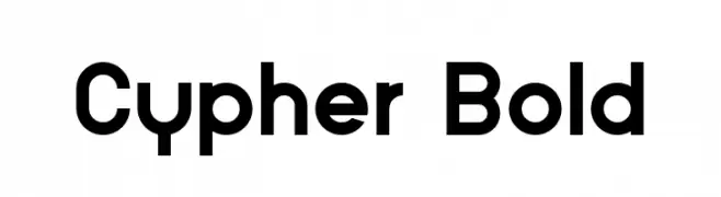
( Fonts by Nabeel Khalid - Personal-use only. For commercial use please contact owner. )
A bold, modern font with clean lines and geometric structure.
![Cypher Bold Frei Schriftart Herunterladen]() Herunterladen 512 Downloads@WebFont
Herunterladen 512 Downloads@WebFont -
![A Scratched Remix Frei Schriftart Herunterladen]() Herunterladen 512 Downloads@WebFont
Herunterladen 512 Downloads@WebFont -
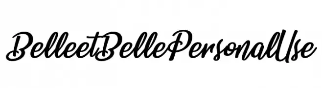
( Billy Argel - billyargel.com/ )
A bold, flowing script font with elegant curves and smooth strokes.
![Belle et Belle Personal Use Frei Schriftart Herunterladen]() Herunterladen 512 Downloads@WebFont
Herunterladen 512 Downloads@WebFont -
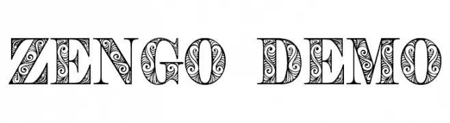
( Fonts by Eva Barabas - www.etsy.com/ie/shop/digitaltypefaces - Personal-use only. For commercial use please contact owner. )
A decorative font with intricate, swirling patterns and a vintage flair.
![Zengo Demo Frei Schriftart Herunterladen]() Herunterladen 512 Downloads@WebFont
Herunterladen 512 Downloads@WebFont -
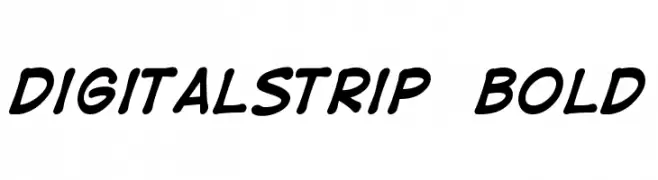
( Fonts by Nate Piekos - www.blambot.com )
A bold, handwritten font with a playful and dynamic style.
![DigitalStrip Bold Frei Schriftart Herunterladen]() Herunterladen 512 Downloads@WebFont
Herunterladen 512 Downloads@WebFont -
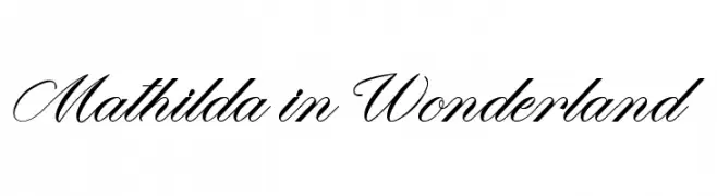
( Fonts by Octotype - www.foundmyfont.com - Personal-use only. For commercial use please contact owner. )
An elegant script font with flowing, interconnected letters and ornate flourishes.
![Mathilda in Wonderland Frei Schriftart Herunterladen]() Herunterladen 512 Downloads@WebFont
Herunterladen 512 Downloads@WebFont -
![000 Frei Schriftart Herunterladen]() Herunterladen 512 Downloads@WebFont
Herunterladen 512 Downloads@WebFont -
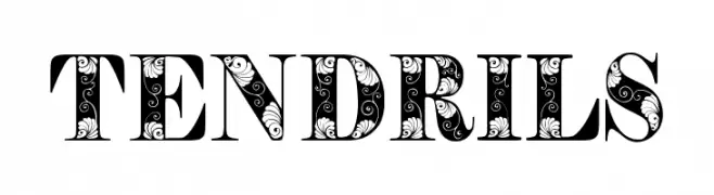
( Fonts by Eva Barabas - www.etsy.com/ie/shop/digitaltypefaces - Personal-use only. For commercial use please contact owner. )
A decorative font with intricate tendril-like designs within bold uppercase letters.
![Tendrils Frei Schriftart Herunterladen]() Herunterladen 512 Downloads@WebFont
Herunterladen 512 Downloads@WebFont -
( Roland Huse Design - Roland Huse - rolandhuse.com )
A whimsical and decorative font with playful curls and ornate details.
![TeachDemo-Regular Frei Schriftart Herunterladen]() Herunterladen 512 Downloads@WebFont
Herunterladen 512 Downloads@WebFont -
( Fonts by www.peter-wiegel.de - Personal-use only. For commercial use please contact owner. )
A sophisticated serif font with elegant lines and subtle curves.
![CATLinz Frei Schriftart Herunterladen]() Herunterladen 512 Downloads@WebFont
Herunterladen 512 Downloads@WebFont -
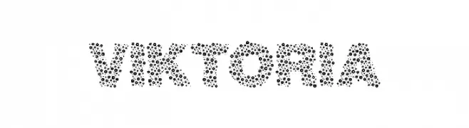
( prask.eu/ )
A playful, dotted font ideal for creative and decorative projects.
![viktoria Frei Schriftart Herunterladen]() Herunterladen 512 Downloads@WebFont
Herunterladen 512 Downloads@WebFont -
![PlumeriaSans Frei Schriftart Herunterladen]() Herunterladen 512 Downloads@WebFont
Herunterladen 512 Downloads@WebFont -
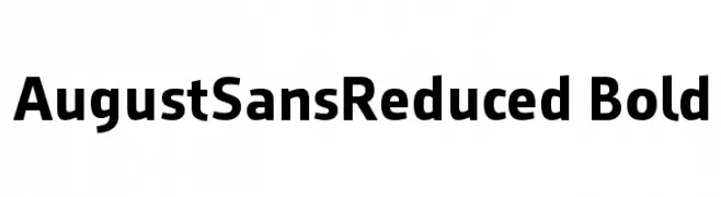
( ingoFonts - Ingo Zimmermann - www.ingofonts.com )
A bold, modern sans-serif font with clean lines and uniform strokes.
![AugustSansReduced-Bold Frei Schriftart Herunterladen]() Herunterladen 512 Downloads@WebFont
Herunterladen 512 Downloads@WebFont -
( Fonts by Press Gang Studios - Andeh Pinkard - www.pressgang-studios.com )
A dynamic, handwritten-style font with slanted, energetic letterforms.
![Dealspinner TBS Frei Schriftart Herunterladen]() Herunterladen 512 Downloads@WebFont
Herunterladen 512 Downloads@WebFont -
( Fonts by Peax Webdesign - www.peax-webdesign.com. Personal-use only. For commercial use please contact owner. )
A hand-drawn serif font with a textured, scratchy appearance.
![PWSerifScratch Frei Schriftart Herunterladen]() Herunterladen 512 Downloads@WebFont
Herunterladen 512 Downloads@WebFont -
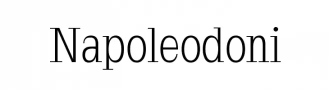
( Fonts by Manfred Klein - manfred-klein.ina-mar.com )
A classic serif typeface with elegant contrast and sharp serifs.
![Napoleodoni Frei Schriftart Herunterladen]() Herunterladen 512 Downloads@WebFont
Herunterladen 512 Downloads@WebFont -
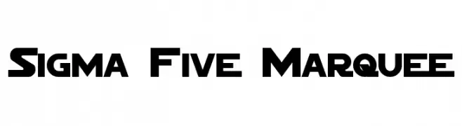
( Fonts by a Neale Davidson - www.pixelsagas.com. Personal-use only. For commercial use please contact owner. )
A bold, geometric font with a futuristic and modern design.
![Sigma Five Marquee Frei Schriftart Herunterladen]() Herunterladen 512 Downloads@WebFont
Herunterladen 512 Downloads@WebFont -
![RockArt Frei Schriftart Herunterladen]() Herunterladen 512 Downloads@WebFont
Herunterladen 512 Downloads@WebFont -
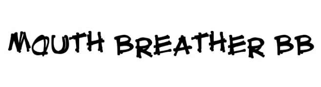
( Fonts by Nate Piekos - www.blambot.com )
A bold, playful handwritten font with an energetic and informal style.
![Mouth Breather BB Frei Schriftart Herunterladen]() Herunterladen 512 Downloads@WebFont
Herunterladen 512 Downloads@WebFont -
![fatpen Frei Schriftart Herunterladen]() Herunterladen 512 Downloads@WebFont
Herunterladen 512 Downloads@WebFont -
![SF Diego Sans Oblique Frei Schriftart Herunterladen]() Herunterladen 512 Downloads@WebFont
Herunterladen 512 Downloads@WebFont -
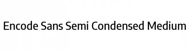
( Copyright 2012 The Encode Project Authors (impallari@gmail.com), with Reserved Font Name "Encode Sansâ€. )
A modern, semi-condensed sans-serif font with medium contrast and clean lines.
![Encode Sans Semi Condensed Medium Frei Schriftart Herunterladen]() Herunterladen 512 Downloads@WebFont
Herunterladen 512 Downloads@WebFont -
( Fonts by Daniel Zadorozny - www.iconian.com - Free for personal use )
A bold, decorative font with a Western, vintage style.
![Texas Ranger Expanded Frei Schriftart Herunterladen]() Herunterladen 512 Downloads@WebFont
Herunterladen 512 Downloads@WebFont -
( Fonts by www.ajpaglia.com - FREE for personal or commercial usage )
A bold, geometric font with a three-dimensional, industrial style.
![Iron Sans Frei Schriftart Herunterladen]() Herunterladen 512 Downloads@WebFont
Herunterladen 512 Downloads@WebFont -
![Bujardet Freres Frei Schriftart Herunterladen]() Herunterladen 512 Downloads@WebFont
Herunterladen 512 Downloads@WebFont


Welche Schriften sind gerade am populärsten?
Poppins, Roboto, Montserrat, Open Sans und Lato sind wegen ihrer klaren Formen und breiten Einsetzbarkeit sehr gefragt – von Markenauftritt über Landingpages bis hin zu Postern.
Welche Fonts eignen sich für Logos?
Geometrische Sans‑Serifs (z. B. Poppins, Familien im Gotham‑Stil) sind ein häufiger Griff für sauberes, skalierbares Branding. Für eine persönlichere Note bleiben Scripts und Handschrift‑Stile beliebt. Kombinieren Sie einen prägnanten Headline‑Font mit einer neutralen Brotschrift für Wiedererkennung und Harmonie.
Wie oft wird die Top‑Liste aktualisiert?
Regelmäßig – basierend auf realen Downloads und Interaktionen. Schauen Sie öfter vorbei, um aufstrebende Favoriten früh zu entdecken.
💡 Tipp: Seite bookmarken – Trends wechseln schnell, und heutige Top‑Schriften inspirieren morgen vielleicht das Rebranding.