Willkommen bei den Top‑Schriften – hier treffen Beliebtheit und Qualität aufeinander. Das sind die in diesem Jahr am häufigsten heruntergeladenen und genutzten Fonts. Wenn Sie sichere Optionen für Logo, Web oder Social suchen, starten Sie hier.
Jeder Top‑Font überzeugt durch Balance, Lesbarkeit und Vielseitigkeit. Sie finden moderne Sans‑Serifs, elegante Scripts, Vintage‑Serifs und minimalistische Displays.
-
 Herunterladen 102 Downloads@WebFont
 -
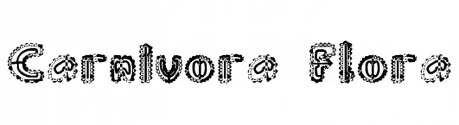
![Carnivora Flora Frei Schriftart Herunterladen]() Herunterladen 102 Downloads@WebFont
Herunterladen 102 Downloads@WebFont -
( Fonts by Situjuh Nazara - 7ntypes.com - Personal-use only. For commercial use please contact owner. )
A playful, bold handwritten font with rounded, lively characters.
![Stephia Frei Schriftart Herunterladen]() Herunterladen 102 Downloads@WebFont
Herunterladen 102 Downloads@WebFont -
( Fonts by Emtheen Studio )
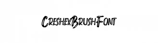
A bold, brush-style font with an energetic and artistic feel.
![Creshex Brush Font Frei Schriftart Herunterladen]() Herunterladen 102 Downloads@WebFont
Herunterladen 102 Downloads@WebFont -
( Fonts by Allouse Studio - Personal-use only. For commercial use please contact owner. )
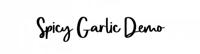
A playful, handwritten font with a modern, energetic style.
![Spicy Garlic Demo Frei Schriftart Herunterladen]() Herunterladen 102 Downloads@WebFont
Herunterladen 102 Downloads@WebFont -
-
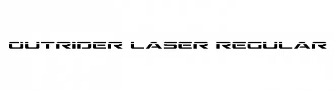
( Fonts by Daniel Zadorozny - www.iconian.com )
A futuristic, angular font with a bold, sci-fi aesthetic.
![Outrider Laser Regular Frei Schriftart Herunterladen]() Herunterladen 102 Downloads@WebFont
Herunterladen 102 Downloads@WebFont -
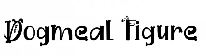
( Fonts by www.movefont .com )
A whimsical, playful font with cartoonish dog face embellishments.
![Dogmeal Figure Frei Schriftart Herunterladen]() Herunterladen 102 Downloads@WebFont
Herunterladen 102 Downloads@WebFont -
( Fonts by Jeremy Irons )
A playful, bold handwritten font with expressive strokes and a whimsical style.
![Skylarking Frei Schriftart Herunterladen]() Herunterladen 102 Downloads@WebFont
Herunterladen 102 Downloads@WebFont -
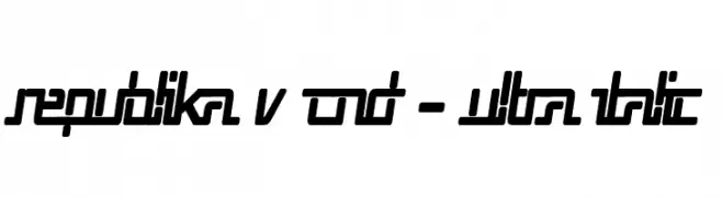
( Fonts by Apostrophic Lab )
A bold, ultra-condensed italic font with geometric shapes and dynamic style.
![Republika V Cnd - Ultra Italic Frei Schriftart Herunterladen]() Herunterladen 102 Downloads@WebFont
Herunterladen 102 Downloads@WebFont -
( Fonts by Greentrik6789 )
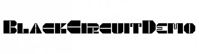
A bold, futuristic font with geometric, angular shapes and a technological feel.
![Black Circuit Demo Frei Schriftart Herunterladen]() Herunterladen 102 Downloads@WebFont
Herunterladen 102 Downloads@WebFont

Welche Schriften sind gerade am populärsten?
Poppins, Roboto, Montserrat, Open Sans und Lato sind wegen ihrer klaren Formen und breiten Einsetzbarkeit sehr gefragt – von Markenauftritt über Landingpages bis hin zu Postern.
Welche Fonts eignen sich für Logos?
Geometrische Sans‑Serifs (z. B. Poppins, Familien im Gotham‑Stil) sind ein häufiger Griff für sauberes, skalierbares Branding. Für eine persönlichere Note bleiben Scripts und Handschrift‑Stile beliebt. Kombinieren Sie einen prägnanten Headline‑Font mit einer neutralen Brotschrift für Wiedererkennung und Harmonie.
Wie oft wird die Top‑Liste aktualisiert?
Regelmäßig – basierend auf realen Downloads und Interaktionen. Schauen Sie öfter vorbei, um aufstrebende Favoriten früh zu entdecken.
💡 Tipp: Seite bookmarken – Trends wechseln schnell, und heutige Top‑Schriften inspirieren morgen vielleicht das Rebranding.