Willkommen bei den Top‑Schriften – hier treffen Beliebtheit und Qualität aufeinander. Das sind die in diesem Jahr am häufigsten heruntergeladenen und genutzten Fonts. Wenn Sie sichere Optionen für Logo, Web oder Social suchen, starten Sie hier.
Jeder Top‑Font überzeugt durch Balance, Lesbarkeit und Vielseitigkeit. Sie finden moderne Sans‑Serifs, elegante Scripts, Vintage‑Serifs und minimalistische Displays.
-
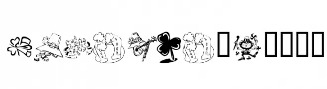
( Fonts by Kat`s Fun Fonts - Personal-use only. For commercial use please contact owner. )
A decorative font with St. Patrick's Day-themed illustrations.
 Herunterladen 101 Downloads@WebFont
 -
![Fujita Ray Frei Schriftart Herunterladen]() Herunterladen 101 Downloads@WebFont
Herunterladen 101 Downloads@WebFont -
( Fonts by Ditya Ananto )
A decorative font with leaf and vine motifs, offering a whimsical and organic style.
![FOLIAGE Frei Schriftart Herunterladen]() Herunterladen 101 Downloads@WebFont
Herunterladen 101 Downloads@WebFont -
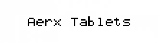
( memesbruh03 - Aaron D. Chand )
A pixelated, retro-style font with a blocky, digital appearance.
![Aerx Tablets Frei Schriftart Herunterladen]() Herunterladen 101 Downloads@WebFont
Herunterladen 101 Downloads@WebFont -
![Blimpixels Frei Schriftart Herunterladen]() Herunterladen 101 Downloads@WebFont
Herunterladen 101 Downloads@WebFont -
-
( Fonts by Michael Gaines )
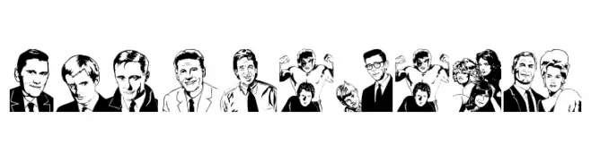
Not a valid font image.
![Quotidian Frei Schriftart Herunterladen]() Herunterladen 101 Downloads@WebFont
Herunterladen 101 Downloads@WebFont -
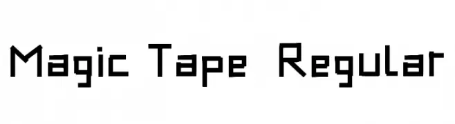
( Fonts by Graphics Bam )
A geometric, blocky font with sharp angles and bold strokes.
![Magic Tape - Regular Frei Schriftart Herunterladen]() Herunterladen 101 Downloads@WebFont
Herunterladen 101 Downloads@WebFont -
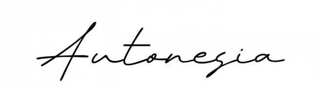
( Fonts by Khurasan )
A fluid and elegant handwritten script font with seamless connections.
![Autonesia Frei Schriftart Herunterladen]() Herunterladen 101 Downloads@WebFont
Herunterladen 101 Downloads@WebFont -
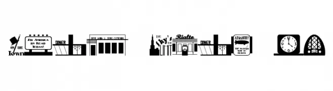
( Fonts by Jeff Levine. FREEWARE )
A decorative font featuring vintage-inspired signage and illustrations.
![Deco Pics JL Frei Schriftart Herunterladen]() Herunterladen 101 Downloads@WebFont
Herunterladen 101 Downloads@WebFont -
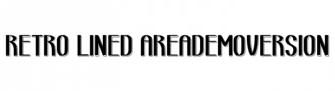
( Fontscafe.com - fontscafe.com/ )
A bold, retro-style font with lined characters and a vintage flair.
![retro lined area_demo-version Frei Schriftart Herunterladen]() Herunterladen 101 Downloads@WebFont
Herunterladen 101 Downloads@WebFont


Welche Schriften sind gerade am populärsten?
Poppins, Roboto, Montserrat, Open Sans und Lato sind wegen ihrer klaren Formen und breiten Einsetzbarkeit sehr gefragt – von Markenauftritt über Landingpages bis hin zu Postern.
Welche Fonts eignen sich für Logos?
Geometrische Sans‑Serifs (z. B. Poppins, Familien im Gotham‑Stil) sind ein häufiger Griff für sauberes, skalierbares Branding. Für eine persönlichere Note bleiben Scripts und Handschrift‑Stile beliebt. Kombinieren Sie einen prägnanten Headline‑Font mit einer neutralen Brotschrift für Wiedererkennung und Harmonie.
Wie oft wird die Top‑Liste aktualisiert?
Regelmäßig – basierend auf realen Downloads und Interaktionen. Schauen Sie öfter vorbei, um aufstrebende Favoriten früh zu entdecken.
💡 Tipp: Seite bookmarken – Trends wechseln schnell, und heutige Top‑Schriften inspirieren morgen vielleicht das Rebranding.