Willkommen bei den Top‑Schriften – hier treffen Beliebtheit und Qualität aufeinander. Das sind die in diesem Jahr am häufigsten heruntergeladenen und genutzten Fonts. Wenn Sie sichere Optionen für Logo, Web oder Social suchen, starten Sie hier.
Jeder Top‑Font überzeugt durch Balance, Lesbarkeit und Vielseitigkeit. Sie finden moderne Sans‑Serifs, elegante Scripts, Vintage‑Serifs und minimalistische Displays.
-
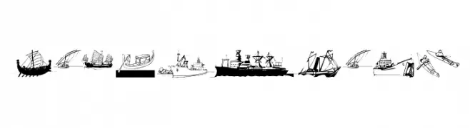
( Fonts by Manfred Klein. Free for private and charity use. Free for commercial with donation to organizations )
A display font composed of ship and boat illustrations as characters.
 Herunterladen 101 Downloads@WebFont
 -
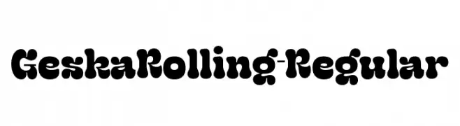
( Fonts by Kulokale Studio )
A bold, playful font with a bubble-like, decorative style.
![GeskaRolling-Regular Frei Schriftart Herunterladen]() Herunterladen 101 Downloads@WebFont
Herunterladen 101 Downloads@WebFont -
( Fonts by a Max Infeld - XEROGRAPHER FONTS - xerographer.blogspot.com . Personal-use only. For commercial use please contact owner. )
A playful and eclectic font with unique, whimsical characters.
![FairHouse Frei Schriftart Herunterladen]() Herunterladen 101 Downloads@WebFont
Herunterladen 101 Downloads@WebFont -
( Fonts by Almarkhatype - Abdul Malik Wisnu - Personal-use only. For commercial use please contact owner. )
A modern, geometric font with clean lines and a minimalist aesthetic.
![Quinger Frei Schriftart Herunterladen]() Herunterladen 101 Downloads@WebFont
Herunterladen 101 Downloads@WebFont -
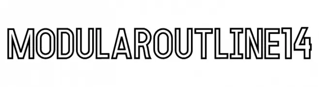
( Fonts by fortunes co - Ramandhani Nugraha - Personal-use only. For commercial use please contact owner. )
A bold, geometric outline font with a modern and precise design.
![MODULAR Outline 14 Frei Schriftart Herunterladen]() Herunterladen 101 Downloads@WebFont
Herunterladen 101 Downloads@WebFont -
-
( Fonts by Jimtype Studio )
A bold, retro font with rounded, bubbly letterforms.
![Bambi Retro Frei Schriftart Herunterladen]() Herunterladen 101 Downloads@WebFont
Herunterladen 101 Downloads@WebFont -
( Yff - Alexander Kapusta - www.indieutka.com )
A pixelated, blocky font with a retro digital aesthetic.
![Indieutka Pixel8 Frei Schriftart Herunterladen]() Herunterladen 101 Downloads@WebFont
Herunterladen 101 Downloads@WebFont -
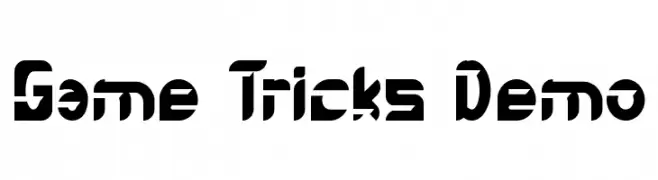
( Fonts by Noah Type - noahtype.com - Personal-use only. For commercial use please contact owner. )
A bold, futuristic font with geometric and edgy design elements.
![Game Tricks Demo Frei Schriftart Herunterladen]() Herunterladen 101 Downloads@WebFont
Herunterladen 101 Downloads@WebFont -
( Fonts by a Neale Davidson - www.pixelsagas.com. Personal-use only. For commercial use please contact owner. )
A bold, angular font with a runic, stone-carved aesthetic.
![Dethek Stone Frei Schriftart Herunterladen]() Herunterladen 101 Downloads@WebFont
Herunterladen 101 Downloads@WebFont -
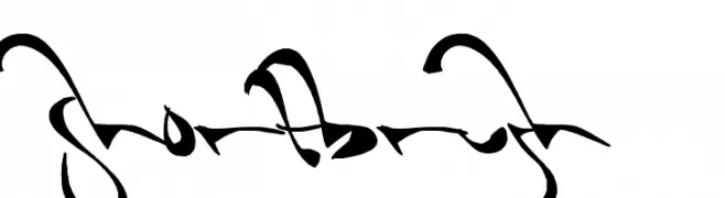
( Fonts by Mans Greback - www.mawns.com )
An expressive, brush-like font with dynamic strokes and artistic flair.
![Shortbrush Frei Schriftart Herunterladen]() Herunterladen 101 Downloads@WebFont
Herunterladen 101 Downloads@WebFont


Welche Schriften sind gerade am populärsten?
Poppins, Roboto, Montserrat, Open Sans und Lato sind wegen ihrer klaren Formen und breiten Einsetzbarkeit sehr gefragt – von Markenauftritt über Landingpages bis hin zu Postern.
Welche Fonts eignen sich für Logos?
Geometrische Sans‑Serifs (z. B. Poppins, Familien im Gotham‑Stil) sind ein häufiger Griff für sauberes, skalierbares Branding. Für eine persönlichere Note bleiben Scripts und Handschrift‑Stile beliebt. Kombinieren Sie einen prägnanten Headline‑Font mit einer neutralen Brotschrift für Wiedererkennung und Harmonie.
Wie oft wird die Top‑Liste aktualisiert?
Regelmäßig – basierend auf realen Downloads und Interaktionen. Schauen Sie öfter vorbei, um aufstrebende Favoriten früh zu entdecken.
💡 Tipp: Seite bookmarken – Trends wechseln schnell, und heutige Top‑Schriften inspirieren morgen vielleicht das Rebranding.