Willkommen auf der Seite Schrift‑Trends – entdecken Sie Fonts, die das aktuelle Design prägen. Ob Marken‑Refresh, Social‑Visuals oder Website‑UI: Wer Trends verfolgt, wirkt frisch und relevant.
Diese Sammlung zeigt die angesagtesten Schriften der Saison, gewählt von Kreativen auf der ganzen Welt. Erwarten Sie elegante Serifs, minimalistische Sans‑Serifs, expressive Displays und handgemachte Scripts, die den Look von 2025 mitbestimmen.
Kombinieren Sie Trend‑Fonts mit zeitlosen Kategorien wie Modern, Serif oder Handwritten für ausgewogene, aufmerksamkeitsstarke Typografie.
-
 Herunterladen 40762 Downloads@WebFont
 -
( Fonts by Daniel Zadorozny - www.iconian.com - Free for personal use )
A futuristic, geometric font with bold, angular letterforms.
![Dodger Frei Schriftart Herunterladen]() Herunterladen 85558 Downloads@WebFont
Herunterladen 85558 Downloads@WebFont -
( Fonts by Johan Holmdahl - www.free-typewriter-fonts.com )
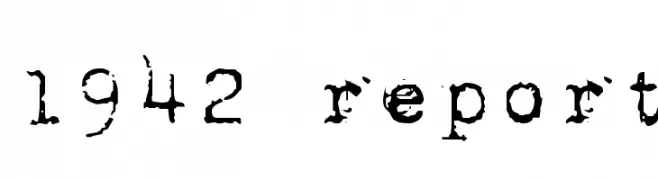
A distressed, vintage typewriter-style font with a bold, textured appearance.
![1942 report Frei Schriftart Herunterladen]() Herunterladen 41750 Downloads@WebFont
Herunterladen 41750 Downloads@WebFont -
( Fonts by or from www.graffitifonts.net )
A bold, playful font with a 3D effect and cartoon-like style.
![Smartie Frei Schriftart Herunterladen]() Herunterladen 38655 Downloads@WebFont
Herunterladen 38655 Downloads@WebFont -
( Fonts by Billy Argel - www.billyargel.com - Personal-use only. For commercial use please contact owner. )
A bold, playful font with a retro flair and decorative flourishes.
![Satisfaction Frei Schriftart Herunterladen]() Herunterladen 901 Downloads@WebFont
Herunterladen 901 Downloads@WebFont -
-
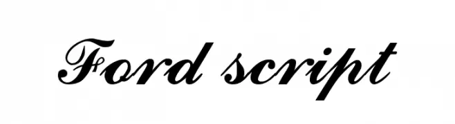
![Ford script Frei Schriftart Herunterladen]() Herunterladen 66679 Downloads@WebFont
Herunterladen 66679 Downloads@WebFont -
![Quicksand Light Regular Frei Schriftart Herunterladen]() Herunterladen 23548 Downloads@WebFont
Herunterladen 23548 Downloads@WebFont -
( Fonts by Gyom Seguin - last-soundtrack.daportfolio.com )
A decorative, distressed font with elaborate swirls and a grungy appearance.
![Bleeding Cowboys Frei Schriftart Herunterladen]() Herunterladen 38639 Downloads@WebFont
Herunterladen 38639 Downloads@WebFont -
![Zirkon Frei Schriftart Herunterladen]() Herunterladen 26701 Downloads@WebFont
Herunterladen 26701 Downloads@WebFont -
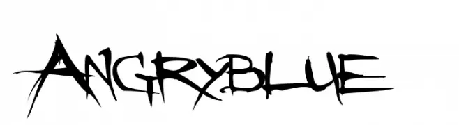
( Fonts by www.angryblue.com )
A raw, edgy font with a hand-drawn, rebellious style.
![Angryblue Frei Schriftart Herunterladen]() Herunterladen 24910 Downloads@WebFont
Herunterladen 24910 Downloads@WebFont


FAQ – Schrift‑Trends
Was sind die aktuellen Tendenzen?
Im Fokus stehen Einfachheit, Lesbarkeit und Wärme: abgerundete Sans‑Serifs, elegante kontrastreiche Serifs und feine Retro‑Remakes – clean, aber menschlich.
Welche Fonts liegen im Trend?
Beliebt sind u. a. Poppins, Roboto und Montserrat – ein guter Mix aus Modernität und Zeitlosigkeit. Sie funktionieren hervorragend im Web, auf Social‑Grafiken und Verpackungen.
Wie setze ich Trend‑Fonts sinnvoll ein?
Wählen Sie einen markanten Display‑Font für Überschriften und kombinieren Sie ihn mit einer schlichten Sans‑Serif als Fließtext. So entsteht Kontrast ohne Einbußen bei der Lesbarkeit. Prüfen Sie verschiedene Geräte und Medien vor dem Go‑Live.
💡 Tipp: Aktualisieren Sie Kernassets alle paar Monate mit einem Trend‑Font, um Frische und SEO‑Wirkung zu bewahren.