Willkommen bei den Top‑Schriften – hier treffen Beliebtheit und Qualität aufeinander. Das sind die in diesem Jahr am häufigsten heruntergeladenen und genutzten Fonts. Wenn Sie sichere Optionen für Logo, Web oder Social suchen, starten Sie hier.
Jeder Top‑Font überzeugt durch Balance, Lesbarkeit und Vielseitigkeit. Sie finden moderne Sans‑Serifs, elegante Scripts, Vintage‑Serifs und minimalistische Displays.
-
 Herunterladen 466 Downloads@WebFont
 -
( Fonts by Jonathan Harris - www.tattoowoo.com )
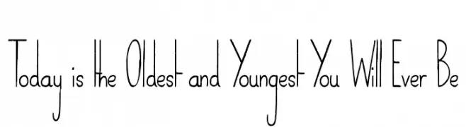
A tall, narrow font with a modern and artistic style.
![Today is the Oldest and Youngest You Will Ever Be Frei Schriftart Herunterladen]() Herunterladen 466 Downloads@WebFont
Herunterladen 466 Downloads@WebFont -
![Robinne Frei Schriftart Herunterladen]() Herunterladen 466 Downloads@WebFont
Herunterladen 466 Downloads@WebFont -
( Fonts by Daniel Zadorozny - www.iconian.com - Free for personal use )
A bold, condensed, and italic font with a futuristic, angular design.
![Gearhead Condensed Italic Frei Schriftart Herunterladen]() Herunterladen 466 Downloads@WebFont
Herunterladen 466 Downloads@WebFont -
( Fonts by www.woodcutter.es - woodcutter Manero - Personal-use only. For commercial use please contact owner. )
Taxi-themed dingbat font with bold, iconic symbols.
![Taxi Frei Schriftart Herunterladen]() Herunterladen 466 Downloads@WebFont
Herunterladen 466 Downloads@WebFont -
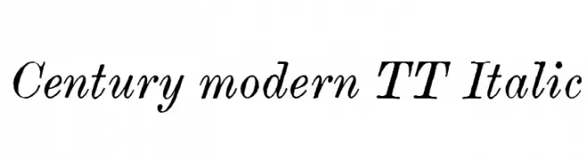
-
![Century modern TT Italic Frei Schriftart Herunterladen]() Herunterladen 466 Downloads@WebFont
Herunterladen 466 Downloads@WebFont -
( Fonts by Agathe M.Joyce - www.foundmyfont.com - Personal-use only. For commercial use please contact owner. )
A dynamic, brush-style font with fluid, hand-painted strokes.
![Refreshen and Softening Frei Schriftart Herunterladen]() Herunterladen 466 Downloads@WebFont
Herunterladen 466 Downloads@WebFont -
( Fonts by a Neale Davidson - www.pixelsagas.com. Personal-use only. For commercial use please contact owner. )
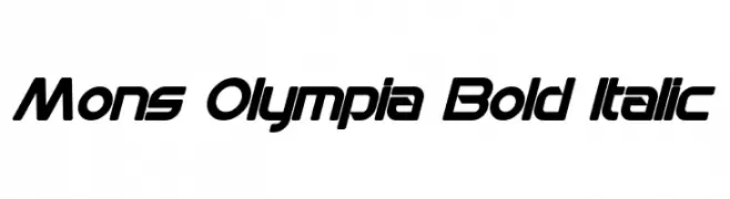
A bold, italicized font with a modern, futuristic design.
![Mons Olympia Bold Italic Frei Schriftart Herunterladen]() Herunterladen 466 Downloads@WebFont
Herunterladen 466 Downloads@WebFont -
( Fonts by Toto )
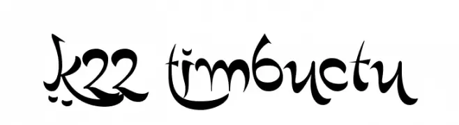
A whimsical and playful font with decorative elements and expressive forms.
![K22 Timbuctu Frei Schriftart Herunterladen]() Herunterladen 466 Downloads@WebFont
Herunterladen 466 Downloads@WebFont -
( Fonts by www.3r4u.de )
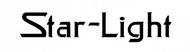
A futuristic and angular font with geometric elements.
![Star-Light Frei Schriftart Herunterladen]() Herunterladen 466 Downloads@WebFont
Herunterladen 466 Downloads@WebFont -
( Font by Jonathan Harris - www.tattoowoo.com )
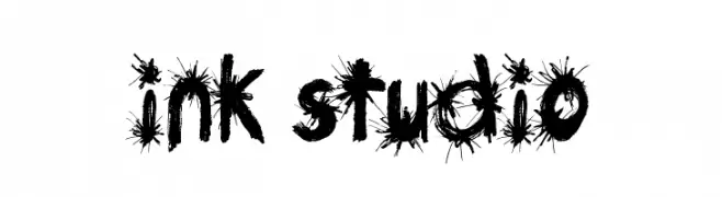
A bold, spiky, ink-splattered decorative font with a raw, expressive style.
![Ink Studio Frei Schriftart Herunterladen]() Herunterladen 466 Downloads@WebFont
Herunterladen 466 Downloads@WebFont -
( Fonts by Des Gomez )
A bold, hand-drawn font with playful patterns and a whimsical style.
![Guestservice Frei Schriftart Herunterladen]() Herunterladen 466 Downloads@WebFont
Herunterladen 466 Downloads@WebFont -
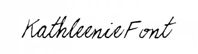
![KathleenieFont Frei Schriftart Herunterladen]() Herunterladen 466 Downloads
Herunterladen 466 Downloads -
( Fonts by Chris Vile )
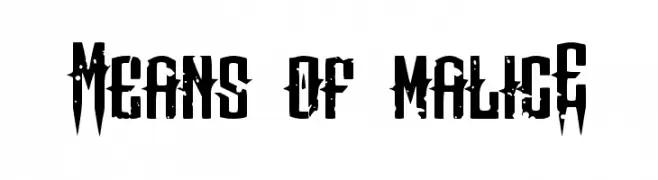
A bold, distressed font with sharp, angular edges and a rugged appearance.
![Means of malicE Frei Schriftart Herunterladen]() Herunterladen 466 Downloads@WebFont
Herunterladen 466 Downloads@WebFont -
![Biting My Nails Frei Schriftart Herunterladen]() Herunterladen 466 Downloads@WebFont
Herunterladen 466 Downloads@WebFont -
![Mainpar Frei Schriftart Herunterladen]() Herunterladen 466 Downloads@WebFont
Herunterladen 466 Downloads@WebFont -
![Slinkster v9 Regular Frei Schriftart Herunterladen]() Herunterladen 466 Downloads@WebFont
Herunterladen 466 Downloads@WebFont -
( Fonts by Hanoded )
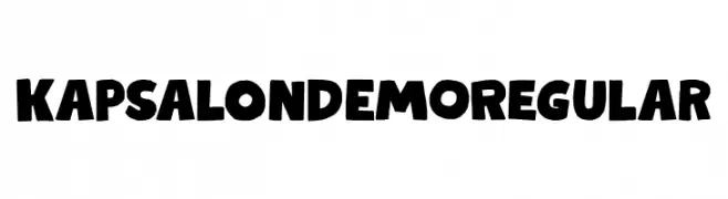
A bold, playful font with chunky, stylized characters and whimsical elements.
![Kapsalon DEMO Regular Frei Schriftart Herunterladen]() Herunterladen 466 Downloads@WebFont
Herunterladen 466 Downloads@WebFont -
( Fonts by Manfred Klein. Free for private and charity use. Free for commercial with donation to organizations )
A dynamic, angular font with a calligraphic influence and high contrast strokes.
![SaiGon Frei Schriftart Herunterladen]() Herunterladen 466 Downloads@WebFont
Herunterladen 466 Downloads@WebFont -
( Fonts by www.tipometar.org )
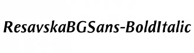
A bold, italic sans-serif font with a modern and dynamic style.
![ResavskaBGSans-BoldItalic Frei Schriftart Herunterladen]() Herunterladen 466 Downloads@WebFont
Herunterladen 466 Downloads@WebFont -
( Fonts by www.typodermicfonts.com - Ray Larabie )
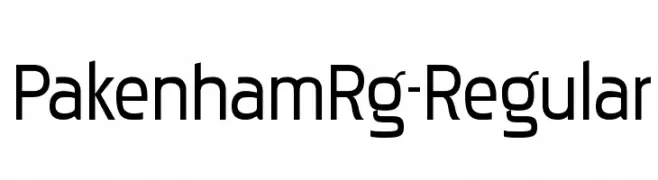
A modern, geometric sans-serif font with clean lines and uniform strokes.
![PakenhamRg-Regular Frei Schriftart Herunterladen]() Herunterladen 466 Downloads@WebFont
Herunterladen 466 Downloads@WebFont -
( Fonts by Castcraft Software - OPTI Fonts Archive - opti.netii.net - Personal-use only. For commercial use please contact owner. )
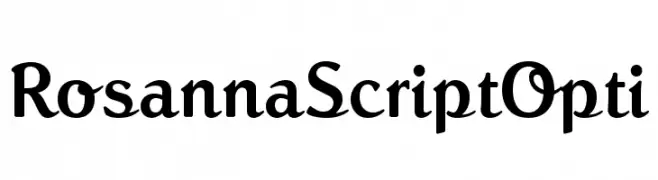
An elegant script-like font with distinct serifs and cohesive design.
![RosannaScriptOpti Frei Schriftart Herunterladen]() Herunterladen 466 Downloads@WebFont
Herunterladen 466 Downloads@WebFont -
( Fonts by www.woodcutter.es - woodcutter Manero - Personal-use only. For commercial use please contact owner. )
A decorative font made from boot and shoe illustrations.
![Boots Frei Schriftart Herunterladen]() Herunterladen 466 Downloads@WebFont
Herunterladen 466 Downloads@WebFont -
![miniskup Frei Schriftart Herunterladen]() Herunterladen 466 Downloads@WebFont
Herunterladen 466 Downloads@WebFont -
( Free for a personal use. For a commercial use please visit www.kevinandamanda.com )
A playful, handwritten font with doodle-like embellishments and a casual style.
![Pea Snoflake Doodles Frei Schriftart Herunterladen]() Herunterladen 466 Downloads@WebFont
Herunterladen 466 Downloads@WebFont -
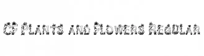
( Fonts by Steve Cloutier - www.cloutierfontes.ca )
A decorative font with letters entwined in plant and flower motifs.
![CF Plants and Flowers Regular Frei Schriftart Herunterladen]() Herunterladen 466 Downloads@WebFont
Herunterladen 466 Downloads@WebFont -
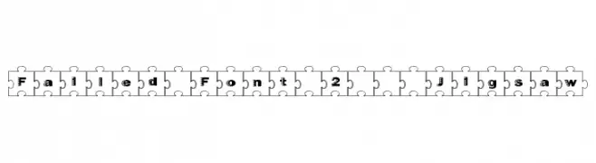
( Fonts by Graham Meade - GemFonts )
A playful font with characters enclosed in jigsaw puzzle pieces, offering a bold and unique style.
![Failed Font 2 Jigsaw Frei Schriftart Herunterladen]() Herunterladen 466 Downloads@WebFont
Herunterladen 466 Downloads@WebFont -
![JW Brass Frei Schriftart Herunterladen]() Herunterladen 466 Downloads
Herunterladen 466 Downloads -
( MirBSD )
A bold, monospaced font with a clean, modern design and medium contrast.
![Inconsolata zi4[varl,varqu] Bold Frei Schriftart Herunterladen]() Herunterladen 466 Downloads@WebFont
Herunterladen 466 Downloads@WebFont -
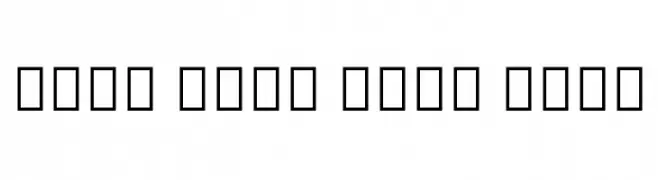
( Noto is a trademark of Google Inc. Noto fonts are open source. All Noto fonts are published under the SIL Open Font License, Version 1.1 )
Invalid font display with placeholder boxes.
![Noto Sans Thai Bold Frei Schriftart Herunterladen]() Herunterladen 466 Downloads@WebFont
Herunterladen 466 Downloads@WebFont -
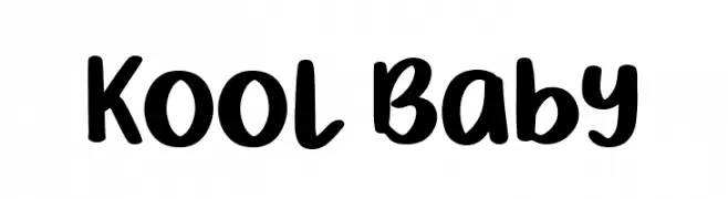
( Fonts by Phantom Studio )
Playful, rounded handwritten font.
![Kool Baby Frei Schriftart Herunterladen]() Herunterladen 466 Downloads@WebFont
Herunterladen 466 Downloads@WebFont -
![ELEMENTARY Frei Schriftart Herunterladen]() Herunterladen 466 Downloads@WebFont
Herunterladen 466 Downloads@WebFont -
( - ft.hotglue.me )
A textured, pixelated font with a geometric and mechanical style.
![Fragile Regular Frei Schriftart Herunterladen]() Herunterladen 466 Downloads@WebFont
Herunterladen 466 Downloads@WebFont -
![Engineer Hand Frei Schriftart Herunterladen]() Herunterladen 465 Downloads@WebFont
Herunterladen 465 Downloads@WebFont -
( https://www.behance.net/konstantinestudio )
A bold, textured font with a rugged, dynamic style.
![Upjohn - Rough Frei Schriftart Herunterladen]() Herunterladen 465 Downloads@WebFont
Herunterladen 465 Downloads@WebFont


![Inconsolata zi4[varl,varqu] Bold Frei Schriftart Herunterladen](https://d144mzi0q5mijx.cloudfront.net/img/I/N/Inconsolata-zi4-varlvarqu-Bold.webp)

Welche Schriften sind gerade am populärsten?
Poppins, Roboto, Montserrat, Open Sans und Lato sind wegen ihrer klaren Formen und breiten Einsetzbarkeit sehr gefragt – von Markenauftritt über Landingpages bis hin zu Postern.
Welche Fonts eignen sich für Logos?
Geometrische Sans‑Serifs (z. B. Poppins, Familien im Gotham‑Stil) sind ein häufiger Griff für sauberes, skalierbares Branding. Für eine persönlichere Note bleiben Scripts und Handschrift‑Stile beliebt. Kombinieren Sie einen prägnanten Headline‑Font mit einer neutralen Brotschrift für Wiedererkennung und Harmonie.
Wie oft wird die Top‑Liste aktualisiert?
Regelmäßig – basierend auf realen Downloads und Interaktionen. Schauen Sie öfter vorbei, um aufstrebende Favoriten früh zu entdecken.
💡 Tipp: Seite bookmarken – Trends wechseln schnell, und heutige Top‑Schriften inspirieren morgen vielleicht das Rebranding.