Willkommen bei den Top‑Schriften – hier treffen Beliebtheit und Qualität aufeinander. Das sind die in diesem Jahr am häufigsten heruntergeladenen und genutzten Fonts. Wenn Sie sichere Optionen für Logo, Web oder Social suchen, starten Sie hier.
Jeder Top‑Font überzeugt durch Balance, Lesbarkeit und Vielseitigkeit. Sie finden moderne Sans‑Serifs, elegante Scripts, Vintage‑Serifs und minimalistische Displays.
-
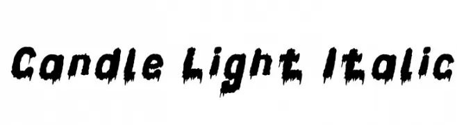
( weknow - Wino S Kadir - www.creativefabrica.com/designer/weknow/ )
A bold, dripping font with an eerie, horror-inspired style and italic slant.
 Herunterladen 85 Downloads@WebFont
 -
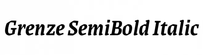
( Copyright 2018 The Grenze Project Authors (https://github.com/Omnibus-Type/Grenze), with Reserved Font Name "Grenze". )
A semi-bold italic serif font with moderate contrast and classic elegance.
![Grenze SemiBold Italic Frei Schriftart Herunterladen]() Herunterladen 85 Downloads@WebFont
Herunterladen 85 Downloads@WebFont -
( www.woodcutter.es )
A dramatic, edgy font with a dripping, chaotic style.
![Fresh Blood Frei Schriftart Herunterladen]() Herunterladen 85 Downloads@WebFont
Herunterladen 85 Downloads@WebFont -
![Kantai Collection Camouflage Frei Schriftart Herunterladen]() Herunterladen 85 Downloads@WebFont
Herunterladen 85 Downloads@WebFont -
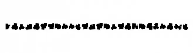
( Font Environment - www.fontenvironment.com/ )
Tactile dot-based font for Braille literacy.
![Balkan Peninsula Braille Frei Schriftart Herunterladen]() Herunterladen 85 Downloads@WebFont
Herunterladen 85 Downloads@WebFont -
-
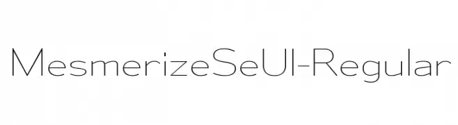
( Typodermic Fonts - Ray Larabie - www.typodermicfonts.com/ )
A modern, geometric typeface with uniform strokes and balanced spacing.
![MesmerizeSeUl-Regular Frei Schriftart Herunterladen]() Herunterladen 85 Downloads@WebFont
Herunterladen 85 Downloads@WebFont -
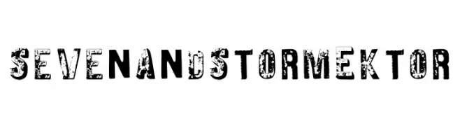
( Fonts by Dimitri Castrique )
A bold, distressed font with a rugged, vintage appearance.
![Seven And Storm Ektor Frei Schriftart Herunterladen]() Herunterladen 85 Downloads@WebFont
Herunterladen 85 Downloads@WebFont -
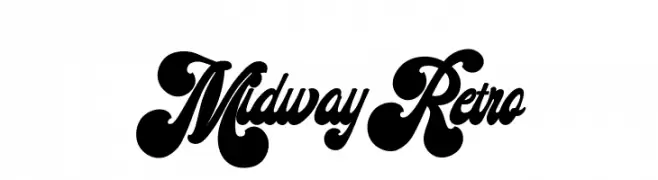
( Fonts by Ardana Creative - Personal-use only. For commercial use please contact owner. )
A bold, retro font with playful curves and a vintage flair.
![Midway Retro Frei Schriftart Herunterladen]() Herunterladen 85 Downloads@WebFont
Herunterladen 85 Downloads@WebFont -
( Fonts by Daniel Zadorozny - www.iconian.com - Free for personal use )
A bold, futuristic font with geometric and slightly slanted characters.
![Direktor Leftalic Frei Schriftart Herunterladen]() Herunterladen 85 Downloads@WebFont
Herunterladen 85 Downloads@WebFont -
( Fonts by Md Shohail Bhuian - Personal-use only. For commercial use please contact owner. )
A playful, handwritten font with consistent stroke width and friendly appearance.
![Our Santa Frei Schriftart Herunterladen]() Herunterladen 85 Downloads@WebFont
Herunterladen 85 Downloads@WebFont


Welche Schriften sind gerade am populärsten?
Poppins, Roboto, Montserrat, Open Sans und Lato sind wegen ihrer klaren Formen und breiten Einsetzbarkeit sehr gefragt – von Markenauftritt über Landingpages bis hin zu Postern.
Welche Fonts eignen sich für Logos?
Geometrische Sans‑Serifs (z. B. Poppins, Familien im Gotham‑Stil) sind ein häufiger Griff für sauberes, skalierbares Branding. Für eine persönlichere Note bleiben Scripts und Handschrift‑Stile beliebt. Kombinieren Sie einen prägnanten Headline‑Font mit einer neutralen Brotschrift für Wiedererkennung und Harmonie.
Wie oft wird die Top‑Liste aktualisiert?
Regelmäßig – basierend auf realen Downloads und Interaktionen. Schauen Sie öfter vorbei, um aufstrebende Favoriten früh zu entdecken.
💡 Tipp: Seite bookmarken – Trends wechseln schnell, und heutige Top‑Schriften inspirieren morgen vielleicht das Rebranding.