Willkommen bei den Top‑Schriften – hier treffen Beliebtheit und Qualität aufeinander. Das sind die in diesem Jahr am häufigsten heruntergeladenen und genutzten Fonts. Wenn Sie sichere Optionen für Logo, Web oder Social suchen, starten Sie hier.
Jeder Top‑Font überzeugt durch Balance, Lesbarkeit und Vielseitigkeit. Sie finden moderne Sans‑Serifs, elegante Scripts, Vintage‑Serifs und minimalistische Displays.
-
( Fonts by Ardana Creative - Personal-use only. For commercial use please contact owner. )
A bold, retro font with playful curves and a vintage flair.
 Herunterladen 85 Downloads@WebFont
 -
( Fonts by Daniel Zadorozny - www.iconian.com - Free for personal use )
A bold, futuristic font with geometric and slightly slanted characters.
![Direktor Leftalic Frei Schriftart Herunterladen]() Herunterladen 85 Downloads@WebFont
Herunterladen 85 Downloads@WebFont -
( Fonts by Allouse Studio - Personal-use only. For commercial use please contact owner. )
A playful, bold, hand-drawn font with a lively and informal style.
![Smelly Peach Frei Schriftart Herunterladen]() Herunterladen 85 Downloads@WebFont
Herunterladen 85 Downloads@WebFont -
( Fonts by Md Shohail Bhuian - Personal-use only. For commercial use please contact owner. )
A playful, handwritten font with consistent stroke width and friendly appearance.
![Our Santa Frei Schriftart Herunterladen]() Herunterladen 85 Downloads@WebFont
Herunterladen 85 Downloads@WebFont -
( Fonts by Hanoded - David Kerkhoff - Personal-use only. For commercial use please contact owner. )
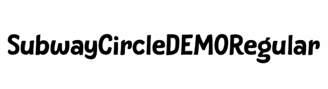
A playful, bold font with rounded edges and a hand-drawn feel.
![Subway Circle DEMO Regular Frei Schriftart Herunterladen]() Herunterladen 85 Downloads@WebFont
Herunterladen 85 Downloads@WebFont -
-
( Fonts by nendi emelia - pratiwi emelia - Personal-use only. For commercial use please contact owner. )
A modern, rounded sans-serif font with a friendly and approachable design.
![LIBURANCORegular Frei Schriftart Herunterladen]() Herunterladen 85 Downloads@WebFont
Herunterladen 85 Downloads@WebFont -
( Fonts by Manfred Klein. Free for private and charity use. Free for commercial with donation to organizations )
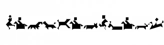
An abstract, geometric font inspired by tangram puzzles, featuring bold and angular designs.
![TangramBlack Frei Schriftart Herunterladen]() Herunterladen 85 Downloads@WebFont
Herunterladen 85 Downloads@WebFont -
( Fonts by Adult Ramblings - Anastacia E. Zittel - Personal-use only. For commercial use please contact owner. )
A whimsical serif font with decorative duck illustrations accompanying each letter.
![AEZ mother daughter ducks Frei Schriftart Herunterladen]() Herunterladen 85 Downloads@WebFont
Herunterladen 85 Downloads@WebFont -
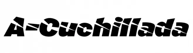
![A-Cuchillada Frei Schriftart Herunterladen]() Herunterladen 85 Downloads@WebFont
Herunterladen 85 Downloads@WebFont -
( Fonts by Ardana Creative - Personal-use only. For commercial use please contact owner. )
A bold, dynamic script font with sweeping curves and dramatic flourishes.
![Lettro Frei Schriftart Herunterladen]() Herunterladen 85 Downloads@WebFont
Herunterladen 85 Downloads@WebFont


Welche Schriften sind gerade am populärsten?
Poppins, Roboto, Montserrat, Open Sans und Lato sind wegen ihrer klaren Formen und breiten Einsetzbarkeit sehr gefragt – von Markenauftritt über Landingpages bis hin zu Postern.
Welche Fonts eignen sich für Logos?
Geometrische Sans‑Serifs (z. B. Poppins, Familien im Gotham‑Stil) sind ein häufiger Griff für sauberes, skalierbares Branding. Für eine persönlichere Note bleiben Scripts und Handschrift‑Stile beliebt. Kombinieren Sie einen prägnanten Headline‑Font mit einer neutralen Brotschrift für Wiedererkennung und Harmonie.
Wie oft wird die Top‑Liste aktualisiert?
Regelmäßig – basierend auf realen Downloads und Interaktionen. Schauen Sie öfter vorbei, um aufstrebende Favoriten früh zu entdecken.
💡 Tipp: Seite bookmarken – Trends wechseln schnell, und heutige Top‑Schriften inspirieren morgen vielleicht das Rebranding.