Willkommen bei den Top‑Schriften – hier treffen Beliebtheit und Qualität aufeinander. Das sind die in diesem Jahr am häufigsten heruntergeladenen und genutzten Fonts. Wenn Sie sichere Optionen für Logo, Web oder Social suchen, starten Sie hier.
Jeder Top‑Font überzeugt durch Balance, Lesbarkeit und Vielseitigkeit. Sie finden moderne Sans‑Serifs, elegante Scripts, Vintage‑Serifs und minimalistische Displays.
-
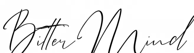
( Fonts by Thirtypath - Personal-use only. For commercial use please contact owner. )
A flowing, cursive script font with elegant, connected strokes.
 Herunterladen 434 Downloads@WebFont
 -
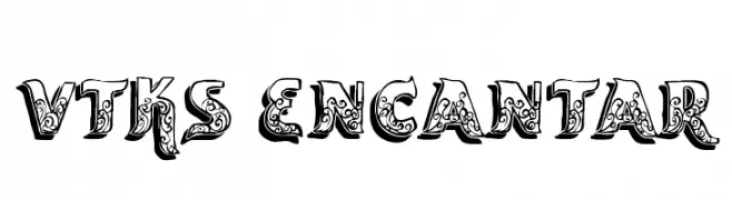
( Fonts by Douglas Vitkauskas - www.vtksdesign.com. Personal-use only. For commercial use please contact owner. )
An ornate, decorative font with intricate floral patterns in each character.
![vtks encantar Frei Schriftart Herunterladen]() Herunterladen 434 Downloads@WebFont
Herunterladen 434 Downloads@WebFont -
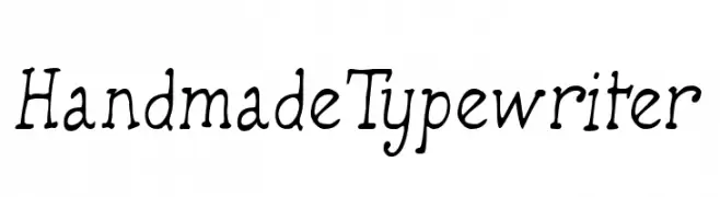
( Fonts by Manfred Klein. Free for private and charity use. Free for commercial with donation to organizations )
A charming, handcrafted typewriter-style font with a vintage feel.
![HandmadeTypewriter Frei Schriftart Herunterladen]() Herunterladen 434 Downloads@WebFont
Herunterladen 434 Downloads@WebFont -
![Autocars & Rolling Bikes Regular Frei Schriftart Herunterladen]() Herunterladen 434 Downloads@WebFont
Herunterladen 434 Downloads@WebFont -
![Cranberry Gin Frei Schriftart Herunterladen]() Herunterladen 434 Downloads@WebFont
Herunterladen 434 Downloads@WebFont -
-
( Fonts by German Olaya - www.typo5.com )
A bold, distressed font with a hand-drawn, graffiti-like style.
![maldita Frei Schriftart Herunterladen]() Herunterladen 434 Downloads@WebFont
Herunterladen 434 Downloads@WebFont -
( Fonts by www.gliphmaker.com. Personal-use only. For commercial use please contact owner. )
An elegant and decorative serif font with high contrast and unique character designs.
![Ametist Frei Schriftart Herunterladen]() Herunterladen 434 Downloads@WebFont
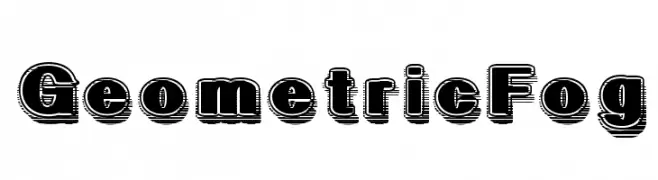
Herunterladen 434 Downloads@WebFont -
![GeometricFog Frei Schriftart Herunterladen]() Herunterladen 434 Downloads@WebFont
Herunterladen 434 Downloads@WebFont -
![CarrickCaps Caps:001.001 Frei Schriftart Herunterladen]() Herunterladen 433 Downloads@WebFont
Herunterladen 433 Downloads@WebFont -
![Morse NK Frei Schriftart Herunterladen]() Herunterladen 433 Downloads
Herunterladen 433 Downloads -
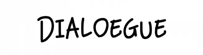
( Fonts by 7NTypes )
A playful handwritten font with smooth, rounded letterforms and a casual style.
![Dialoegue Frei Schriftart Herunterladen]() Herunterladen 433 Downloads@WebFont
Herunterladen 433 Downloads@WebFont -
Schriftart von Delcane. For commercial use please contact the owner.
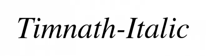
( Classic roman typeface, modified and curated from the STIX Fonts (TM). Free for unlimited private and commercial use. SIL Open Font Licence (OFL) Version 1.1. )
A classic italic font with elegant curves and refined style.
![Timnath-Italic Frei Schriftart Herunterladen]() Herunterladen 433 Downloads@WebFont
Herunterladen 433 Downloads@WebFont -
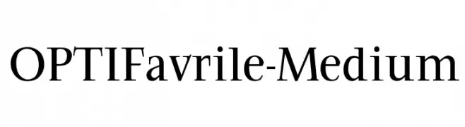
( Fonts by Castcraft Software - opti.netii.net - check the website before use )
A classic serif typeface with elegant strokes and refined design.
![OPTIFavrile-Medium Frei Schriftart Herunterladen]() Herunterladen 433 Downloads@WebFont
Herunterladen 433 Downloads@WebFont -
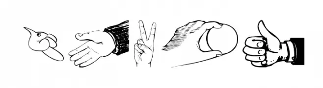
( Fonts by Manfred Klein. Free for private and charity use. Free for commercial with donation to organizations )
A diverse illustrated hand gesture font with cartoon and realistic styles.
![Hands Frei Schriftart Herunterladen]() Herunterladen 433 Downloads@WebFont
Herunterladen 433 Downloads@WebFont -
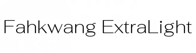
( Copyright 2018 The Fahkwang Project Authors (https://github.com/cadsondemak/Fah-Kwang) )
A sleek, modern typeface with clean lines and balanced proportions.
![Fahkwang ExtraLight Frei Schriftart Herunterladen]() Herunterladen 433 Downloads@WebFont
Herunterladen 433 Downloads@WebFont -
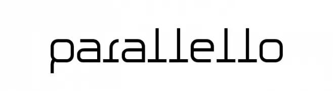
( Fonts by Espen Morten Kvalheim - www.unbornchikken.com )
A modern, geometric font with parallel line motifs and consistent stroke width.
![Parallello Frei Schriftart Herunterladen]() Herunterladen 433 Downloads@WebFont
Herunterladen 433 Downloads@WebFont -
![KR Cuori Divertenti 6 Frei Schriftart Herunterladen]() Herunterladen 433 Downloads@WebFont
Herunterladen 433 Downloads@WebFont -
![Asylum Regular Frei Schriftart Herunterladen]() Herunterladen 433 Downloads@WebFont
Herunterladen 433 Downloads@WebFont -
( Fonts by Patrirs20 - Personal-use only. For commercial use please contact owner. )
A tall, elegant serif font with playful curves and consistent flow.
![Nerea Frei Schriftart Herunterladen]() Herunterladen 433 Downloads@WebFont
Herunterladen 433 Downloads@WebFont -
![Onesize Reverse Frei Schriftart Herunterladen]() Herunterladen 433 Downloads@WebFont
Herunterladen 433 Downloads@WebFont -
( Fonts by Buddha Graphix - buddha.graphix.dk/fonts.html )
A bold, condensed font with sharp angles and a modern aesthetic.
![Batmos Regular Frei Schriftart Herunterladen]() Herunterladen 433 Downloads@WebFont
Herunterladen 433 Downloads@WebFont -
( Fonts by Iconian Fonts )
A futuristic, geometric font with rounded edges and uniform strokes.
![Planet N Compact Frei Schriftart Herunterladen]() Herunterladen 433 Downloads@WebFont
Herunterladen 433 Downloads@WebFont -
( Fonts by Makashi - Maqsum Kamil - Personal-use only. For commercial use please contact owner. )
An elegant script font with ornate swashes and decorative flourishes.
![Bellarose DEMO Frei Schriftart Herunterladen]() Herunterladen 433 Downloads@WebFont
Herunterladen 433 Downloads@WebFont -
![BD BillDing Frei Schriftart Herunterladen]() Herunterladen 433 Downloads@WebFont
Herunterladen 433 Downloads@WebFont -
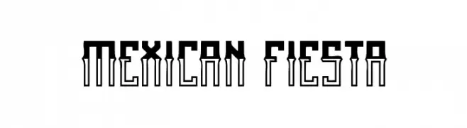
( Qkila - Quentin Aquila - www.creativefabrica.com/designer/qkila/ )
A bold, decorative font with geometric influences and a festive flair.
![Mexican fiesta Frei Schriftart Herunterladen]() Herunterladen 433 Downloads@WebFont
Herunterladen 433 Downloads@WebFont -
( Fonts by Omnibus Type )
A bold, modern sans-serif font with clean lines and strong presence.
![Saira Bold Frei Schriftart Herunterladen]() Herunterladen 433 Downloads@WebFont
Herunterladen 433 Downloads@WebFont -
( Free for personal use - Fonts by Markus Schroppel. For commercial license please donate to http://www.die-gute-schrift.de/donation.html )
A pixelated, grid-based font with a retro digital aesthetic.
![LLPixel Frei Schriftart Herunterladen]() Herunterladen 433 Downloads@WebFont
Herunterladen 433 Downloads@WebFont -
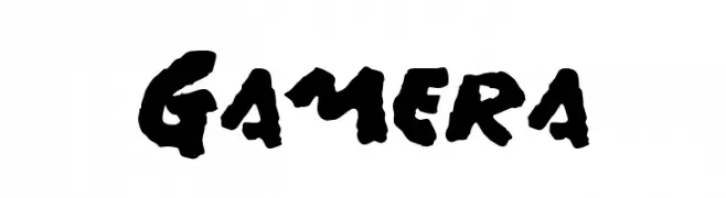
( Fonts by Harold Lohner - www.haroldsfonts.com )
A bold, hand-painted style font with dynamic, expressive characters.
![Gamera Frei Schriftart Herunterladen]() Herunterladen 433 Downloads@WebFont
Herunterladen 433 Downloads@WebFont -
![zig zag zeg Frei Schriftart Herunterladen]() Herunterladen 433 Downloads@WebFont
Herunterladen 433 Downloads@WebFont -
![Carybe-Regular Frei Schriftart Herunterladen]() Herunterladen 433 Downloads@WebFont
Herunterladen 433 Downloads@WebFont -
( Fonts by Essentials Studio )
A playful, handwritten font with smooth curves and a casual style.
![Joyline Notes Frei Schriftart Herunterladen]() Herunterladen 433 Downloads@WebFont
Herunterladen 433 Downloads@WebFont -
( Fonts by Anthony Robinson )
![English Football Club Badges Frei Schriftart Herunterladen]() Herunterladen 433 Downloads@WebFont
Herunterladen 433 Downloads@WebFont -
( Fonts by Jayde Garrow - GarrowGlitch - http://jaydegarrow.wix.com/jaydefonts. Personal-use only. For commercial use please contact owner. )
A bold, jagged font with dynamic strokes and a graffiti-like style.
![HoganMania Frei Schriftart Herunterladen]() Herunterladen 433 Downloads@WebFont
Herunterladen 433 Downloads@WebFont -
( Lettersiro - Shiro Ngampus - creativemarket.com/Lettersiro )
A bold, textured vintage font with a distressed, rustic look.
![ZEMBOOD Vintage Frei Schriftart Herunterladen]() Herunterladen 433 Downloads@WebFont
Herunterladen 433 Downloads@WebFont -
( Fonts by a Max Infeld - XEROGRAPHER FONTS - xerographer.blogspot.com . Personal-use only. For commercial use please contact owner. )
A bold, distressed font with a vintage, grunge aesthetic.
![SpotEvent Frei Schriftart Herunterladen]() Herunterladen 433 Downloads@WebFont
Herunterladen 433 Downloads@WebFont


Welche Schriften sind gerade am populärsten?
Poppins, Roboto, Montserrat, Open Sans und Lato sind wegen ihrer klaren Formen und breiten Einsetzbarkeit sehr gefragt – von Markenauftritt über Landingpages bis hin zu Postern.
Welche Fonts eignen sich für Logos?
Geometrische Sans‑Serifs (z. B. Poppins, Familien im Gotham‑Stil) sind ein häufiger Griff für sauberes, skalierbares Branding. Für eine persönlichere Note bleiben Scripts und Handschrift‑Stile beliebt. Kombinieren Sie einen prägnanten Headline‑Font mit einer neutralen Brotschrift für Wiedererkennung und Harmonie.
Wie oft wird die Top‑Liste aktualisiert?
Regelmäßig – basierend auf realen Downloads und Interaktionen. Schauen Sie öfter vorbei, um aufstrebende Favoriten früh zu entdecken.
💡 Tipp: Seite bookmarken – Trends wechseln schnell, und heutige Top‑Schriften inspirieren morgen vielleicht das Rebranding.