Willkommen bei den Top‑Schriften – hier treffen Beliebtheit und Qualität aufeinander. Das sind die in diesem Jahr am häufigsten heruntergeladenen und genutzten Fonts. Wenn Sie sichere Optionen für Logo, Web oder Social suchen, starten Sie hier.
Jeder Top‑Font überzeugt durch Balance, Lesbarkeit und Vielseitigkeit. Sie finden moderne Sans‑Serifs, elegante Scripts, Vintage‑Serifs und minimalistische Displays.
-
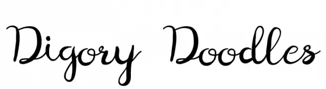
( Fonts by holdsworthdesign )
A playful, whimsical script font with a handwritten style.
 Herunterladen 394 Downloads@WebFont
 -
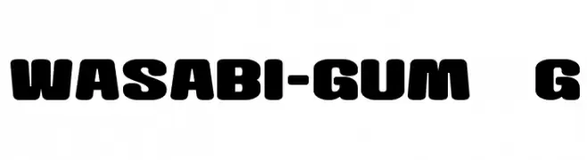
( Fonts by Goma Shin - Shintarou Nakayama www.geocities.jp/gomarice_font/ )
A bold, rounded font with a playful and modern style.
![Wasabi-Gum__G Frei Schriftart Herunterladen]() Herunterladen 394 Downloads@WebFont
Herunterladen 394 Downloads@WebFont -
( Copyright 2016 The Chivo Project Authors (omnibus.type@gmail.com) )
A bold, italicized font with a modern and dynamic style.
![Chivo Bold Italic Frei Schriftart Herunterladen]() Herunterladen 394 Downloads@WebFont
Herunterladen 394 Downloads@WebFont -
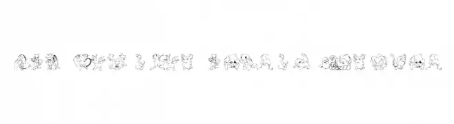
![LMS Poke'mon Master DingBat Frei Schriftart Herunterladen]() Herunterladen 394 Downloads@WebFont
Herunterladen 394 Downloads@WebFont -
![SJSpringhascome Frei Schriftart Herunterladen]() Herunterladen 394 Downloads@WebFont
Herunterladen 394 Downloads@WebFont -
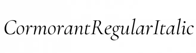
( Fonts by Catharsis - Personal-use only. For commercial use please contact owner. )
A classic, elegant serif font with italicized characters and medium contrast.
![Cormorant Regular Italic Frei Schriftart Herunterladen]() Herunterladen 394 Downloads@WebFont
Herunterladen 394 Downloads@WebFont -
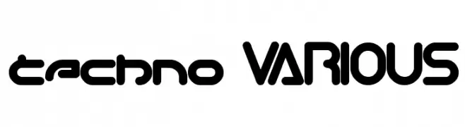
( Fonts by weknow - Wino S Kadir )
A futuristic, geometric font with rounded edges and bold strokes.
![techno VARIOUS Frei Schriftart Herunterladen]() Herunterladen 394 Downloads@WebFont
Herunterladen 394 Downloads@WebFont -
( Fonts by Miffies - mfs.jp.org - Personal-use only. For commercial use please contact owner. )
A bold, pixelated font with a geometric, digital display style.
![M20_SP-RANKER Frei Schriftart Herunterladen]() Herunterladen 394 Downloads@WebFont
Herunterladen 394 Downloads@WebFont -
![RMFIRE Frei Schriftart Herunterladen]() Herunterladen 394 Downloads@WebFont
Herunterladen 394 Downloads@WebFont -
( Fonts by omnibus-type.com. Personal-use only. For commercial use please contact owner. )
Bold and italicized font with a modern and dynamic style.
![Asap-BoldItalic Frei Schriftart Herunterladen]() Herunterladen 394 Downloads@WebFont
Herunterladen 394 Downloads@WebFont -
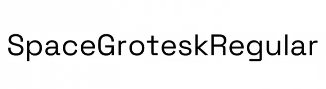
( Fonts by Florian Karsten )
A modern, geometric sans-serif font with clean lines and balanced proportions.
![Space Grotesk Regular Frei Schriftart Herunterladen]() Herunterladen 394 Downloads@WebFont
Herunterladen 394 Downloads@WebFont -
![Fiesta Win95 Frei Schriftart Herunterladen]() Herunterladen 394 Downloads@WebFont
Herunterladen 394 Downloads@WebFont -
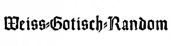
( Fonts by Manfred Klein. Free for private and charity use. Free for commercial with donation to organizations )
A bold, traditional blackletter font with intricate, angular strokes.
![Weiss-Gotisch-Random Frei Schriftart Herunterladen]() Herunterladen 394 Downloads@WebFont
Herunterladen 394 Downloads@WebFont -
( Fonts by Ach Syafii )
A bold, handwritten font with a playful and friendly style.
![Gempita Frei Schriftart Herunterladen]() Herunterladen 394 Downloads@WebFont
Herunterladen 394 Downloads@WebFont -
![tenuki gothic Normal Frei Schriftart Herunterladen]() Herunterladen 393 Downloads@WebFont
Herunterladen 393 Downloads@WebFont -
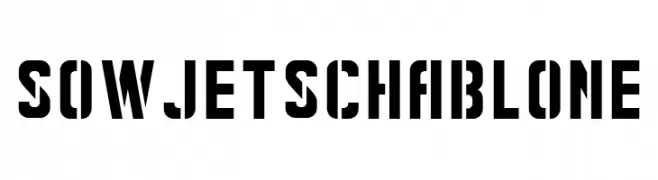
( Fonts by Peter Wiegel - www.peter-wiegel.de - Personal-use only. For commercial use please contact owner. )
A bold, stencil-style font with a strong industrial aesthetic.
![Sowjetschablone Frei Schriftart Herunterladen]() Herunterladen 393 Downloads@WebFont
Herunterladen 393 Downloads@WebFont -
( Fonts by Ahmad Syarif Afandi - https://delapan.studio - Personal-use only. For commercial use please contact owner. )
An elegant script font with fluid, cursive strokes and graceful loops.
![klara Frei Schriftart Herunterladen]() Herunterladen 393 Downloads@WebFont
Herunterladen 393 Downloads@WebFont -
![YOzFontC04 Italic Frei Schriftart Herunterladen]() Herunterladen 393 Downloads@WebFont
Herunterladen 393 Downloads@WebFont -
( Fonts by Roland Huse - rolandhuse.com )
A bold, hand-crafted font with a rugged and organic feel.
![UrbanStone Frei Schriftart Herunterladen]() Herunterladen 393 Downloads@WebFont
Herunterladen 393 Downloads@WebFont -
( Fonts by Kong Font - https://fontkong.com/ - Personal-use only. For commercial use please contact owner. )
A playful and elegant script font with smooth, rounded letterforms.
![Rosanna Frei Schriftart Herunterladen]() Herunterladen 393 Downloads@WebFont
Herunterladen 393 Downloads@WebFont -
![Engrossing!]() Herunterladen 393 Downloads@WebFont
Herunterladen 393 Downloads@WebFont -
( Iconian Fonts - Daniel Zadorozny - www.iconian.com )
A futuristic, angular font with bold, geometric shapes.
![Space Ranger Title Frei Schriftart Herunterladen]() Herunterladen 393 Downloads@WebFont
Herunterladen 393 Downloads@WebFont -
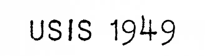
Schriftart von krraaa. For commercial use please contact the owner.
( Fonts by Lukas Krakora - Free for personal use )
A vintage, typewriter-style font with a distressed, handcrafted appearance.
![USIS 1949 Frei Schriftart Herunterladen]() Herunterladen 393 Downloads@WebFont
Herunterladen 393 Downloads@WebFont -
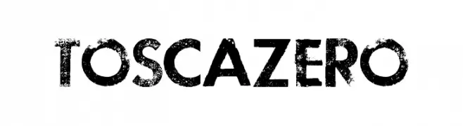
( Fonts by Billy Argel - www.billyargel.com - Personal-use only. For commercial use please contact owner. )
A bold, distressed font with a grunge aesthetic and textured edges.
![TOSCA ZERO Frei Schriftart Herunterladen]() Herunterladen 393 Downloads@WebFont
Herunterladen 393 Downloads@WebFont -
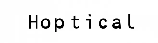
![Hoptical Frei Schriftart Herunterladen]() Herunterladen 393 Downloads@WebFont
Herunterladen 393 Downloads@WebFont -
( Fonts by Daniel Zadorozny - www.iconian.com )
A bold, condensed, and italic font with sharp, angular edges and a modern, dynamic style.
![Pistoleer Condensed Italic Frei Schriftart Herunterladen]() Herunterladen 393 Downloads@WebFont
Herunterladen 393 Downloads@WebFont -
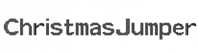
Schriftart von spideraysfonts. For commercial use please contact the owner.
![ChristmasJumper Frei Schriftart Herunterladen]() Herunterladen 393 Downloads@WebFont
Herunterladen 393 Downloads@WebFont -
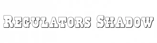
( Fonts by Daniel Zadorozny - www.iconian.com )
Bold, blocky font with a three-dimensional shadow effect.
![Regulators Shadow Frei Schriftart Herunterladen]() Herunterladen 393 Downloads@WebFont
Herunterladen 393 Downloads@WebFont -
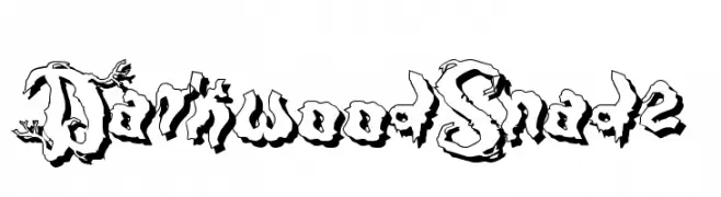
( Fonts by Otto Maurer Design )
A decorative, bold font with a twisted, shadowed design ideal for dramatic displays.
![DarkwoodShad2 Frei Schriftart Herunterladen]() Herunterladen 393 Downloads@WebFont
Herunterladen 393 Downloads@WebFont -
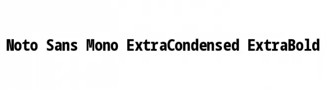
( Noto is a trademark of Google Inc. Noto fonts are open source. All Noto fonts are published under the SIL Open Font License, Version 1.1 )
A bold, extra-condensed monospaced font with a modern and clean design.
![Noto Sans Mono ExtraCondensed ExtraBold Frei Schriftart Herunterladen]() Herunterladen 393 Downloads@WebFont
Herunterladen 393 Downloads@WebFont -
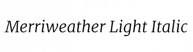
( Copyright 2016 The Merriweather Project Authors (https://github.com/EbenSorkin/Merriweather), with Reserved Font Name "Merriweather". )
A refined, light, and italic serif font with medium contrast and a modern aesthetic.
![Merriweather Light Italic Frei Schriftart Herunterladen]() Herunterladen 393 Downloads@WebFont
Herunterladen 393 Downloads@WebFont -
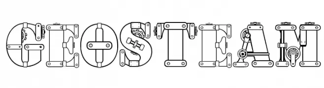
![geosteam Frei Schriftart Herunterladen]() Herunterladen 393 Downloads@WebFont
Herunterladen 393 Downloads@WebFont -
( Fonts by www.peter-wiegel.de. Personal-use only. For commercial use please contact owner. )
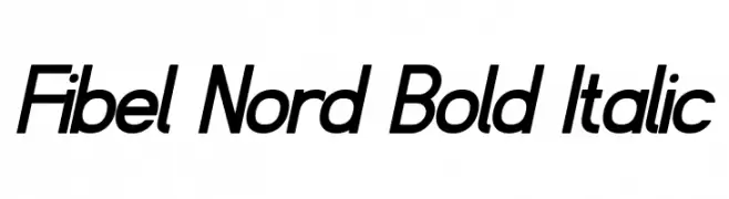
A bold, italicized font with a modern and sleek appearance.
![Fibel Nord Bold Italic Frei Schriftart Herunterladen]() Herunterladen 393 Downloads@WebFont
Herunterladen 393 Downloads@WebFont -
( Bhavika Malhotra - www.creativemarket.com/theinkaffair/?u=theinkaffair )
A bold, handwritten font with a playful and energetic style.
![Wild Wanderlust Personal Frei Schriftart Herunterladen]() Herunterladen 393 Downloads@WebFont
Herunterladen 393 Downloads@WebFont -
( truefonts.blogspot.com )
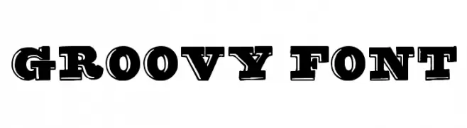
A bold, vintage-style font with a three-dimensional shadow effect.
![groovy font Frei Schriftart Herunterladen]() Herunterladen 393 Downloads@WebFont
Herunterladen 393 Downloads@WebFont


Welche Schriften sind gerade am populärsten?
Poppins, Roboto, Montserrat, Open Sans und Lato sind wegen ihrer klaren Formen und breiten Einsetzbarkeit sehr gefragt – von Markenauftritt über Landingpages bis hin zu Postern.
Welche Fonts eignen sich für Logos?
Geometrische Sans‑Serifs (z. B. Poppins, Familien im Gotham‑Stil) sind ein häufiger Griff für sauberes, skalierbares Branding. Für eine persönlichere Note bleiben Scripts und Handschrift‑Stile beliebt. Kombinieren Sie einen prägnanten Headline‑Font mit einer neutralen Brotschrift für Wiedererkennung und Harmonie.
Wie oft wird die Top‑Liste aktualisiert?
Regelmäßig – basierend auf realen Downloads und Interaktionen. Schauen Sie öfter vorbei, um aufstrebende Favoriten früh zu entdecken.
💡 Tipp: Seite bookmarken – Trends wechseln schnell, und heutige Top‑Schriften inspirieren morgen vielleicht das Rebranding.