Willkommen bei den Top‑Schriften – hier treffen Beliebtheit und Qualität aufeinander. Das sind die in diesem Jahr am häufigsten heruntergeladenen und genutzten Fonts. Wenn Sie sichere Optionen für Logo, Web oder Social suchen, starten Sie hier.
Jeder Top‑Font überzeugt durch Balance, Lesbarkeit und Vielseitigkeit. Sie finden moderne Sans‑Serifs, elegante Scripts, Vintage‑Serifs und minimalistische Displays.
-
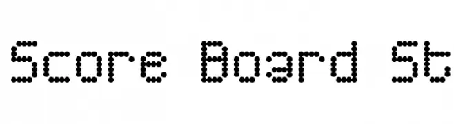
( Fonts by Southype )
A dot matrix font with a retro, digital scoreboard style.
 Herunterladen 365 Downloads@WebFont
 -
( Fonts by a Neale Davidson - www.pixelsagas.com. Personal-use only. For commercial use please contact owner. )
A bold, angular font with a futuristic, robotic design.
![Medabots Frei Schriftart Herunterladen]() Herunterladen 365 Downloads@WebFont
Herunterladen 365 Downloads@WebFont -
( Fonts by Quzma Supply Co - Personal-use only. For commercial use please contact owner. )
A playful, rounded sans-serif font with smooth curves and uniform strokes.
![Warlow Sans Frei Schriftart Herunterladen]() Herunterladen 365 Downloads@WebFont
Herunterladen 365 Downloads@WebFont -
Schriftart von fontsnthings. For commercial use please contact the owner.
![Heart Things Frei Schriftart Herunterladen]() Herunterladen 365 Downloads@WebFont
Herunterladen 365 Downloads@WebFont -
![Old Cologne Regular Frei Schriftart Herunterladen]() Herunterladen 365 Downloads
Herunterladen 365 Downloads -
-
![sciallo Frei Schriftart Herunterladen]() Herunterladen 365 Downloads@WebFont
Herunterladen 365 Downloads@WebFont -
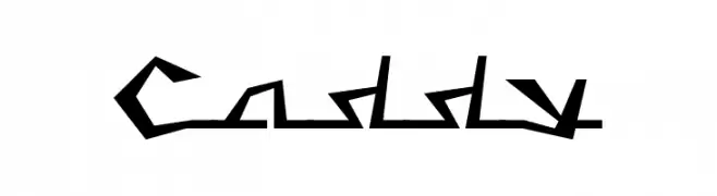
( Fonts by Levi Halmos )
A bold, angular font with a futuristic and edgy design.
![Caddy Frei Schriftart Herunterladen]() Herunterladen 365 Downloads@WebFont
Herunterladen 365 Downloads@WebFont -
( Emile, Byeongsu Kim - panopt.net )
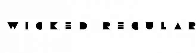
A bold, geometric font with sharp angles and a modern aesthetic.
![WICKED REGULAR Frei Schriftart Herunterladen]() Herunterladen 365 Downloads@WebFont
Herunterladen 365 Downloads@WebFont -
( Copyright © 2017 IBM Corp. with Reserved Font Name "Plex" )
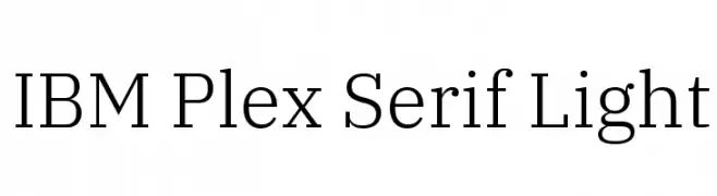
A modern serif font with a light weight, offering elegance and readability.
![IBM Plex Serif Light Frei Schriftart Herunterladen]() Herunterladen 365 Downloads@WebFont
Herunterladen 365 Downloads@WebFont -
( Fonts by Peter Wiegel - www.peter-wiegel.de )
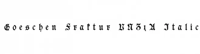
An ornate Blackletter font with intricate details and an italic style.
![Goeschen Fraktur UNZ1A Italic Frei Schriftart Herunterladen]() Herunterladen 365 Downloads@WebFont
Herunterladen 365 Downloads@WebFont -
( Fonts by Jacob Fisher - www.pizzadude.dk )
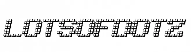
A pixelated, dot-based font with a modern, tech-inspired style.
![LotsOfDotz Frei Schriftart Herunterladen]() Herunterladen 365 Downloads@WebFont
Herunterladen 365 Downloads@WebFont -
( Fonts by Leonard Posavec - leosupply.co - Personal-use only. For commercial use please contact owner. )
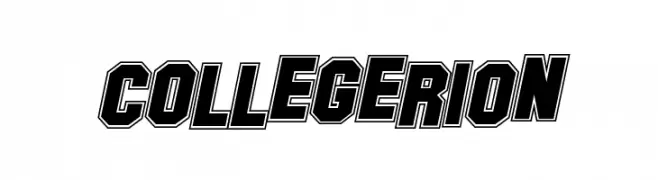
A bold, angular font with a three-dimensional outline, perfect for dynamic and impactful designs.
![Collegerion Frei Schriftart Herunterladen]() Herunterladen 365 Downloads@WebFont
Herunterladen 365 Downloads@WebFont -
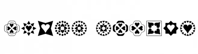
( Fonts by Misti Hammers - mistifonts.com - Personal-use only. For commercial use please contact owner. )
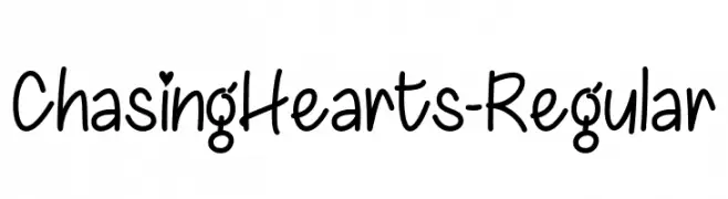
A playful handwritten font with heart accents, perfect for romantic and casual designs.
![ChasingHearts-Regular Frei Schriftart Herunterladen]() Herunterladen 365 Downloads@WebFont
Herunterladen 365 Downloads@WebFont -
( Fonts by billyargel.blogspot.com - Billy Argel )
A modern, geometric font with sharp edges and a futuristic style.
![MANABU Frei Schriftart Herunterladen]() Herunterladen 365 Downloads@WebFont
Herunterladen 365 Downloads@WebFont -
( Free for a personal use. For a commercial use please visit www.kevinandamanda.com )
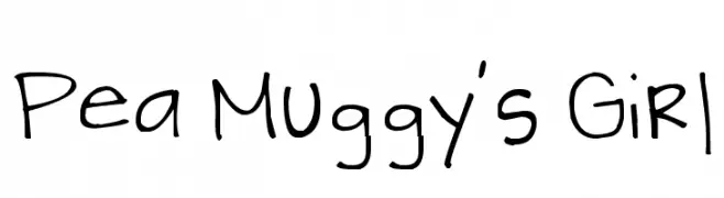
A playful, handwritten font with a casual and dynamic style.
![Pea Muggy's Girl Frei Schriftart Herunterladen]() Herunterladen 365 Downloads@WebFont
Herunterladen 365 Downloads@WebFont -
( Fonts by Daniel Gauthier )
A tall, narrow font with high contrast and elegant, modern design.
![ChineseWatchShop Frei Schriftart Herunterladen]() Herunterladen 365 Downloads@WebFont
Herunterladen 365 Downloads@WebFont -
( Fonts by Bumbayo Font Fabrik - bumbayo.blogspot.com )
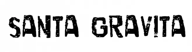
A bold, distressed font with a vintage, rugged texture.
![Santa Gravita Frei Schriftart Herunterladen]() Herunterladen 365 Downloads@WebFont
Herunterladen 365 Downloads@WebFont -
( Fonts by ShyFonts )
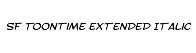
A playful, handwritten font with a slight slant and smooth, rounded characters.
![SF Toontime Extended Italic Frei Schriftart Herunterladen]() Herunterladen 365 Downloads@WebFont
Herunterladen 365 Downloads@WebFont -
( Copyright (c) 2015, Cadson Demak (info@cadsondemak.com) )
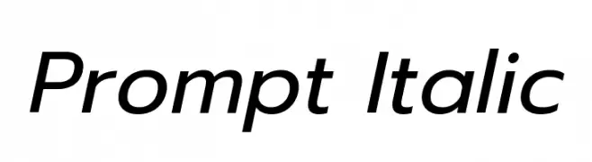
A modern, italic font with clean lines and a dynamic slant.
![Prompt Italic Frei Schriftart Herunterladen]() Herunterladen 365 Downloads@WebFont
Herunterladen 365 Downloads@WebFont -
( Fonts by a Galdino Otten - galdinootten.com . Personal-use only. For commercial use please contact owner. )
A festive, snow-capped font with a playful, cartoonish style.
![Snaps Taste Christmas Frei Schriftart Herunterladen]() Herunterladen 365 Downloads@WebFont
Herunterladen 365 Downloads@WebFont -
( Fonts by www.houseoflime.com )
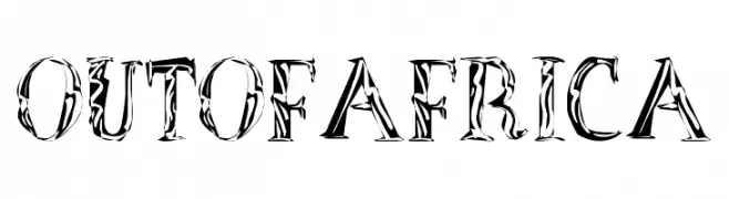
A bold, decorative font with intricate, nature-inspired patterns.
![OutOfAfrica Frei Schriftart Herunterladen]() Herunterladen 365 Downloads@WebFont
Herunterladen 365 Downloads@WebFont -
( Fonts by Small Voice Studio - smallvoice.studio/typefaces - Personal-use only. For commercial use please contact owner. )
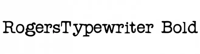
A bold, monospaced typewriter-style font with slab serif elements.
![RogersTypewriter Bold Frei Schriftart Herunterladen]() Herunterladen 365 Downloads@WebFont
Herunterladen 365 Downloads@WebFont -
( Fonts by vladimirnikolic - Personal-use only. For commercial use please contact owner. )
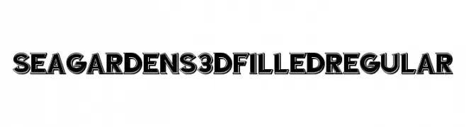
A bold, 3D font with filled interiors and prominent outlines, perfect for impactful designs.
![Sea Gardens 3D Filled Regular Frei Schriftart Herunterladen]() Herunterladen 365 Downloads@WebFont
Herunterladen 365 Downloads@WebFont -
( www.woodcutter.es )
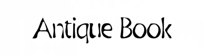
A vintage-inspired font with artistic, hand-drawn strokes and playful curves.
![Antique Book Frei Schriftart Herunterladen]() Herunterladen 365 Downloads@WebFont
Herunterladen 365 Downloads@WebFont -
( Fonts by Daniel Zadorozny - www.iconian.com )
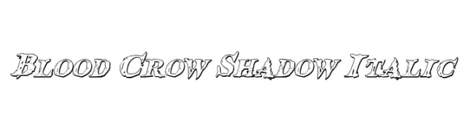
A bold, italicized font with a shadow effect and distressed edges.
![Blood Crow Shadow Italic Frei Schriftart Herunterladen]() Herunterladen 365 Downloads@WebFont
Herunterladen 365 Downloads@WebFont -
( Fonts by Jeri Ingalls - littlehouse.homestead.com )
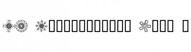
Ornamental dingbat font with kaleidoscopic, geometric motifs.
![JI Kaleidoscope Bats 5 Frei Schriftart Herunterladen]() Herunterladen 365 Downloads@WebFont
Herunterladen 365 Downloads@WebFont -
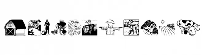
( Fonts by Manfred Klein. Free for private and charity use. Free for commercial with donation to organizations )
A decorative font featuring detailed illustrations of rural life elements.
![CountryLife Frei Schriftart Herunterladen]() Herunterladen 365 Downloads@WebFont
Herunterladen 365 Downloads@WebFont -
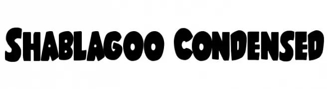
( Fonts by Iconian Fonts )
A bold, playful font with thick, rounded characters and tight spacing.
![Shablagoo Condensed Frei Schriftart Herunterladen]() Herunterladen 365 Downloads@WebFont
Herunterladen 365 Downloads@WebFont -
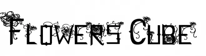
( Fonts by Albertine Nerevan - albertinenerevan.blogspot.com )
A decorative font with floral embellishments and angular, bold characters.
![Flowers Cube Frei Schriftart Herunterladen]() Herunterladen 365 Downloads@WebFont
Herunterladen 365 Downloads@WebFont -
( Fonts by MJType )
A playful, casual handwritten font with smooth, flowing lines.
![Jhon Max Frei Schriftart Herunterladen]() Herunterladen 365 Downloads@WebFont
Herunterladen 365 Downloads@WebFont -
( Fonts by www.fontalicious.com )
A bold, geometric font with rounded edges and consistent proportions.
![Dunebug Frei Schriftart Herunterladen]() Herunterladen 365 Downloads@WebFont
Herunterladen 365 Downloads@WebFont -
( Fonts by David Rakowski )
A playful, bold font with rabbit ear-like ascenders and rounded characters.
![RabbitEars Frei Schriftart Herunterladen]() Herunterladen 365 Downloads@WebFont
Herunterladen 365 Downloads@WebFont -
( Fonts by HastaType - Salman Mashudi - Personal-use only. For commercial use please contact owner. )
A bold, cursive script with dynamic curves and elegant flourishes.
![Franky Frei Schriftart Herunterladen]() Herunterladen 365 Downloads@WebFont
Herunterladen 365 Downloads@WebFont -
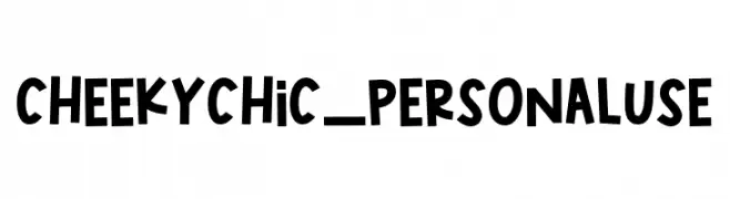
( Fonts by Jimtype Studio )
A playful, hand-drawn font with bold, quirky characters.
![CheekyChic_PERSONALUSE Frei Schriftart Herunterladen]() Herunterladen 365 Downloads@WebFont
Herunterladen 365 Downloads@WebFont -
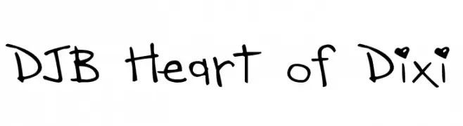
( Fonts by Darcy Baldwin - darcybaldwin.com. Free for personal use only )
A playful, handwritten font with a casual and friendly vibe.
![DJB Heart of Dixi Frei Schriftart Herunterladen]() Herunterladen 365 Downloads@WebFont
Herunterladen 365 Downloads@WebFont


Welche Schriften sind gerade am populärsten?
Poppins, Roboto, Montserrat, Open Sans und Lato sind wegen ihrer klaren Formen und breiten Einsetzbarkeit sehr gefragt – von Markenauftritt über Landingpages bis hin zu Postern.
Welche Fonts eignen sich für Logos?
Geometrische Sans‑Serifs (z. B. Poppins, Familien im Gotham‑Stil) sind ein häufiger Griff für sauberes, skalierbares Branding. Für eine persönlichere Note bleiben Scripts und Handschrift‑Stile beliebt. Kombinieren Sie einen prägnanten Headline‑Font mit einer neutralen Brotschrift für Wiedererkennung und Harmonie.
Wie oft wird die Top‑Liste aktualisiert?
Regelmäßig – basierend auf realen Downloads und Interaktionen. Schauen Sie öfter vorbei, um aufstrebende Favoriten früh zu entdecken.
💡 Tipp: Seite bookmarken – Trends wechseln schnell, und heutige Top‑Schriften inspirieren morgen vielleicht das Rebranding.