Willkommen bei den Top‑Schriften – hier treffen Beliebtheit und Qualität aufeinander. Das sind die in diesem Jahr am häufigsten heruntergeladenen und genutzten Fonts. Wenn Sie sichere Optionen für Logo, Web oder Social suchen, starten Sie hier.
Jeder Top‑Font überzeugt durch Balance, Lesbarkeit und Vielseitigkeit. Sie finden moderne Sans‑Serifs, elegante Scripts, Vintage‑Serifs und minimalistische Displays.
-
( Fonts by Brixdee )
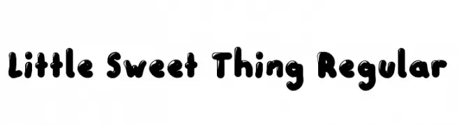
A playful, bubbly font with bold, rounded characters and a friendly feel.
 Herunterladen 366 Downloads@WebFont
 -
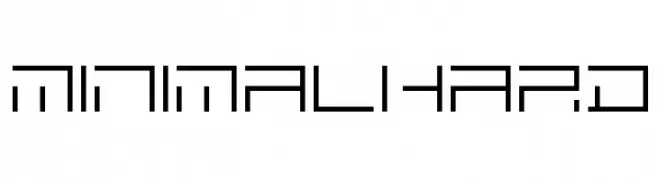
![MINIMALHARD Frei Schriftart Herunterladen]() Herunterladen 366 Downloads@WebFont
Herunterladen 366 Downloads@WebFont -
( Fonts by Mustakim - - Personal-use only. For commercial use please contact owner. )
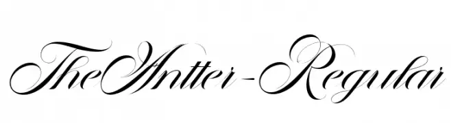
An elegant script font with flowing, interconnected characters and high contrast strokes.
![TheAntter-Regular Frei Schriftart Herunterladen]() Herunterladen 366 Downloads@WebFont
Herunterladen 366 Downloads@WebFont -
( Fonts by Tomasz Skowroński )
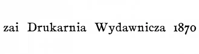
A bold, vintage serif font with a handcrafted feel.
![zai Drukarnia Wydawnicza 1870 Frei Schriftart Herunterladen]() Herunterladen 366 Downloads@WebFont
Herunterladen 366 Downloads@WebFont -
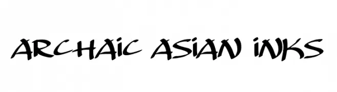
( Fonts by Darrell Flood )
A bold, calligraphic font inspired by traditional Asian ink styles.
![Archaic Asian Inks Frei Schriftart Herunterladen]() Herunterladen 366 Downloads@WebFont
Herunterladen 366 Downloads@WebFont -
-
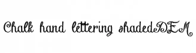
( Fontscafe.com - fontscafe.com/ )
A decorative, hand-drawn font with elegant swirls and a chalk-like texture.
![Chalk-hand-lettering-shaded DEM Frei Schriftart Herunterladen]() Herunterladen 366 Downloads@WebFont
Herunterladen 366 Downloads@WebFont -
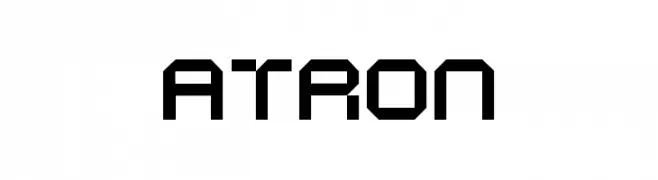
( Helldunkel - www.helldunkel.com )
A geometric, futuristic font with bold, angular shapes and clean lines.
![ATRON Frei Schriftart Herunterladen]() Herunterladen 366 Downloads@WebFont
Herunterladen 366 Downloads@WebFont -
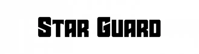
( Fonts by Iconian Fonts - Daniel Zadorozny - Personal-use only. For commercial use please contact owner. )
A bold, geometric font with a futuristic and sci-fi aesthetic.
![Star Guard Frei Schriftart Herunterladen]() Herunterladen 366 Downloads@WebFont
Herunterladen 366 Downloads@WebFont -
( Fonts by Apostrophic Lab )
A bold, italicized sans-serif font with a modern and dynamic style.
![Florencesans SC Bold Italic Frei Schriftart Herunterladen]() Herunterladen 366 Downloads@WebFont
Herunterladen 366 Downloads@WebFont -
( Fonts by Edric Studio www.creativefabrica.com/designer/edricstudio/ - Personal-use only. For commercial use please contact owner. )
A playful and whimsical script font with decorative swirls and loops.
![saila nurissalma Frei Schriftart Herunterladen]() Herunterladen 366 Downloads@WebFont
Herunterladen 366 Downloads@WebFont -
( Fonts by Apostrophic Lab )
An elegant serif font with classic curves and sharp serifs, offering a timeless and sophisticated look.
![Phosphorus Sulphide Frei Schriftart Herunterladen]() Herunterladen 366 Downloads@WebFont
Herunterladen 366 Downloads@WebFont -
( Fonts by Daniel Gauthier )
A bold, fur-textured font with a playful and wild aesthetic.
![Sasquatch Frei Schriftart Herunterladen]() Herunterladen 366 Downloads@WebFont
Herunterladen 366 Downloads@WebFont -
( Fonts by a Neale Davidson - www.pixelsagas.com. Personal-use only. For commercial use please contact owner. )
A bold, italicized font with a modern, geometric style.
![Protoculture Bold Italic Frei Schriftart Herunterladen]() Herunterladen 366 Downloads@WebFont
Herunterladen 366 Downloads@WebFont -
( Fonts by Dan P. Lyons - Personal-use only. For commercial use please contact owner. )
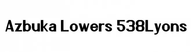
A bold, modern sans-serif font with clean lines and strong presence.
![Azbuka Lowers 538Lyons Frei Schriftart Herunterladen]() Herunterladen 366 Downloads@WebFont
Herunterladen 366 Downloads@WebFont -
( Fonts by joeBob graff-X )
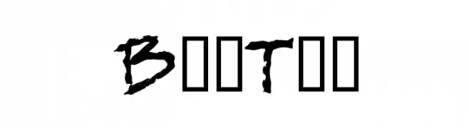
A bold, graffiti-inspired font with dynamic, hand-drawn strokes.
![BobTag Frei Schriftart Herunterladen]() Herunterladen 366 Downloads@WebFont
Herunterladen 366 Downloads@WebFont -
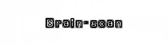
![Brain-scan Frei Schriftart Herunterladen]() Herunterladen 366 Downloads@WebFont
Herunterladen 366 Downloads@WebFont -
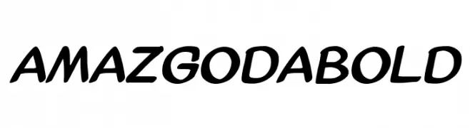
( Fonts by Amazingmax - Maxim Avdeev )
A bold, slanted font with rounded, smooth characters for a modern look.
![AmazGoDaBold Frei Schriftart Herunterladen]() Herunterladen 366 Downloads@WebFont
Herunterladen 366 Downloads@WebFont -
( Fonts by Hanna Bie )
A bold, handwritten font with a playful and energetic style.
![Retriever Frei Schriftart Herunterladen]() Herunterladen 366 Downloads@WebFont
Herunterladen 366 Downloads@WebFont -
![SmokeShadow-Medium Frei Schriftart Herunterladen]() Herunterladen 366 Downloads@WebFont
Herunterladen 366 Downloads@WebFont -
( Fonts by Wahyu Eka Prasetya - wepfont.com - Personal-use only. For commercial use please contact owner. )
A lively, cursive font with fluid strokes and a handwritten charm.
![Easy Sticky Frei Schriftart Herunterladen]() Herunterladen 366 Downloads@WebFont
Herunterladen 366 Downloads@WebFont -
![UnciaDis Frei Schriftart Herunterladen]() Herunterladen 366 Downloads@WebFont
Herunterladen 366 Downloads@WebFont -
![KR Weather Dings Frei Schriftart Herunterladen]() Herunterladen 366 Downloads@WebFont
Herunterladen 366 Downloads@WebFont -
( Fonts by a Max Infeld - XEROGRAPHER FONTS - xerographer.blogspot.com . Personal-use only. For commercial use please contact owner. )
A bold, dynamic font with sharp, angular strokes and an energetic appearance.
![GreatArrows Frei Schriftart Herunterladen]() Herunterladen 366 Downloads@WebFont
Herunterladen 366 Downloads@WebFont -
![TypographerGotisch A Frei Schriftart Herunterladen]() Herunterladen 366 Downloads@WebFont
Herunterladen 366 Downloads@WebFont -
( Fonts by Daniel Zadorozny - www.iconian.com - Free for personal use )
A bold, futuristic font with italicized characters enclosed in circles.
![Dot.com Frei Schriftart Herunterladen]() Herunterladen 366 Downloads
Herunterladen 366 Downloads -
( imagex - www.imagex-fonts.com )
A bold, hand-drawn style font with an expressive and artistic appearance.
![Flowers Kingdom Frei Schriftart Herunterladen]() Herunterladen 366 Downloads@WebFont
Herunterladen 366 Downloads@WebFont -
( Fonts by Daniel Zadorozny - www.iconian.com - Free for personal use )
A sleek, modern, condensed italic font with dynamic angles.
![Concielian Break Condensed Italic Frei Schriftart Herunterladen]() Herunterladen 366 Downloads@WebFont
Herunterladen 366 Downloads@WebFont -
![Cicle Semi Italic Frei Schriftart Herunterladen]() Herunterladen 366 Downloads@WebFont
Herunterladen 366 Downloads@WebFont -
( Fonts by Vít Čondák )
A flowing, elegant cursive font with a classic yet modern appeal.
![Residuální Frei Schriftart Herunterladen]() Herunterladen 366 Downloads@WebFont
Herunterladen 366 Downloads@WebFont -
( Fonts by Fontles.com )
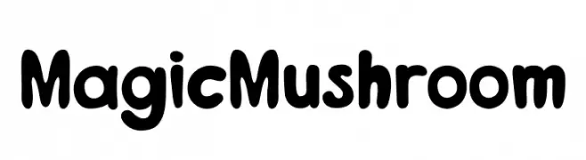
A playful, bold font with rounded edges and a bubbly appearance.
![MagicMushroom Frei Schriftart Herunterladen]() Herunterladen 366 Downloads@WebFont
Herunterladen 366 Downloads@WebFont -
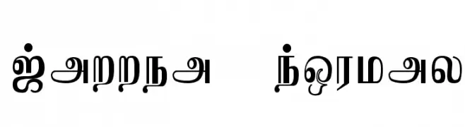
![Jaffna Normal Frei Schriftart Herunterladen]() Herunterladen 366 Downloads
Herunterladen 366 Downloads -
( Fonts by Paige Lyon )
A playful handwritten font with rounded, informal characters.
![Ellie Mae Demo Demo Frei Schriftart Herunterladen]() Herunterladen 366 Downloads@WebFont
Herunterladen 366 Downloads@WebFont -
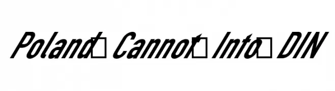
![Poland Cannot Into DIN Frei Schriftart Herunterladen]() Herunterladen 366 Downloads@WebFont
Herunterladen 366 Downloads@WebFont -
( Fonts by Woodcutter Manero - http://www.woodcutter.es - Personal-use only. For commercial use please contact owner. )
Bold, shadowed font with a vintage yet modern appeal.
![La Cebadita Frei Schriftart Herunterladen]() Herunterladen 366 Downloads@WebFont
Herunterladen 366 Downloads@WebFont -
![Risaltyp Frei Schriftart Herunterladen]() Herunterladen 366 Downloads@WebFont
Herunterladen 366 Downloads@WebFont


Welche Schriften sind gerade am populärsten?
Poppins, Roboto, Montserrat, Open Sans und Lato sind wegen ihrer klaren Formen und breiten Einsetzbarkeit sehr gefragt – von Markenauftritt über Landingpages bis hin zu Postern.
Welche Fonts eignen sich für Logos?
Geometrische Sans‑Serifs (z. B. Poppins, Familien im Gotham‑Stil) sind ein häufiger Griff für sauberes, skalierbares Branding. Für eine persönlichere Note bleiben Scripts und Handschrift‑Stile beliebt. Kombinieren Sie einen prägnanten Headline‑Font mit einer neutralen Brotschrift für Wiedererkennung und Harmonie.
Wie oft wird die Top‑Liste aktualisiert?
Regelmäßig – basierend auf realen Downloads und Interaktionen. Schauen Sie öfter vorbei, um aufstrebende Favoriten früh zu entdecken.
💡 Tipp: Seite bookmarken – Trends wechseln schnell, und heutige Top‑Schriften inspirieren morgen vielleicht das Rebranding.