Willkommen bei den Top‑Schriften – hier treffen Beliebtheit und Qualität aufeinander. Das sind die in diesem Jahr am häufigsten heruntergeladenen und genutzten Fonts. Wenn Sie sichere Optionen für Logo, Web oder Social suchen, starten Sie hier.
Jeder Top‑Font überzeugt durch Balance, Lesbarkeit und Vielseitigkeit. Sie finden moderne Sans‑Serifs, elegante Scripts, Vintage‑Serifs und minimalistische Displays.
-
 Herunterladen 357 Downloads@WebFont
 -
( Fonts by Katatrad Team, changes by Cristiano Sobral - Personal-use only. For commercial use please contact owner. )
A modern, clean sans-serif font with uniform stroke width and excellent readability.
![Dizhitl ExtraLight Frei Schriftart Herunterladen]() Herunterladen 357 Downloads@WebFont
Herunterladen 357 Downloads@WebFont -
![SoLonely Frei Schriftart Herunterladen]() Herunterladen 357 Downloads@WebFont
Herunterladen 357 Downloads@WebFont -
( Fadhil Aqsa - creativemarket.com/Meutuwah )
A stylish and elegant script font with fluid, cursive strokes and a handcrafted feel.
![Vettorell free Frei Schriftart Herunterladen]() Herunterladen 357 Downloads@WebFont
Herunterladen 357 Downloads@WebFont -
( Fonts by Daniel Gauthier )
A playful, bold font with bubbly outlines and textured interiors.
![GassyGaut Frei Schriftart Herunterladen]() Herunterladen 356 Downloads@WebFont
Herunterladen 356 Downloads@WebFont -
-
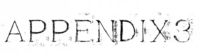
( Fonts by Ryoichi Tsunekawa - www.dharmatype.com )
A distressed serif font with a vintage, weathered appearance.
![Appendix3 Frei Schriftart Herunterladen]() Herunterladen 356 Downloads@WebFont
Herunterladen 356 Downloads@WebFont -
( Fonts by Antonio Rodrigues Jr - Personal-use only. For commercial use please contact owner. )
A bold, high-contrast font with a dramatic and elegant style.
![London Fill Bold Frei Schriftart Herunterladen]() Herunterladen 356 Downloads@WebFont
Herunterladen 356 Downloads@WebFont -
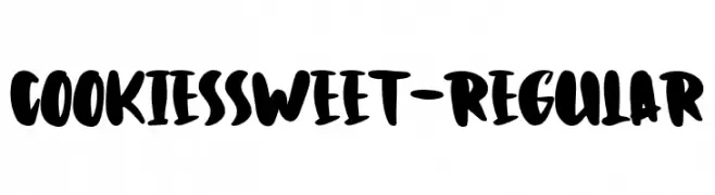
( Fonts by Typetemp Studio )
A playful, bold font with thick, rounded strokes and a hand-drawn style.
![CookiesSweet-Regular Frei Schriftart Herunterladen]() Herunterladen 356 Downloads@WebFont
Herunterladen 356 Downloads@WebFont -
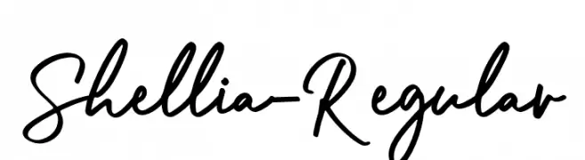
( Fonts by Mr Letters - https://www.creativefabrica.com/designer/mrletters/ - Personal-use only. For commercial use please contact owner. )
A casual, elegant handwritten font with smooth, flowing lines.
![Shellia-Regular Frei Schriftart Herunterladen]() Herunterladen 356 Downloads@WebFont
Herunterladen 356 Downloads@WebFont -
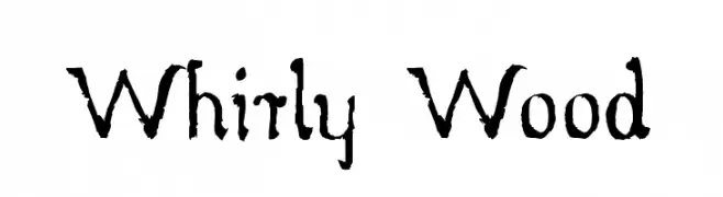
( myhandwritings.com )
A rustic, distressed font with a handcrafted, vintage feel.
![Whirly Wood Frei Schriftart Herunterladen]() Herunterladen 356 Downloads@WebFont
Herunterladen 356 Downloads@WebFont -
( Fonts by Arkandis Digital Foundry )
A bold and italicized font with a dynamic and elegant style.
![VenturisSansADFEx-BoldItalic Frei Schriftart Herunterladen]() Herunterladen 356 Downloads@WebFont
Herunterladen 356 Downloads@WebFont -
( Font by Sven Stuber - www.superlooper.de )
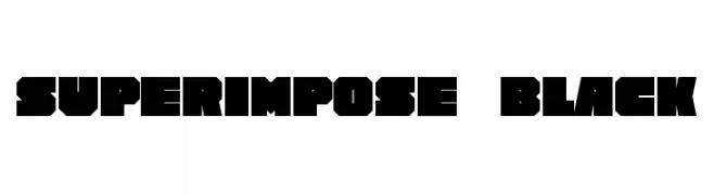
A bold, geometric font with strong, angular lines and minimal spacing.
![Superimpose Black Frei Schriftart Herunterladen]() Herunterladen 356 Downloads@WebFont
Herunterladen 356 Downloads@WebFont -
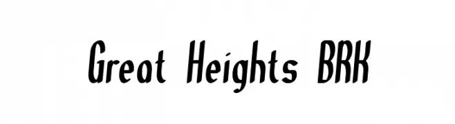
![Great Heights BRK Frei Schriftart Herunterladen]() Herunterladen 356 Downloads@WebFont
Herunterladen 356 Downloads@WebFont -
( Free for personal and commercial use. Fonts by www.hvdfonts.com )
A playful, hand-drawn font with bold, irregular strokes and a casual style.
![HVDEdding780-Normal Frei Schriftart Herunterladen]() Herunterladen 356 Downloads@WebFont
Herunterladen 356 Downloads@WebFont -
( Fonts by zamjump - Ahmad Zamzami - Personal-use only. For commercial use please contact owner. )
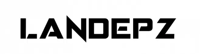
A bold, geometric font with a modern, industrial style.
![LANDEPZ Frei Schriftart Herunterladen]() Herunterladen 356 Downloads@WebFont
Herunterladen 356 Downloads@WebFont -
( Fonts by Alde Saputro - aldedesign - https://www.creativefabrica.com/product/the-crafty-holiday-font-bundle/ref/125925/ - Personal-use only. For commercial use please contact owner. )
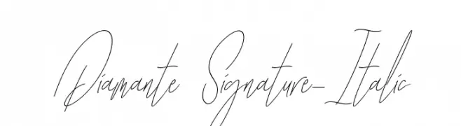
A refined, cursive script font with an elegant italic slant.
![Diamante Signature_Italic Frei Schriftart Herunterladen]() Herunterladen 356 Downloads@WebFont
Herunterladen 356 Downloads@WebFont -
( Iconian Fonts - Daniel Zadorozny - www.iconian.com )
A bold, blocky font with an industrial and modern aesthetic.
![Uglier Things Expanded Frei Schriftart Herunterladen]() Herunterladen 356 Downloads@WebFont
Herunterladen 356 Downloads@WebFont -
( Fonts by Style-7 - www.styleseven.com - Personal-use only. For commercial use please contact owner. )
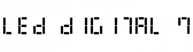
A digital, retro font inspired by classic LED displays with a geometric, pixelated style.
![LED Digital 7 Frei Schriftart Herunterladen]() Herunterladen 356 Downloads@WebFont
Herunterladen 356 Downloads@WebFont -
( Sansita Swashed is designed by Pablo Cosgaya (Omnibus-Type) and developed by Aldo De Losa )
A playful, swashed semi-bold font with elegant curves and decorative style.
![Sansita Swashed SemiBold Frei Schriftart Herunterladen]() Herunterladen 356 Downloads
Herunterladen 356 Downloads -
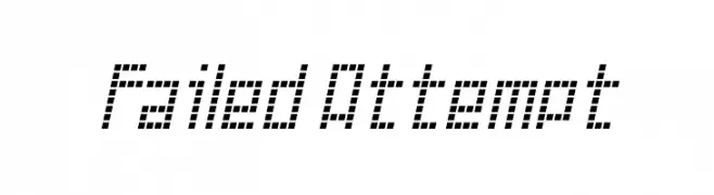
![Failed Attempt Frei Schriftart Herunterladen]() Herunterladen 356 Downloads@WebFont
Herunterladen 356 Downloads@WebFont -
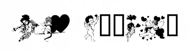
![LM Cupids Frei Schriftart Herunterladen]() Herunterladen 356 Downloads@WebFont
Herunterladen 356 Downloads@WebFont -
( Fonts by Steve Deffeyes - www.deffeyes.com )
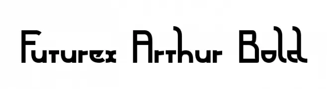
A bold, geometric font with a futuristic and modern design.
![Futurex Arthur Bold Frei Schriftart Herunterladen]() Herunterladen 356 Downloads@WebFont
Herunterladen 356 Downloads@WebFont -
![tups Frei Schriftart Herunterladen]() Herunterladen 356 Downloads@WebFont
Herunterladen 356 Downloads@WebFont -
( Fonts by Benoit Sjoholm - www.benoitsjoholm.com - All my fonts are for sale )
A bold, high-contrast font with a modern and elegant design.
![Nolla01 Frei Schriftart Herunterladen]() Herunterladen 356 Downloads@WebFont
Herunterladen 356 Downloads@WebFont -
( Fonts by Flanker - Personal-use only. For commercial use please contact owner. )
A bold, italicized font with a modern and dynamic style.
![Semplicita-BoldItalic Frei Schriftart Herunterladen]() Herunterladen 356 Downloads@WebFont
Herunterladen 356 Downloads@WebFont -
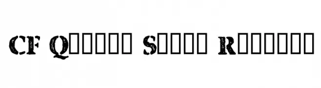
![CF Quebec Stamp Regular Frei Schriftart Herunterladen]() Herunterladen 356 Downloads@WebFont
Herunterladen 356 Downloads@WebFont -
( Fonts by Eknoji Studio - www.eknojistudio.com - Personal-use only. For commercial use please contact owner. )
A playful and elegant script font with smooth, flowing characters.
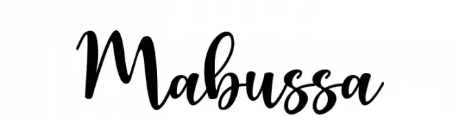
![Mabussa Frei Schriftart Herunterladen]() Herunterladen 356 Downloads@WebFont
Herunterladen 356 Downloads@WebFont -
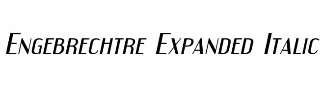
![Engebrechtre Expanded Italic Frei Schriftart Herunterladen]() Herunterladen 356 Downloads@WebFont
Herunterladen 356 Downloads@WebFont -
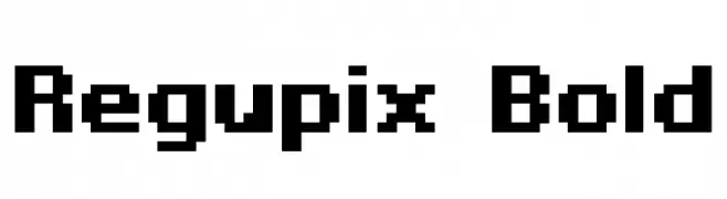
![Regupix Bold Frei Schriftart Herunterladen]() Herunterladen 356 Downloads@WebFont
Herunterladen 356 Downloads@WebFont -
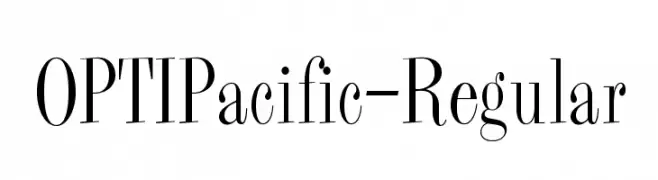
( Fonts by Castcraft Software - OPTI Fonts Archive - opti.netii.net - Personal-use only. For commercial use please contact owner. )
A classic serif font with elegant, elongated strokes and high contrast.
![OPTIPacific-Regular Frei Schriftart Herunterladen]() Herunterladen 356 Downloads@WebFont
Herunterladen 356 Downloads@WebFont -
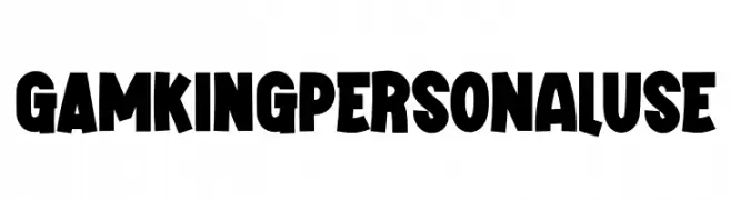
( Fonts by twinletter )
A bold, playful font with thick, blocky uppercase letters and a quirky, dynamic style.
![GAMKING Personal Use Frei Schriftart Herunterladen]() Herunterladen 356 Downloads@WebFont
Herunterladen 356 Downloads@WebFont -
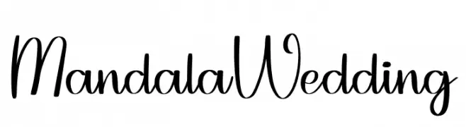
( Fonts by Belina Studio )
Elegant script font with a handwritten style.
![Mandala Wedding Frei Schriftart Herunterladen]() Herunterladen 356 Downloads@WebFont
Herunterladen 356 Downloads@WebFont -
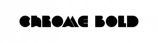
( Peter Olexa - www.dealjumbo.com )
A bold, geometric font with a futuristic and modern design.
![Chrome Bold Frei Schriftart Herunterladen]() Herunterladen 356 Downloads@WebFont
Herunterladen 356 Downloads@WebFont -
( Fonts by www.typodermicfonts.com - Ray Larabie )
A playful, hand-drawn font with a whimsical and dynamic style.
![Xtraflexidisc Frei Schriftart Herunterladen]() Herunterladen 356 Downloads@WebFont
Herunterladen 356 Downloads@WebFont -
( Fonts by Beyond Design - Ola Bjorling )
A futuristic, bold outline font with rounded, continuous lines.
![hybrid Outline Frei Schriftart Herunterladen]() Herunterladen 356 Downloads@WebFont
Herunterladen 356 Downloads@WebFont


Welche Schriften sind gerade am populärsten?
Poppins, Roboto, Montserrat, Open Sans und Lato sind wegen ihrer klaren Formen und breiten Einsetzbarkeit sehr gefragt – von Markenauftritt über Landingpages bis hin zu Postern.
Welche Fonts eignen sich für Logos?
Geometrische Sans‑Serifs (z. B. Poppins, Familien im Gotham‑Stil) sind ein häufiger Griff für sauberes, skalierbares Branding. Für eine persönlichere Note bleiben Scripts und Handschrift‑Stile beliebt. Kombinieren Sie einen prägnanten Headline‑Font mit einer neutralen Brotschrift für Wiedererkennung und Harmonie.
Wie oft wird die Top‑Liste aktualisiert?
Regelmäßig – basierend auf realen Downloads und Interaktionen. Schauen Sie öfter vorbei, um aufstrebende Favoriten früh zu entdecken.
💡 Tipp: Seite bookmarken – Trends wechseln schnell, und heutige Top‑Schriften inspirieren morgen vielleicht das Rebranding.