Willkommen bei den Top‑Schriften – hier treffen Beliebtheit und Qualität aufeinander. Das sind die in diesem Jahr am häufigsten heruntergeladenen und genutzten Fonts. Wenn Sie sichere Optionen für Logo, Web oder Social suchen, starten Sie hier.
Jeder Top‑Font überzeugt durch Balance, Lesbarkeit und Vielseitigkeit. Sie finden moderne Sans‑Serifs, elegante Scripts, Vintage‑Serifs und minimalistische Displays.
-
( Noto is a trademark of Google Inc. Noto fonts are open source. All Noto fonts are published under the SIL Open Font License, Version 1.1 )
A monospaced, extra condensed, light sans-serif font with a modern and clean design.
 Herunterladen 340 Downloads@WebFont
 -
( Fonts by Mans Greback - Personal-use only. For commercial use please contact owner. )
A bold, modern sans-serif typeface with strong, uniform strokes.
![Famiar PERSONAL USE ONLY ExtraBold Frei Schriftart Herunterladen]() Herunterladen 340 Downloads@WebFont
Herunterladen 340 Downloads@WebFont -
( OldStudioo - Muhammad Ilham - www.fontdraft.com )
An elegant script font with flowing, cursive letters and intricate swashes.
![Anastasia script [demo] Frei Schriftart Herunterladen]() Herunterladen 340 Downloads@WebFont
Herunterladen 340 Downloads@WebFont -
( Free for a personal use. For a commercial use please visit www.kevinandamanda.com )
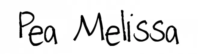
A casual, playful handwritten font with uneven strokes.
![Pea Melissa Frei Schriftart Herunterladen]() Herunterladen 340 Downloads@WebFont
Herunterladen 340 Downloads@WebFont -
( Fonts by Daniel Zadorozny - www.iconian.com - Free for personal use )
A bold, italicized font with a futuristic, angular design.
![U.S.S. Dallas Bold Italic Frei Schriftart Herunterladen]() Herunterladen 340 Downloads@WebFont
Herunterladen 340 Downloads@WebFont -
-
( گالری فانت فارسی پژوهش آريانا - only compatible with Farsi and Arabic )
A bold, geometric font with a modern, industrial aesthetic.
![Amood III Frei Schriftart Herunterladen]() Herunterladen 340 Downloads@WebFont
Herunterladen 340 Downloads@WebFont -
( Fonts by EssentialsStudio - Personal-use only. For commercial use please contact owner. )
An elegant script font with flowing, interconnected letters and calligraphic flourishes.
![gildane hyme Frei Schriftart Herunterladen]() Herunterladen 340 Downloads@WebFont
Herunterladen 340 Downloads@WebFont -
( Fonts by Des Gomez )
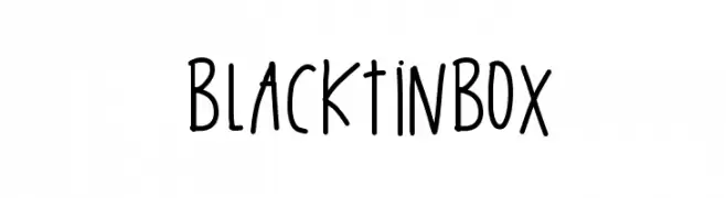
A playful, handwritten font with tall, narrow letters and a casual, whimsical style.
![BlackTinBox Frei Schriftart Herunterladen]() Herunterladen 340 Downloads@WebFont
Herunterladen 340 Downloads@WebFont -
( Fonts by Vissol Ltd. )
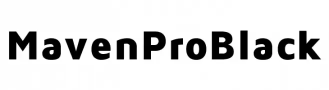
A bold, modern sans-serif font with clean lines and strong presence.
![Maven Pro Black Frei Schriftart Herunterladen]() Herunterladen 340 Downloads@WebFont
Herunterladen 340 Downloads@WebFont -
( hellowoo.com )
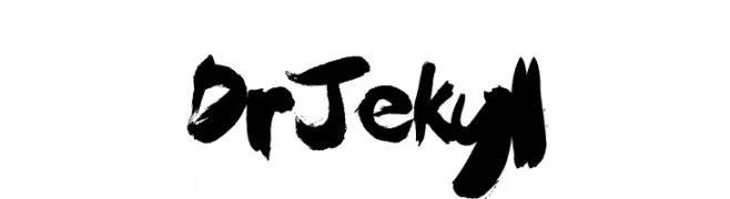
A bold, expressive brushstroke font with dynamic and artistic flair.
![Dr Jekyll Frei Schriftart Herunterladen]() Herunterladen 340 Downloads@WebFont
Herunterladen 340 Downloads@WebFont -
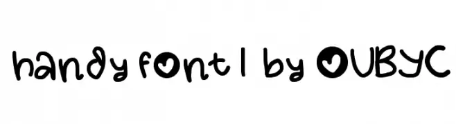
![handy font 1 by OUBYC Frei Schriftart Herunterladen]() Herunterladen 340 Downloads@WebFont
Herunterladen 340 Downloads@WebFont -
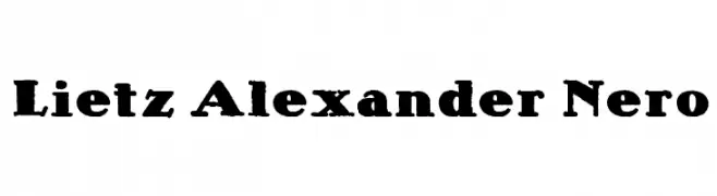
![Lietz Alexander Nero Frei Schriftart Herunterladen]() Herunterladen 340 Downloads@WebFont
Herunterladen 340 Downloads@WebFont -
Schriftart von fontsnthings. For commercial use please contact the owner.
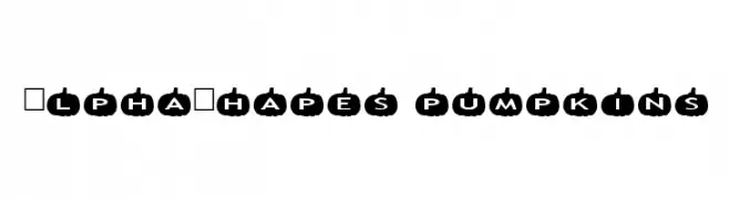
![AlphaShapes pumpkins Frei Schriftart Herunterladen]() Herunterladen 340 Downloads@WebFont
Herunterladen 340 Downloads@WebFont -
( Fonts by junkohanhero )
A playful, hand-drawn font with tall, narrow characters and a whimsical style.
![Read between the lines Frei Schriftart Herunterladen]() Herunterladen 340 Downloads@WebFont
Herunterladen 340 Downloads@WebFont -
( Fonts by a kmzero font foundry - www.zetafonts.com. Personal-use only. For commercial use please contact owner. )
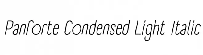
A sleek, condensed, light italic font with a modern and elegant style.
![Panforte Condensed Light Italic Frei Schriftart Herunterladen]() Herunterladen 340 Downloads@WebFont
Herunterladen 340 Downloads@WebFont -
( Fonts by Manfred Klein - manfred-klein.ina-mar.com )
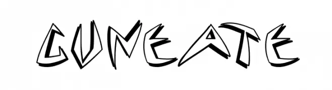
A bold, angular font with a graffiti-inspired, dynamic style.
![Cuneate Frei Schriftart Herunterladen]() Herunterladen 340 Downloads@WebFont
Herunterladen 340 Downloads@WebFont -
![Wittenbach Demo Frei Schriftart Herunterladen]() Herunterladen 340 Downloads@WebFont
Herunterladen 340 Downloads@WebFont -
( Fonts by Daniel Zadorozny - www.iconian.com )
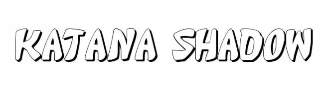
A bold, playful font with a 3D shadow effect, perfect for dynamic designs.
![Katana Shadow Frei Schriftart Herunterladen]() Herunterladen 340 Downloads@WebFont
Herunterladen 340 Downloads@WebFont -
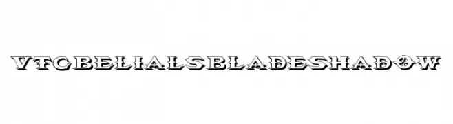
![VTCBelialsBladeShadow Frei Schriftart Herunterladen]() Herunterladen 340 Downloads@WebFont
Herunterladen 340 Downloads@WebFont -
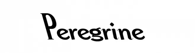
![Peregrine Frei Schriftart Herunterladen]() Herunterladen 340 Downloads
Herunterladen 340 Downloads -
![MoonPie Cadet Frei Schriftart Herunterladen]() Herunterladen 340 Downloads@WebFont
Herunterladen 340 Downloads@WebFont -
( Fonts by Tipo - Personal-use only. For commercial use please contact owner. )
A modern, clean sans-serif font with excellent readability.
![Imprima Frei Schriftart Herunterladen]() Herunterladen 340 Downloads@WebFont
Herunterladen 340 Downloads@WebFont -
( Fonts by Daniel Zadorozny - www.iconian.com - Free for personal use )
A bold, futuristic font with geometric shapes and tight spacing.
![Sea-Dog Condensed Frei Schriftart Herunterladen]() Herunterladen 340 Downloads@WebFont
Herunterladen 340 Downloads@WebFont -
( Fonts by Woodcutter )
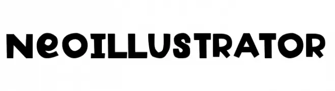
A bold, geometric font with playful, rounded characters.
![Neo Illustrator Frei Schriftart Herunterladen]() Herunterladen 340 Downloads@WebFont
Herunterladen 340 Downloads@WebFont -
( Fonts by a Max Infeld - XEROGRAPHER FONTS - xerographer.blogspot.com . Personal-use only. For commercial use please contact owner. )
A bold, blocky font with a shadow effect, perfect for impactful headlines.
![NextWave Frei Schriftart Herunterladen]() Herunterladen 340 Downloads@WebFont
Herunterladen 340 Downloads@WebFont -
( Fonts by Daniel Zadorozny - www.iconian.com )
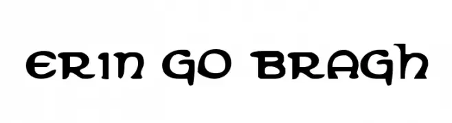
A bold, decorative font with Celtic-inspired curves and flourishes.
![Erin Go Bragh Frei Schriftart Herunterladen]() Herunterladen 340 Downloads@WebFont
Herunterladen 340 Downloads@WebFont -
( Fonts by Wahyu Eka Prasetya - wepfont.com - Personal-use only. For commercial use please contact owner. )
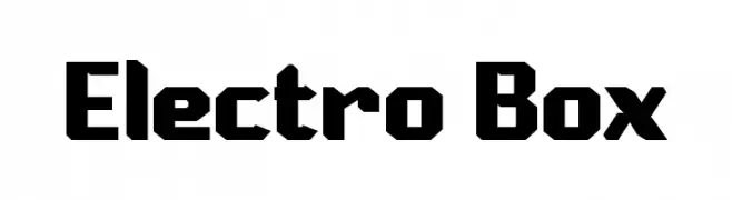
A bold, geometric font with a futuristic and industrial design.
![Electro Box Frei Schriftart Herunterladen]() Herunterladen 340 Downloads@WebFont
Herunterladen 340 Downloads@WebFont -
( Fonts by GorillaBlu - Personal-use only. For commercial use please contact owner. )
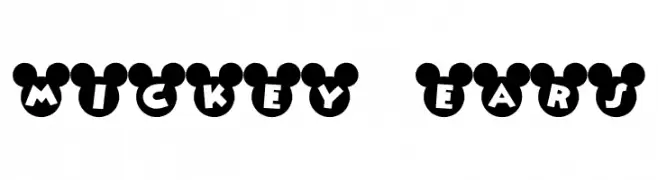
A playful font with bold letters inside iconic mouse ear silhouettes.
![Mickey Ears Frei Schriftart Herunterladen]() Herunterladen 340 Downloads@WebFont
Herunterladen 340 Downloads@WebFont -
( Free for a personal use. For a commercial use please visit www.kevinandamanda.com )
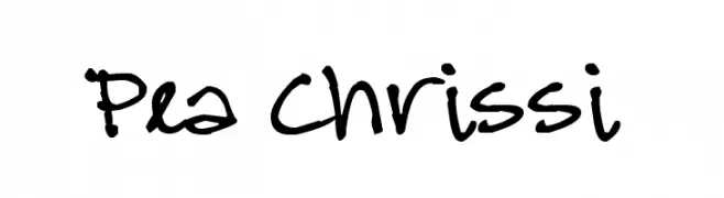
A playful, casual handwritten font with irregular strokes and a lively feel.
![Pea Chrissi Frei Schriftart Herunterladen]() Herunterladen 340 Downloads@WebFont
Herunterladen 340 Downloads@WebFont -
( Fonts by Manfred Klein. Free for private and charity use. Free for commercial with donation to organizations )
Ornate woodcut-style font with pictorial glyphs.
![HolzSchnitte Frei Schriftart Herunterladen]() Herunterladen 340 Downloads@WebFont
Herunterladen 340 Downloads@WebFont -
( Fonts by Steve Cloutier - www.cloutierfontes.ca )
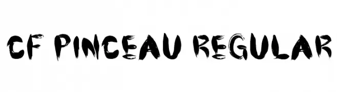
A bold, brush-style font with dynamic, hand-painted strokes.
![CF Pinceau Regular Frei Schriftart Herunterladen]() Herunterladen 340 Downloads@WebFont
Herunterladen 340 Downloads@WebFont -
![The Youther Frei Schriftart Herunterladen]() Herunterladen 340 Downloads@WebFont
Herunterladen 340 Downloads@WebFont -
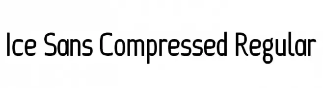
![Ice Sans Compressed Regular Frei Schriftart Herunterladen]() Herunterladen 340 Downloads@WebFont
Herunterladen 340 Downloads@WebFont -
( Fonts by Andreas Hofeld - www.fontgrube.de )
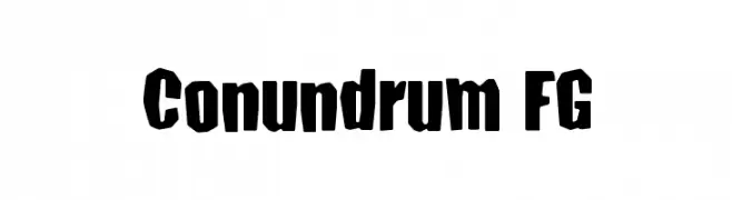
A bold, dynamic font with a playful, distorted style.
![Conundrum FG Frei Schriftart Herunterladen]() Herunterladen 340 Downloads@WebFont
Herunterladen 340 Downloads@WebFont -
![DS_Nasilnese Frei Schriftart Herunterladen]() Herunterladen 340 Downloads
Herunterladen 340 Downloads

![Anastasia script [demo] Frei Schriftart Herunterladen](https://d144mzi0q5mijx.cloudfront.net/img/A/N/Anastasia-script-demo.webp)


Welche Schriften sind gerade am populärsten?
Poppins, Roboto, Montserrat, Open Sans und Lato sind wegen ihrer klaren Formen und breiten Einsetzbarkeit sehr gefragt – von Markenauftritt über Landingpages bis hin zu Postern.
Welche Fonts eignen sich für Logos?
Geometrische Sans‑Serifs (z. B. Poppins, Familien im Gotham‑Stil) sind ein häufiger Griff für sauberes, skalierbares Branding. Für eine persönlichere Note bleiben Scripts und Handschrift‑Stile beliebt. Kombinieren Sie einen prägnanten Headline‑Font mit einer neutralen Brotschrift für Wiedererkennung und Harmonie.
Wie oft wird die Top‑Liste aktualisiert?
Regelmäßig – basierend auf realen Downloads und Interaktionen. Schauen Sie öfter vorbei, um aufstrebende Favoriten früh zu entdecken.
💡 Tipp: Seite bookmarken – Trends wechseln schnell, und heutige Top‑Schriften inspirieren morgen vielleicht das Rebranding.