Willkommen bei den Top‑Schriften – hier treffen Beliebtheit und Qualität aufeinander. Das sind die in diesem Jahr am häufigsten heruntergeladenen und genutzten Fonts. Wenn Sie sichere Optionen für Logo, Web oder Social suchen, starten Sie hier.
Jeder Top‑Font überzeugt durch Balance, Lesbarkeit und Vielseitigkeit. Sie finden moderne Sans‑Serifs, elegante Scripts, Vintage‑Serifs und minimalistische Displays.
-
( Fonts by Woodcutter )
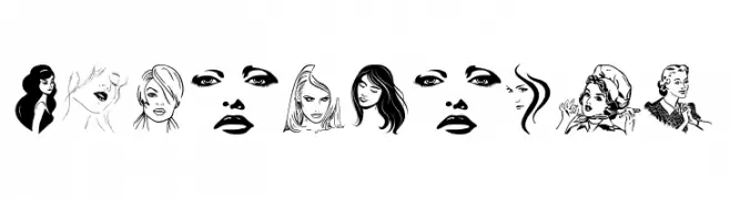
A decorative dingbat font featuring illustrated woman faces in multiple styles.
 Herunterladen 314 Downloads@WebFont
 -
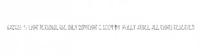
![NACHOS TV Light personal use only Copyright c 2009 by Billy Argel All rights reserved Frei Schriftart Herunterladen]() Herunterladen 314 Downloads@WebFont
Herunterladen 314 Downloads@WebFont -
( Fonts by or from www.graffitifonts.net )
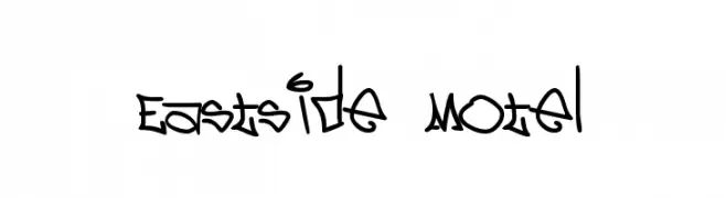
A bold, graffiti-inspired font with sharp angles and urban flair.
![Eastside Motel Frei Schriftart Herunterladen]() Herunterladen 314 Downloads@WebFont
Herunterladen 314 Downloads@WebFont -
( Copyright 2011 The Londrina Shadow Authors (https://github.com/marcelommp/Londrina-Typeface), with Reserved Font Name "Londrina Shadow" )
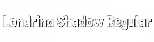
A bold, playful font with a unique shadow effect and outlined characters.
![Londrina Shadow Regular Frei Schriftart Herunterladen]() Herunterladen 314 Downloads@WebFont
Herunterladen 314 Downloads@WebFont -
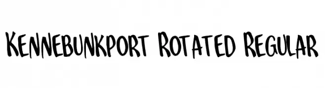
( Fonts by Daniel Zadorozny - www.iconian.com - Free for personal use )
A playful, bold handwritten font with dynamic and irregular strokes.
![Kennebunkport Rotated Regular Frei Schriftart Herunterladen]() Herunterladen 314 Downloads@WebFont
Herunterladen 314 Downloads@WebFont -
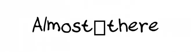
-
![Almost_there Frei Schriftart Herunterladen]() Herunterladen 314 Downloads@WebFont
Herunterladen 314 Downloads@WebFont -
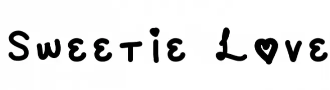
![Sweetie Love Frei Schriftart Herunterladen]() Herunterladen 314 Downloads@WebFont
Herunterladen 314 Downloads@WebFont -
( dccanim.deviantart.com )
A bold, distressed font with a vintage, rugged appearance.
![DCC-Manifest Frei Schriftart Herunterladen]() Herunterladen 314 Downloads@WebFont
Herunterladen 314 Downloads@WebFont -
![ReafFont Frei Schriftart Herunterladen]() Herunterladen 314 Downloads@WebFont
Herunterladen 314 Downloads@WebFont -
( Fonts by GLUK fonts )
A modern, geometric sans-serif font with clean lines and balanced proportions.
![RawengulkSans Frei Schriftart Herunterladen]() Herunterladen 314 Downloads@WebFont
Herunterladen 314 Downloads@WebFont -
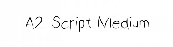
( Fonts by Matěj Hofman )
A whimsical, script-like font with a hand-drawn, artistic style.
![A2 Script Medium Frei Schriftart Herunterladen]() Herunterladen 314 Downloads@WebFont
Herunterladen 314 Downloads@WebFont -
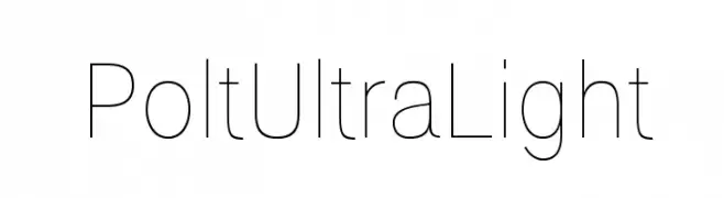
( Ariel Alvares )
A sleek, ultra-light font with a modern and minimalist design.
![Polt Ultra Light Frei Schriftart Herunterladen]() Herunterladen 314 Downloads@WebFont
Herunterladen 314 Downloads@WebFont -
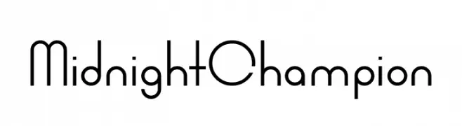
( Fonts by www.chequered.ink - Chequered Ink - Personal-use only. For commercial use please contact owner. )
A sleek, modern font with geometric lines and a sophisticated appearance.
![Midnight Champion Frei Schriftart Herunterladen]() Herunterladen 314 Downloads@WebFont
Herunterladen 314 Downloads@WebFont -
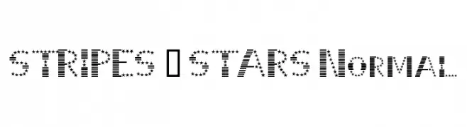
( Fonts by Dieter Schumacher )
A decorative font with characters made of stripes and stars, offering a bold and festive look.
![STRIPES & STARS Normal Frei Schriftart Herunterladen]() Herunterladen 314 Downloads@WebFont
Herunterladen 314 Downloads@WebFont -
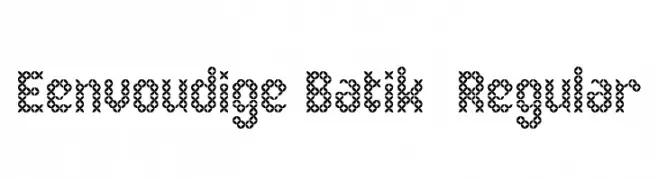
( Fonts by Adien Gunarta - fontasticindonesia.blogspot.com )
A decorative font with intricate, batik-inspired patterns and interlocking loops.
![Eenvoudige Batik Regular Frei Schriftart Herunterladen]() Herunterladen 314 Downloads@WebFont
Herunterladen 314 Downloads@WebFont -
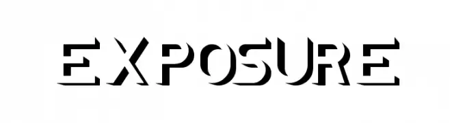
( Fonts by Wino S Kadir - weknow - www.revolge.com/shop/weknow/ - Personal-use only. For commercial use please contact owner. )
A bold, stencil-like font with sharp, angular edges and geometric shapes.
![EXPOSURE Frei Schriftart Herunterladen]() Herunterladen 314 Downloads@WebFont
Herunterladen 314 Downloads@WebFont -
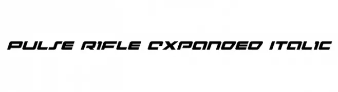
( Fonts by Daniel Zadorozny - www.iconian.com )
A bold, expanded, and italicized futuristic font with a dynamic and modern design.
![Pulse Rifle Expanded Italic Frei Schriftart Herunterladen]() Herunterladen 314 Downloads@WebFont
Herunterladen 314 Downloads@WebFont -
![GENOCIDE Frei Schriftart Herunterladen]() Herunterladen 314 Downloads@WebFont
Herunterladen 314 Downloads@WebFont -
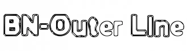
( Fonts by Ben Nathan )
A bold, playful outline font with bubble-like characters and rounded edges.
![BN-Outer Line Frei Schriftart Herunterladen]() Herunterladen 314 Downloads@WebFont
Herunterladen 314 Downloads@WebFont -
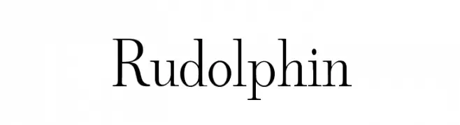
( GemFonts - moorstation.org/typoasis/designers/gemnew/home.htm )
A classic serif font with elegant strokes and refined serifs.
![Rudolphin Frei Schriftart Herunterladen]() Herunterladen 314 Downloads@WebFont
Herunterladen 314 Downloads@WebFont -
![Skyline Beach NBP Regular Frei Schriftart Herunterladen]() Herunterladen 314 Downloads@WebFont
Herunterladen 314 Downloads@WebFont -
( Fonts by Typetemp Studio - Personal-use only. For commercial use please contact owner. )
A bold, high-contrast serif font with elegant, angular serifs.
![Wastinger Display Free Personal Frei Schriftart Herunterladen]() Herunterladen 314 Downloads@WebFont
Herunterladen 314 Downloads@WebFont -
( Fonts by Daniel Zadorozny - www.iconian.com )
![Time Warriors Frei Schriftart Herunterladen]() Herunterladen 314 Downloads@WebFont
Herunterladen 314 Downloads@WebFont -
![DK Boris Brush Frei Schriftart Herunterladen]() Herunterladen 314 Downloads@WebFont
Herunterladen 314 Downloads@WebFont -
( Fonts by weknow - Wino S Kadir )
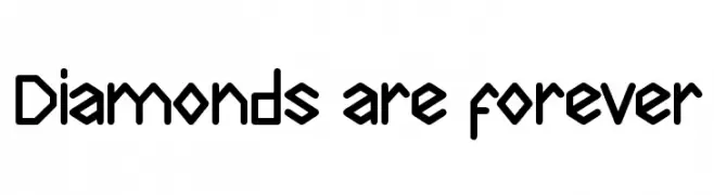
A bold, geometric font with angular, futuristic design.
![Diamonds are forever Frei Schriftart Herunterladen]() Herunterladen 314 Downloads@WebFont
Herunterladen 314 Downloads@WebFont -
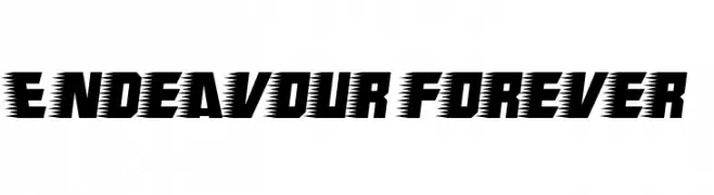
( Fonts by Jacob Fisher - www.pizzadude.dk )
A bold, dynamic font with jagged edges, ideal for energetic and modern designs.
![Endeavour forever Frei Schriftart Herunterladen]() Herunterladen 314 Downloads@WebFont
Herunterladen 314 Downloads@WebFont -
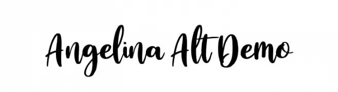
( Fonts by vilogsign - Nur Kholis - Personal-use only. For commercial use please contact owner. )
A bold, flowing script font with elegant, cursive strokes.
![Angelina Alt Demo Frei Schriftart Herunterladen]() Herunterladen 314 Downloads@WebFont
Herunterladen 314 Downloads@WebFont -
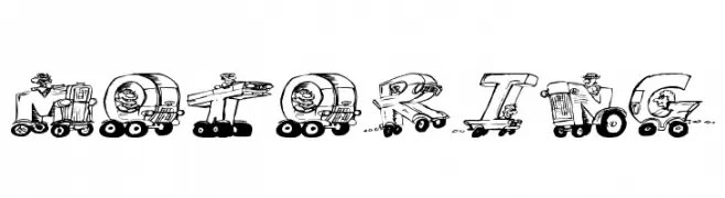
![Motoring Frei Schriftart Herunterladen]() Herunterladen 314 Downloads@WebFont
Herunterladen 314 Downloads@WebFont -
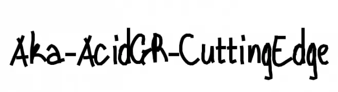
( Fonts by www.aka-acid.com )
A bold, hand-drawn font with a playful and dynamic style.
![Aka-AcidGR-CuttingEdge Frei Schriftart Herunterladen]() Herunterladen 314 Downloads@WebFont
Herunterladen 314 Downloads@WebFont -
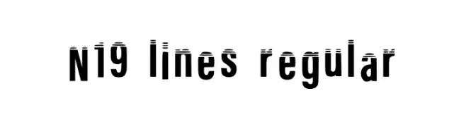
( Fonts by Nineteen Works )
A bold, modern font with horizontal line accents for a dynamic look.
![N19 Lines Regular Frei Schriftart Herunterladen]() Herunterladen 314 Downloads@WebFont
Herunterladen 314 Downloads@WebFont -
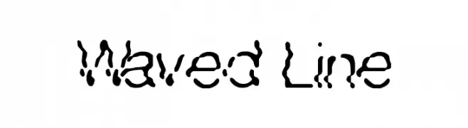
![Waved Line Frei Schriftart Herunterladen]() Herunterladen 314 Downloads@WebFont
Herunterladen 314 Downloads@WebFont -
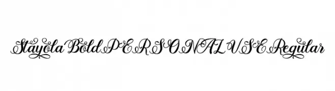
( Fonts by Mans Greback - Personal-use only. For commercial use please contact owner. )
An elegant script font with intricate swashes and decorative flourishes.
![Stayola Bold PERSONAL USE Regular Frei Schriftart Herunterladen]() Herunterladen 314 Downloads@WebFont
Herunterladen 314 Downloads@WebFont -
![Molluca Frei Schriftart Herunterladen]() Herunterladen 314 Downloads@WebFont
Herunterladen 314 Downloads@WebFont -
![choppersforlife Frei Schriftart Herunterladen]() Herunterladen 314 Downloads@WebFont
Herunterladen 314 Downloads@WebFont -
( www.southype.com )
A dot matrix style font with a modern, digital appearance.
![LediZ St Frei Schriftart Herunterladen]() Herunterladen 314 Downloads@WebFont
Herunterladen 314 Downloads@WebFont


Welche Schriften sind gerade am populärsten?
Poppins, Roboto, Montserrat, Open Sans und Lato sind wegen ihrer klaren Formen und breiten Einsetzbarkeit sehr gefragt – von Markenauftritt über Landingpages bis hin zu Postern.
Welche Fonts eignen sich für Logos?
Geometrische Sans‑Serifs (z. B. Poppins, Familien im Gotham‑Stil) sind ein häufiger Griff für sauberes, skalierbares Branding. Für eine persönlichere Note bleiben Scripts und Handschrift‑Stile beliebt. Kombinieren Sie einen prägnanten Headline‑Font mit einer neutralen Brotschrift für Wiedererkennung und Harmonie.
Wie oft wird die Top‑Liste aktualisiert?
Regelmäßig – basierend auf realen Downloads und Interaktionen. Schauen Sie öfter vorbei, um aufstrebende Favoriten früh zu entdecken.
💡 Tipp: Seite bookmarken – Trends wechseln schnell, und heutige Top‑Schriften inspirieren morgen vielleicht das Rebranding.