Willkommen bei den Top‑Schriften – hier treffen Beliebtheit und Qualität aufeinander. Das sind die in diesem Jahr am häufigsten heruntergeladenen und genutzten Fonts. Wenn Sie sichere Optionen für Logo, Web oder Social suchen, starten Sie hier.
Jeder Top‑Font überzeugt durch Balance, Lesbarkeit und Vielseitigkeit. Sie finden moderne Sans‑Serifs, elegante Scripts, Vintage‑Serifs und minimalistische Displays.
-
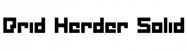
( Fonts by Daniel Zadorozny - www.iconian.com - Free for personal use )
A bold, pixelated font with a retro digital aesthetic.
 Herunterladen 299 Downloads@WebFont
 -
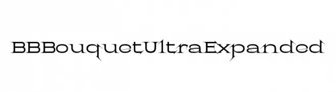
( Fonts by www.lobbby24.com - Personal-use only. For commercial use please contact owner. )
A decorative font with sharp serifs and high contrast, perfect for bold designs.
![BBBouquet Ultra Expanded Frei Schriftart Herunterladen]() Herunterladen 299 Downloads@WebFont
Herunterladen 299 Downloads@WebFont -
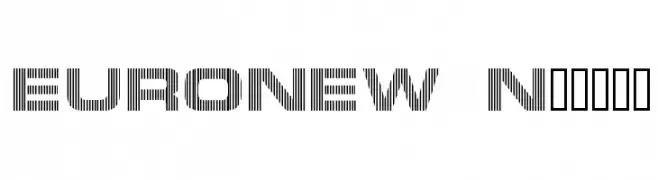
![EURONEW Normal Frei Schriftart Herunterladen]() Herunterladen 299 Downloads@WebFont
Herunterladen 299 Downloads@WebFont -
( Character )
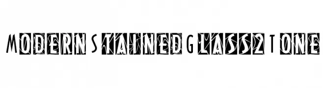
A modern, stained glass-inspired font with bold, geometric patterns.
![ModernStainedGlass2Tone Frei Schriftart Herunterladen]() Herunterladen 299 Downloads@WebFont
Herunterladen 299 Downloads@WebFont -
( Fonts by www.woodcutter.es - woodcutter Manero - Personal-use only. For commercial use please contact owner. )
Bold, geometric sans-serif font with rounded corners and modern style.
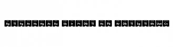
![Periodic Table of Elements Frei Schriftart Herunterladen]() Herunterladen 299 Downloads@WebFont
Herunterladen 299 Downloads@WebFont -
-
( Fonts by Four Lines )
A bold, playful font with rounded edges and a slightly condensed style.
![OWLY BARN Frei Schriftart Herunterladen]() Herunterladen 299 Downloads@WebFont
Herunterladen 299 Downloads@WebFont -
( Fonts by MJType )
Casual handwritten font with smooth curves.
![Dristan Story Frei Schriftart Herunterladen]() Herunterladen 299 Downloads@WebFont
Herunterladen 299 Downloads@WebFont -
( Fonts by Graphix Line Studio - Personal-use only. For commercial use please contact owner. )
A flowing, cursive script with elegant loops and swashes.
![Dahlia Frei Schriftart Herunterladen]() Herunterladen 299 Downloads@WebFont
Herunterladen 299 Downloads@WebFont -
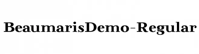
( Roland Huse Design - Roland Huse - rolandhuse.com )
A classic serif font with bold strokes and a traditional, elegant appearance.
![BeaumarisDemo-Regular Frei Schriftart Herunterladen]() Herunterladen 299 Downloads@WebFont
Herunterladen 299 Downloads@WebFont -
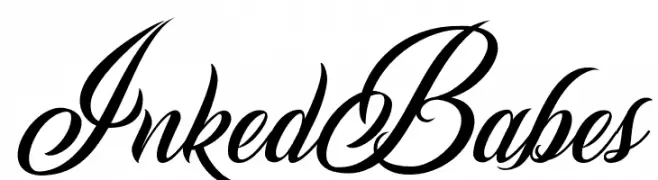
( Billy Argel - billyargel.com/ )
An elegant and flowing script font with ornate letterforms and dynamic style.
![Inked Babes Frei Schriftart Herunterladen]() Herunterladen 299 Downloads@WebFont
Herunterladen 299 Downloads@WebFont -
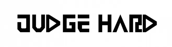
( Fonts by Iconian Fonts - Daniel Zadorozny )
A bold, geometric font with sharp angles and a futuristic style.
![Judge Hard Frei Schriftart Herunterladen]() Herunterladen 299 Downloads
Herunterladen 299 Downloads -
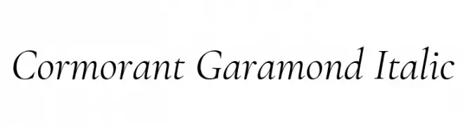
( Copyright (c) 2015, Christian Thalmann and the Cormorant Project Authors (github.com/CatharsisFonts/Cormorant) )
An elegant serif font with a classic italic style and moderate contrast.
![Cormorant Garamond Italic Frei Schriftart Herunterladen]() Herunterladen 299 Downloads@WebFont
Herunterladen 299 Downloads@WebFont -
( Fonts by Mr.Soon Design )
A bold, playful font with rounded, bubbly characters.
![Nighteen December Frei Schriftart Herunterladen]() Herunterladen 299 Downloads@WebFont
Herunterladen 299 Downloads@WebFont -
( Fonts by Bree Gorton )
A bold, playful font with rounded edges and a whimsical style.
![Sphericals Frei Schriftart Herunterladen]() Herunterladen 299 Downloads@WebFont
Herunterladen 299 Downloads@WebFont -
( Free - apolstamaria.com )
A playful font with characters featuring small arms and hands, perfect for humorous and creative projects.
![Star Frei Schriftart Herunterladen]() Herunterladen 299 Downloads@WebFont
Herunterladen 299 Downloads@WebFont -
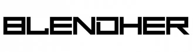
( Chequered Ink - chequered.ink/ )
A bold, geometric font with a futuristic and digital aesthetic.
![Blend Her Frei Schriftart Herunterladen]() Herunterladen 299 Downloads@WebFont
Herunterladen 299 Downloads@WebFont -
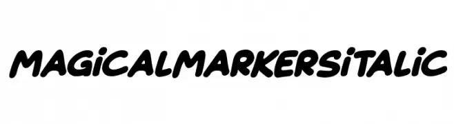
![Magical Markers Italic Frei Schriftart Herunterladen]() Herunterladen 299 Downloads@WebFont
Herunterladen 299 Downloads@WebFont -
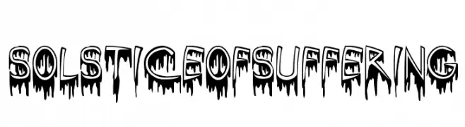
![SolsticeOfSuffering Frei Schriftart Herunterladen]() Herunterladen 299 Downloads@WebFont
Herunterladen 299 Downloads@WebFont -
( Fonts by Chank Co. - www.chank.com )
A bold, 3D font with a playful and dynamic style.
![BrokenDreamsPreview Frei Schriftart Herunterladen]() Herunterladen 299 Downloads@WebFont
Herunterladen 299 Downloads@WebFont -
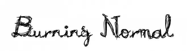
( Fonts by http://perso.calixo.net/~uzim/ )
A chaotic, flame-like decorative font with swirling, jagged lines.
![Burning Normal Frei Schriftart Herunterladen]() Herunterladen 299 Downloads@WebFont
Herunterladen 299 Downloads@WebFont -
( Fonts by zamjump - Ahmad Zamzami - Personal-use only. For commercial use please contact owner. )
A jagged, edgy font with a hand-drawn, rebellious style.
![Karbetz Frei Schriftart Herunterladen]() Herunterladen 299 Downloads@WebFont
Herunterladen 299 Downloads@WebFont -
( Fonts by Gilang Ternadho )
A playful, rounded font with smooth curves and a friendly appearance.
![Andak Frei Schriftart Herunterladen]() Herunterladen 299 Downloads@WebFont
Herunterladen 299 Downloads@WebFont -
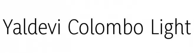
( Copyright (c) 1996-2016 Yaldevi Project Authors (https://github.com/mooniak/yaldevi-fonts) )
A modern, light sans-serif font with clean lines and excellent readability.
![Yaldevi Colombo Light Frei Schriftart Herunterladen]() Herunterladen 299 Downloads@WebFont
Herunterladen 299 Downloads@WebFont -
( Craft Supply Co. - creativemarket.com/craftsupplyco )
A bold, outlined uppercase font with a modern, geometric style.
![Bondie-Outline Frei Schriftart Herunterladen]() Herunterladen 299 Downloads@WebFont
Herunterladen 299 Downloads@WebFont -
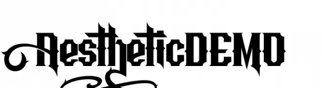
( Fonts by Figuree Studio - Icep Fadhil - Personal-use only. For commercial use please contact owner. )
A bold, Gothic-inspired font with sharp, angular edges.
![Aesthetic DEMO Frei Schriftart Herunterladen]() Herunterladen 299 Downloads@WebFont
Herunterladen 299 Downloads@WebFont -
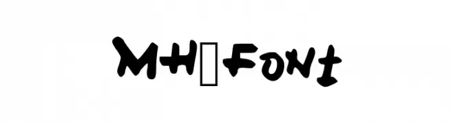
( Fonts by M H )
A bold, playful handwritten font with thick strokes and a casual style.
![MH_Font Frei Schriftart Herunterladen]() Herunterladen 299 Downloads@WebFont
Herunterladen 299 Downloads@WebFont -
( گالری فانت فارسی پژوهش آريانا - only compatible with Farsi and Arabic )
A futuristic, geometric font with bold, angular letterforms.
![Amood II Frei Schriftart Herunterladen]() Herunterladen 299 Downloads@WebFont
Herunterladen 299 Downloads@WebFont -
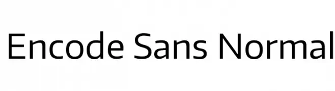
( Fonts by Impallari Type - Personal-use only. For commercial use please contact owner. )
A clean, modern sans-serif typeface with excellent legibility.
![Encode Sans Normal Frei Schriftart Herunterladen]() Herunterladen 299 Downloads@WebFont
Herunterladen 299 Downloads@WebFont -
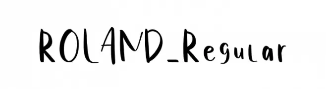
( Fonts by Ferdiansyah - Personal-use only. For commercial use please contact owner. )
A playful, handwritten font with smooth curves and a casual style.
![ROLAND-Regular Frei Schriftart Herunterladen]() Herunterladen 299 Downloads@WebFont
Herunterladen 299 Downloads@WebFont -
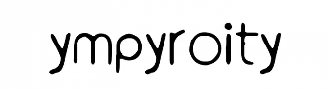
( Fonts by www.junkohanhero.com )
A playful, hand-drawn font with rounded, irregular shapes.
![ympyroity Frei Schriftart Herunterladen]() Herunterladen 299 Downloads@WebFont
Herunterladen 299 Downloads@WebFont -
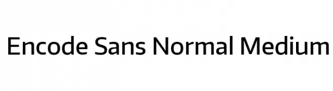
( Fonts by Impallari Type - Personal-use only. For commercial use please contact owner. )
A modern, geometric sans-serif font with clean lines and uniform strokes.
![Encode Sans Normal Medium Frei Schriftart Herunterladen]() Herunterladen 299 Downloads@WebFont
Herunterladen 299 Downloads@WebFont -
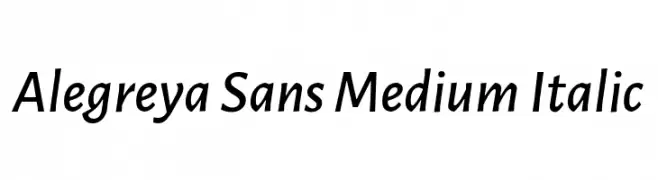
( Copyright 2013 The Alegreya Sans Project Authors (https://github.com/huertatipografica/Alegreya-Sans) )
A modern, medium-weight sans-serif font with an elegant italic style.
![Alegreya Sans Medium Italic Frei Schriftart Herunterladen]() Herunterladen 299 Downloads@WebFont
Herunterladen 299 Downloads@WebFont -
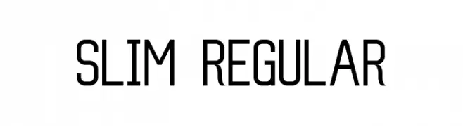
( Aquaflame Fonts - Aqua Flame - aquaflameweb.weebly.com )
A sleek, geometric font with a modern and elegant style.
![Slim Regular Frei Schriftart Herunterladen]() Herunterladen 299 Downloads@WebFont
Herunterladen 299 Downloads@WebFont -
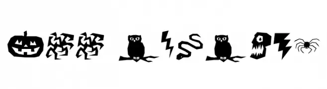
( Font by http://home.luna.nl/~xino/ )
A bold, jagged Halloween-themed decorative font with spooky icons.
![ILL oCtoBer Frei Schriftart Herunterladen]() Herunterladen 299 Downloads@WebFont
Herunterladen 299 Downloads@WebFont -
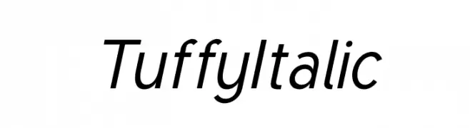
( Fonts by Thatcher Ulrich )
A modern, italic sans-serif font with clean lines and excellent readability.
![Tuffy Italic Frei Schriftart Herunterladen]() Herunterladen 299 Downloads@WebFont
Herunterladen 299 Downloads@WebFont


Welche Schriften sind gerade am populärsten?
Poppins, Roboto, Montserrat, Open Sans und Lato sind wegen ihrer klaren Formen und breiten Einsetzbarkeit sehr gefragt – von Markenauftritt über Landingpages bis hin zu Postern.
Welche Fonts eignen sich für Logos?
Geometrische Sans‑Serifs (z. B. Poppins, Familien im Gotham‑Stil) sind ein häufiger Griff für sauberes, skalierbares Branding. Für eine persönlichere Note bleiben Scripts und Handschrift‑Stile beliebt. Kombinieren Sie einen prägnanten Headline‑Font mit einer neutralen Brotschrift für Wiedererkennung und Harmonie.
Wie oft wird die Top‑Liste aktualisiert?
Regelmäßig – basierend auf realen Downloads und Interaktionen. Schauen Sie öfter vorbei, um aufstrebende Favoriten früh zu entdecken.
💡 Tipp: Seite bookmarken – Trends wechseln schnell, und heutige Top‑Schriften inspirieren morgen vielleicht das Rebranding.