Willkommen bei den Top‑Schriften – hier treffen Beliebtheit und Qualität aufeinander. Das sind die in diesem Jahr am häufigsten heruntergeladenen und genutzten Fonts. Wenn Sie sichere Optionen für Logo, Web oder Social suchen, starten Sie hier.
Jeder Top‑Font überzeugt durch Balance, Lesbarkeit und Vielseitigkeit. Sie finden moderne Sans‑Serifs, elegante Scripts, Vintage‑Serifs und minimalistische Displays.
-
 Herunterladen 296 Downloads@WebFont
 -
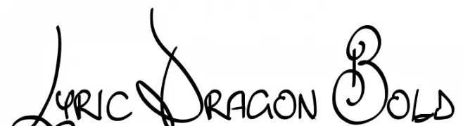
![Lyric Dragon Bold Frei Schriftart Herunterladen]() Herunterladen 296 Downloads@WebFont
Herunterladen 296 Downloads@WebFont -
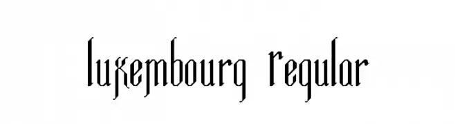
![Luxembourg Regular Frei Schriftart Herunterladen]() Herunterladen 296 Downloads@WebFont
Herunterladen 296 Downloads@WebFont -
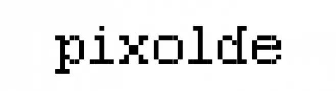
![pixolde Frei Schriftart Herunterladen]() Herunterladen 296 Downloads@WebFont
Herunterladen 296 Downloads@WebFont -
( Fonts by Zetafonts - Personal-use only. For commercial use please contact owner. )
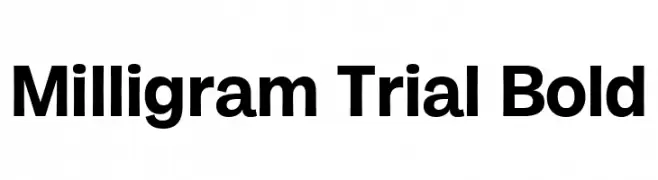
A bold, modern font with clean lines and excellent legibility.
![Milligram Trial Bold Frei Schriftart Herunterladen]() Herunterladen 296 Downloads@WebFont
Herunterladen 296 Downloads@WebFont -
-
( Fonts by appajid )
A modern, geometric sans-serif font with a sleek and elongated appearance.
![Chathura-Light Frei Schriftart Herunterladen]() Herunterladen 296 Downloads@WebFont
Herunterladen 296 Downloads@WebFont -
( Fonts by Sinister Visions - Chad Savage - www.sinisterfonts.com )
A bold, gothic-inspired font with sharp, angular edges and dramatic flair.
![NekroKids Frei Schriftart Herunterladen]() Herunterladen 296 Downloads@WebFont
Herunterladen 296 Downloads@WebFont -
( Fonts by Phitradesign )
A playful, handwritten font with rounded, consistent strokes.
![Kanada-Regular Frei Schriftart Herunterladen]() Herunterladen 296 Downloads@WebFont
Herunterladen 296 Downloads@WebFont -
( Fonts by Dieter Steffmann )
An ornate, medieval-inspired font with intricate decorative elements.
![Liturgisch Zierbuchstaben Frei Schriftart Herunterladen]() Herunterladen 296 Downloads@WebFont
Herunterladen 296 Downloads@WebFont -
( Fonts by Audrius Skersys - www.extate.lt )
A whimsical, hand-drawn font with playful, irregular letterforms.
![Ikusuteito Frei Schriftart Herunterladen]() Herunterladen 296 Downloads@WebFont
Herunterladen 296 Downloads@WebFont -
( Fonts by Daniel Zadorozny - www.iconian.com )
A dynamic, italicized, and condensed font with a futuristic style.
![Gemina 2 Condensed Italic Frei Schriftart Herunterladen]() Herunterladen 296 Downloads@WebFont
Herunterladen 296 Downloads@WebFont -
( Fonts by www.kimberlygeswein.com - Kimberly Geswein )
A playful, handwritten font with smooth, rounded edges and a casual style.
![She Paints Me Blue Frei Schriftart Herunterladen]() Herunterladen 296 Downloads@WebFont
Herunterladen 296 Downloads@WebFont -
( Parker Creative - Alan Parker - fontbundles.net/parker-creative )
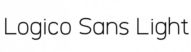
A modern, light sans-serif font with low contrast and excellent readability.
![Logico Sans Light Frei Schriftart Herunterladen]() Herunterladen 296 Downloads@WebFont
Herunterladen 296 Downloads@WebFont -
( Fonts by Typhoon Type - Suthi Srisopha - Personal-use only. For commercial use please contact owner. )
A playful, festive font with bold, rounded characters ideal for holiday themes.
![Playful Christmas-Personal Use Frei Schriftart Herunterladen]() Herunterladen 295 Downloads@WebFont
Herunterladen 295 Downloads@WebFont -
![Indigo Frei Schriftart Herunterladen]() Herunterladen 295 Downloads@WebFont
Herunterladen 295 Downloads@WebFont -
( Copyright 2011 The Montserrat Project Authors (https://github.com/JulietaUla/Montserrat) )
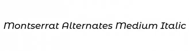
A modern, italic sans-serif font with medium weight and low contrast.
![Montserrat Alternates Medium Italic Frei Schriftart Herunterladen]() Herunterladen 295 Downloads@WebFont
Herunterladen 295 Downloads@WebFont -
( Fonts by Daniel Zadorozny - www.iconian.com )
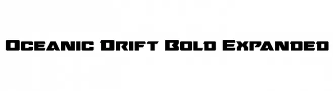
A bold, expanded font with a geometric and modern style.
![Oceanic Drift Bold Expanded Frei Schriftart Herunterladen]() Herunterladen 295 Downloads@WebFont
Herunterladen 295 Downloads@WebFont -
![Zurklez Outline BRK Frei Schriftart Herunterladen]() Herunterladen 295 Downloads@WebFont
Herunterladen 295 Downloads@WebFont -
( Fonts by Scratchones )
A playful, romantic script font with tall, narrow letters and whimsical loops.
![Signature Valentine Frei Schriftart Herunterladen]() Herunterladen 295 Downloads@WebFont
Herunterladen 295 Downloads@WebFont -
( Fonts by Bartek Nowak - www.nowak.tv/fontoholic/ )
Bold, high-contrast eco and recycling icon set.
![RecycleIt Frei Schriftart Herunterladen]() Herunterladen 295 Downloads@WebFont
Herunterladen 295 Downloads@WebFont -
( Fonts by www.aenigmafonts.com )
A bold, geometric font with a modern, industrial style.
![Zephyrean Gust BRK Frei Schriftart Herunterladen]() Herunterladen 295 Downloads@WebFont
Herunterladen 295 Downloads@WebFont -
( Fonts by www.peter-wiegel.de. Personal-use only. For commercial use please contact owner. )
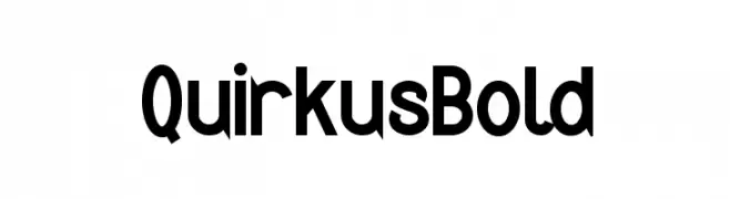
A bold, playful font with rounded characters and a modern style.
![Quirkus Bold Frei Schriftart Herunterladen]() Herunterladen 295 Downloads@WebFont
Herunterladen 295 Downloads@WebFont -
( Fonts by Toto )
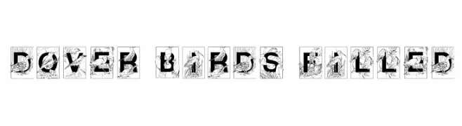
A decorative font with letters filled with detailed bird and foliage illustrations.
![Dover Birds Filled Frei Schriftart Herunterladen]() Herunterladen 295 Downloads@WebFont
Herunterladen 295 Downloads@WebFont -
![SF Covington Cond Bold Frei Schriftart Herunterladen]() Herunterladen 295 Downloads@WebFont
Herunterladen 295 Downloads@WebFont -
( Fonts by Itsm )
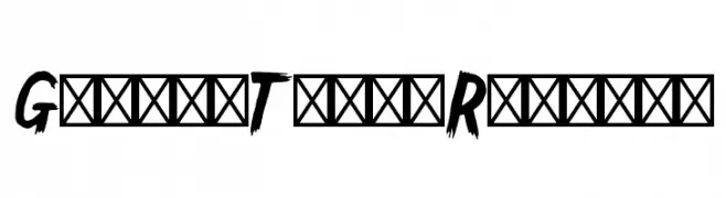
A bold, jagged font with a dynamic, hand-drawn appearance.
![GallowTree-Regular Frei Schriftart Herunterladen]() Herunterladen 295 Downloads@WebFont
Herunterladen 295 Downloads@WebFont -
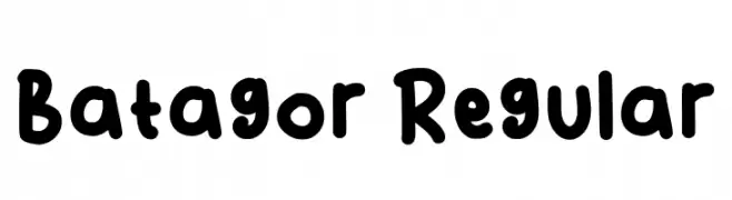
( Fonts by Aris Mulya )
Playful, bold handwritten font.
![Batagor Regular Frei Schriftart Herunterladen]() Herunterladen 295 Downloads@WebFont
Herunterladen 295 Downloads@WebFont -
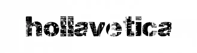
( Fonts by a Max Infeld - XEROGRAPHER FONTS - xerographer.blogspot.com . Personal-use only. For commercial use please contact owner. )
A bold, distressed font with a grunge aesthetic.
![hollavetica Frei Schriftart Herunterladen]() Herunterladen 295 Downloads@WebFont
Herunterladen 295 Downloads@WebFont -
( Fonts by Daniel Zadorozny - www.iconian.com )
A sleek, modern italic font with sharp angles and a futuristic style.
![911 Porscha Title Italic Frei Schriftart Herunterladen]() Herunterladen 295 Downloads@WebFont
Herunterladen 295 Downloads@WebFont -
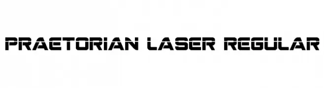
( Fonts by Daniel Zadorozny - www.iconian.com )
A bold, geometric font with a futuristic and industrial style.
![Praetorian Laser Regular Frei Schriftart Herunterladen]() Herunterladen 295 Downloads@WebFont
Herunterladen 295 Downloads@WebFont -
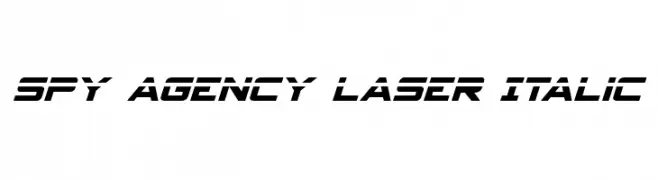
( Iconian Fonts - Daniel Zadorozny - www.iconian.com )
A bold, italic font with a futuristic and angular design.
![Spy Agency Laser Italic Frei Schriftart Herunterladen]() Herunterladen 295 Downloads@WebFont
Herunterladen 295 Downloads@WebFont -
( Fonts by www.blambot.com )
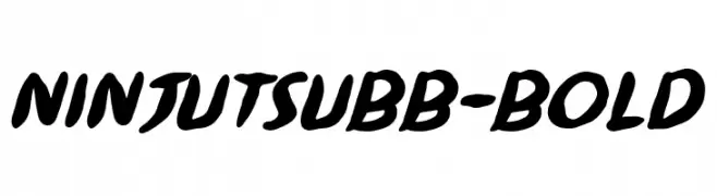
A bold, dynamic font with flowing strokes and a playful slant.
![NinjutsuBB-Bold Frei Schriftart Herunterladen]() Herunterladen 295 Downloads@WebFont
Herunterladen 295 Downloads@WebFont -
( Fonts by Daniel Zadorozny - www.iconian.com - Free for personal use )
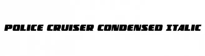
A bold, condensed, and italicized font with a dynamic and impactful style.
![Police Cruiser Condensed Italic Frei Schriftart Herunterladen]() Herunterladen 295 Downloads@WebFont
Herunterladen 295 Downloads@WebFont -
( Fonts by Violet MX )
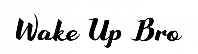
A bold, expressive script font with high contrast and elegant flourishes.
![Wake Up Bro Frei Schriftart Herunterladen]() Herunterladen 295 Downloads@WebFont
Herunterladen 295 Downloads@WebFont -
( Fonts by Rochadi Sudarma [Rochart Studio] - Personal-use only. For commercial use please contact owner. )
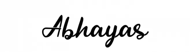
A cursive, handwritten-style font with elegant, flowing strokes.
![Abhayas Frei Schriftart Herunterladen]() Herunterladen 295 Downloads@WebFont
Herunterladen 295 Downloads@WebFont -
( Fonts by Leonard Posavec )
A bold, dynamic font with rounded edges and a playful, energetic style.
![Xeno's! Frei Schriftart Herunterladen]() Herunterladen 295 Downloads@WebFont
Herunterladen 295 Downloads@WebFont


Welche Schriften sind gerade am populärsten?
Poppins, Roboto, Montserrat, Open Sans und Lato sind wegen ihrer klaren Formen und breiten Einsetzbarkeit sehr gefragt – von Markenauftritt über Landingpages bis hin zu Postern.
Welche Fonts eignen sich für Logos?
Geometrische Sans‑Serifs (z. B. Poppins, Familien im Gotham‑Stil) sind ein häufiger Griff für sauberes, skalierbares Branding. Für eine persönlichere Note bleiben Scripts und Handschrift‑Stile beliebt. Kombinieren Sie einen prägnanten Headline‑Font mit einer neutralen Brotschrift für Wiedererkennung und Harmonie.
Wie oft wird die Top‑Liste aktualisiert?
Regelmäßig – basierend auf realen Downloads und Interaktionen. Schauen Sie öfter vorbei, um aufstrebende Favoriten früh zu entdecken.
💡 Tipp: Seite bookmarken – Trends wechseln schnell, und heutige Top‑Schriften inspirieren morgen vielleicht das Rebranding.