Willkommen bei den Top‑Schriften – hier treffen Beliebtheit und Qualität aufeinander. Das sind die in diesem Jahr am häufigsten heruntergeladenen und genutzten Fonts. Wenn Sie sichere Optionen für Logo, Web oder Social suchen, starten Sie hier.
Jeder Top‑Font überzeugt durch Balance, Lesbarkeit und Vielseitigkeit. Sie finden moderne Sans‑Serifs, elegante Scripts, Vintage‑Serifs und minimalistische Displays.
-
( Fonts by MuraKnockout Media + Design - muraknockout.com. Personal-use only. For commercial use please contact owner. )
A sleek, modern sans-serif font with geometric lines and balanced characters.
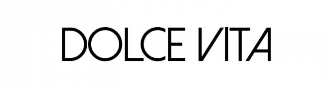 Herunterladen 3824 Downloads@WebFont
 -
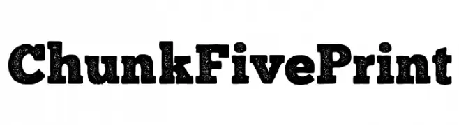
( Fonts by The League of Moveable Type - Personal-use only. For commercial use please contact owner. )
A bold, distressed slab serif font with a vintage, rugged appearance.
![ChunkFivePrint Frei Schriftart Herunterladen]() Herunterladen 3823 Downloads@WebFont
Herunterladen 3823 Downloads@WebFont -
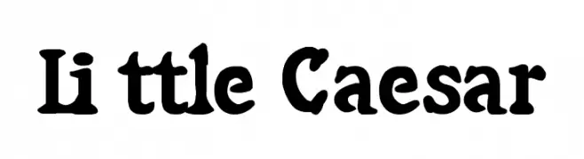
![Little Caesar Frei Schriftart Herunterladen]() Herunterladen 3823 Downloads@WebFont
Herunterladen 3823 Downloads@WebFont -
( Fonts by HENRIavecunK. Personal-use only. For commercial use please contact owner. )
A bold, condensed font with a modern and sleek appearance.
![Entschuldigung Regular Frei Schriftart Herunterladen]() Herunterladen 3822 Downloads@WebFont
Herunterladen 3822 Downloads@WebFont -
![Bunya PERSONAL Regular Frei Schriftart Herunterladen]() Herunterladen 3821 Downloads@WebFont
Herunterladen 3821 Downloads@WebFont -
-
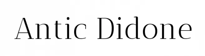
( Copyright (c) 2011, Santiago Orozco (hi@typemade.mx), with Reserved Font Name "Antic Didone". )
A high-contrast serif font with elegant, refined details.
![Antic Didone Frei Schriftart Herunterladen]() Herunterladen 3821 Downloads@WebFont
Herunterladen 3821 Downloads@WebFont -
![Anlongvill Khek1 Frei Schriftart Herunterladen]() Herunterladen 3821 Downloads@WebFont
Herunterladen 3821 Downloads@WebFont -
![hebrew Frei Schriftart Herunterladen]() Herunterladen 3820 Downloads
Herunterladen 3820 Downloads -
( Fonts by Tup Wanders - Personal-use only. For commercial use please contact owner. )
A bold, geometric font with a strong, industrial aesthetic.
![Evil Empire Frei Schriftart Herunterladen]() Herunterladen 3819 Downloads@WebFont
Herunterladen 3819 Downloads@WebFont -
![NBA Heat Frei Schriftart Herunterladen]() Herunterladen 3819 Downloads@WebFont
Herunterladen 3819 Downloads@WebFont -
![Linoscript Frei Schriftart Herunterladen]() Herunterladen 3819 Downloads
Herunterladen 3819 Downloads -
( Copyright 2018 The Chakra Petch Project Authors (https://github.com/m4rc1e/Chakra-Petch.git) )
A bold, geometric font with a modern and technical design.
![Chakra Petch Bold Frei Schriftart Herunterladen]() Herunterladen 3818 Downloads@WebFont
Herunterladen 3818 Downloads@WebFont -
( Fonts by Leonard Posavec - leosupply.co - Personal-use only. For commercial use please contact owner. )
A bold, brush-style font with dynamic and expressive strokes.
![California-Medium Frei Schriftart Herunterladen]() Herunterladen 3818 Downloads@WebFont
Herunterladen 3818 Downloads@WebFont -
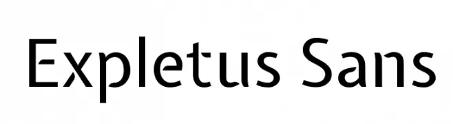
( Copyright (c) 2011, Jasper de Waard (jasper@designtown.nl) )
A modern, geometric sans-serif font with clean lines and balanced proportions.
![Expletus Sans Frei Schriftart Herunterladen]() Herunterladen 3817 Downloads@WebFont
Herunterladen 3817 Downloads@WebFont -
( Fonts by Arkandis Digital Foundry )
A bold serif font with strong strokes and classic elegance.
![VenturisADFCdStyle-Bold Frei Schriftart Herunterladen]() Herunterladen 3816 Downloads@WebFont
Herunterladen 3816 Downloads@WebFont -
![PaddingtonSC Bold Frei Schriftart Herunterladen]() Herunterladen 3816 Downloads@WebFont
Herunterladen 3816 Downloads@WebFont -
![MagicMedieval Frei Schriftart Herunterladen]() Herunterladen 3816 Downloads@WebFont
Herunterladen 3816 Downloads@WebFont -
( Fonts by Castcraft Software - opti.netii.net - check the website before use )
A bold, narrow font with high contrast, perfect for impactful headlines.
![OPBinderStyle-Bold Frei Schriftart Herunterladen]() Herunterladen 3814 Downloads@WebFont
Herunterladen 3814 Downloads@WebFont -
![SF Chaerilidae Bold Frei Schriftart Herunterladen]() Herunterladen 3814 Downloads@WebFont
Herunterladen 3814 Downloads@WebFont -
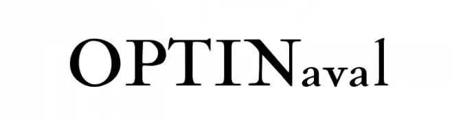
( Fonts by Castcraft Software - opti.netii.net - check the website before use )
A classic serif font with elegant contrast and sharp serifs.
![OPTINaval Frei Schriftart Herunterladen]() Herunterladen 3813 Downloads@WebFont
Herunterladen 3813 Downloads@WebFont -
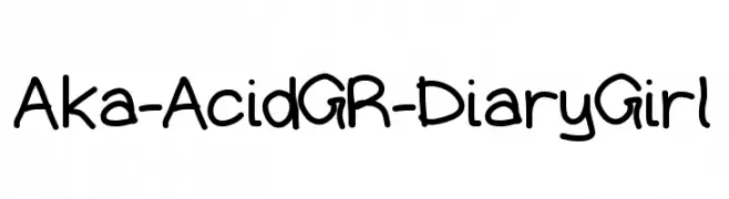
( Fonts by www.aka-acid.com )
A playful, handwritten font with rounded edges and a casual style.
![Aka-AcidGR-DiaryGirl Frei Schriftart Herunterladen]() Herunterladen 3811 Downloads@WebFont
Herunterladen 3811 Downloads@WebFont -
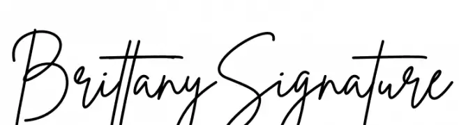
![Brittany Signature Frei Schriftart Herunterladen]() Herunterladen 3810 Downloads@WebFont
Herunterladen 3810 Downloads@WebFont -
![Britney-Online.net Frei Schriftart Herunterladen]() Herunterladen 3810 Downloads@WebFont
Herunterladen 3810 Downloads@WebFont -
( Fonts by CannotIntoSpaceFonts - KineticPlasma Fonts - Personal-use only. For commercial use please contact owner. )
A bold, impactful typeface with a vintage woodtype aesthetic.
![Warsaw Gothic Woodtype Frei Schriftart Herunterladen]() Herunterladen 3809 Downloads@WebFont
Herunterladen 3809 Downloads@WebFont -
( Fonts by a Claude Pelletier . Personal-use only. For commercial use please contact owner. )
An elegant script font with flowing, cursive letterforms and ornate flourishes.
![Maratre Frei Schriftart Herunterladen]() Herunterladen 3808 Downloads@WebFont
Herunterladen 3808 Downloads@WebFont -
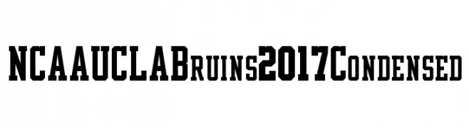
![NCAA UCLA Bruins 2017 Condensed Frei Schriftart Herunterladen]() Herunterladen 3805 Downloads@WebFont
Herunterladen 3805 Downloads@WebFont -
![American Purpose STRIPE 1 Normal Frei Schriftart Herunterladen]() Herunterladen 3805 Downloads@WebFont
Herunterladen 3805 Downloads@WebFont -
![Fatman Frei Schriftart Herunterladen]() Herunterladen 3805 Downloads@WebFont
Herunterladen 3805 Downloads@WebFont -
( Fonts by www.alphabetype.it )
A bold, expressive handwritten font with dynamic strokes.
![Casablanca Frei Schriftart Herunterladen]() Herunterladen 3804 Downloads@WebFont
Herunterladen 3804 Downloads@WebFont -
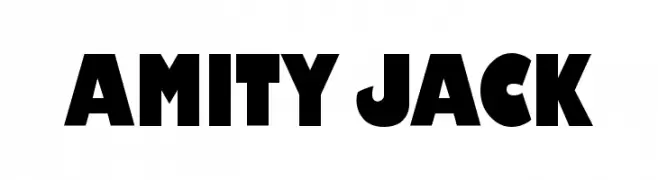
( Fonts by www.ajpaglia.com - FREE for personal or commercial usage )
A bold, geometric font with strong visual impact and uniform strokes.
![Amity Jack Frei Schriftart Herunterladen]() Herunterladen 3804 Downloads@WebFont
Herunterladen 3804 Downloads@WebFont -
( Fonts by www.fontmesa.com )
A bold, vintage-style font with strong, thick strokes and a slightly condensed appearance.
![Corleone Due Frei Schriftart Herunterladen]() Herunterladen 3802 Downloads@WebFont
Herunterladen 3802 Downloads@WebFont -
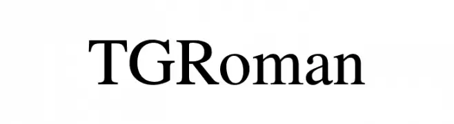
( Personal-use only. For commercial use please contact owner. )
A classic serif font with elegant proportions and clear, distinct characters.
![TGRoman Frei Schriftart Herunterladen]() Herunterladen 3801 Downloads@WebFont
Herunterladen 3801 Downloads@WebFont -
( Copyright (c) 2011 by Sorkin Type Co (www.sorkintype.com) )
A bold, flowing script font with smooth, connected strokes.
![Sarina Frei Schriftart Herunterladen]() Herunterladen 3800 Downloads@WebFont
Herunterladen 3800 Downloads@WebFont -
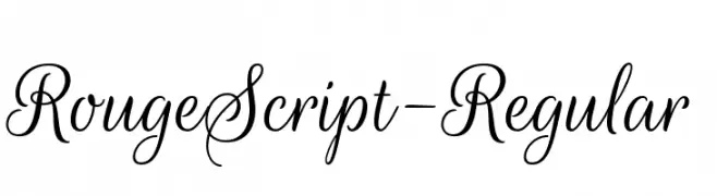
( Google Web Fonts )
An elegant script font with flowing, interconnected letters and ornate details.
![RougeScript-Regular Frei Schriftart Herunterladen]() Herunterladen 3800 Downloads@WebFont
Herunterladen 3800 Downloads@WebFont -
( Fonts by Digital Graphics Labs - www.digitalgraphiclabs.com )
An elegant, flowing script font with ornate, cursive letterforms.
![SNC Script Italic Frei Schriftart Herunterladen]() Herunterladen 3800 Downloads@WebFont
Herunterladen 3800 Downloads@WebFont


Welche Schriften sind gerade am populärsten?
Poppins, Roboto, Montserrat, Open Sans und Lato sind wegen ihrer klaren Formen und breiten Einsetzbarkeit sehr gefragt – von Markenauftritt über Landingpages bis hin zu Postern.
Welche Fonts eignen sich für Logos?
Geometrische Sans‑Serifs (z. B. Poppins, Familien im Gotham‑Stil) sind ein häufiger Griff für sauberes, skalierbares Branding. Für eine persönlichere Note bleiben Scripts und Handschrift‑Stile beliebt. Kombinieren Sie einen prägnanten Headline‑Font mit einer neutralen Brotschrift für Wiedererkennung und Harmonie.
Wie oft wird die Top‑Liste aktualisiert?
Regelmäßig – basierend auf realen Downloads und Interaktionen. Schauen Sie öfter vorbei, um aufstrebende Favoriten früh zu entdecken.
💡 Tipp: Seite bookmarken – Trends wechseln schnell, und heutige Top‑Schriften inspirieren morgen vielleicht das Rebranding.