Willkommen bei den Top‑Schriften – hier treffen Beliebtheit und Qualität aufeinander. Das sind die in diesem Jahr am häufigsten heruntergeladenen und genutzten Fonts. Wenn Sie sichere Optionen für Logo, Web oder Social suchen, starten Sie hier.
Jeder Top‑Font überzeugt durch Balance, Lesbarkeit und Vielseitigkeit. Sie finden moderne Sans‑Serifs, elegante Scripts, Vintage‑Serifs und minimalistische Displays.
-
 Herunterladen 284 Downloads@WebFont
 -
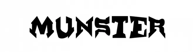
![Munster Frei Schriftart Herunterladen]() Herunterladen 284 Downloads@WebFont
Herunterladen 284 Downloads@WebFont -
![SamEvans Frei Schriftart Herunterladen]() Herunterladen 284 Downloads@WebFont
Herunterladen 284 Downloads@WebFont -
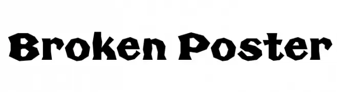
![Broken Poster Frei Schriftart Herunterladen]() Herunterladen 284 Downloads@WebFont
Herunterladen 284 Downloads@WebFont -
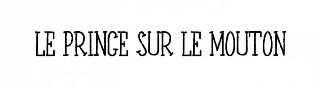
![LE PRINCE SUR LE MOUTON Frei Schriftart Herunterladen]() Herunterladen 284 Downloads@WebFont
Herunterladen 284 Downloads@WebFont -
-
![FKR SlurrLife Medium Frei Schriftart Herunterladen]() Herunterladen 284 Downloads@WebFont
Herunterladen 284 Downloads@WebFont -
( Fonts by Ronin Design - Personal-use only. For commercial use please contact owner. )
A bold, futuristic font with geometric shapes and sharp angles.
![Origin Tech Demo Frei Schriftart Herunterladen]() Herunterladen 284 Downloads@WebFont
Herunterladen 284 Downloads@WebFont -
![Pride Thusly Frei Schriftart Herunterladen]() Herunterladen 284 Downloads@WebFont
Herunterladen 284 Downloads@WebFont -
( Fonts by www.lifewithouttaffy.com )
A bold, hand-drawn font with an edgy, irregular style.
![Black Sunshine Frei Schriftart Herunterladen]() Herunterladen 284 Downloads@WebFont
Herunterladen 284 Downloads@WebFont -
( Docallisme HAS Feat Dutsky - docallisme.blogspot.com )
A bold, hand-drawn font with a playful, sketch-like style.
![ROCKET TO MARS Frei Schriftart Herunterladen]() Herunterladen 284 Downloads@WebFont
Herunterladen 284 Downloads@WebFont -
![Bae Frei Schriftart Herunterladen]() Herunterladen 284 Downloads@WebFont
Herunterladen 284 Downloads@WebFont -
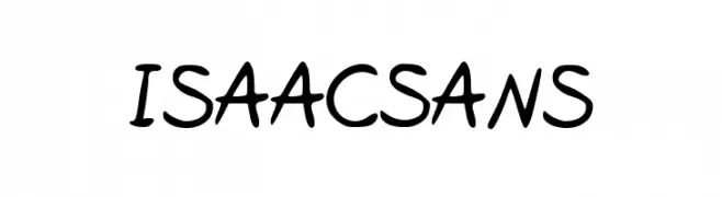
![IsaacSans Frei Schriftart Herunterladen]() Herunterladen 284 Downloads@WebFont
Herunterladen 284 Downloads@WebFont -
( Fonts by Maelle.K - Thomas Boucherie )
A playful, hand-drawn font with rounded edges and a casual style.
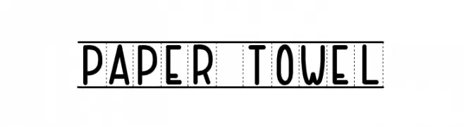
![PAPER TOWEL Frei Schriftart Herunterladen]() Herunterladen 284 Downloads@WebFont
Herunterladen 284 Downloads@WebFont -
( Fonts by Burhan Afif - hanscostudio.com - Personal-use only. For commercial use please contact owner. )
A bold, brush-style script font with dynamic, expressive strokes.
![Crunchy Frei Schriftart Herunterladen]() Herunterladen 284 Downloads@WebFont
Herunterladen 284 Downloads@WebFont -
( Fonts by wep - Wahyu Eka Prasetya - Personal-use only. For commercial use please contact owner. )
A bold, playful handwritten font with rounded, smooth strokes.
![Baiknya Frei Schriftart Herunterladen]() Herunterladen 284 Downloads@WebFont
Herunterladen 284 Downloads@WebFont -
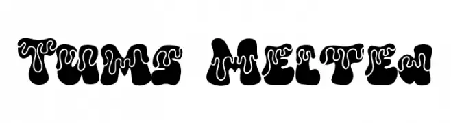
( Fonts by Bearytype )
A bold, playful font with a unique melted effect, perfect for creative projects.
![Tums Melted Frei Schriftart Herunterladen]() Herunterladen 284 Downloads@WebFont
Herunterladen 284 Downloads@WebFont -
![Suwa Frei Schriftart Herunterladen]() Herunterladen 284 Downloads@WebFont
Herunterladen 284 Downloads@WebFont -
( Fonts by www.tepidmonkey.net )
A playful, informal handwritten font with a whimsical and dynamic style.
![Hipchick Frei Schriftart Herunterladen]() Herunterladen 284 Downloads@WebFont
Herunterladen 284 Downloads@WebFont -
( Fonts by The Font Emporium )
A bold, distressed font with a rugged, grungy appearance.
![Blackfly Mambo Frei Schriftart Herunterladen]() Herunterladen 284 Downloads@WebFont
Herunterladen 284 Downloads@WebFont -
( themangycat.com/ )
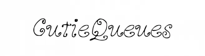
A whimsical, curly font with playful loops and decorative swirls.
![CutieQueues Frei Schriftart Herunterladen]() Herunterladen 284 Downloads@WebFont
Herunterladen 284 Downloads@WebFont -
![Aclonica Frei Schriftart Herunterladen]() Herunterladen 284 Downloads@WebFont
Herunterladen 284 Downloads@WebFont -
( Fonts by Woodcutter Manero - www.woodcutter.es - Personal-use only. For commercial use please contact owner. )
A tall, narrow font with a sleek, modern design.
![La Distinguida Frei Schriftart Herunterladen]() Herunterladen 284 Downloads@WebFont
Herunterladen 284 Downloads@WebFont -
![Made by me! Frei Schriftart Herunterladen]() Herunterladen 284 Downloads@WebFont
Herunterladen 284 Downloads@WebFont -
( Fonts by junkohanhero )
A bold, distressed font with a gritty, vintage texture.
![Rip-off Frei Schriftart Herunterladen]() Herunterladen 284 Downloads@WebFont
Herunterladen 284 Downloads@WebFont -
![Berenika Bold Frei Schriftart Herunterladen]() Herunterladen 284 Downloads@WebFont
Herunterladen 284 Downloads@WebFont -
![ShlopHappy Frei Schriftart Herunterladen]() Herunterladen 284 Downloads@WebFont
Herunterladen 284 Downloads@WebFont -
( Fonts by Manfred Klein. Free for private and charity use. Free for commercial with donation to organizations )
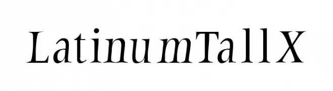
A classic serif font with elegant, elongated letterforms and high contrast.
![LatinumTallX Frei Schriftart Herunterladen]() Herunterladen 284 Downloads@WebFont
Herunterladen 284 Downloads@WebFont -
( Fonts by Bangkit Tri Setiadi )
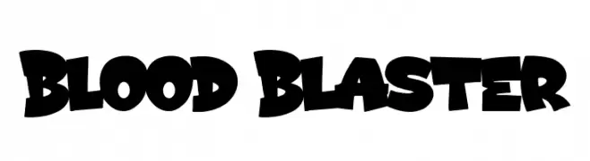
A bold, dynamic font with exaggerated strokes and a playful, chaotic style.
![Blood Blaster Frei Schriftart Herunterladen]() Herunterladen 284 Downloads@WebFont
Herunterladen 284 Downloads@WebFont -
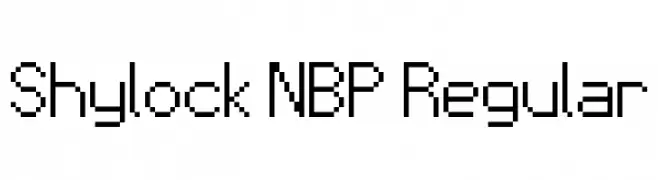
![Shylock NBP Regular Frei Schriftart Herunterladen]() Herunterladen 284 Downloads@WebFont
Herunterladen 284 Downloads@WebFont -
( Fonts by Peter Wiegel - www.peter-wiegel.de - Personal-use only. For commercial use please contact owner. )
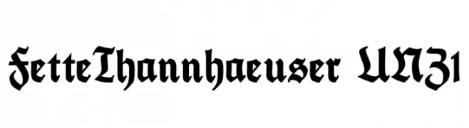
A bold, Gothic-inspired font with intricate and angular letterforms.
![FetteThannhaeuser UNZ1 Frei Schriftart Herunterladen]() Herunterladen 284 Downloads@WebFont
Herunterladen 284 Downloads@WebFont -
( Darrell Flood )
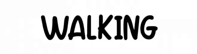
A playful, bold font with rounded, hand-drawn characters.
![Walking Frei Schriftart Herunterladen]() Herunterladen 284 Downloads@WebFont
Herunterladen 284 Downloads@WebFont -
( Fonts by a Max Infeld - XEROGRAPHER FONTS - xerographer.blogspot.com . Personal-use only. For commercial use please contact owner. )
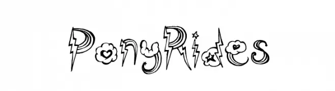
A whimsical and decorative font with playful embellishments and dynamic shapes.
![PonyRides Frei Schriftart Herunterladen]() Herunterladen 284 Downloads@WebFont
Herunterladen 284 Downloads@WebFont -
( Fonts by Daniel Zadorozny - www.iconian.com )
A bold, italicized font with a futuristic and dynamic style.
![Drive Bold Italic Frei Schriftart Herunterladen]() Herunterladen 284 Downloads@WebFont
Herunterladen 284 Downloads@WebFont -
( Fonts by a Max Infeld - XEROGRAPHER FONTS - xerographer.blogspot.com . Personal-use only. For commercial use please contact owner. )
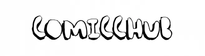
A bold, cartoonish font with a playful, hand-drawn style.
![ComicChub Frei Schriftart Herunterladen]() Herunterladen 284 Downloads@WebFont
Herunterladen 284 Downloads@WebFont -
( Fonts by Alex Tomlinson - Skyhaven Fonts - shfonts.com )
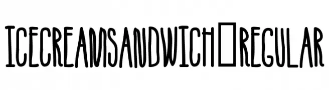
A playful, hand-drawn font with tall, narrow letters and a whimsical style.
![IceCreamSandwich-Regular Frei Schriftart Herunterladen]() Herunterladen 284 Downloads@WebFont
Herunterladen 284 Downloads@WebFont


Welche Schriften sind gerade am populärsten?
Poppins, Roboto, Montserrat, Open Sans und Lato sind wegen ihrer klaren Formen und breiten Einsetzbarkeit sehr gefragt – von Markenauftritt über Landingpages bis hin zu Postern.
Welche Fonts eignen sich für Logos?
Geometrische Sans‑Serifs (z. B. Poppins, Familien im Gotham‑Stil) sind ein häufiger Griff für sauberes, skalierbares Branding. Für eine persönlichere Note bleiben Scripts und Handschrift‑Stile beliebt. Kombinieren Sie einen prägnanten Headline‑Font mit einer neutralen Brotschrift für Wiedererkennung und Harmonie.
Wie oft wird die Top‑Liste aktualisiert?
Regelmäßig – basierend auf realen Downloads und Interaktionen. Schauen Sie öfter vorbei, um aufstrebende Favoriten früh zu entdecken.
💡 Tipp: Seite bookmarken – Trends wechseln schnell, und heutige Top‑Schriften inspirieren morgen vielleicht das Rebranding.