Willkommen bei den Top‑Schriften – hier treffen Beliebtheit und Qualität aufeinander. Das sind die in diesem Jahr am häufigsten heruntergeladenen und genutzten Fonts. Wenn Sie sichere Optionen für Logo, Web oder Social suchen, starten Sie hier.
Jeder Top‑Font überzeugt durch Balance, Lesbarkeit und Vielseitigkeit. Sie finden moderne Sans‑Serifs, elegante Scripts, Vintage‑Serifs und minimalistische Displays.
-
 Herunterladen 280 Downloads@WebFont
 -
( Fonts by Pizzadude )
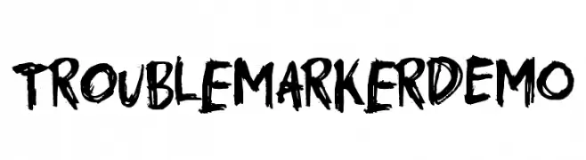
A bold, brush-style font with a rebellious and energetic character.
![TroublemarkerDEMO Frei Schriftart Herunterladen]() Herunterladen 280 Downloads@WebFont
Herunterladen 280 Downloads@WebFont -
![Gtartings Frei Schriftart Herunterladen]() Herunterladen 280 Downloads@WebFont
Herunterladen 280 Downloads@WebFont -
( Fonts by Nick Curtis - www.nicksfonts.com )
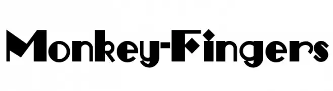
A bold, geometric font with a playful and unique character.
![Monkey-Fingers Frei Schriftart Herunterladen]() Herunterladen 280 Downloads
Herunterladen 280 Downloads -
( Free - comeunbound.tumblr.com/ )
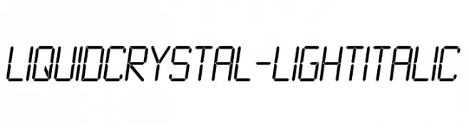
A futuristic, segmented font with an italic slant, ideal for tech themes.
![LiquidCrystal-LightItalic Frei Schriftart Herunterladen]() Herunterladen 280 Downloads@WebFont
Herunterladen 280 Downloads@WebFont -
-
( Fonts by Octotype - www.foundmyfont.com - Personal-use only. For commercial use please contact owner. )
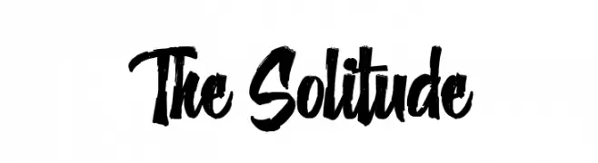
A bold, brush-style font with dynamic, expressive strokes.
![The Solitude Frei Schriftart Herunterladen]() Herunterladen 280 Downloads@WebFont
Herunterladen 280 Downloads@WebFont -
( Bambootypes - Florian Bambhout )
A modern, elongated font with narrow letterforms and consistent stroke width.
![Meditation Frei Schriftart Herunterladen]() Herunterladen 280 Downloads@WebFont
Herunterladen 280 Downloads@WebFont -
( Fonts by Douglas Vitkauskas - www.vtksdesign.com. Personal-use only. For commercial use please contact owner. )
A bold, decorative font with gothic, thorn-like embellishments.
![VTKS Black Label Normal Frei Schriftart Herunterladen]() Herunterladen 280 Downloads@WebFont
Herunterladen 280 Downloads@WebFont -
( Fonts by Southype )
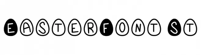
A playful, egg-shaped decorative font with a hand-drawn style.
![EasterFont St Frei Schriftart Herunterladen]() Herunterladen 280 Downloads@WebFont
Herunterladen 280 Downloads@WebFont -
( Fonts by Wahyu Eka Prasetya - wepfont.com - Personal-use only. For commercial use please contact owner. )
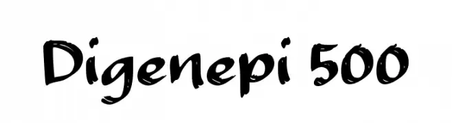
A bold, brush-style font with dynamic strokes and a lively appearance.
![Digenepi 500 Frei Schriftart Herunterladen]() Herunterladen 280 Downloads@WebFont
Herunterladen 280 Downloads@WebFont -
![RittswoodClassic Regular Frei Schriftart Herunterladen]() Herunterladen 280 Downloads@WebFont
Herunterladen 280 Downloads@WebFont -
![Hobbiton Handscrawl Regular Frei Schriftart Herunterladen]() Herunterladen 280 Downloads@WebFont
Herunterladen 280 Downloads@WebFont -
( Fonts by Vladimir Nikolic - www.creativefabrica.com/designer/vladimirnikolic/ - Personal-use only. For commercial use please contact owner. )
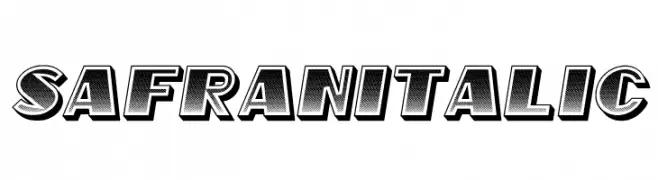
A bold, italicized font with a 3D effect and dotted texture.
![Safran Italic Frei Schriftart Herunterladen]() Herunterladen 280 Downloads@WebFont
Herunterladen 280 Downloads@WebFont -
( Fonts by Octotype - www.foundmyfont.com - Personal-use only. For commercial use please contact owner. )
A bold, cursive font with dynamic and fluid strokes, perfect for creative projects.
![Quicksilver Frei Schriftart Herunterladen]() Herunterladen 280 Downloads@WebFont
Herunterladen 280 Downloads@WebFont -
![South Frei Schriftart Herunterladen]() Herunterladen 280 Downloads@WebFont
Herunterladen 280 Downloads@WebFont -
( www.typedifferent.com/ )
A bold, geometric font with circular cutouts for a modern, playful look.
![BDPipe Frei Schriftart Herunterladen]() Herunterladen 280 Downloads@WebFont
Herunterladen 280 Downloads@WebFont -
( www.woodcutter.es )
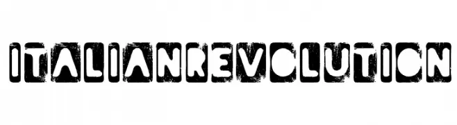
A bold, distressed font with a grunge texture and rugged, rebellious style.
![Italian Revolution Frei Schriftart Herunterladen]() Herunterladen 280 Downloads@WebFont
Herunterladen 280 Downloads@WebFont -
( George Williams - web.archive.org/web/20051223080638/bibliofile.mc.duke.edu/gww/fonts/fonts.html )
A whimsical, decorative font with playful curls and swirls.
![Ringlet Frei Schriftart Herunterladen]() Herunterladen 280 Downloads@WebFont
Herunterladen 280 Downloads@WebFont -
( Fonts by Miftah Arzaq - Personal-use only. For commercial use please contact owner. )
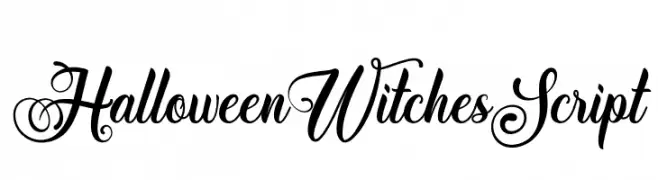
An elegant and whimsical script font with ornate, flowing letterforms.
![Halloween Witches Script Frei Schriftart Herunterladen]() Herunterladen 280 Downloads@WebFont
Herunterladen 280 Downloads@WebFont -
( Fonts by www.houseoflime.com )
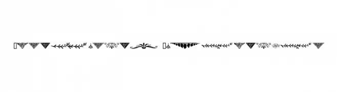
Highly decorative ornamental motifs for embellishment.
![Ornamental Decoration Frei Schriftart Herunterladen]() Herunterladen 280 Downloads@WebFont
Herunterladen 280 Downloads@WebFont -
( Fonts by Kevin Richey - Personal-use only. For commercial use please contact owner. )
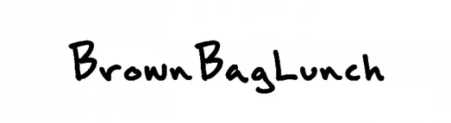
A playful, casual handwritten font with a natural, organic flow.
![BrownBagLunch Frei Schriftart Herunterladen]() Herunterladen 280 Downloads@WebFont
Herunterladen 280 Downloads@WebFont -
( Hareesh Seela )
A modern, minimalist font with clean lines and geometric shapes.
![Aadhunik Light Frei Schriftart Herunterladen]() Herunterladen 280 Downloads@WebFont
Herunterladen 280 Downloads@WebFont -
( Fonts by Vable studio )
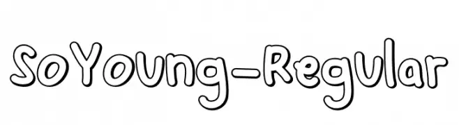
A playful, hand-drawn outlined font with a whimsical and friendly style.
![SoYoung-Regular Frei Schriftart Herunterladen]() Herunterladen 280 Downloads@WebFont
Herunterladen 280 Downloads@WebFont -
( weknow - Wino S Kadir - www.creativefabrica.com/designer/weknow/ )
A bold, geometric font with a modern, futuristic style.
![Purpose Frei Schriftart Herunterladen]() Herunterladen 280 Downloads@WebFont
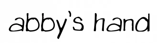
Herunterladen 280 Downloads@WebFont -
![abby's hand Frei Schriftart Herunterladen]() Herunterladen 279 Downloads@WebFont
Herunterladen 279 Downloads@WebFont -
( Fonts by Daniel Zadorozny - www.iconian.com - Free for personal use )
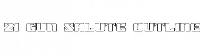
A bold, geometric outline font with a modern, industrial style.
![21 Gun Salute Outline Frei Schriftart Herunterladen]() Herunterladen 279 Downloads@WebFont
Herunterladen 279 Downloads@WebFont -
( Fonts by Daniel Zadorozny - www.iconian.com - Free for personal use )
A bold, italicized font with a futuristic and dynamic style.
![Weaponeer Academy Italic Frei Schriftart Herunterladen]() Herunterladen 279 Downloads@WebFont
Herunterladen 279 Downloads@WebFont -
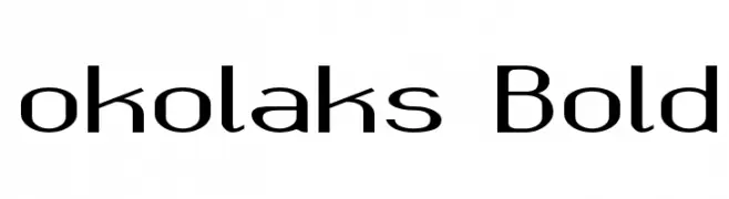
( Fonts by Grzegorz l - www.glukfonts.pl )
A bold, modern font with geometric structure and consistent stroke width.
![okolaks Bold Frei Schriftart Herunterladen]() Herunterladen 279 Downloads@WebFont
Herunterladen 279 Downloads@WebFont -
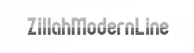
( Fonts by Apostrophic Lab )
A modern, striped font with bold geometric shapes and a dynamic linear texture.
![ZillahModernLine Frei Schriftart Herunterladen]() Herunterladen 279 Downloads@WebFont
Herunterladen 279 Downloads@WebFont -
( imagex - www.imagex-fonts.com )
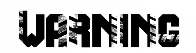
A bold, distressed font with a glitch effect, ideal for modern and edgy designs.
![Warning Frei Schriftart Herunterladen]() Herunterladen 279 Downloads@WebFont
Herunterladen 279 Downloads@WebFont -
( Fonts by Typographer Mediengestaltung - Personal-use only. For commercial use please contact owner. )
A bold, decorative font with a three-dimensional contour effect.
![Long Island Contour Frei Schriftart Herunterladen]() Herunterladen 279 Downloads@WebFont
Herunterladen 279 Downloads@WebFont -
( Konstantine Studio - konstantinestudio.com/ )
A delicate and elegant handwritten font with fluid, natural strokes.
![Sweet Getaway DEMO Regular Frei Schriftart Herunterladen]() Herunterladen 279 Downloads@WebFont
Herunterladen 279 Downloads@WebFont -
( Tama Putra - be.net/tmptr )
A bold, gothic-inspired font with intricate blackletter details.
![Crozzoe Personal Use Regular Frei Schriftart Herunterladen]() Herunterladen 279 Downloads@WebFont
Herunterladen 279 Downloads@WebFont -
( Fonts by Daniel Zadorozny - www.iconian.com - Free for personal use )
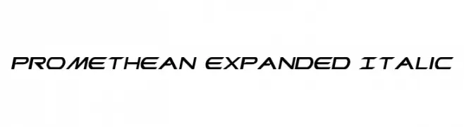
A dynamic, expanded italic font with a futuristic and modern design.
![Promethean Expanded Italic Frei Schriftart Herunterladen]() Herunterladen 279 Downloads@WebFont
Herunterladen 279 Downloads@WebFont -
( Billy Argel - billyargel.com/ )
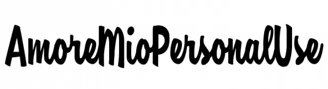
A bold, playful script font with a handwritten style.
![Amore Mio Personal Use Frei Schriftart Herunterladen]() Herunterladen 279 Downloads@WebFont
Herunterladen 279 Downloads@WebFont


Welche Schriften sind gerade am populärsten?
Poppins, Roboto, Montserrat, Open Sans und Lato sind wegen ihrer klaren Formen und breiten Einsetzbarkeit sehr gefragt – von Markenauftritt über Landingpages bis hin zu Postern.
Welche Fonts eignen sich für Logos?
Geometrische Sans‑Serifs (z. B. Poppins, Familien im Gotham‑Stil) sind ein häufiger Griff für sauberes, skalierbares Branding. Für eine persönlichere Note bleiben Scripts und Handschrift‑Stile beliebt. Kombinieren Sie einen prägnanten Headline‑Font mit einer neutralen Brotschrift für Wiedererkennung und Harmonie.
Wie oft wird die Top‑Liste aktualisiert?
Regelmäßig – basierend auf realen Downloads und Interaktionen. Schauen Sie öfter vorbei, um aufstrebende Favoriten früh zu entdecken.
💡 Tipp: Seite bookmarken – Trends wechseln schnell, und heutige Top‑Schriften inspirieren morgen vielleicht das Rebranding.