Willkommen bei den Top‑Schriften – hier treffen Beliebtheit und Qualität aufeinander. Das sind die in diesem Jahr am häufigsten heruntergeladenen und genutzten Fonts. Wenn Sie sichere Optionen für Logo, Web oder Social suchen, starten Sie hier.
Jeder Top‑Font überzeugt durch Balance, Lesbarkeit und Vielseitigkeit. Sie finden moderne Sans‑Serifs, elegante Scripts, Vintage‑Serifs und minimalistische Displays.
-
( Musafir LAB )
A flowing, elegant script font with bold, sweeping uppercase and smooth, slanted lowercase letters.
 Herunterladen 279 Downloads@WebFont
 -
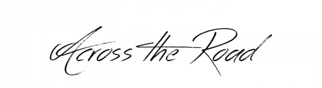
( Fonts by Jonathan S. Harris - www.tattoowoo.com. Personal-use only. For commercial use please contact owner. )
A dynamic, expressive handwritten font with fluid strokes.
![Across the Road Frei Schriftart Herunterladen]() Herunterladen 279 Downloads@WebFont
Herunterladen 279 Downloads@WebFont -
![Onestroke Frei Schriftart Herunterladen]() Herunterladen 279 Downloads@WebFont
Herunterladen 279 Downloads@WebFont -
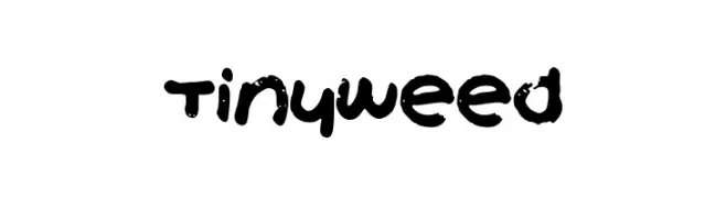
![TinyWeed Frei Schriftart Herunterladen]() Herunterladen 279 Downloads@WebFont
Herunterladen 279 Downloads@WebFont -
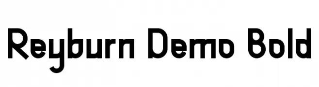
( Fonts by Edric Studio - Personal-use only. For commercial use please contact owner. )
A bold, geometric font with a modern and structured design.
![Reyburn Demo Bold Frei Schriftart Herunterladen]() Herunterladen 279 Downloads@WebFont
Herunterladen 279 Downloads@WebFont -
-
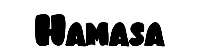
( Fonts by Arendx Studio )
A bold, playful font with rounded, chunky characters ideal for eye-catching designs.
![Hamasa Frei Schriftart Herunterladen]() Herunterladen 279 Downloads@WebFont
Herunterladen 279 Downloads@WebFont -
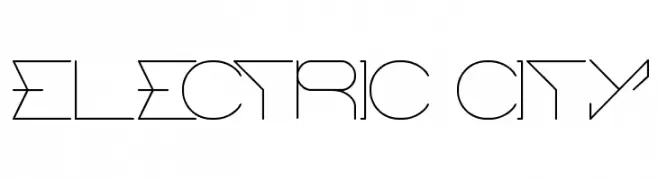
( Fonts by Wino S Kadir - weknow - www.revolge.com/shop/weknow/ - Personal-use only. For commercial use please contact owner. )
A decorative, geometric font with a futuristic, technological style.
![ELECTRIC CITY Frei Schriftart Herunterladen]() Herunterladen 279 Downloads@WebFont
Herunterladen 279 Downloads@WebFont -
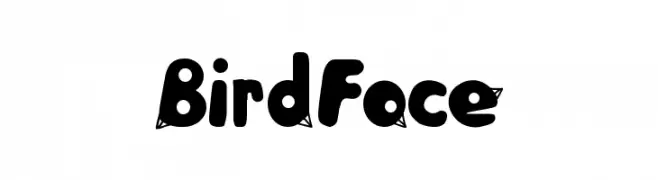
![BirdFace Frei Schriftart Herunterladen]() Herunterladen 279 Downloads@WebFont
Herunterladen 279 Downloads@WebFont -
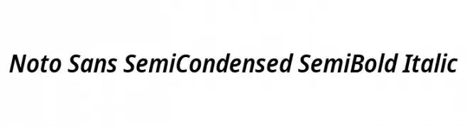
( Fonts by Google - Personal-use only. For commercial use please contact owner. )
A modern, semi-condensed sans-serif font with semi-bold weight and italic style.
![Noto Sans SemiCondensed SemiBold Italic Frei Schriftart Herunterladen]() Herunterladen 279 Downloads@WebFont
Herunterladen 279 Downloads@WebFont -
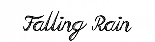
( Fonts by Jonathan S. Harris - www.tattoowoo.com. Personal-use only. For commercial use please contact owner. )
A dynamic, hand-drawn script font with textured, flowing letters.
![Falling Rain Frei Schriftart Herunterladen]() Herunterladen 279 Downloads@WebFont
Herunterladen 279 Downloads@WebFont -
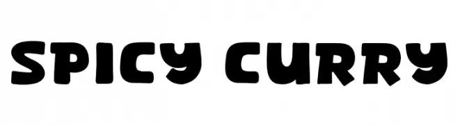
( Fonts by Khurasan )
A bold, rounded font with a playful and dynamic style.
![Spicy Curry Frei Schriftart Herunterladen]() Herunterladen 279 Downloads@WebFont
Herunterladen 279 Downloads@WebFont -
![Hititte Arrow Regular Frei Schriftart Herunterladen]() Herunterladen 279 Downloads@WebFont
Herunterladen 279 Downloads@WebFont -
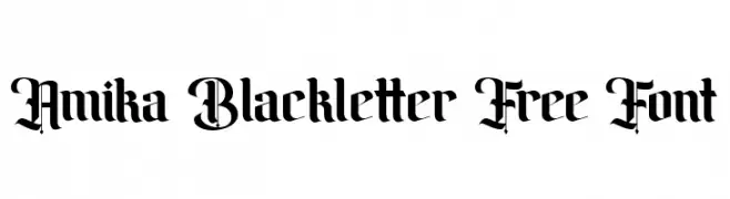
( Fonts by Maulana Creative - Gilang Maulana - Personal-use only. For commercial use please contact owner. )
A bold, gothic blackletter font with intricate, angular designs.
![Amika Blackletter Free Font Frei Schriftart Herunterladen]() Herunterladen 279 Downloads@WebFont
Herunterladen 279 Downloads@WebFont -
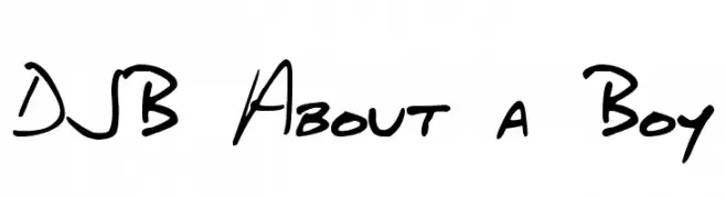
( Fonts by Darcy Baldwin - darcybaldwin.com. Free for personal use only )
A playful, casual handwritten font with fluid strokes and a dynamic style.
![DJB About a Boy Frei Schriftart Herunterladen]() Herunterladen 279 Downloads@WebFont
Herunterladen 279 Downloads@WebFont -
( www.anchorfonts.com )
A bold, distressed font with a grunge, textured appearance.
![Hungry Ghosts Frei Schriftart Herunterladen]() Herunterladen 279 Downloads@WebFont
Herunterladen 279 Downloads@WebFont -
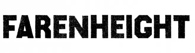
( Fonts by Billy Argel Fonts - www.billyargel.com - Personal-use only. For commercial use please contact owner. )
A bold, distressed font with a rugged, vintage feel.
![Farenheight Frei Schriftart Herunterladen]() Herunterladen 279 Downloads@WebFont
Herunterladen 279 Downloads@WebFont -
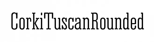
( Fonts by typedepot - Personal-use only. For commercial use please contact owner. )
A modern serif font with rounded edges and elongated letterforms.
![Corki Tuscan Rounded Frei Schriftart Herunterladen]() Herunterladen 279 Downloads@WebFont
Herunterladen 279 Downloads@WebFont -
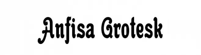
( Fonts by www.gliphmaker.com. Personal-use only. For commercial use please contact owner. )
A bold, playful font with decorative curves and loops.
![Anfisa Grotesk Frei Schriftart Herunterladen]() Herunterladen 279 Downloads@WebFont
Herunterladen 279 Downloads@WebFont -
![wmcorners3 Frei Schriftart Herunterladen]() Herunterladen 279 Downloads@WebFont
Herunterladen 279 Downloads@WebFont -
![acroscript Frei Schriftart Herunterladen]() Herunterladen 279 Downloads@WebFont
Herunterladen 279 Downloads@WebFont -
( Font by Eric Wirjanata. All of my font are donation based. You can support by buying something from here. http://society6.com/EricWirjanata )
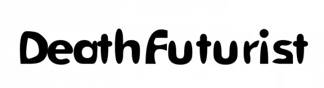
A bold, playful font with a futuristic and dynamic style.
![DeathFuturist Frei Schriftart Herunterladen]() Herunterladen 279 Downloads@WebFont
Herunterladen 279 Downloads@WebFont -
( Fonts by Daniel Zadorozny - www.iconian.com - Free for personal use )
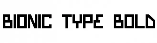
A bold, geometric font with a futuristic and digital aesthetic.
![Bionic Type Bold Frei Schriftart Herunterladen]() Herunterladen 279 Downloads
Herunterladen 279 Downloads -
![Langó Italic Frei Schriftart Herunterladen]() Herunterladen 279 Downloads@WebFont
Herunterladen 279 Downloads@WebFont -
![Faxer Frei Schriftart Herunterladen]() Herunterladen 279 Downloads@WebFont
Herunterladen 279 Downloads@WebFont -
( Fonts by Hassina L )
A bold, playful handwritten font with thick, rounded strokes.
![hassina Frei Schriftart Herunterladen]() Herunterladen 279 Downloads@WebFont
Herunterladen 279 Downloads@WebFont -
( Fonts by Marty Bee - www.martybee.com )
A bold, brush-style font with an expressive and dynamic appearance.
![HillWilliam Frei Schriftart Herunterladen]() Herunterladen 279 Downloads@WebFont
Herunterladen 279 Downloads@WebFont -
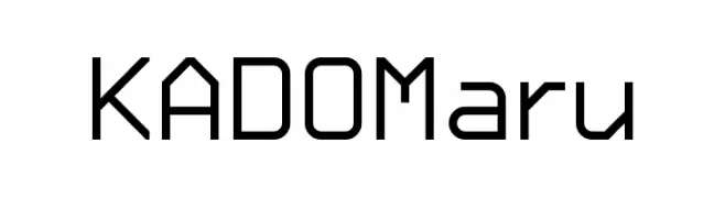
( Kinema Moon Graphics - www.kinemamoon.com/ )
A modern, geometric font with rounded edges and consistent stroke widths.
![KADO_Maru Frei Schriftart Herunterladen]() Herunterladen 279 Downloads@WebFont
Herunterladen 279 Downloads@WebFont -
( Figuree Studio - Icep Fadhil )
A tall, narrow, and modern font with a sleek and consistent design.
![GENNARO Frei Schriftart Herunterladen]() Herunterladen 279 Downloads@WebFont
Herunterladen 279 Downloads@WebFont -
( Fonts by Manfred Klein. Free for private and charity use. Free for commercial with donation to organizations )
A playful, casual handwritten font with smooth, flowing lines.
![Katrins Frei Schriftart Herunterladen]() Herunterladen 279 Downloads@WebFont
Herunterladen 279 Downloads@WebFont -
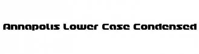
![Annapolis Lower Case Condensed Frei Schriftart Herunterladen]() Herunterladen 279 Downloads@WebFont
Herunterladen 279 Downloads@WebFont -
![lpnature Frei Schriftart Herunterladen]() Herunterladen 279 Downloads@WebFont
Herunterladen 279 Downloads@WebFont -
![LJ Studios MFJH Frei Schriftart Herunterladen]() Herunterladen 279 Downloads@WebFont
Herunterladen 279 Downloads@WebFont -
( Fonts by Guillaume )
A bold, hand-drawn font with a rough, distressed texture.
![Layer Frei Schriftart Herunterladen]() Herunterladen 279 Downloads@WebFont
Herunterladen 279 Downloads@WebFont -
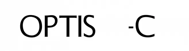
( Fonts by Castcraft Software - OPTI Fonts Archive - opti.netii.net - Personal-use only. For commercial use please contact owner. )
A modern, geometric sans-serif font with bold uppercase letters.
![OPTISteel-Caps Frei Schriftart Herunterladen]() Herunterladen 279 Downloads@WebFont
Herunterladen 279 Downloads@WebFont -
Schriftart von paschka21. For commercial use please contact the owner.
![Hello there Frei Schriftart Herunterladen]() Herunterladen 279 Downloads@WebFont
Herunterladen 279 Downloads@WebFont


Welche Schriften sind gerade am populärsten?
Poppins, Roboto, Montserrat, Open Sans und Lato sind wegen ihrer klaren Formen und breiten Einsetzbarkeit sehr gefragt – von Markenauftritt über Landingpages bis hin zu Postern.
Welche Fonts eignen sich für Logos?
Geometrische Sans‑Serifs (z. B. Poppins, Familien im Gotham‑Stil) sind ein häufiger Griff für sauberes, skalierbares Branding. Für eine persönlichere Note bleiben Scripts und Handschrift‑Stile beliebt. Kombinieren Sie einen prägnanten Headline‑Font mit einer neutralen Brotschrift für Wiedererkennung und Harmonie.
Wie oft wird die Top‑Liste aktualisiert?
Regelmäßig – basierend auf realen Downloads und Interaktionen. Schauen Sie öfter vorbei, um aufstrebende Favoriten früh zu entdecken.
💡 Tipp: Seite bookmarken – Trends wechseln schnell, und heutige Top‑Schriften inspirieren morgen vielleicht das Rebranding.