Willkommen bei den Top‑Schriften – hier treffen Beliebtheit und Qualität aufeinander. Das sind die in diesem Jahr am häufigsten heruntergeladenen und genutzten Fonts. Wenn Sie sichere Optionen für Logo, Web oder Social suchen, starten Sie hier.
Jeder Top‑Font überzeugt durch Balance, Lesbarkeit und Vielseitigkeit. Sie finden moderne Sans‑Serifs, elegante Scripts, Vintage‑Serifs und minimalistische Displays.
-
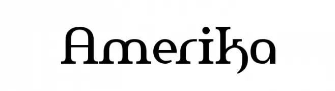
( Fonts by Apostrophic Lab )
A modern serif font with balanced proportions and distinct serifs.
 Herunterladen 3717 Downloads@WebFont
 -
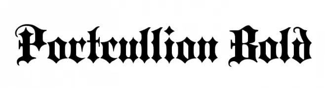
( Fonts by Paul Lloyd )
A bold blackletter font with intricate, ornate letterforms and a historical aesthetic.
![Portcullion Bold Frei Schriftart Herunterladen]() Herunterladen 3717 Downloads@WebFont
Herunterladen 3717 Downloads@WebFont -
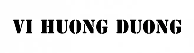
![VI Huong Duong Frei Schriftart Herunterladen]() Herunterladen 3716 Downloads@WebFont
Herunterladen 3716 Downloads@WebFont -
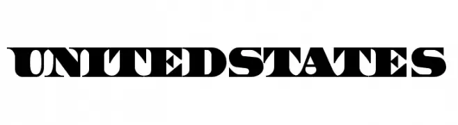
( Fonts by Typearound )
A bold, stencil-like font with an industrial, impactful design.
![UnitedStates Frei Schriftart Herunterladen]() Herunterladen 3716 Downloads@WebFont
Herunterladen 3716 Downloads@WebFont -
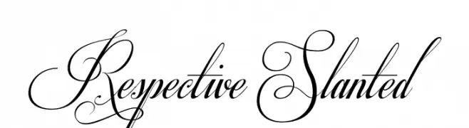
( Fonts by Mans Greback - www.mawns.com )
An elegant script font with ornate swirls and flourishes, exuding luxury and sophistication.
![Respective Slanted Frei Schriftart Herunterladen]() Herunterladen 3715 Downloads@WebFont
Herunterladen 3715 Downloads@WebFont -
-
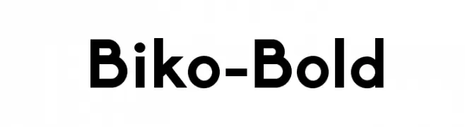
( Fonts by Marco Ugolini - www.jesuismonreve.org )
A bold, modern sans-serif font with clean lines and geometric structure.
![Biko-Bold Frei Schriftart Herunterladen]() Herunterladen 3714 Downloads@WebFont
Herunterladen 3714 Downloads@WebFont -
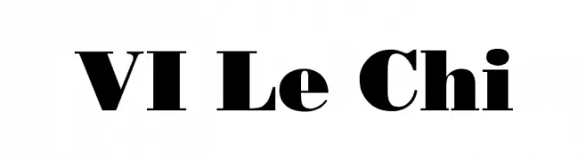
![VI Le Chi Frei Schriftart Herunterladen]() Herunterladen 3713 Downloads@WebFont
Herunterladen 3713 Downloads@WebFont -
![GurmukhiIIGS Frei Schriftart Herunterladen]() Herunterladen 3713 Downloads@WebFont
Herunterladen 3713 Downloads@WebFont -
( Noto is a trademark of Google Inc. Noto fonts are open source. All Noto fonts are published under the SIL Open Font License, Version 1.1 )
A clean, modern sans-serif font designed for clarity and legibility.
![Noto Sans Gurmukhi Frei Schriftart Herunterladen]() Herunterladen 3712 Downloads@WebFont
Herunterladen 3712 Downloads@WebFont -
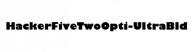
( Fonts by Castcraft Software - opti.netii.net - check the website before use )
A bold, geometric font with high contrast and strong visual impact.
![HackerFiveTwoOpti-UltraBld Frei Schriftart Herunterladen]() Herunterladen 3712 Downloads@WebFont
Herunterladen 3712 Downloads@WebFont -
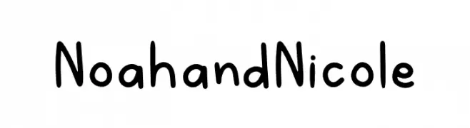
( Fonts by Dominique Demetz - ddemetz.com - Personal-use only. For commercial use please contact owner. )
A playful, handwritten font with rounded edges and a casual style.
![NoahandNicole Frei Schriftart Herunterladen]() Herunterladen 3711 Downloads@WebFont
Herunterladen 3711 Downloads@WebFont -
( dharmas - Jamaludin Ahmad - creativemarket.com/dharmas?u=dharmas )
A flowing, cursive font with elegant, interconnected strokes.
![Serenity-Bold Frei Schriftart Herunterladen]() Herunterladen 3711 Downloads@WebFont
Herunterladen 3711 Downloads@WebFont -
![Dev Gothic Frei Schriftart Herunterladen]() Herunterladen 3711 Downloads@WebFont
Herunterladen 3711 Downloads@WebFont -
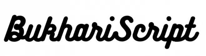
![BukhariScript Frei Schriftart Herunterladen]() Herunterladen 3710 Downloads@WebFont
Herunterladen 3710 Downloads@WebFont -
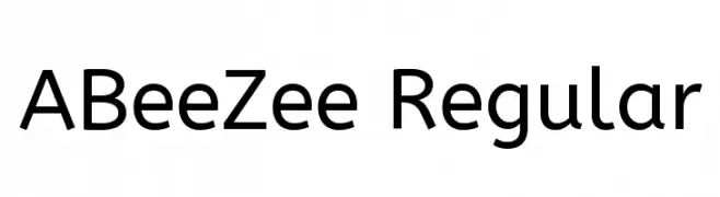
( Copyright (c) 2011 by Anja Meiners, with Reserved Font Name 'ABeeZee' )
A clean, modern sans-serif font with balanced proportions and excellent readability.
![ABeeZee Regular Frei Schriftart Herunterladen]() Herunterladen 3709 Downloads@WebFont
Herunterladen 3709 Downloads@WebFont -
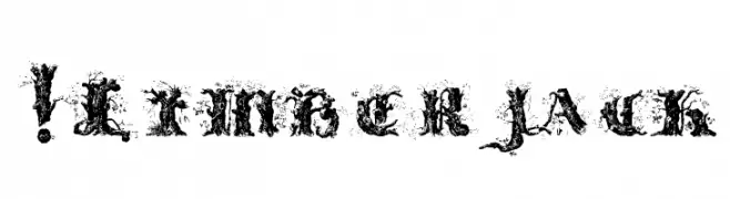
( Fonts by www.exclamachine.com )
A decorative, grunge-style font with a distressed, textured appearance.
![!Limberjack Frei Schriftart Herunterladen]() Herunterladen 3708 Downloads@WebFont
Herunterladen 3708 Downloads@WebFont -
( Fonts by Huerta Tipografia - Personal-use only. For commercial use please contact owner. )
A classic serif font with modern elegance and readability.
![Caladea Frei Schriftart Herunterladen]() Herunterladen 3707 Downloads@WebFont
Herunterladen 3707 Downloads@WebFont -
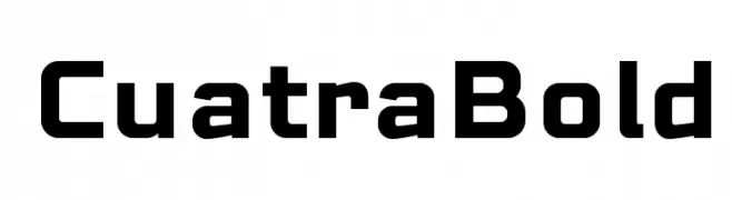
( deFharo - Fernando Haro - defharo.com )
A bold, geometric font with a modern and assertive style.
![CuatraBold Frei Schriftart Herunterladen]() Herunterladen 3705 Downloads@WebFont
Herunterladen 3705 Downloads@WebFont -
( Fonts by Dibujado )
A casual, handwritten font with a playful and dynamic style.
![Blunt Frei Schriftart Herunterladen]() Herunterladen 3704 Downloads@WebFont
Herunterladen 3704 Downloads@WebFont -
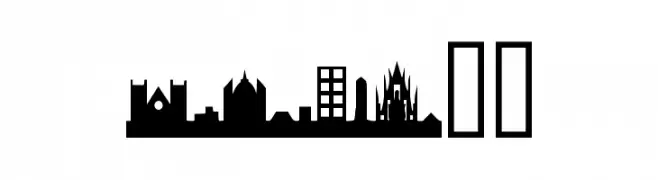
( Fonts by The Scriptorium - Dave Nalle )
City skyline silhouettes form each character in a bold, decorative style.
![Cityscape!]() Herunterladen 3703 Downloads@WebFont
Herunterladen 3703 Downloads@WebFont -
( Fonts by Vernon Adams )
A modern, rounded sans-serif font with a friendly and approachable style.
![Nunito Medium Frei Schriftart Herunterladen]() Herunterladen 3702 Downloads@WebFont
Herunterladen 3702 Downloads@WebFont -
![14 LED Frei Schriftart Herunterladen]() Herunterladen 3702 Downloads@WebFont
Herunterladen 3702 Downloads@WebFont -
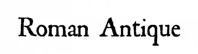
( Fonts by Dieter Steffmann )
A classic, bold serif font with a hand-carved, historical appearance.
![Roman Antique Frei Schriftart Herunterladen]() Herunterladen 3702 Downloads@WebFont
Herunterladen 3702 Downloads@WebFont -
![Hieroglyphic Frei Schriftart Herunterladen]() Herunterladen 3702 Downloads@WebFont
Herunterladen 3702 Downloads@WebFont -
( Copyright (c) 2014, Indian Type Foundry (info@indiantypefoundry.com). )
A bold, elegant serif font with high contrast and classic-modern appeal.
![Rozha One Frei Schriftart Herunterladen]() Herunterladen 3701 Downloads@WebFont
Herunterladen 3701 Downloads@WebFont -
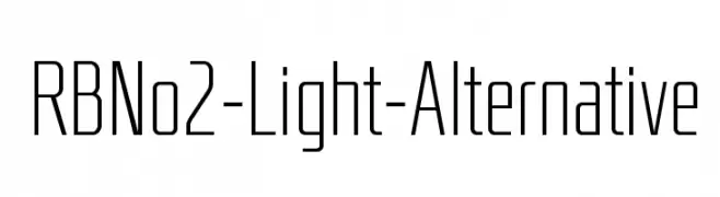
( Fonts by www.Fontfabric.com )
A modern, geometric font with tall, narrow characters and consistent stroke width.
![RBNo2-Light-Alternative Frei Schriftart Herunterladen]() Herunterladen 3701 Downloads@WebFont
Herunterladen 3701 Downloads@WebFont -
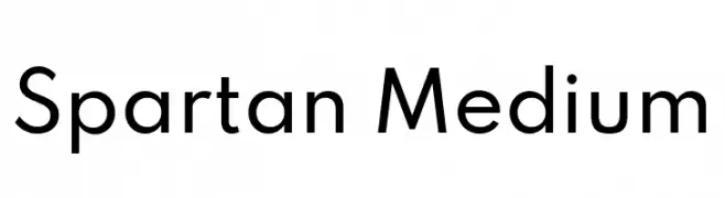
( Copyright 2020 The Spartan Project Authors (https://github.com/bghryct/Spartan-MB) )
A modern, geometric sans-serif typeface with clean lines and balanced proportions.
![Spartan Medium Frei Schriftart Herunterladen]() Herunterladen 3700 Downloads@WebFont
Herunterladen 3700 Downloads@WebFont -
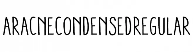
( Fonts by exe.vis.ne.jp )
A hand-drawn, condensed font with a playful and informal style.
![AracneCondensedRegular Frei Schriftart Herunterladen]() Herunterladen 3699 Downloads@WebFont
Herunterladen 3699 Downloads@WebFont -
( Fonts by Andrew McCluskey - nalgames.com. Personal-use only. For commercial use please contact owner. )
A bold, modern font with clean lines and geometric structure.
![Noasarck Frei Schriftart Herunterladen]() Herunterladen 3697 Downloads@WebFont
Herunterladen 3697 Downloads@WebFont -
![New gothic Frei Schriftart Herunterladen]() Herunterladen 3696 Downloads@WebFont
Herunterladen 3696 Downloads@WebFont -
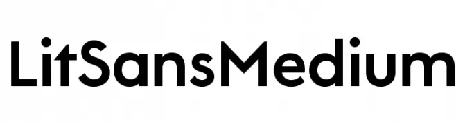
( Fonts by Lit Design Studio - Personal-use only. For commercial use please contact owner. )
A modern, medium-weight sans-serif font with clean lines and balanced proportions.
![LitSans Medium Frei Schriftart Herunterladen]() Herunterladen 3695 Downloads@WebFont
Herunterladen 3695 Downloads@WebFont -
( Fonts by Zetafonts - Personal-use only. For commercial use please contact owner. )
A bold, modern font with thick, uniform strokes and tight spacing.
![Heading Now Trial 57 Extrabold Frei Schriftart Herunterladen]() Herunterladen 3692 Downloads@WebFont
Herunterladen 3692 Downloads@WebFont -
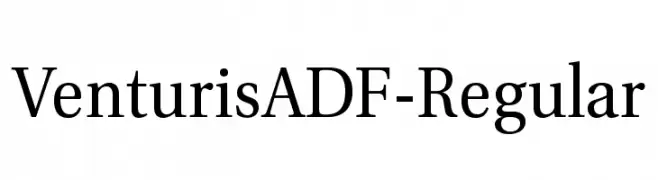
( Fonts by Arkandis Digital Foundry )
A classic serif font with elegant, balanced letterforms and pronounced serifs.
![VenturisADF-Regular Frei Schriftart Herunterladen]() Herunterladen 3690 Downloads@WebFont
Herunterladen 3690 Downloads@WebFont -
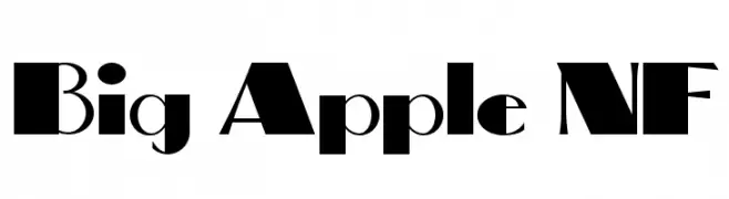
( Fonts by Nick Curtis - www.nicksfonts.com )
A bold, geometric font with high contrast and striking visual impact.
![Big Apple NF Frei Schriftart Herunterladen]() Herunterladen 3690 Downloads@WebFont
Herunterladen 3690 Downloads@WebFont -
![NFL Varsity Block A Frei Schriftart Herunterladen]() Herunterladen 3689 Downloads@WebFont
Herunterladen 3689 Downloads@WebFont


Welche Schriften sind gerade am populärsten?
Poppins, Roboto, Montserrat, Open Sans und Lato sind wegen ihrer klaren Formen und breiten Einsetzbarkeit sehr gefragt – von Markenauftritt über Landingpages bis hin zu Postern.
Welche Fonts eignen sich für Logos?
Geometrische Sans‑Serifs (z. B. Poppins, Familien im Gotham‑Stil) sind ein häufiger Griff für sauberes, skalierbares Branding. Für eine persönlichere Note bleiben Scripts und Handschrift‑Stile beliebt. Kombinieren Sie einen prägnanten Headline‑Font mit einer neutralen Brotschrift für Wiedererkennung und Harmonie.
Wie oft wird die Top‑Liste aktualisiert?
Regelmäßig – basierend auf realen Downloads und Interaktionen. Schauen Sie öfter vorbei, um aufstrebende Favoriten früh zu entdecken.
💡 Tipp: Seite bookmarken – Trends wechseln schnell, und heutige Top‑Schriften inspirieren morgen vielleicht das Rebranding.