Willkommen bei den Top‑Schriften – hier treffen Beliebtheit und Qualität aufeinander. Das sind die in diesem Jahr am häufigsten heruntergeladenen und genutzten Fonts. Wenn Sie sichere Optionen für Logo, Web oder Social suchen, starten Sie hier.
Jeder Top‑Font überzeugt durch Balance, Lesbarkeit und Vielseitigkeit. Sie finden moderne Sans‑Serifs, elegante Scripts, Vintage‑Serifs und minimalistische Displays.
-
 Herunterladen 274 Downloads@WebFont
 -
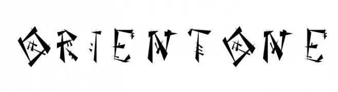
![OrientOne Frei Schriftart Herunterladen]() Herunterladen 274 Downloads@WebFont
Herunterladen 274 Downloads@WebFont -
( Fonts by www.DigitalDreamDesign.net )
A bold, geometric font with a futuristic and industrial design.
![D3 Superstructurism Kat_Out Frei Schriftart Herunterladen]() Herunterladen 274 Downloads@WebFont
Herunterladen 274 Downloads@WebFont -
Schriftart von fontdationstudio. For commercial use please contact the owner.
( Thank you for downloading this font This font is free for PERSONAL USE ONLY! Commercial license for this font can be purchased at: http://bit.ly/2wTYCXy )
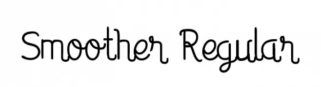
A playful, handwritten-style font with smooth, flowing lines and rounded edges.
![Smoother Regular Frei Schriftart Herunterladen]() Herunterladen 274 Downloads@WebFont
Herunterladen 274 Downloads@WebFont -
![SF Pale Bottom Frei Schriftart Herunterladen]() Herunterladen 274 Downloads@WebFont
Herunterladen 274 Downloads@WebFont -
-
( Fonts by fsuarez913 )
Playful, bold, and bubbly font.
![Super Joyful Frei Schriftart Herunterladen]() Herunterladen 274 Downloads@WebFont
Herunterladen 274 Downloads@WebFont -
( Fonts by Pawel Burgiel - Personal-use only. For commercial use please contact owner. )
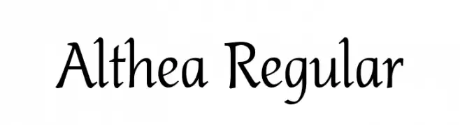
A classic serif font with elegant curves and a calligraphic touch.
![Althea Regular Frei Schriftart Herunterladen]() Herunterladen 274 Downloads@WebFont
Herunterladen 274 Downloads@WebFont -
( Fonts by Omnibus Type )
A bold, condensed, and italic font with a modern and dynamic style.
![Saira Condensed ExtraBold Italic Frei Schriftart Herunterladen]() Herunterladen 274 Downloads@WebFont
Herunterladen 274 Downloads@WebFont -
( Fonts by Greg Medina - www.dcoxy.com - Personal-use only. For commercial use please contact owner. )
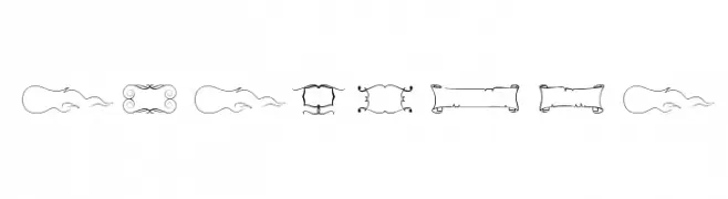
Ornamental dingbat font with decorative frames and flourishes.
![Elegance Frei Schriftart Herunterladen]() Herunterladen 274 Downloads@WebFont
Herunterladen 274 Downloads@WebFont -
( Free for personal use - new.myfonts.com/foundry/Intellecta_Design/?refby=paulow )
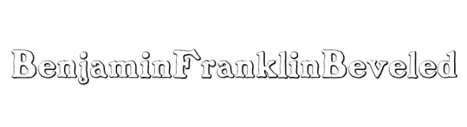
A classic serif font with a unique beveled, three-dimensional style.
![BenjaminFranklinBeveled Frei Schriftart Herunterladen]() Herunterladen 274 Downloads@WebFont
Herunterladen 274 Downloads@WebFont -
( Fonts by Kong Font - https://fontkong.com/ - Personal-use only. For commercial use please contact owner. )
A refined and elegant script font with flowing, cursive letters.
![Carrie Gallerie Frei Schriftart Herunterladen]() Herunterladen 274 Downloads@WebFont
Herunterladen 274 Downloads@WebFont -
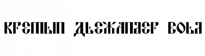
![Kremlin Alexander Bold Frei Schriftart Herunterladen]() Herunterladen 274 Downloads@WebFont
Herunterladen 274 Downloads@WebFont -
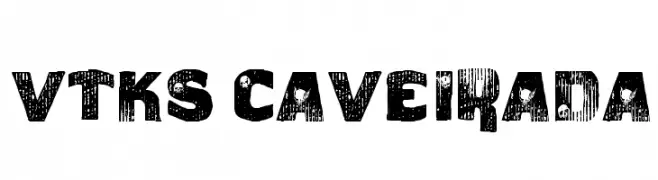
( Fonts by Douglas Vitkauskas - www.vtksdesign.com. Personal-use only. For commercial use please contact owner. )
A bold, distressed font with a textured, grunge aesthetic.
![vtks caveirada Frei Schriftart Herunterladen]() Herunterladen 274 Downloads@WebFont
Herunterladen 274 Downloads@WebFont -
( Fonts by Manfred Klein - manfred-klein.ina-mar.com )
A bold, playful font with dynamic, hand-drawn style letterforms.
![JonasSplint-Normal Frei Schriftart Herunterladen]() Herunterladen 274 Downloads@WebFont
Herunterladen 274 Downloads@WebFont -
( Fonts by Tan Cundrawan - cove703 - creativemarket.com/cove703 - Personal-use only. For commercial use please contact owner. )
A playful, handwritten script font with interconnected letters and moderate stroke thickness.
![Hot Restaurant Frei Schriftart Herunterladen]() Herunterladen 274 Downloads@WebFont
Herunterladen 274 Downloads@WebFont -
( dondon nillo - Dondon Nillo - www.creativefabrica.com/designer/dondon_nillo/ )
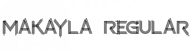
A decorative, multi-line font with a geometric and modern style.
![makayla Regular Frei Schriftart Herunterladen]() Herunterladen 274 Downloads@WebFont
Herunterladen 274 Downloads@WebFont -
( Fonts by Miss Tiina at www.misstiina.com (please check the website before use) )
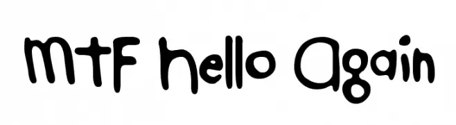
A playful, hand-drawn font with bold, rounded characters.
![MTF Hello Again Frei Schriftart Herunterladen]() Herunterladen 274 Downloads@WebFont
Herunterladen 274 Downloads@WebFont -
![The Drips Frei Schriftart Herunterladen]() Herunterladen 274 Downloads@WebFont
Herunterladen 274 Downloads@WebFont -
( Fonts by Woodcutter )
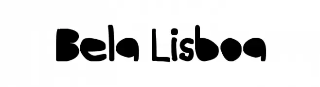
A playful, hand-drawn font with bold, rounded characters.
![Bela Lisboa Frei Schriftart Herunterladen]() Herunterladen 274 Downloads@WebFont
Herunterladen 274 Downloads@WebFont -
![Rampant Frei Schriftart Herunterladen]() Herunterladen 274 Downloads@WebFont
Herunterladen 274 Downloads@WebFont -
( Fonts by junkohanhero )
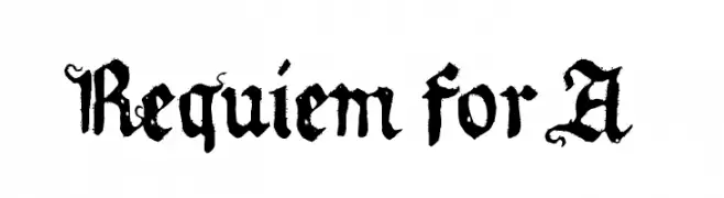
A bold, ornate Blackletter font with a Gothic, medieval style.
![Requiem for A Frei Schriftart Herunterladen]() Herunterladen 274 Downloads@WebFont
Herunterladen 274 Downloads@WebFont -
( www.foodonthewall.com )
A playful, hand-drawn font with a whimsical and casual style.
![CupcakeFont Frei Schriftart Herunterladen]() Herunterladen 274 Downloads@WebFont
Herunterladen 274 Downloads@WebFont -
( Font by Jonathan Harris - www.tattoowoo.com )
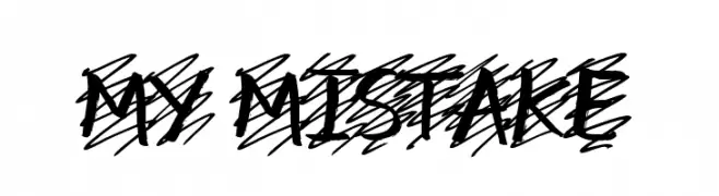
A bold, dynamic script font with a hand-drawn, energetic style.
![my mistake Frei Schriftart Herunterladen]() Herunterladen 274 Downloads@WebFont
Herunterladen 274 Downloads@WebFont -
( Fonts by Bumbayo Font Fabrik )
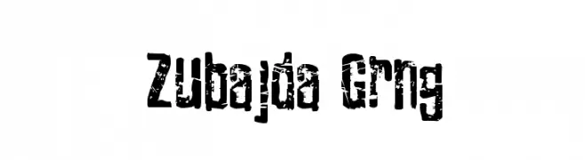
A bold, distressed font with a rugged, grunge appearance.
![Zubajda Grng Frei Schriftart Herunterladen]() Herunterladen 274 Downloads@WebFont
Herunterladen 274 Downloads@WebFont -
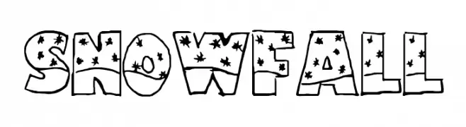
![Snowfall Frei Schriftart Herunterladen]() Herunterladen 274 Downloads@WebFont
Herunterladen 274 Downloads@WebFont -
( Free for a personal use. For a commercial use please visit www.kevinandamanda.com )
A bold, expressive handwritten font with dynamic strokes and artistic flair.
![Pea Thinksilver Frei Schriftart Herunterladen]() Herunterladen 274 Downloads@WebFont
Herunterladen 274 Downloads@WebFont -
( Fonts by Levi Szekeres - www.loremipsum.ro. Personal-use only. For commercial use please contact owner. )
A bold, geometric font with a pixelated, digital aesthetic.
![pxlxxlcond Frei Schriftart Herunterladen]() Herunterladen 274 Downloads@WebFont
Herunterladen 274 Downloads@WebFont -
( Fonts by Aksoro 99 - Wahyu Nugroho - Personal-use only. For commercial use please contact owner. )
A bold, cursive font with a flowing, handwritten style.
![Cardives Frei Schriftart Herunterladen]() Herunterladen 274 Downloads@WebFont
Herunterladen 274 Downloads@WebFont -
( Pizzadude - Jakob Fischer - www.pizzadude.dk/ )
A bold, brush-stroke style font with a hand-painted, artistic feel.
![Madpakke DEMO Regular Frei Schriftart Herunterladen]() Herunterladen 274 Downloads@WebFont
Herunterladen 274 Downloads@WebFont -
( Fonts by Iconian Fonts )
A bold, italic font with a playful and dynamic style.
![98 Bottles of Beer Bold Italic Frei Schriftart Herunterladen]() Herunterladen 274 Downloads@WebFont
Herunterladen 274 Downloads@WebFont -
![SF Speakeasy Oblique Frei Schriftart Herunterladen]() Herunterladen 274 Downloads@WebFont
Herunterladen 274 Downloads@WebFont -
( Fonts by www.smeltery.net )
A modern oblique font with a sleek, dynamic style.
![ALusine Oblique Frei Schriftart Herunterladen]() Herunterladen 274 Downloads@WebFont
Herunterladen 274 Downloads@WebFont -
( Iconian Fonts - Daniel Zadorozny - www.iconian.com )
A bold, geometric font with a strong, modern aesthetic.
![Americorps Straight Frei Schriftart Herunterladen]() Herunterladen 274 Downloads@WebFont
Herunterladen 274 Downloads@WebFont -
![full font Regular Frei Schriftart Herunterladen]() Herunterladen 274 Downloads@WebFont
Herunterladen 274 Downloads@WebFont -
( Fonts by Monotype Design Team - Personal-use only. For commercial use please contact owner. )
A modern, condensed sans-serif font with an extra light weight and minimal contrast.
![Avrile Sans Condensed ExtraLight Frei Schriftart Herunterladen]() Herunterladen 274 Downloads@WebFont
Herunterladen 274 Downloads@WebFont


Welche Schriften sind gerade am populärsten?
Poppins, Roboto, Montserrat, Open Sans und Lato sind wegen ihrer klaren Formen und breiten Einsetzbarkeit sehr gefragt – von Markenauftritt über Landingpages bis hin zu Postern.
Welche Fonts eignen sich für Logos?
Geometrische Sans‑Serifs (z. B. Poppins, Familien im Gotham‑Stil) sind ein häufiger Griff für sauberes, skalierbares Branding. Für eine persönlichere Note bleiben Scripts und Handschrift‑Stile beliebt. Kombinieren Sie einen prägnanten Headline‑Font mit einer neutralen Brotschrift für Wiedererkennung und Harmonie.
Wie oft wird die Top‑Liste aktualisiert?
Regelmäßig – basierend auf realen Downloads und Interaktionen. Schauen Sie öfter vorbei, um aufstrebende Favoriten früh zu entdecken.
💡 Tipp: Seite bookmarken – Trends wechseln schnell, und heutige Top‑Schriften inspirieren morgen vielleicht das Rebranding.