Willkommen bei den Top‑Schriften – hier treffen Beliebtheit und Qualität aufeinander. Das sind die in diesem Jahr am häufigsten heruntergeladenen und genutzten Fonts. Wenn Sie sichere Optionen für Logo, Web oder Social suchen, starten Sie hier.
Jeder Top‑Font überzeugt durch Balance, Lesbarkeit und Vielseitigkeit. Sie finden moderne Sans‑Serifs, elegante Scripts, Vintage‑Serifs und minimalistische Displays.
-
 Herunterladen 271 Downloads@WebFont
 -
( Fonts by Apostrophic Lab )
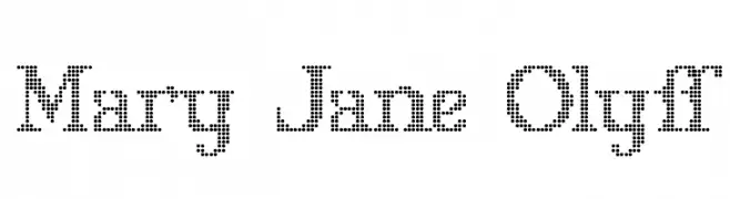
A dotted, pixelated font with a modern and playful aesthetic.
![Mary Jane Olyff Frei Schriftart Herunterladen]() Herunterladen 271 Downloads@WebFont
Herunterladen 271 Downloads@WebFont -
( Fonts by Adobe )
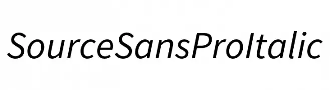
A modern, italic sans-serif font with clean lines and balanced proportions.
![Source Sans Pro Italic Frei Schriftart Herunterladen]() Herunterladen 271 Downloads@WebFont
Herunterladen 271 Downloads@WebFont -
( Fonts by billyargel.blogspot.com - Billy Argel )
A bold, dotted font with a vintage, textured style.
![DOTLED Frei Schriftart Herunterladen]() Herunterladen 271 Downloads@WebFont
Herunterladen 271 Downloads@WebFont -
( Fonts by Apostrophic Lab )
A casual, handwritten-style font with rounded, playful characters.
![Street Freehand - Rev Frei Schriftart Herunterladen]() Herunterladen 271 Downloads@WebFont
Herunterladen 271 Downloads@WebFont -
-
( Fonts by wepfont - Wahyu Eka Prasetya - Personal-use only. For commercial use please contact owner. )
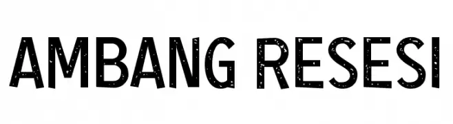
A bold, modern sans-serif font with a distressed texture.
![Ambang Resesi Frei Schriftart Herunterladen]() Herunterladen 271 Downloads@WebFont
Herunterladen 271 Downloads@WebFont -
( www.leodsen.com )
A bold, distressed font with rugged, uneven edges and a dynamic style.
![HeavyBomb Frei Schriftart Herunterladen]() Herunterladen 271 Downloads@WebFont
Herunterladen 271 Downloads@WebFont -
( Fonts by Billy Argel Fonts - www.billyargel.com - Personal-use only. For commercial use please contact owner. )
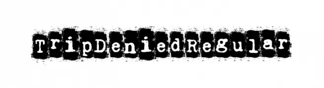
A bold, distressed font with a grunge, stamp-like appearance.
![Trip Denied Regular Frei Schriftart Herunterladen]() Herunterladen 271 Downloads@WebFont
Herunterladen 271 Downloads@WebFont -
( Fonts by Letterday Studio )
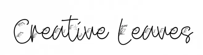
A whimsical handwritten font with leaf motifs integrated into each character.
![Creative Leaves Frei Schriftart Herunterladen]() Herunterladen 271 Downloads@WebFont
Herunterladen 271 Downloads@WebFont -
( Büro Sequenz - sequenz.net )
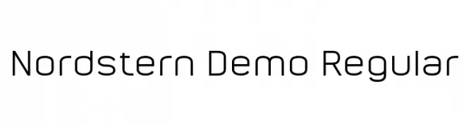
A modern, geometric sans-serif font with clean lines and balanced proportions.
![Nordstern Demo Regular Frei Schriftart Herunterladen]() Herunterladen 271 Downloads@WebFont
Herunterladen 271 Downloads@WebFont -
( Fonts by twinletter )
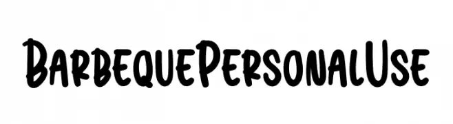
A bold, playful font with a hand-drawn, marker-like style.
![Barbeque Personal Use Frei Schriftart Herunterladen]() Herunterladen 271 Downloads@WebFont
Herunterladen 271 Downloads@WebFont -
Schriftart von fontdationstudio. For commercial use please contact the owner.
( Thank you for downloading this font This font is free for PERSONAL USE ONLY! Commercial license for this font can be purchased at: http://bit.ly/2wjqpgh )
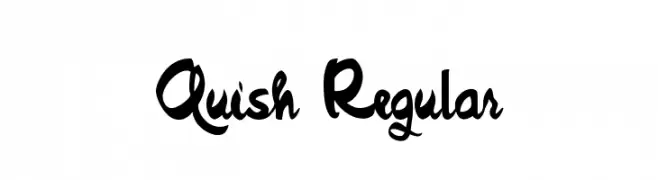
A bold, expressive handwritten font with a cursive style.
![Quish Regular Frei Schriftart Herunterladen]() Herunterladen 271 Downloads@WebFont
Herunterladen 271 Downloads@WebFont -
( Fonts by CannotIntoSpaceFonts - KineticPlasma Fonts - Personal-use only. For commercial use please contact owner. )
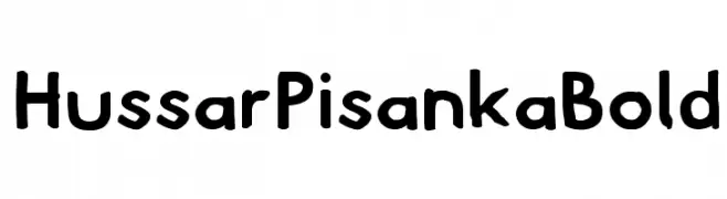
A bold, playful font with a hand-drawn, whimsical style.
![Hussar Pisanka Bold Frei Schriftart Herunterladen]() Herunterladen 271 Downloads@WebFont
Herunterladen 271 Downloads@WebFont -
( Fonts by newecreator - Personal-use only. For commercial use please contact owner. )
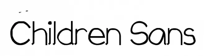
A playful, modern sans-serif font with rounded edges and balanced spacing.
![Children Sans Frei Schriftart Herunterladen]() Herunterladen 271 Downloads@WebFont
Herunterladen 271 Downloads@WebFont -
( Fonts by Typetemp Studio - Personal-use only. For commercial use please contact owner. )
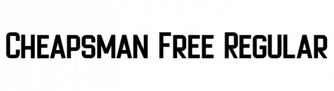
A bold, geometric font with a modern and impactful style.
![Cheapsman Free Regular Frei Schriftart Herunterladen]() Herunterladen 271 Downloads@WebFont
Herunterladen 271 Downloads@WebFont -
Schriftart von danny91194. For commercial use please contact the owner.
( off of )
A playful and eclectic font with varied character styles and unique forms.
![Bits Frei Schriftart Herunterladen]() Herunterladen 271 Downloads@WebFont
Herunterladen 271 Downloads@WebFont -
( Fonts by t )
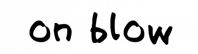
A bold, playful handwritten font with dynamic strokes.
![on blow Frei Schriftart Herunterladen]() Herunterladen 271 Downloads@WebFont
Herunterladen 271 Downloads@WebFont -
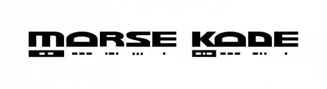
![Morse Kode Frei Schriftart Herunterladen]() Herunterladen 271 Downloads
Herunterladen 271 Downloads -
( Fonts by www.peter-wiegel.de. Personal-use only. For commercial use please contact owner. )
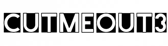
Bold, geometric font with high contrast and enclosed characters.
![CutMeOut3 Frei Schriftart Herunterladen]() Herunterladen 271 Downloads@WebFont
Herunterladen 271 Downloads@WebFont -
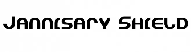
![Jannisary Shield Frei Schriftart Herunterladen]() Herunterladen 271 Downloads@WebFont
Herunterladen 271 Downloads@WebFont -
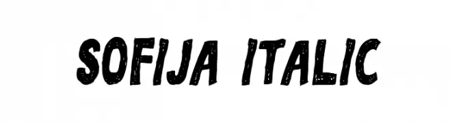
( Vladimir Nikolic - www.coroflot.com/vladimirnikolic )
A bold, textured, hand-drawn font with a playful and dynamic style.
![Sofija Italic Frei Schriftart Herunterladen]() Herunterladen 271 Downloads@WebFont
Herunterladen 271 Downloads@WebFont -
( Fonts by Indra Gunawan )
A bold, decorative font with a unique patterned texture.
![ALPHABETH Frei Schriftart Herunterladen]() Herunterladen 271 Downloads@WebFont
Herunterladen 271 Downloads@WebFont -
( Fonts by a Neale Davidson - www.pixelsagas.com. Personal-use only. For commercial use please contact owner. )
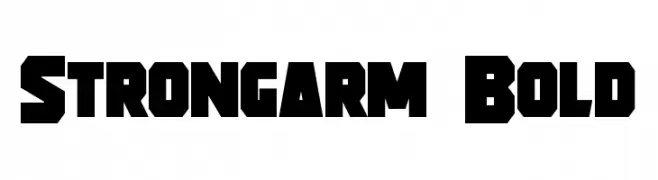
A bold, geometric font with a strong, industrial aesthetic.
![Strongarm Bold Frei Schriftart Herunterladen]() Herunterladen 271 Downloads@WebFont
Herunterladen 271 Downloads@WebFont -
( Fonts by Steve Cloutier - www.cloutierfontes.ca )
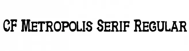
A bold serif font with strong strokes and a classic, vintage appeal.
![CF Metropolis Serif Regular Frei Schriftart Herunterladen]() Herunterladen 271 Downloads@WebFont
Herunterladen 271 Downloads@WebFont -
( new.myfonts.com/foundry/Intellecta_Design/?refby=paulow )
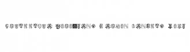
An ornate and decorative font with intricate, vintage-inspired letterforms.
![Intellecta Monograms Random Samples Four Frei Schriftart Herunterladen]() Herunterladen 271 Downloads@WebFont
Herunterladen 271 Downloads@WebFont -
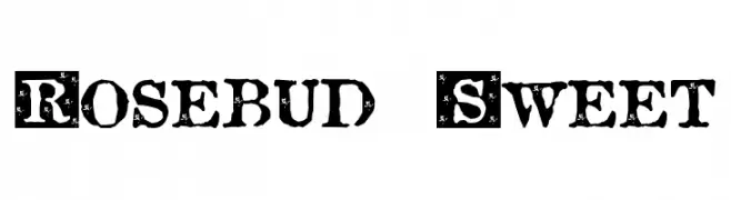
![Rosebud Sweet Frei Schriftart Herunterladen]() Herunterladen 271 Downloads@WebFont
Herunterladen 271 Downloads@WebFont -
( Fonts by Tan Cundrawan - cove703 - creativemarket.com/cove703 - Personal-use only. For commercial use please contact owner. )
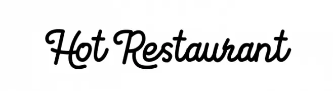
A playful, handwritten script font with interconnected letters and moderate stroke thickness.
![Hot Restaurant Frei Schriftart Herunterladen]() Herunterladen 271 Downloads@WebFont
Herunterladen 271 Downloads@WebFont -
( Fonts by Andrew Hart - dirt2.com )
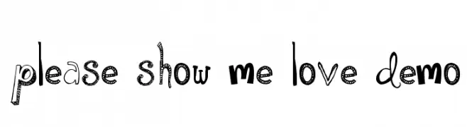
A playful and eclectic font with varied styles and textures.
![Please Show Me Love DEMO Frei Schriftart Herunterladen]() Herunterladen 271 Downloads@WebFont
Herunterladen 271 Downloads@WebFont -
( Fonts by Maelle.K - Thomas Boucherie )
A playful, handwritten font with smooth, flowing lines and a casual style.
![The Chicken love Story Frei Schriftart Herunterladen]() Herunterladen 271 Downloads@WebFont
Herunterladen 271 Downloads@WebFont -
( Fonts by Typographer Mediengestaltung - Personal-use only. For commercial use please contact owner. )
A bold, angular Blackletter-inspired font with a modern contour effect.
![Tannenberg Contour Frei Schriftart Herunterladen]() Herunterladen 271 Downloads@WebFont
Herunterladen 271 Downloads@WebFont -
( Fonts by Nick Curtis - www.nicksfonts.com )
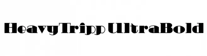
A bold, high-contrast font with a modern and dramatic style.
![HeavyTripp UltraBold Frei Schriftart Herunterladen]() Herunterladen 271 Downloads@WebFont
Herunterladen 271 Downloads@WebFont -
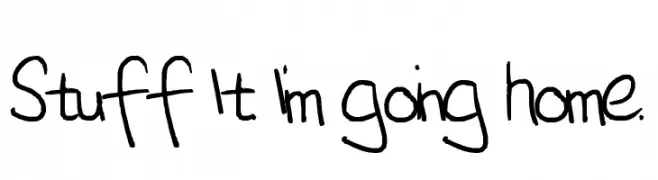
![Stuff It. I'm going home. Frei Schriftart Herunterladen]() Herunterladen 271 Downloads@WebFont
Herunterladen 271 Downloads@WebFont -
( Fonts by Bumbayo Font Fabrik )
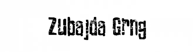
A bold, distressed font with a rugged, grunge appearance.
![Zubajda Grng Frei Schriftart Herunterladen]() Herunterladen 271 Downloads@WebFont
Herunterladen 271 Downloads@WebFont -
( Fonts by a Andrew Hart Dirt2.com - SickCapital. Personal-use only. For commercial use please contact owner. )
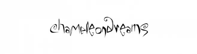
A whimsical, artistic font with playful, exaggerated letterforms and a hand-drawn quality.
![ChaMeLEonDrEamS Frei Schriftart Herunterladen]() Herunterladen 271 Downloads@WebFont
Herunterladen 271 Downloads@WebFont -
( Fonts by Apostrophic Lab )
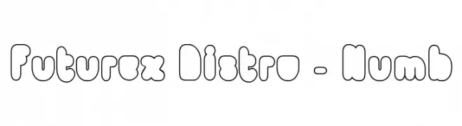
A playful, bubble-like font with rounded, bold characters.
![Futurex Distro - Numb Frei Schriftart Herunterladen]() Herunterladen 271 Downloads@WebFont
Herunterladen 271 Downloads@WebFont


Welche Schriften sind gerade am populärsten?
Poppins, Roboto, Montserrat, Open Sans und Lato sind wegen ihrer klaren Formen und breiten Einsetzbarkeit sehr gefragt – von Markenauftritt über Landingpages bis hin zu Postern.
Welche Fonts eignen sich für Logos?
Geometrische Sans‑Serifs (z. B. Poppins, Familien im Gotham‑Stil) sind ein häufiger Griff für sauberes, skalierbares Branding. Für eine persönlichere Note bleiben Scripts und Handschrift‑Stile beliebt. Kombinieren Sie einen prägnanten Headline‑Font mit einer neutralen Brotschrift für Wiedererkennung und Harmonie.
Wie oft wird die Top‑Liste aktualisiert?
Regelmäßig – basierend auf realen Downloads und Interaktionen. Schauen Sie öfter vorbei, um aufstrebende Favoriten früh zu entdecken.
💡 Tipp: Seite bookmarken – Trends wechseln schnell, und heutige Top‑Schriften inspirieren morgen vielleicht das Rebranding.