Willkommen bei den Top‑Schriften – hier treffen Beliebtheit und Qualität aufeinander. Das sind die in diesem Jahr am häufigsten heruntergeladenen und genutzten Fonts. Wenn Sie sichere Optionen für Logo, Web oder Social suchen, starten Sie hier.
Jeder Top‑Font überzeugt durch Balance, Lesbarkeit und Vielseitigkeit. Sie finden moderne Sans‑Serifs, elegante Scripts, Vintage‑Serifs und minimalistische Displays.
-
 Herunterladen 268 Downloads@WebFont
 -
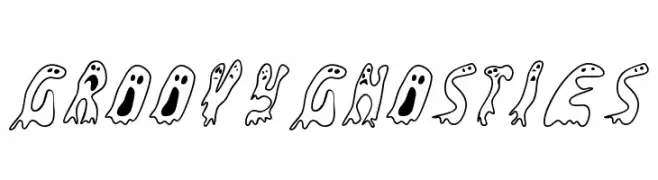
![GroovyGhosties Frei Schriftart Herunterladen]() Herunterladen 268 Downloads@WebFont
Herunterladen 268 Downloads@WebFont -
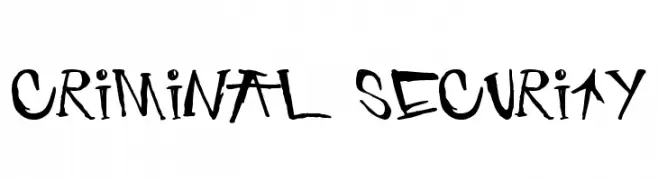
![criminal security Frei Schriftart Herunterladen]() Herunterladen 268 Downloads@WebFont
Herunterladen 268 Downloads@WebFont -
( www.foodonthewall.com )
A playful, hand-drawn font with a whimsical and casual style.
![CupcakeFont Frei Schriftart Herunterladen]() Herunterladen 268 Downloads@WebFont
Herunterladen 268 Downloads@WebFont -
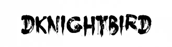
( Hanoded - David Kerkhoff - www.hanodedfonts.com )
A bold, distressed font with a gritty, hand-painted style.
![DK Nightbird Frei Schriftart Herunterladen]() Herunterladen 268 Downloads@WebFont
Herunterladen 268 Downloads@WebFont -
-
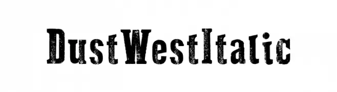
( Fonts by Galdino Otten Fonts - www.galdinootten.com - Personal-use only. For commercial use please contact owner. )
A bold, distressed slab serif font with a vintage Western feel.
![Dust West Italic Frei Schriftart Herunterladen]() Herunterladen 268 Downloads@WebFont
Herunterladen 268 Downloads@WebFont -
( Fonts by fredcre.free.fr - Personal-use only. For commercial use please contact owner. )
A bold, geometric font with angular, blocky shapes.
![CUTTY_CRE Frei Schriftart Herunterladen]() Herunterladen 268 Downloads@WebFont
Herunterladen 268 Downloads@WebFont -
( Fonts by Fausto Furioso )
A bold, hand-drawn font with dynamic, brush-like strokes.
![Fvriosa Frei Schriftart Herunterladen]() Herunterladen 268 Downloads@WebFont
Herunterladen 268 Downloads@WebFont -
( Nght's Place - www.crosswinds.net/~nghtmvs/font/fonts1.html )
A circuit-inspired font with intricate, tech-themed detailing.
![101! Circuit Board Frei Schriftart Herunterladen]() Herunterladen 268 Downloads@WebFont
Herunterladen 268 Downloads@WebFont -
![Sunantara Frei Schriftart Herunterladen]() Herunterladen 268 Downloads@WebFont
Herunterladen 268 Downloads@WebFont -
( Fonts by Rajesh Rajput - gumroad.com/rajputrajesh_448 - Personal-use only. For commercial use please contact owner. )
A tall, elegant font with narrow, elongated letterforms and a modern aesthetic.
![Gorgeous Regular Frei Schriftart Herunterladen]() Herunterladen 268 Downloads@WebFont
Herunterladen 268 Downloads@WebFont -
( Fonts by Mr Fisk - Mike Larsson - fontorama.net )
A playful, hand-drawn outline font with a whimsical and energetic style.
![Sinking Ship [outline] Frei Schriftart Herunterladen]() Herunterladen 268 Downloads@WebFont
Herunterladen 268 Downloads@WebFont -
( Fonts by Letterflow Studio - Personal-use only. For commercial use please contact owner. )
An elegant serif font with high contrast and sharp serifs.
![Braga Frei Schriftart Herunterladen]() Herunterladen 268 Downloads@WebFont
Herunterladen 268 Downloads@WebFont -
( Fonts by cherchercherita )
A playful, handwritten font with rounded edges and a casual style.
![Andrea Regular Frei Schriftart Herunterladen]() Herunterladen 268 Downloads@WebFont
Herunterladen 268 Downloads@WebFont -
( Typhoon Type - Suthi Srisopha - www.typhoontype.net )
An elegant and flowing script font with classic cursive letterforms.
![Kansha Frei Schriftart Herunterladen]() Herunterladen 268 Downloads@WebFont
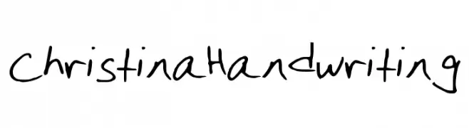
Herunterladen 268 Downloads@WebFont -
![ChristinaHandwriting Frei Schriftart Herunterladen]() Herunterladen 268 Downloads@WebFont
Herunterladen 268 Downloads@WebFont -
( Fonts by Rangkai Aksara )
A playful, casual handwritten font with rounded, smooth letterforms.
![One Shot Frei Schriftart Herunterladen]() Herunterladen 268 Downloads@WebFont
Herunterladen 268 Downloads@WebFont -
( Fonts by Situjuh Nazara - 7ntypes.com - Personal-use only. For commercial use please contact owner. )
A modern, minimalist font with thin, uniform strokes and a sleek appearance.
![Goeslim Frei Schriftart Herunterladen]() Herunterladen 268 Downloads@WebFont
Herunterladen 268 Downloads@WebFont -
( Fonts by FallenGraphic Studio - Vava Aryanto - Personal-use only. For commercial use please contact owner. )
A playful and energetic script font with flowing, cursive letterforms.
![Hamburg Frei Schriftart Herunterladen]() Herunterladen 268 Downloads@WebFont
Herunterladen 268 Downloads@WebFont -
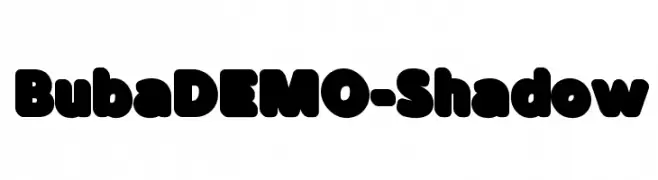
( Genilson L. Santos )
A bold, playful font with rounded edges and a shadow effect for a 3D look.
![BubaDEMO-Shadow Frei Schriftart Herunterladen]() Herunterladen 268 Downloads@WebFont
Herunterladen 268 Downloads@WebFont -
( Fonts by Mr Letters - https://www.creativefabrica.com/designer/mrletters/ - Personal-use only. For commercial use please contact owner. )
A sophisticated, cursive script font with elegant, flowing lines.
![martini-Regular Frei Schriftart Herunterladen]() Herunterladen 268 Downloads@WebFont
Herunterladen 268 Downloads@WebFont -
( Fonts by Neoqueto - Personal-use only. For commercial use please contact owner. )
A futuristic, geometric font with angular, block-like letterforms.
![Walker Bot LDR Regular Frei Schriftart Herunterladen]() Herunterladen 267 Downloads@WebFont
Herunterladen 267 Downloads@WebFont -
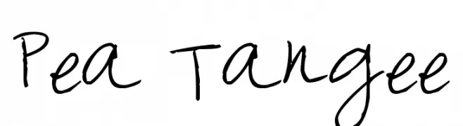
( Free for a personal use. For a commercial use please visit www.kevinandamanda.com )
A playful, handwritten font with a casual and informal style.
![Pea Tangee Frei Schriftart Herunterladen]() Herunterladen 267 Downloads@WebFont
Herunterladen 267 Downloads@WebFont -
( Fonts by Alvaro Thomaz - alvarothomaz.com )
A bold, modern font with sharp angles and a slightly condensed style.
![Pirates Writers Frei Schriftart Herunterladen]() Herunterladen 267 Downloads@WebFont
Herunterladen 267 Downloads@WebFont -
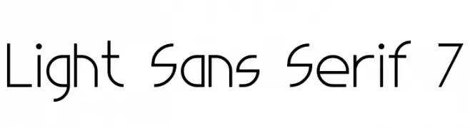
( Fonts by Style-7 - www.styleseven.com - Personal-use only. For commercial use please contact owner. )
A modern, light sans-serif font with geometric precision and minimalist design.
![Light Sans Serif 7 Frei Schriftart Herunterladen]() Herunterladen 267 Downloads@WebFont
Herunterladen 267 Downloads@WebFont -
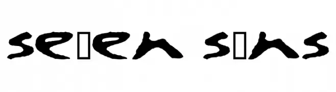
![se7en sins Frei Schriftart Herunterladen]() Herunterladen 267 Downloads@WebFont
Herunterladen 267 Downloads@WebFont -
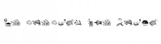
![KR Turtles For Julie Frei Schriftart Herunterladen]() Herunterladen 267 Downloads@WebFont
Herunterladen 267 Downloads@WebFont -
( Free for a personal use. For a commercial use please visit www.kevinandamanda.com )
A bold, expressive handwritten font with thick, uneven strokes and a playful style.
![Landie Frei Schriftart Herunterladen]() Herunterladen 267 Downloads@WebFont
Herunterladen 267 Downloads@WebFont -
( Fonts by Febryl Arully - Personal-use only. For commercial use please contact owner. )
A bold, flowing script font with a modern, playful aesthetic.
![Love Frei Schriftart Herunterladen]() Herunterladen 267 Downloads@WebFont
Herunterladen 267 Downloads@WebFont -
( weknow - Wino S Kadir - www.creativefabrica.com/designer/weknow/ )
A bold, geometric font with a modern and futuristic style.
![Switch System Frei Schriftart Herunterladen]() Herunterladen 267 Downloads@WebFont
Herunterladen 267 Downloads@WebFont -
( Fonts by dcoxy )
A bold, flowing script font with a playful, handwritten style.
![Magic Club_PersonalUseOnly Frei Schriftart Herunterladen]() Herunterladen 267 Downloads@WebFont
Herunterladen 267 Downloads@WebFont -
( Fonts by Maelle.K - Thomas Boucherie - Personal-use only. For commercial use please contact owner. )
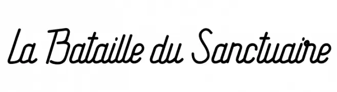
A modern, flowing script font with dynamic angularity and smooth curves.
![La Bataille du Sanctuaire Frei Schriftart Herunterladen]() Herunterladen 267 Downloads@WebFont
Herunterladen 267 Downloads@WebFont -
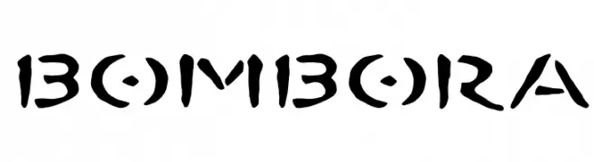
![BOMBORA Frei Schriftart Herunterladen]() Herunterladen 267 Downloads@WebFont
Herunterladen 267 Downloads@WebFont -
( Fonts by Arkandis Digital Foundry )
A bold, italic serif font with a classic and elegant style.
![VenturisOldADF-BoldItalic Frei Schriftart Herunterladen]() Herunterladen 267 Downloads@WebFont
Herunterladen 267 Downloads@WebFont -
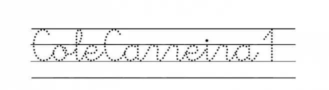
( www.edu.xunta.es/centros/cepcarreira/ )
A modern dotted font with geometric uppercase and cursive lowercase letters.
![ColeCarreira1 Frei Schriftart Herunterladen]() Herunterladen 267 Downloads@WebFont
Herunterladen 267 Downloads@WebFont


![Sinking Ship [outline] Frei Schriftart Herunterladen](https://d144mzi0q5mijx.cloudfront.net/img/S/I/Sinking-Ship-outline.webp)


Welche Schriften sind gerade am populärsten?
Poppins, Roboto, Montserrat, Open Sans und Lato sind wegen ihrer klaren Formen und breiten Einsetzbarkeit sehr gefragt – von Markenauftritt über Landingpages bis hin zu Postern.
Welche Fonts eignen sich für Logos?
Geometrische Sans‑Serifs (z. B. Poppins, Familien im Gotham‑Stil) sind ein häufiger Griff für sauberes, skalierbares Branding. Für eine persönlichere Note bleiben Scripts und Handschrift‑Stile beliebt. Kombinieren Sie einen prägnanten Headline‑Font mit einer neutralen Brotschrift für Wiedererkennung und Harmonie.
Wie oft wird die Top‑Liste aktualisiert?
Regelmäßig – basierend auf realen Downloads und Interaktionen. Schauen Sie öfter vorbei, um aufstrebende Favoriten früh zu entdecken.
💡 Tipp: Seite bookmarken – Trends wechseln schnell, und heutige Top‑Schriften inspirieren morgen vielleicht das Rebranding.