Willkommen bei den Top‑Schriften – hier treffen Beliebtheit und Qualität aufeinander. Das sind die in diesem Jahr am häufigsten heruntergeladenen und genutzten Fonts. Wenn Sie sichere Optionen für Logo, Web oder Social suchen, starten Sie hier.
Jeder Top‑Font überzeugt durch Balance, Lesbarkeit und Vielseitigkeit. Sie finden moderne Sans‑Serifs, elegante Scripts, Vintage‑Serifs und minimalistische Displays.
-
 Herunterladen 266 Downloads@WebFont
 -
( Fonts by www.waltervelezart.com )
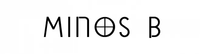
A modern, geometric font with a futuristic and sleek design.
![Minos B Frei Schriftart Herunterladen]() Herunterladen 266 Downloads@WebFont
Herunterladen 266 Downloads@WebFont -
( Fonts by Zetafonts - Personal-use only. For commercial use please contact owner. )
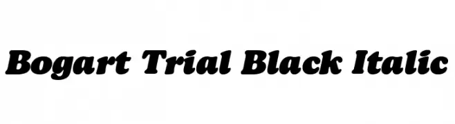
A bold, italicized font with thick, rounded characters for impactful designs.
![Bogart Trial Black Italic Frei Schriftart Herunterladen]() Herunterladen 266 Downloads@WebFont
Herunterladen 266 Downloads@WebFont -
( Fonts by David Panca )
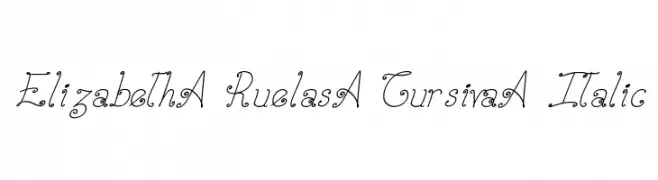
An elegant cursive font with decorative swirls and an italic slant.
![Elizabeth-Ruelas-Cursiva-Italic Frei Schriftart Herunterladen]() Herunterladen 266 Downloads@WebFont
Herunterladen 266 Downloads@WebFont -
( qrealib.ultra-book.com/ )
A textured, dot-patterned font with rounded, approachable characters.
![airlib Frei Schriftart Herunterladen]() Herunterladen 266 Downloads@WebFont
Herunterladen 266 Downloads@WebFont -
-
![Term-RegAaa Frei Schriftart Herunterladen]() Herunterladen 266 Downloads@WebFont
Herunterladen 266 Downloads@WebFont -
( Fonts by Graham Meade - GemFonts )
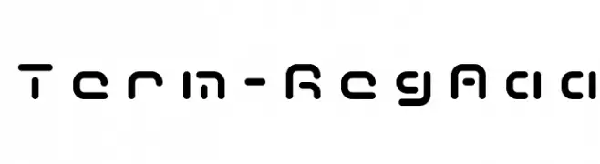
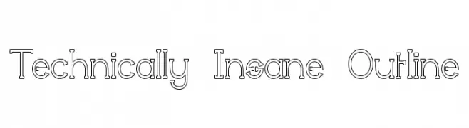
A modern, geometric outline font with a technical and structured appearance.
![Technically Insane Outline Frei Schriftart Herunterladen]() Herunterladen 266 Downloads@WebFont
Herunterladen 266 Downloads@WebFont -
( Fonts by InspiraType )
A bold, playful font with a hand-drawn, informal style.
![KOSMIK FREE Frei Schriftart Herunterladen]() Herunterladen 266 Downloads@WebFont
Herunterladen 266 Downloads@WebFont -
( Fonts by Typhoon Type - Suthi Srisopha - www.typhoontype.net - Personal-use only. For commercial use please contact owner. )
A bold, playful script font with a lively, handwritten style.
![Atomic Robusta - Personal Use Frei Schriftart Herunterladen]() Herunterladen 266 Downloads@WebFont
Herunterladen 266 Downloads@WebFont -
( Fonts by CannotIntoSpaceFonts - KineticPlasma Fonts - Personal-use only. For commercial use please contact owner. )
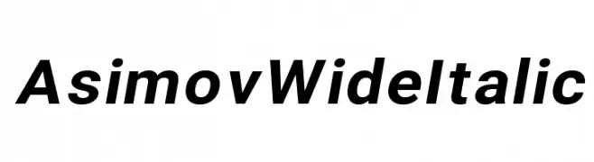
A modern, wide, and italicized font with bold characters and a sleek design.
![Asimov Wide Italic Frei Schriftart Herunterladen]() Herunterladen 266 Downloads@WebFont
Herunterladen 266 Downloads@WebFont -
( Fonts by Daniel Zadorozny - www.iconian.com - Free for personal use )
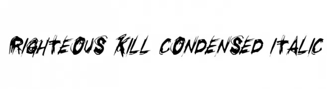
A bold, jagged, and dynamic font with a brush-like, slanted style.
![Righteous Kill Condensed Italic Frei Schriftart Herunterladen]() Herunterladen 266 Downloads@WebFont
Herunterladen 266 Downloads@WebFont -
( Måns Grebäck - www.mansgreback.com )
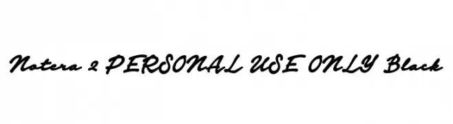
A bold, cursive font with a flowing, handwritten style.
![Notera 2 PERSONAL USE ONLY Black Frei Schriftart Herunterladen]() Herunterladen 266 Downloads@WebFont
Herunterladen 266 Downloads@WebFont -
( Fonts by Haslinda Adnan - Personal-use only. For commercial use please contact owner. )
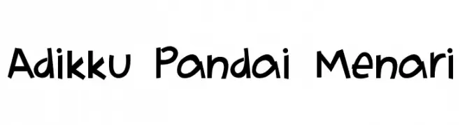
A playful, hand-drawn font with bold, rounded characters and a whimsical style.
![Adikku Pandai Menari Frei Schriftart Herunterladen]() Herunterladen 266 Downloads@WebFont
Herunterladen 266 Downloads@WebFont -
( Fonts by Steve Cloutier - www.cloutierfontes.ca )
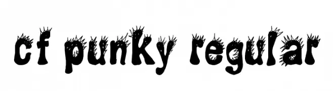
A bold, punk-inspired font with spiky, irregular edges and high contrast.
![CF Punky Regular Frei Schriftart Herunterladen]() Herunterladen 266 Downloads@WebFont
Herunterladen 266 Downloads@WebFont -
![TagalogAlibata Frei Schriftart Herunterladen]() Herunterladen 266 Downloads
Herunterladen 266 Downloads -
( Fonts by fsuarez913 )
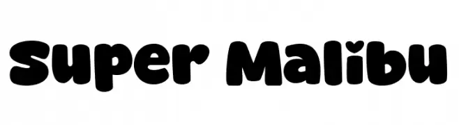
A playful, bold font with rounded, bubble-like characters.
![Super Malibu Frei Schriftart Herunterladen]() Herunterladen 266 Downloads@WebFont
Herunterladen 266 Downloads@WebFont -
![Winged Frei Schriftart Herunterladen]() Herunterladen 266 Downloads@WebFont
Herunterladen 266 Downloads@WebFont -
( Fonts by Good Java Studio - www.creativefabrica.com/designer/goodjavastudio/ref/236564 - Personal-use only. For commercial use please contact owner. )
A bold, energetic script font with flowing cursive letterforms.
![Intensity Frei Schriftart Herunterladen]() Herunterladen 266 Downloads@WebFont
Herunterladen 266 Downloads@WebFont -
( Fonts by Qwerks - Personal-use only. For commercial use please contact owner. )
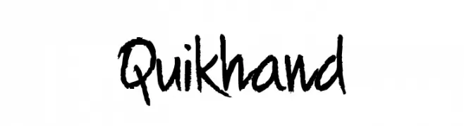
A lively and expressive handwritten font with bold, dynamic strokes.
![Quikhand Frei Schriftart Herunterladen]() Herunterladen 266 Downloads@WebFont
Herunterladen 266 Downloads@WebFont -
( Fonts by Zetafonts - Personal-use only. For commercial use please contact owner. )
A modern, narrow font with sleek, elegant characters.
![Heading Now Trial 23 Book Frei Schriftart Herunterladen]() Herunterladen 266 Downloads@WebFont
Herunterladen 266 Downloads@WebFont -
( Fonts by Daniel Zadorozny - www.iconian.com - Free for personal use )
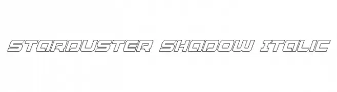
A dynamic, italicized font with a shadow effect and futuristic design.
![Starduster Shadow Italic Frei Schriftart Herunterladen]() Herunterladen 266 Downloads@WebFont
Herunterladen 266 Downloads@WebFont -
( Fonts by Jonathan S. Harris )
A playful, wavy outline font with a hand-drawn, doodle-like appearance.
![Quaker Shaker extra numbers Frei Schriftart Herunterladen]() Herunterladen 266 Downloads@WebFont
Herunterladen 266 Downloads@WebFont -
( Fonts by Iconian Fonts )
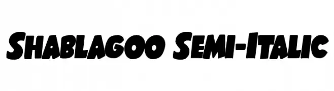
A bold, playful, and slightly italicized font with a cartoonish style.
![Shablagoo Semi-Italic Frei Schriftart Herunterladen]() Herunterladen 266 Downloads@WebFont
Herunterladen 266 Downloads@WebFont -
( Fonts by Omega Font Labs )
A diverse icon set featuring global cultural and symbolic motifs.
![Cultural Icons Frei Schriftart Herunterladen]() Herunterladen 266 Downloads@WebFont
Herunterladen 266 Downloads@WebFont -
( Free for a personal use. For a commercial use please visit www.kevinandamanda.com )
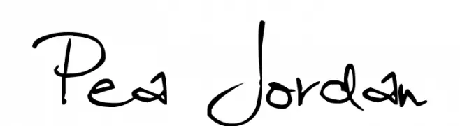
A playful, handwritten font with a casual and dynamic style.
![Pea Jordan Frei Schriftart Herunterladen]() Herunterladen 266 Downloads@WebFont
Herunterladen 266 Downloads@WebFont -
( Fonts by Chuck Mountain - Chuck`s Fonts - Personal-use only. For commercial use please contact owner. )
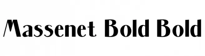
A bold, modern font with thick strokes and slightly condensed letterforms.
![Massenet Bold Bold Frei Schriftart Herunterladen]() Herunterladen 266 Downloads@WebFont
Herunterladen 266 Downloads@WebFont -
( Fonts by Rhidtype - Repi Hilmana - Personal-use only. For commercial use please contact owner. )
A bold, geometric font with a modern, angular design.
![OVER'GRID Frei Schriftart Herunterladen]() Herunterladen 266 Downloads@WebFont
Herunterladen 266 Downloads@WebFont -
( Fonts by AV Type - Aldo Vesely - Personal-use only. For commercial use please contact owner. )
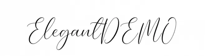
A graceful, cursive font with elegant, flowing lines.
![Elegant DEMO Frei Schriftart Herunterladen]() Herunterladen 266 Downloads@WebFont
Herunterladen 266 Downloads@WebFont -
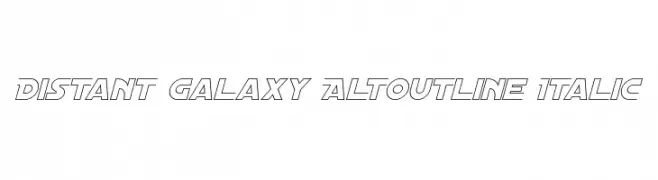
![Distant Galaxy AltOutline Italic Frei Schriftart Herunterladen]() Herunterladen 266 Downloads@WebFont
Herunterladen 266 Downloads@WebFont -
![This Is Ridiculous Frei Schriftart Herunterladen]() Herunterladen 266 Downloads@WebFont
Herunterladen 266 Downloads@WebFont -
( Fonts by Castcraft Software - opti.netii.net - check the website before use )
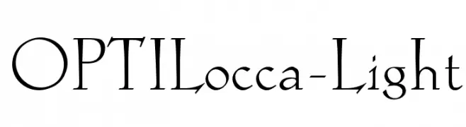
A refined serif font with elegant, thin strokes and a classic aesthetic.
![OPTILocca-Light Frei Schriftart Herunterladen]() Herunterladen 266 Downloads@WebFont
Herunterladen 266 Downloads@WebFont -
( Fonts by Iconian Fonts )
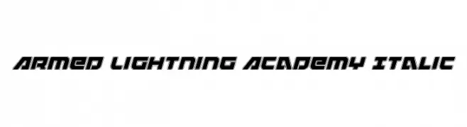
A bold, italicized font with a futuristic and dynamic style.
![Armed Lightning Academy Italic Frei Schriftart Herunterladen]() Herunterladen 266 Downloads@WebFont
Herunterladen 266 Downloads@WebFont -
( Fonts by Agathe M.Joyce - www.foundmyfont.com - Personal-use only. For commercial use please contact owner. )
An elegant and romantic script font with intricate swirls and flourishes.
![Heart Romance Frei Schriftart Herunterladen]() Herunterladen 266 Downloads@WebFont
Herunterladen 266 Downloads@WebFont -
( Fonts by FONTS BY LYAJKA - Personal-use only. For commercial use please contact owner. )
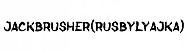
A bold, textured brush font with a dynamic and energetic appearance.
![Jack Brusher(RUS BY LYAJKA) Frei Schriftart Herunterladen]() Herunterladen 266 Downloads@WebFont
Herunterladen 266 Downloads@WebFont -
![Blarrack Personal Use Regular Frei Schriftart Herunterladen]() Herunterladen 266 Downloads@WebFont
Herunterladen 266 Downloads@WebFont


Welche Schriften sind gerade am populärsten?
Poppins, Roboto, Montserrat, Open Sans und Lato sind wegen ihrer klaren Formen und breiten Einsetzbarkeit sehr gefragt – von Markenauftritt über Landingpages bis hin zu Postern.
Welche Fonts eignen sich für Logos?
Geometrische Sans‑Serifs (z. B. Poppins, Familien im Gotham‑Stil) sind ein häufiger Griff für sauberes, skalierbares Branding. Für eine persönlichere Note bleiben Scripts und Handschrift‑Stile beliebt. Kombinieren Sie einen prägnanten Headline‑Font mit einer neutralen Brotschrift für Wiedererkennung und Harmonie.
Wie oft wird die Top‑Liste aktualisiert?
Regelmäßig – basierend auf realen Downloads und Interaktionen. Schauen Sie öfter vorbei, um aufstrebende Favoriten früh zu entdecken.
💡 Tipp: Seite bookmarken – Trends wechseln schnell, und heutige Top‑Schriften inspirieren morgen vielleicht das Rebranding.