Willkommen bei den Top‑Schriften – hier treffen Beliebtheit und Qualität aufeinander. Das sind die in diesem Jahr am häufigsten heruntergeladenen und genutzten Fonts. Wenn Sie sichere Optionen für Logo, Web oder Social suchen, starten Sie hier.
Jeder Top‑Font überzeugt durch Balance, Lesbarkeit und Vielseitigkeit. Sie finden moderne Sans‑Serifs, elegante Scripts, Vintage‑Serifs und minimalistische Displays.
-
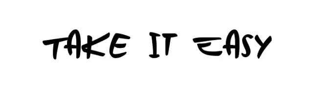
( Fonts by Runes & Fonts )
A bold, dynamic handwritten font with fluid, expressive strokes.
 Herunterladen 261 Downloads@WebFont
 -
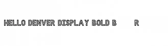
( Fonts by Good Apples - Personal-use only. For commercial use please contact owner. )
A bold, geometric font with a distinct outline style, perfect for modern and impactful designs.
![HELLO DENVER DISPLAY BOLD Bold Regular Frei Schriftart Herunterladen]() Herunterladen 261 Downloads@WebFont
Herunterladen 261 Downloads@WebFont -
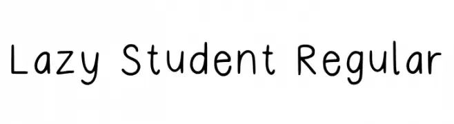
( Fonts by moonlightme )
Playful handwritten font with a casual style.
![Lazy Student Regular Frei Schriftart Herunterladen]() Herunterladen 261 Downloads@WebFont
Herunterladen 261 Downloads@WebFont -
![PWCartoonist Frei Schriftart Herunterladen]() Herunterladen 261 Downloads@WebFont
Herunterladen 261 Downloads@WebFont -
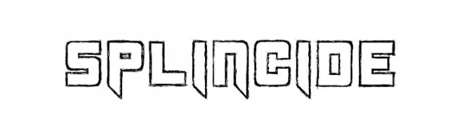
( Fonts by Koczman Balint - magiquefonts.gportal.hu )
A bold, angular font with a futuristic, three-dimensional look.
![Splincide Frei Schriftart Herunterladen]() Herunterladen 261 Downloads@WebFont
Herunterladen 261 Downloads@WebFont -
-
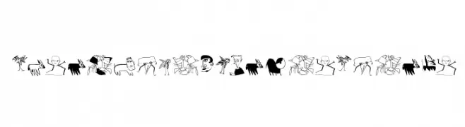
( Fonts by Manfred Klein. Free for private and charity use. Free for commercial with donation to organizations )
An abstract, doodle-like font with unique, artistic characters.
![AbsoluteImprovisations Frei Schriftart Herunterladen]() Herunterladen 261 Downloads@WebFont
Herunterladen 261 Downloads@WebFont -
( Fonts by www.braineaters.com )
A bold, horror-themed font with a dripping effect, perfect for spooky designs.
![BloodFeastSW Frei Schriftart Herunterladen]() Herunterladen 261 Downloads@WebFont
Herunterladen 261 Downloads@WebFont -
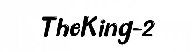
( Haksen Letters - Sarwo Edhi Prayitno )
A bold, dynamic script font with a playful and energetic style.
![The King - 2 Frei Schriftart Herunterladen]() Herunterladen 261 Downloads@WebFont
Herunterladen 261 Downloads@WebFont -
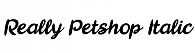
![Really Petshop Italic Frei Schriftart Herunterladen]() Herunterladen 261 Downloads@WebFont
Herunterladen 261 Downloads@WebFont -
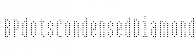
( Fonts by backpacker.gr )
A decorative font with characters formed by diamond-shaped dots, offering a pixelated look.
![BPdotsCondensedDiamond Frei Schriftart Herunterladen]() Herunterladen 261 Downloads@WebFont
Herunterladen 261 Downloads@WebFont -
( Fonts by a Neale Davidson - www.pixelsagas.com. Personal-use only. For commercial use please contact owner. )
A bold, italic, and condensed font with a modern and dynamic style.
![Red World Italic Frei Schriftart Herunterladen]() Herunterladen 261 Downloads@WebFont
Herunterladen 261 Downloads@WebFont -
( Fonts by MagicType - Jaikishan Patel - Personal-use only. For commercial use please contact owner. )
A bold, modern font with strong, uniform letterforms.
![Rowdy Regular Frei Schriftart Herunterladen]() Herunterladen 261 Downloads@WebFont
Herunterladen 261 Downloads@WebFont -
( Peter Wiegel - www.peter-wiegel.de/ )
A modern, geometric font with rounded edges and a minimalist style.
![Googee Frei Schriftart Herunterladen]() Herunterladen 261 Downloads@WebFont
Herunterladen 261 Downloads@WebFont -
![Dirty Female Feet Frei Schriftart Herunterladen]() Herunterladen 261 Downloads@WebFont
Herunterladen 261 Downloads@WebFont -
( Fonts by Elephant Shape Productions )
Geometric, decorative typeface with dot accents and a sci-fi feel.
![Silver Frei Schriftart Herunterladen]() Herunterladen 261 Downloads@WebFont
Herunterladen 261 Downloads@WebFont -
( Free for personal use - www.mschroeppel.de/ )
A distressed, vintage-style font with a bold, textured appearance.
![LLPearlBlack Frei Schriftart Herunterladen]() Herunterladen 261 Downloads@WebFont
Herunterladen 261 Downloads@WebFont -
( Public domain / GPL / OFL - www.finck.co )
A modern, monospaced outline font with a futuristic style.
![TaurusMonoOutline Frei Schriftart Herunterladen]() Herunterladen 261 Downloads@WebFont
Herunterladen 261 Downloads@WebFont -
( Copyright 2012 The Scada Project Authors (lemonad@jovanny.ru) )
A sleek, modern italic font with smooth, slightly slanted letterforms.
![Scada Italic Frei Schriftart Herunterladen]() Herunterladen 261 Downloads@WebFont
Herunterladen 261 Downloads@WebFont -
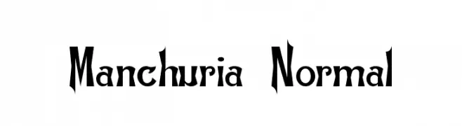
![Manchuria Normal Frei Schriftart Herunterladen]() Herunterladen 261 Downloads@WebFont
Herunterladen 261 Downloads@WebFont -
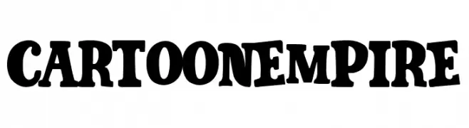
( Fonts by Woodcutter )
A bold, playful font with a cartoonish style and rounded, exaggerated serifs.
![Cartoon Empire Frei Schriftart Herunterladen]() Herunterladen 261 Downloads@WebFont
Herunterladen 261 Downloads@WebFont -
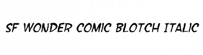
( Fonts by ShyFonts )
A bold, playful font with a hand-drawn, comic-like style.
![SF Wonder Comic Blotch Italic Frei Schriftart Herunterladen]() Herunterladen 261 Downloads@WebFont
Herunterladen 261 Downloads@WebFont -
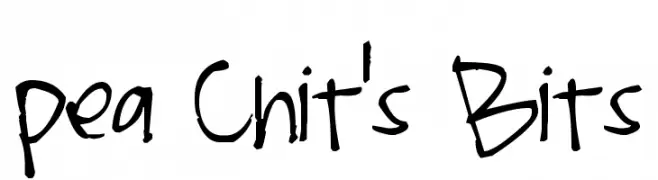
( Free for a personal use. For a commercial use please visit www.kevinandamanda.com )
A playful, handwritten font with a whimsical and dynamic style.
![Pea Chit's Bits Frei Schriftart Herunterladen]() Herunterladen 261 Downloads@WebFont
Herunterladen 261 Downloads@WebFont -
( Fonts by Xerographer Fonts - xerographer.blogspot.com - Personal-use only. For commercial use please contact owner. )
A playful, hand-drawn font with a whimsical and casual style.
![Basket of Candy Frei Schriftart Herunterladen]() Herunterladen 261 Downloads@WebFont
Herunterladen 261 Downloads@WebFont -
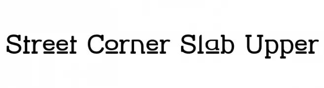
( Fonts by Apostrophic Lab )
A bold slab serif font with strong, block-like serifs and a modern touch.
![Street Corner Slab Upper Frei Schriftart Herunterladen]() Herunterladen 261 Downloads@WebFont
Herunterladen 261 Downloads@WebFont -
![HighLight Frei Schriftart Herunterladen]() Herunterladen 261 Downloads@WebFont
Herunterladen 261 Downloads@WebFont -
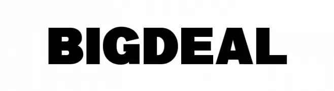
( Fonts by wep - Wahyu Eka Prasetya - Personal-use only. For commercial use please contact owner. )
A bold, modern sans-serif font with a strong, impactful presence.
![Big Deal Frei Schriftart Herunterladen]() Herunterladen 261 Downloads@WebFont
Herunterladen 261 Downloads@WebFont -
( Fonts by Daniel Zadorozny - www.iconian.com - Free for personal use )
Bold, outlined font with a dynamic, sporty style.
![Jack's Candlestick Academy Regular Frei Schriftart Herunterladen]() Herunterladen 261 Downloads@WebFont
Herunterladen 261 Downloads@WebFont -
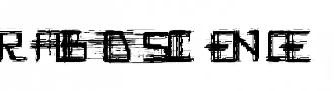
![Rabid_Science Frei Schriftart Herunterladen]() Herunterladen 261 Downloads@WebFont
Herunterladen 261 Downloads@WebFont -
![sports wave Regular Frei Schriftart Herunterladen]() Herunterladen 261 Downloads@WebFont
Herunterladen 261 Downloads@WebFont -
( Fonts by Daniel Zadorozny - www.iconian.com - Free for personal use )
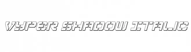
A bold, angular font with a shadow effect and a futuristic, geometric style.
![Vyper Shadow Italic Frei Schriftart Herunterladen]() Herunterladen 261 Downloads@WebFont
Herunterladen 261 Downloads@WebFont -
( Fonts by Manfred Klein - manfred-klein.ina-mar.com )
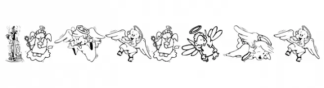
Ornate pictorial font featuring biblical and angelic illustrations.
![Biblical Frei Schriftart Herunterladen]() Herunterladen 261 Downloads@WebFont
Herunterladen 261 Downloads@WebFont -
( Fonts by Muhammad Sirojuddin - lettersiro.com - Personal-use only. For commercial use please contact owner. )
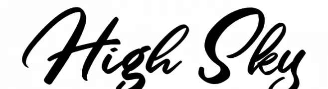
A modern, cursive font with bold strokes and elegant connections.
![High Sky Frei Schriftart Herunterladen]() Herunterladen 261 Downloads@WebFont
Herunterladen 261 Downloads@WebFont -
( Fonts by Daniel Zadorozny - www.iconian.com - Free for personal use )
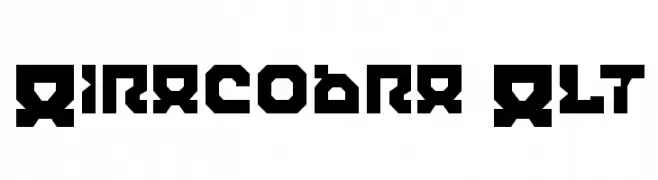
A bold, geometric font with sharp, angular characters and a futuristic style.
![Airacobra Alt Frei Schriftart Herunterladen]() Herunterladen 261 Downloads@WebFont
Herunterladen 261 Downloads@WebFont -
Schriftart von satrianovian20. For commercial use please contact the owner.
( elemental acts )
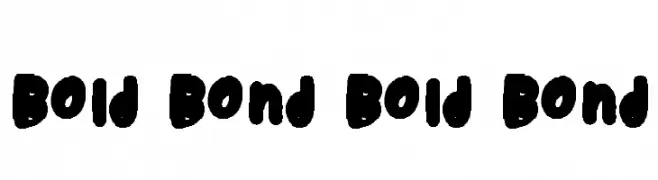
A bold, playful font with rounded, thick strokes and a hand-drawn feel.
![Bold Bond Bold Bond Frei Schriftart Herunterladen]() Herunterladen 261 Downloads@WebFont
Herunterladen 261 Downloads@WebFont -
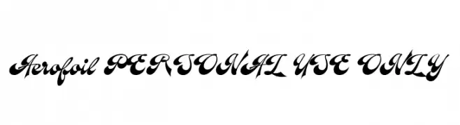
( Fonts by Måns Grebäck )
A bold, flowing script font with elegant curves and dramatic swashes.
![Aerofoil PERSONAL USE ONLY Frei Schriftart Herunterladen]() Herunterladen 261 Downloads@WebFont
Herunterladen 261 Downloads@WebFont


Welche Schriften sind gerade am populärsten?
Poppins, Roboto, Montserrat, Open Sans und Lato sind wegen ihrer klaren Formen und breiten Einsetzbarkeit sehr gefragt – von Markenauftritt über Landingpages bis hin zu Postern.
Welche Fonts eignen sich für Logos?
Geometrische Sans‑Serifs (z. B. Poppins, Familien im Gotham‑Stil) sind ein häufiger Griff für sauberes, skalierbares Branding. Für eine persönlichere Note bleiben Scripts und Handschrift‑Stile beliebt. Kombinieren Sie einen prägnanten Headline‑Font mit einer neutralen Brotschrift für Wiedererkennung und Harmonie.
Wie oft wird die Top‑Liste aktualisiert?
Regelmäßig – basierend auf realen Downloads und Interaktionen. Schauen Sie öfter vorbei, um aufstrebende Favoriten früh zu entdecken.
💡 Tipp: Seite bookmarken – Trends wechseln schnell, und heutige Top‑Schriften inspirieren morgen vielleicht das Rebranding.