Willkommen bei den Top‑Schriften – hier treffen Beliebtheit und Qualität aufeinander. Das sind die in diesem Jahr am häufigsten heruntergeladenen und genutzten Fonts. Wenn Sie sichere Optionen für Logo, Web oder Social suchen, starten Sie hier.
Jeder Top‑Font überzeugt durch Balance, Lesbarkeit und Vielseitigkeit. Sie finden moderne Sans‑Serifs, elegante Scripts, Vintage‑Serifs und minimalistische Displays.
-
 Herunterladen 260 Downloads@WebFont
 -
( Fonts by Almarkhatype - Abdul Malik Wisnu - Personal-use only. For commercial use please contact owner. )
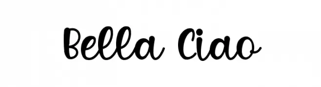
A bold, playful script font with flowing, connected letterforms.
![Bella Ciao Frei Schriftart Herunterladen]() Herunterladen 260 Downloads@WebFont
Herunterladen 260 Downloads@WebFont -
( deFharo - Fernando Haro - defharo.com )
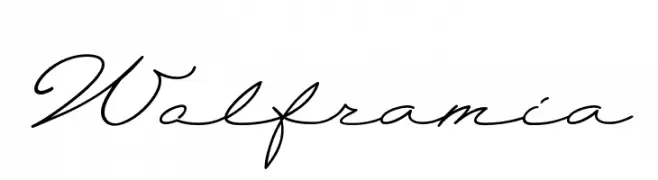
An elegant script font with flowing, cursive letterforms and high contrast.
![Wolframia Frei Schriftart Herunterladen]() Herunterladen 260 Downloads@WebFont
Herunterladen 260 Downloads@WebFont -
( Download for Personal Use. For Commercial: http://www.k-type.com )
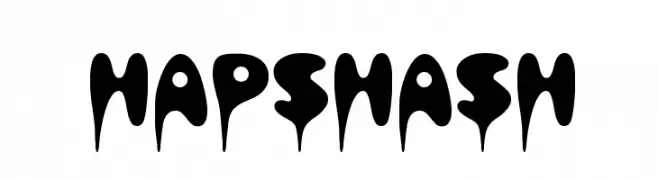
A bold, dripping font with a playful, liquid-like appearance.
![Hapshash Frei Schriftart Herunterladen]() Herunterladen 260 Downloads@WebFont
Herunterladen 260 Downloads@WebFont -
( Fonts by Ikrar Bey Khubaib )
Bold cursive script with a handwritten style.
![Himagine Frei Schriftart Herunterladen]() Herunterladen 260 Downloads@WebFont
Herunterladen 260 Downloads@WebFont -
-
( Fonts by a Max Infeld - XEROGRAPHER FONTS - xerographer.blogspot.com . Personal-use only. For commercial use please contact owner. )
An elegant, vintage script font with ornate detailing and flowing lines.
![FauxAntique Frei Schriftart Herunterladen]() Herunterladen 260 Downloads@WebFont
Herunterladen 260 Downloads@WebFont -
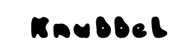
![Knubbel Frei Schriftart Herunterladen]() Herunterladen 260 Downloads@WebFont
Herunterladen 260 Downloads@WebFont -
( Fonts by Qaratype )
A playful and bold font with rounded edges and whimsical serifs.
![CLOSER Frei Schriftart Herunterladen]() Herunterladen 260 Downloads@WebFont
Herunterladen 260 Downloads@WebFont -
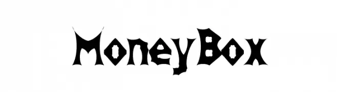
![MoneyBox Frei Schriftart Herunterladen]() Herunterladen 260 Downloads@WebFont
Herunterladen 260 Downloads@WebFont -
( Fonts by Tan Cundrawan - cove703 - creativemarket.com/cove703 - Personal-use only. For commercial use please contact owner. )
A playful and elegant script font with smooth, interconnected letterforms.
![Happy Sunday Frei Schriftart Herunterladen]() Herunterladen 260 Downloads@WebFont
Herunterladen 260 Downloads@WebFont -
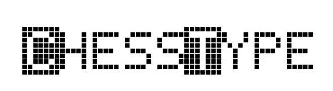
![ChessType Frei Schriftart Herunterladen]() Herunterladen 260 Downloads@WebFont
Herunterladen 260 Downloads@WebFont -
( Fonts by Daniel Zadorozny - www.iconian.com )
A bold, futuristic font with a condensed, geometric style.
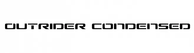
![Outrider Condensed Frei Schriftart Herunterladen]() Herunterladen 260 Downloads@WebFont
Herunterladen 260 Downloads@WebFont -
( Fonts by CannotIntoSpaceFonts - KineticPlasma Fonts - Personal-use only. For commercial use please contact owner. )
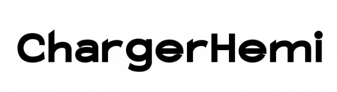
A bold, modern font with clean, geometric lines and rounded edges.
![Charger Hemi Frei Schriftart Herunterladen]() Herunterladen 260 Downloads@WebFont
Herunterladen 260 Downloads@WebFont -
( Andrea Gaspari )
A bold, impactful font with clean lines and high legibility.
![FFF Ultra Frei Schriftart Herunterladen]() Herunterladen 260 Downloads@WebFont
Herunterladen 260 Downloads@WebFont -
![Bellatrix Frei Schriftart Herunterladen]() Herunterladen 260 Downloads@WebFont
Herunterladen 260 Downloads@WebFont -
( Fonts by Lois )
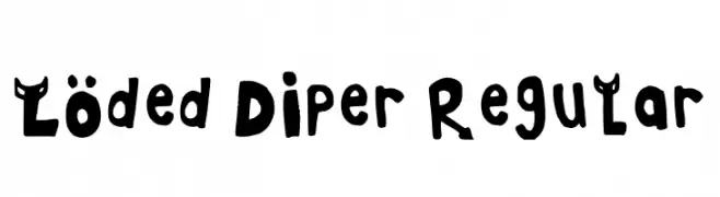
A playful, hand-drawn font with bold, irregular characters and unique embellishments.
![Loded Diper Regular Frei Schriftart Herunterladen]() Herunterladen 260 Downloads@WebFont
Herunterladen 260 Downloads@WebFont -
( Fonts by Chequered Ink - chequered.ink - Personal-use only. For commercial use please contact owner. )
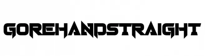
A bold, angular font with a futuristic and aggressive style.
![Gorehand Straight Frei Schriftart Herunterladen]() Herunterladen 260 Downloads@WebFont
Herunterladen 260 Downloads@WebFont -
( Fonts by www.koenhachmang.com - Glitch )
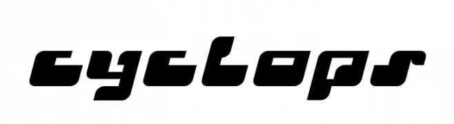
A bold, futuristic font with geometric, block-like characters and a dynamic slant.
![Cyclops Frei Schriftart Herunterladen]() Herunterladen 260 Downloads@WebFont
Herunterladen 260 Downloads@WebFont -
( Fonts by Integritype Studio )
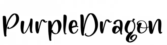
A bold, playful handwritten font with smooth curves and dynamic strokes.
![Purple Dragon Frei Schriftart Herunterladen]() Herunterladen 260 Downloads@WebFont
Herunterladen 260 Downloads@WebFont -
( Fonts by Apostrophic Lab )
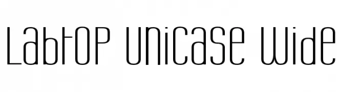
A modern, geometric unicase font with elongated, narrow characters.
![Labtop Unicase Wide Frei Schriftart Herunterladen]() Herunterladen 260 Downloads@WebFont
Herunterladen 260 Downloads@WebFont -
( Syahputra - creativemarket.com/Bexxtype )
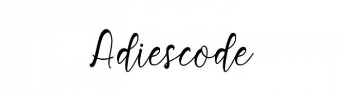
A flowing, cursive font with elegant loops and swashes.
![Adiescode Frei Schriftart Herunterladen]() Herunterladen 260 Downloads@WebFont
Herunterladen 260 Downloads@WebFont -
![Sunplaza Frei Schriftart Herunterladen]() Herunterladen 260 Downloads@WebFont
Herunterladen 260 Downloads@WebFont -
![Kiss From A Rose Frei Schriftart Herunterladen]() Herunterladen 260 Downloads@WebFont
Herunterladen 260 Downloads@WebFont -
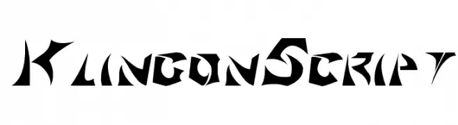
![KlingonScript Frei Schriftart Herunterladen]() Herunterladen 260 Downloads@WebFont
Herunterladen 260 Downloads@WebFont -
![Apple Is My Favorite Frei Schriftart Herunterladen]() Herunterladen 260 Downloads@WebFont
Herunterladen 260 Downloads@WebFont -
( Fonts by Apostrophic Lab )
A modern, geometric font with clean lines and rounded edges.
![Futurex Variation Alpha Frei Schriftart Herunterladen]() Herunterladen 260 Downloads@WebFont
Herunterladen 260 Downloads@WebFont -
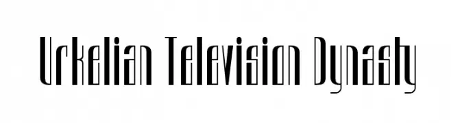
![Urkelian Television Dynasty Frei Schriftart Herunterladen]() Herunterladen 260 Downloads@WebFont
Herunterladen 260 Downloads@WebFont -
( Fonts by Alvaro Ariel - Personal-use only. For commercial use please contact owner. )
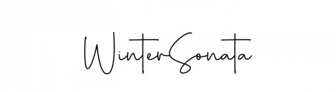
A delicate, handwritten-style font with thin, flowing lines.
![Winter Sonata Frei Schriftart Herunterladen]() Herunterladen 260 Downloads@WebFont
Herunterladen 260 Downloads@WebFont -
( Fonts by PampaType - Personal-use only. For commercial use please contact owner. )
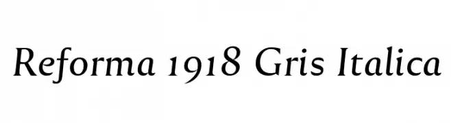
An elegant serif font with a classic, italic style.
![Reforma 1918 Gris Italica Frei Schriftart Herunterladen]() Herunterladen 260 Downloads@WebFont
Herunterladen 260 Downloads@WebFont -
![DS OlymPix Frei Schriftart Herunterladen]() Herunterladen 260 Downloads@WebFont
Herunterladen 260 Downloads@WebFont -
( Fonts by softerviews.org )
A bold, italic serif font with medium contrast and elegant slant.
![Garava Bold Italic Frei Schriftart Herunterladen]() Herunterladen 260 Downloads@WebFont
Herunterladen 260 Downloads@WebFont -
![TBJ Frei Schriftart Herunterladen]() Herunterladen 260 Downloads@WebFont
Herunterladen 260 Downloads@WebFont -
( Fonts by Manfred Klein. Free for private and charity use. Free for commercial with donation to organizations )
Decorative font with illustrated masked faces as glyphs.
![MasKs Frei Schriftart Herunterladen]() Herunterladen 260 Downloads@WebFont
Herunterladen 260 Downloads@WebFont -
( Fonts by Daniel Zadorozny - www.iconian.com - Free for personal use )
A bold, handwritten-style font with smooth curves and a playful, dynamic appearance.
![Vigilante Notes Light Frei Schriftart Herunterladen]() Herunterladen 259 Downloads
Herunterladen 259 Downloads -
( Fonts by Thais Trizoli - www.behance.net/thaistrizoli )
A bold, inclined font with a modern and dynamic style.
![Discreet Bold Inclined Frei Schriftart Herunterladen]() Herunterladen 259 Downloads@WebFont
Herunterladen 259 Downloads@WebFont


Welche Schriften sind gerade am populärsten?
Poppins, Roboto, Montserrat, Open Sans und Lato sind wegen ihrer klaren Formen und breiten Einsetzbarkeit sehr gefragt – von Markenauftritt über Landingpages bis hin zu Postern.
Welche Fonts eignen sich für Logos?
Geometrische Sans‑Serifs (z. B. Poppins, Familien im Gotham‑Stil) sind ein häufiger Griff für sauberes, skalierbares Branding. Für eine persönlichere Note bleiben Scripts und Handschrift‑Stile beliebt. Kombinieren Sie einen prägnanten Headline‑Font mit einer neutralen Brotschrift für Wiedererkennung und Harmonie.
Wie oft wird die Top‑Liste aktualisiert?
Regelmäßig – basierend auf realen Downloads und Interaktionen. Schauen Sie öfter vorbei, um aufstrebende Favoriten früh zu entdecken.
💡 Tipp: Seite bookmarken – Trends wechseln schnell, und heutige Top‑Schriften inspirieren morgen vielleicht das Rebranding.