Willkommen bei den Top‑Schriften – hier treffen Beliebtheit und Qualität aufeinander. Das sind die in diesem Jahr am häufigsten heruntergeladenen und genutzten Fonts. Wenn Sie sichere Optionen für Logo, Web oder Social suchen, starten Sie hier.
Jeder Top‑Font überzeugt durch Balance, Lesbarkeit und Vielseitigkeit. Sie finden moderne Sans‑Serifs, elegante Scripts, Vintage‑Serifs und minimalistische Displays.
-
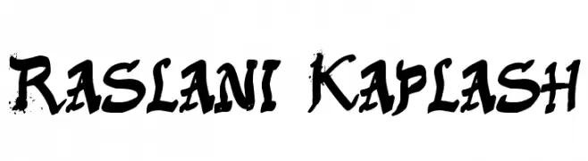
( Fonts by Daniel Zadorozny - www.iconian.com - Free for personal use )
A bold, futuristic font with rounded edges and geometric shapes.
 Herunterladen 259 Downloads@WebFont
 -
![Jingopop Frei Schriftart Herunterladen]() Herunterladen 259 Downloads@WebFont
Herunterladen 259 Downloads@WebFont -
![Raslani Kaplash Frei Schriftart Herunterladen]() Herunterladen 259 Downloads@WebFont
Herunterladen 259 Downloads@WebFont -
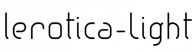
( Fonts by Fernando Haro - defharo.com )
A modern, geometric font with rounded edges and consistent stroke width.
![lerotica-Light Frei Schriftart Herunterladen]() Herunterladen 259 Downloads@WebFont
Herunterladen 259 Downloads@WebFont -
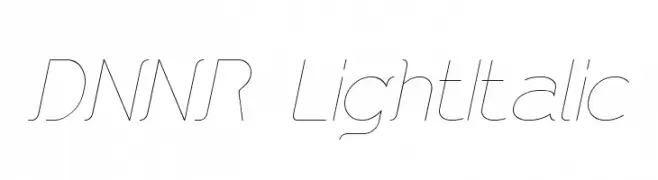
![DNNR LightItalic Frei Schriftart Herunterladen]() Herunterladen 259 Downloads@WebFont
Herunterladen 259 Downloads@WebFont -
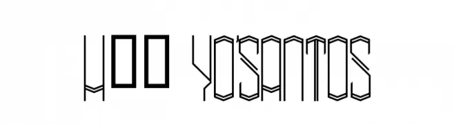
( Fonts by www.legacyofdefeat.com )
A geometric, angular font with a three-dimensional, modern design.
![H74 Yo'Santos Frei Schriftart Herunterladen]() Herunterladen 259 Downloads@WebFont
Herunterladen 259 Downloads@WebFont -
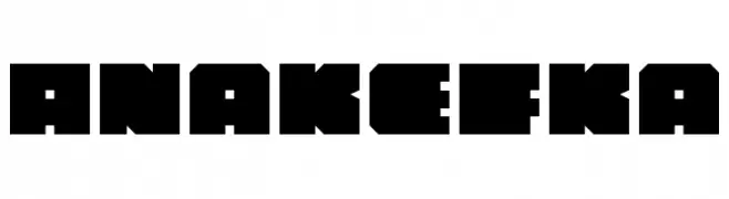
( Fonts by Daniel Zadorozny - www.iconian.com )
A bold, geometric font with a strong, industrial aesthetic.
![Anakefka Frei Schriftart Herunterladen]() Herunterladen 259 Downloads@WebFont
Herunterladen 259 Downloads@WebFont -
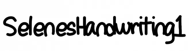
( www.authorsthoughts.wordpress.com )
A playful, bold handwritten font with rounded, consistent strokes.
![SelenesHandwriting1 Frei Schriftart Herunterladen]() Herunterladen 259 Downloads@WebFont
Herunterladen 259 Downloads@WebFont -
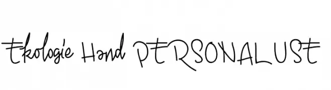
![Ekologie Hand PERSONAL USE Frei Schriftart Herunterladen]() Herunterladen 259 Downloads@WebFont
Herunterladen 259 Downloads@WebFont -
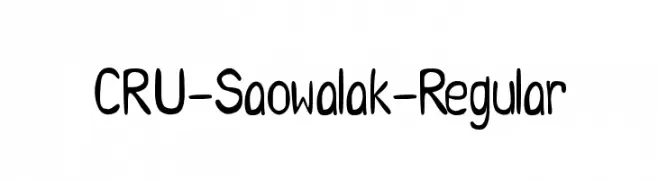
![CRU-Saowalak-Regular Frei Schriftart Herunterladen]() Herunterladen 259 Downloads@WebFont
Herunterladen 259 Downloads@WebFont -
( Fonts by Zetafonts - Personal-use only. For commercial use please contact owner. )
A clean, modern font with uniform strokes and minimalist design.
![Antipasto Pro Extralight Frei Schriftart Herunterladen]() Herunterladen 259 Downloads@WebFont
Herunterladen 259 Downloads@WebFont -
( Fonts by Mans Greback - Personal-use only. For commercial use please contact owner. )
A bold, playful font with a hand-drawn, whimsical style.
![Kurri Island Caps PERSONAL Med Frei Schriftart Herunterladen]() Herunterladen 259 Downloads@WebFont
Herunterladen 259 Downloads@WebFont -
( Cooldesignlab - Kurniadi Saputra - creativemarket.com/cooldesignlab?u=cooldesignlab )
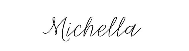
A graceful script font with fluid, cursive strokes and elegant loops.
![Michella Frei Schriftart Herunterladen]() Herunterladen 259 Downloads@WebFont
Herunterladen 259 Downloads@WebFont -
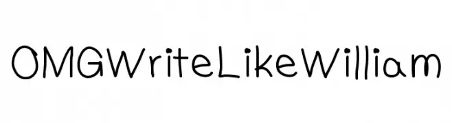
![OMGWriteLikeWilliam Frei Schriftart Herunterladen]() Herunterladen 259 Downloads@WebFont
Herunterladen 259 Downloads@WebFont -
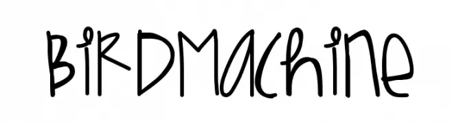
( Fonts by Des Gomez )
A playful, handwritten font with a casual and friendly style.
![BirdMachine Frei Schriftart Herunterladen]() Herunterladen 259 Downloads@WebFont
Herunterladen 259 Downloads@WebFont -
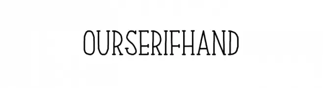
( Fonts by Graphicfresh )
A handcrafted serif font with a modern twist, featuring elongated and narrow letterforms.
![Our Serif Hand Frei Schriftart Herunterladen]() Herunterladen 259 Downloads@WebFont
Herunterladen 259 Downloads@WebFont -
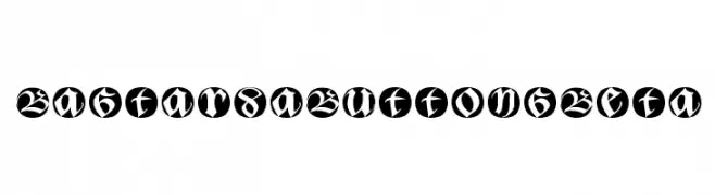
( Fonts by Manfred Klein - manfred-klein.ina-mar.com )
A bold, blackletter-inspired font with modern circular enclosures.
![BastardaButtonsBeta Frei Schriftart Herunterladen]() Herunterladen 259 Downloads@WebFont
Herunterladen 259 Downloads@WebFont -
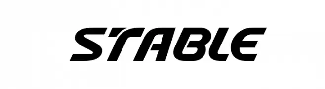
( Fonts by Kong Font - https://fontkong.com/ - Personal-use only. For commercial use please contact owner. )
A bold, italicized font with a modern and dynamic style.
![Stable Frei Schriftart Herunterladen]() Herunterladen 259 Downloads@WebFont
Herunterladen 259 Downloads@WebFont -
( Fonts by Nick Curtis - www.nicksfonts.com )
A bold, high-contrast font with geometric and Art Deco influences.
![BigApple Frei Schriftart Herunterladen]() Herunterladen 259 Downloads
Herunterladen 259 Downloads -
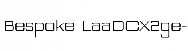
( Omnicoda - www.omnicoda.com/ )
A modern, geometric font with clean lines and a minimalist style.
![Bespoke LaaDCX2ge- Frei Schriftart Herunterladen]() Herunterladen 259 Downloads@WebFont
Herunterladen 259 Downloads@WebFont -
( Fonts by Iconian Fonts )
A bold, italic, and futuristic font with angular, geometric characters.
![Cruiser Fortress Title Italic Frei Schriftart Herunterladen]() Herunterladen 259 Downloads@WebFont
Herunterladen 259 Downloads@WebFont -
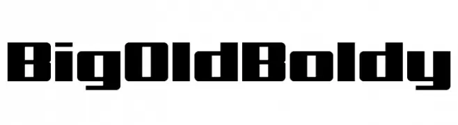
( Chequered Ink - chequered.ink/ )
A bold, geometric font with a strong, blocky appearance.
![Big Old Boldy Frei Schriftart Herunterladen]() Herunterladen 259 Downloads@WebFont
Herunterladen 259 Downloads@WebFont -
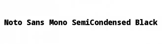
( Noto is a trademark of Google Inc. Noto fonts are open source. All Noto fonts are published under the SIL Open Font License, Version 1.1 )
A bold, monospaced font with a semi-condensed width and strong visual impact.
![Noto Sans Mono SemiCondensed Black Frei Schriftart Herunterladen]() Herunterladen 259 Downloads@WebFont
Herunterladen 259 Downloads@WebFont -
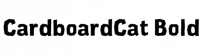
( Fonts by Ontwerpstudio Dot by dot )
A bold, playful font with a rugged, hand-cut appearance and angular edges.
![CardboardCat Bold Frei Schriftart Herunterladen]() Herunterladen 259 Downloads@WebFont
Herunterladen 259 Downloads@WebFont -
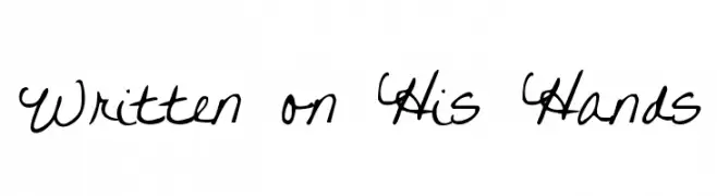
( Fonts by Kimberly Geswein - kimberlygeswein.com )
A casual, handwritten cursive font with fluid strokes and dynamic character.
![Written on His Hands Frei Schriftart Herunterladen]() Herunterladen 259 Downloads@WebFont
Herunterladen 259 Downloads@WebFont -
![AnaSparavec Frei Schriftart Herunterladen]() Herunterladen 259 Downloads@WebFont
Herunterladen 259 Downloads@WebFont -
![ER Kurier KOI-8 Italic Frei Schriftart Herunterladen]() Herunterladen 259 Downloads@WebFont
Herunterladen 259 Downloads@WebFont -
![Soroban Frei Schriftart Herunterladen]() Herunterladen 259 Downloads@WebFont
Herunterladen 259 Downloads@WebFont -
( Copyright (c) 2013, Natanael Gama (www.ndiscovered.com . info(at)ndiscovered.com), with Reserved Font Name 'Exo' )
A sleek, modern, and slightly italicized font with thin, elongated characters.
![Exo 2 Extra Light Italic Frei Schriftart Herunterladen]() Herunterladen 259 Downloads@WebFont
Herunterladen 259 Downloads@WebFont -
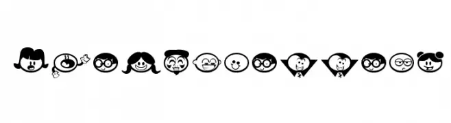
( Fonts by www.fontalicious.com )
A whimsical collection of cartoon character icons with bold outlines and playful expressions.
![Chickabiddies Frei Schriftart Herunterladen]() Herunterladen 259 Downloads@WebFont
Herunterladen 259 Downloads@WebFont -
( Free for a personal use. For a commercial use please visit www.kevinandamanda.com )
A playful, handwritten font with a whimsical and informal style.
![Pea Kassidy Frei Schriftart Herunterladen]() Herunterladen 259 Downloads@WebFont
Herunterladen 259 Downloads@WebFont -
![Shards Frei Schriftart Herunterladen]() Herunterladen 259 Downloads@WebFont
Herunterladen 259 Downloads@WebFont -
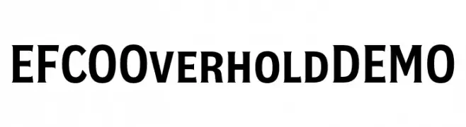
( Fonts by Ilham Herry - Personal-use only. For commercial use please contact owner. )
A bold, serif-inspired font perfect for impactful headlines.
![EFCO Overhold DEMO Frei Schriftart Herunterladen]() Herunterladen 259 Downloads@WebFont
Herunterladen 259 Downloads@WebFont -
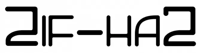
![Zif-ha2 Frei Schriftart Herunterladen]() Herunterladen 259 Downloads@WebFont
Herunterladen 259 Downloads@WebFont -
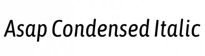
( Copyright 2016 The Asap Project Authors (omnibus.type@gmail.com), with Reserved Font Name 'Jaldi' and 'Asap'. )
A modern, condensed italic font with a sleek and professional appearance.
![Asap Condensed Italic Frei Schriftart Herunterladen]() Herunterladen 259 Downloads@WebFont
Herunterladen 259 Downloads@WebFont


Welche Schriften sind gerade am populärsten?
Poppins, Roboto, Montserrat, Open Sans und Lato sind wegen ihrer klaren Formen und breiten Einsetzbarkeit sehr gefragt – von Markenauftritt über Landingpages bis hin zu Postern.
Welche Fonts eignen sich für Logos?
Geometrische Sans‑Serifs (z. B. Poppins, Familien im Gotham‑Stil) sind ein häufiger Griff für sauberes, skalierbares Branding. Für eine persönlichere Note bleiben Scripts und Handschrift‑Stile beliebt. Kombinieren Sie einen prägnanten Headline‑Font mit einer neutralen Brotschrift für Wiedererkennung und Harmonie.
Wie oft wird die Top‑Liste aktualisiert?
Regelmäßig – basierend auf realen Downloads und Interaktionen. Schauen Sie öfter vorbei, um aufstrebende Favoriten früh zu entdecken.
💡 Tipp: Seite bookmarken – Trends wechseln schnell, und heutige Top‑Schriften inspirieren morgen vielleicht das Rebranding.